health/medicine

The Washington Post has provided an image from the New England Journal of Medicine that illustrates changing causes of death. Comparing the top 10 causes of death in 1900 and 2010 (using data from the Centers for Disease Control and Prevention), we see first that mortality rates have dropped significantly, with deaths from the top 10 causes combined dropping from about 1100/100,000 to about 600/100,000:

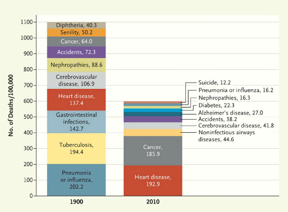
And not surprisingly, what we die from has changed, with infectious diseases decreasing and being replaced by so-called lifestyle diseases. Tuberculosis, a scourge in 1900, is no longer a major concern for most people in the U.S. Pneumonia and the flu are still around, but much less deadly than they used to be. On the other hand, heart disease has increased quite a bit, though not nearly as much as cancer.

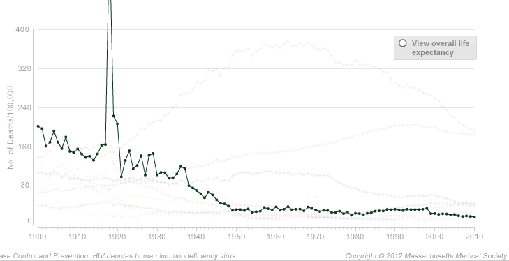
The NEJM has an interactive graph that lets you look at overall death rates for every decade since 1900, as well as isolate one or more causes. For instance, here’s a graph of mortality rates fro pneumonia and influenza, showing the general decline over time but also the major spike in deaths caused by the 1918 influenza epidemic:

The graphs accompany an article looking at the causes of death described in the pages of NEJM since its founding in 1812; the overview highlights the social context of the medical profession. In 1812, doctors had to consider the implications of a near-miss by a cannonball, teething could apparently kill you, and doctors were concerned with a range of fevers, from bilious to putrid. By 1912, the medical community was explaining disease in terms of microbes, the population had gotten healthier, and an editorial looked forward to a glorious future:

Perhaps in 1993, when all the preventable diseases have been eradicated, when the nature and cure of cancer have been discovered, and when eugenics has superseded evolution in the elimination of the unfit, our successors will look back at these pages with an even greater measure of superiority.

As the article explains, the field of medicine is inextricably connected to larger social processes, which both influence medical practice and can be reinforced by definitions of health and disease:

Disease definitions structure the practice of health care, its reimbursement systems, and our debates about health policies and priorities. These political and economic stakes explain the fierce debates that erupt over the definition of such conditions as chronic fatigue syndrome and Gulf War syndrome. Disease is a deeply social process. Its distribution lays bare society’s structures of wealth and power, and the responses it elicits illuminate strongly held values.

Cross-posted at Family Inequality.

Lots of buzz over a New York Times article about men moving into female-dominated occupations, which reported that “more and more men are starting to see the many benefits of jobs long-dominated by women.”

The Times produced this table, which shows the fastest growing occupations for (for some reason) college-educated White men, ages 25-39:

The ones with the pink dots are 70% female or more. The increase of young college educated White men in these occupations over 10 years appears striking, but the numbers are small. For example, compare that increase of (round numbers) 10,000 young White male registered nurses to the 1,900,000 full-time year-round nurses there were in 2010.

Moreover, consider that increase of 10,000 nurses in light of the overall growth of registered nurses from 2000 to 2010: about 500,000. Overall, the representation of men among full-time year-round registered nurses increased from 9.4% to 10.3% during the decade.

The Times article attempts to describe a broad trend of men moving into “pink-collar” jobs:

The trend began well before the crash, and appears to be driven by a variety of factors, including financial concerns, quality-of-life issues and a gradual erosion of gender stereotypes. An analysis of census data by The New York Times shows that from 2000 to 2010, occupations that are more than 70 percent female accounted for almost a third of all job growth for men, double the share of the previous decade.

Bold claims. But check the next sentence: “That does not mean that men are displacing women — those same occupations accounted for almost two-thirds of women’s job growth.” So, lots more men are in these jobs, but even more women are? How does that reflect an “erosion of gender stereotypes”? It seems like it reflects an increase in the size of female-dominated occupations.

In fact, as I reported briefly before, occupational gender segregation dropped barely a hair in the 2000s, from 51 to 50 on a scale of 0 to 100, compared with drops of 5 or 6 points in the decades before 1990. That is a lost decade for integration.

And if you look specifically at the category the Times chose — occupations that are 70% female or more — the percentage of men in those occupations increased, but only from 5.0% to 6.1%. And nurses? In 2010, 0.4% of all full-time year-round working men were nurses, up from 0.3% in 2000. Women are still 11-times more likely to be nurses than men.

Now that’s what you call a “gradual erosion of gender stereotypes.”

Sources: U.S. Census tables for 2000 and 2010 (table B24121).

NPR’s Planet Money asks an interesting question.  If there are more women in the workforce now than there were forty years ago (and there are), where did all the additional jobs come from?

The pie charts below tell some of the story.  On the left are charts representing the percentage of women in various occupations in 1972.  The size of the circle corresponds to the size of the sector: larger is equivalent to more total jobs; on the right are the same charts for 2012.

Notice two trends: first,  in almost all categories today women are a larger percentage of the workers than they were in 1972 and, second, many of the occupational sectors that have high percentages of women have grown (e.g., education and health), whereas many in which men dominate have shrunk (e.g., manufacturing, media/telecommunications).

So, as women have joined the workforce, they’ve contributed to the overall growth of the American workforce and, specifically, filled the demand for employees in growing occupations.

Lisa Wade, PhD is an Associate Professor at Tulane University. She is the author of American Hookup, a book about college sexual culture; a textbook about gender; and a forthcoming introductory text: Terrible Magnificent Sociology. You can follow her on Twitter and Instagram.

Recently Talking Points Memo posted a 1960s coloring book sent in by a reader, who found it among her grandmother’s things. The coloring book, New Frontier, mocks John F. Kennedy and a number of his policies.

What’s fascinating is how closely some of the arguments in it match rhetoric in the presidential debate today. There’s concern that the President’s programs — in this case, Medicare — will negatively affect the quality of medical care, inserting the federal government between patients and doctors:

And an association with Harvard advisors was worthy of scorn then, too:

Another accuses Kennedy of attacking business at the expense of dealing competently with external national security threats:

It’s an interesting reminder that many of the attacks we see against President Obama today aren’t new; there’s the newest round in an ongoing struggle about social policies and political priorities.

NPR’s Planet Money blog posted this image showing changes in major categories of federal spending over the past 50 years. Notably, though defense spending (which includes veteran benefits) is still the largest category of federal spending, it’s a much smaller proportion of the total budget than it was in the ’60s; spending on interest on our debt has also fallen quite a bit since the ’80s. On the other hand, spending on Social Security, Medicare and Medicaid (which didn’t even exist in 1962), and safety net programs (including food stamps and unemployment) have grown. The somewhat reduced “everything else” category includes everything from education to space exploration to agriculture and more:

Via The Sociological Cinema; data available at the Office of Management and Budget.

Cross-posted at Montclair SocioBlog.

In case you wondered about what we in the U.S. pay for health care compared with those unfree unfortunates who suffer under various forms of socialized medicine, here are some graphs from 2009 showing the advantages of what is sometimes called “the best health care system in the world.”

The graphs are from the International Federation of Health Plans. I’ve selected only four — to show the relative costs* of

  • an office visit
  • a day in the hospital
  • a common procedure (childbirth without complications)
  • a widely used drug (Lipitor)

You can download all the charts here, but be warned: it gets boring. We’re number one in every chart, at least in this one category of how much we shell out.

Since we have the best health care in the world, this must mean that you get what you pay for. Our Lipitor must be four to ten times as good as the Lipitor that Canadians take.

Hat tip: Ezra Klein.

———————–

*These amounts are what providers are paid by governments or other insurers, not what the patient pays, which in many Eurpean countries is essentially nothing. See the footnotes for the tables in the original document. Or look at the comments on this at Boing Boing, a discussion which is remarkably civil (do they monitor comments?).

Given our collection of toy make-overs, I was curious when I heard that Quaker Oats had re-vamped their mascot, Larry.  In the toys we’ve covered, the trend is towards greater feminization and sexualization.  Larry, though, is a dude.  And do we really need to sexualize our oatmeal?  (Well, you never know.)

It turns out what prompted the mascot make-over wasn’t an effort to make Larry sexier, but to make him look healthier.  According to the Wall Street Journal, the director of Quaker’s brand-design firm wanted to reinforce people’s association of oatmeal with “energy and healthy choices.”  And by “healthy,” they mean “thin.”   They reduced the roundness of his chin and cheeks.  They also gave him a hair cut in order to expose the sides of his neck.  Another representative of the brand redesign explains: “It’s the same neck,” but the haircut “makes him look thinner… We took about five pounds off him.”

If it’s tough for you to tell the difference between the two, it’s by design.  Quaker wants the changes to work on a subconscious level.  A fascinating peak into the motives and tactics of brand management.

Lisa Wade, PhD is an Associate Professor at Tulane University. She is the author of American Hookup, a book about college sexual culture; a textbook about gender; and a forthcoming introductory text: Terrible Magnificent Sociology. You can follow her on Twitter and Instagram.

Autism appears to be on the rise. The U.S. Centers for Disease Control and Prevention reports that there are 20 times more cases of autism today than there were in the 1980s.  This figure, from the Los Angeles Times, shows a 200% increase in California:

The rise in cases of autism led scientists to ask whether there was an actual increase in incidence or if we were just getting better at identifying it.  The evidence seems to suggest that it’s (at least mostly) the latter.  Said anthropologist Roy Richard Grinker: “Once we are primed to see something, we see it and wonder how we could have never seen it before.”

But how to explain disparities like this?

Often regional differences in health and mental health can be traced to heavier environmental toxin loads.   In most of those cases, though, clusters of illness occur in poor and often disproportionately non-white neighborhoods.  Autism clusters were happening in class-privileged places.

Sociologist Peter Bearman discovered that these clusters were the result of conversation.  Class-privileged parents had the resources to get their child diagnosed, then they talked to other parents.  Some of these parents would recognize the symptoms and take their child to the doctor and… voila… a cluster.  “Living within 250 meters [of a child diagnosed with autism], reports the Los Angeles Times, boosted the chances by 42%, compared to living between 500 and 1,000 meters away.”

Lisa Wade, PhD is an Associate Professor at Tulane University. She is the author of American Hookup, a book about college sexual culture; a textbook about gender; and a forthcoming introductory text: Terrible Magnificent Sociology. You can follow her on Twitter and Instagram.