gender: femininity

Erg. Ugh. Just…[cringe]. That is my reaction upon seeing a clip (first posted at Jezebel), sent in by Dmitriy T.M., of a segment from a recent episode of the reality show Bachelor Pad. The show is a spinoff of the popular shows The Bachelor and The Bachelorette, consisting initially of 20 former contestants from those two shows, one of whom is voted off by the rest of the cast each week. This week, the contestants indicated their votes for who should leave by getting to anonymously throw paint-filled “eggs” at others’ backs. But in case that wasn’t sufficiently humiliating, the host also had contestants throw eggs in response to the question “Who are you least attracted to?” Here’s the segment with the women:

It’s a depressing illustration of the current TV obsession with public humiliation and bullying as entertainment. It’s hard not to feel for Erica as she stands there feeling each successive hit, being publicly held up as the least desirable woman there. But her response is also revealing; it exemplifies the way women are encouraged to think of themselves as being in competition. At 2:54 Erica talks about the experience and the difficulty of having a body that, while appearing incredibly thin to me, in that environment qualifies as notably curvaceous.

But in her ability to defend herself and push back against the judgments of others, she falls back on a common strategy: not questioning the standards of beauty themselves, but simply trying to refocus them, in this case (at about 3:05) pointing to another woman who is “way bigger” and not “that pretty.” The result is to reaffirm both the idea that body size is an objective and essential measure of attractiveness (so being bigger automatically should make you less attractive than a smaller woman) and that women’s self-esteem and resistance to negative judgments of their own attractiveness must come at the expense of other women, with whom them are always, and inevitably, in competition.

Katrin sent along a vintage (apparently 1957) Pepsi commercial I thought you might enjoy, as it has all the classics: lightly mocking tone about women’s supposed competitiveness with one another and obsession with shopping, reminder that attractive = thin, and presentation of marriage as the ideal, ultimate victory for all women:

Yesterday I posted about some children’s luggage that normalizes gendered occupations. Given that, I thought I’d follow up with several more examples of gendering kids’ stuff that have been sitting in our inbox.

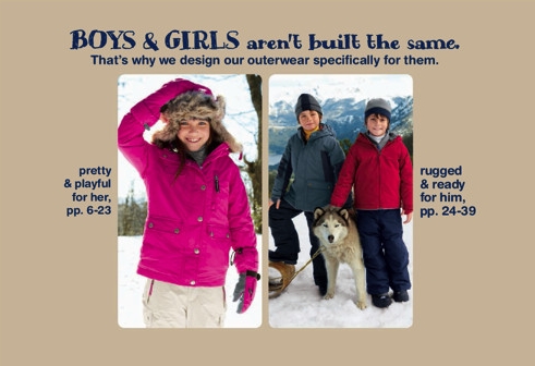
Erin M. saw this image in a Land’s End catalog for kids’ clothing a while back. It draws on the idea that boys and girls are just inherently different, with girls needing things that are “pretty” while boys need stuff that’s “rugged”:

Caspian P. snapped this photo of two video games (by different companies) that efficiently summarize who we assume will be interested in what:

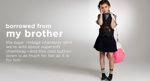
Finally, Cheryl S. noticed that J. Crew decided to market some of their boys’ clothing to girls. Rather than designating the clothes as unisex, or listing them as boys’ items in the boys’ section and girls’ items in the girls’ section, they instead created a section in the girls’ part of the website called Borrowed from My Brother:

As Cheryl points out, there is no “borrowed from my sister” section for boys. We accept the idea of women wearing men’s clothing, even seeing it as potentially sexy, in a way that we don’t tolerate or condone men crossing gender lines to wear women’s items or take on other aspects of femininity. J. Crew simply applies this wider cultural acceptance of women taking on some aspects of masculinity (as long as they balance it with enough signs of femininity), which we see in the marketing of “boyfriend jeans” to women, and applies it to kids.

For a little dose of vintage sexism, I present to you an old Van Heusen ad, sent in by Leticia (via 22 Words):

I am still trying to figure out what a “man-talking” tie is, exactly, but I am more than happy to cede the “power-packed patterns” on those ties to the world of men.

Megan H. and Ami R. sent in contrasting examples of using gender to market fuel-efficient cars. Megan saw this ad (one in a series that plays on the “I’m a Mac/I’m a PC” Apple ads) advocating electric cars over gasoline-powered ones. In this ad, femininity is associated with environmental responsibility. The most stereotypically masculine man in the ad — the blue-collar worker in a hard hat and filthy clothes — represents the harmful oil industry. Beneficial, good wind energy, on the other hand, is personified by a pretty woman in a filmy dress. Her beauty renders the bad guys speechless:

Dodge, on the other hand, wants to distance its claims to fuel efficiency from any association with femininity. Ami found this ad for the new Dodge Charger in the magazine for Go! Chapel Hill, an organization that advocates less car use:

So here, fuel efficiency with is also associated with femininity, but in the negative sense of emasculation. The Charger is the one exception to the other fuel efficient cars out there. You can get better gas mileage and still protect your manly reputation.

For other examples of gender representations of the environment or environmental movement, see our previous posts on femininity and benign nature, using PETA tactics to oppose the BP oil spill, nature in vintage men’s magazines, and even girls can drive electric cars!

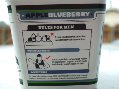
Jeremiah, Sarah S., Nikki R., and Erin H. sent us a great example of a company trying to make a feminized food safe for men. New Zealand’s Mammoth Supply Co. (a subsidiary of the multinational dairy giant Fonterra) is trying to convince men that yogurt is super manly and tough, “built to tame a man’s hunger.” The ads reinforce a whole range of rules about masculinity, which Erin nicely sums up as “the same old mythbashing that men need things that are big, tough, substantial, strong and rugged, and that coded-feminine activities (crying, being too involved in one’s personal appearance, coming into physical contact with people of the same sex) are inferior and weak”:

Via Copyranter.

The website, which assures the reader that this is “real man food, man,” as well as each carton of yogurt includes additional helpful tips:

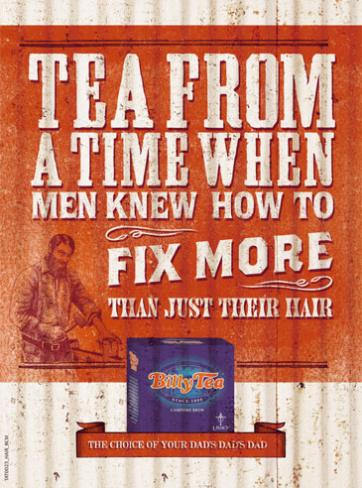
Lisa K. recently saw an ad for Billy Tea in a newspaper that implies men and women are no longer sufficiently masculine and feminine, unlike the good old days when the tea was first produced:

Here’s another one of their ads:

Sarah B. sent in this Miller High Life ad (which she blogged about at Adventures in Mediocrity) that makes it clear that the only types of salad men should eat are the type without, you know, girly vegetables:

In another example of gendering foods, Lisa R. pointed out Applebee’s commercials for its set of dishes with under 550 calories. Women love eating low-calorie meals:

The commercial aimed at men, titled “Manly Man,” presents ordering from the 550-calorie menu as something men might be a bit embarrassed about, but don’t worry — once the guys see your huge plate of food, your masculinity will once again be unquestioned:

Quite some time ago, Laura McD. sent us a link to an NPR story about a new ad campaign for baby carrots (which, if you didn’t know, aren’t actually immature carrots; they’re just regular carrots peeled and cut into small pieces). In an effort to appeal to teens, these ads openly satirize marketing tropes used to sell lots of snacks, especially the effort to market junk food as totally extreme! The website self-consciously makes the link to junk food, winking at the audience about the absurdity of EXTREEEEEME!!!!! marketing, yet hoping that rebranding carrots as similar to junk food, and using the marketing tactics they’re laughing at, actually increases sales. So, for instance, they have new packaging that looks like bags of chips:

The ads serve as a great primer on extreme food marketing cliches, complete with associations with violence (and stupidity), the sexualization of women, and the constant reminder via voiceovers and pounding music that this food is freakin’ extreme, ok?!?!

/p>

This one parodies ads that sexualize both women and food and present eating as an indulgence for women:

The ad campaign presents all this with a tongue-in-cheek tone of “isn’t this ridiculous?” But they’re also genuinely trying to rebrand a food product to increase sales, and clearly see the way to do that as downplaying any claims about health and instead using — if mockingly — the same marketing messages advertisers use to sell soda, chips, energy drinks, and other foods aimed at teens (particularly, though not only, teen boys).

As such, they provide a great summary of these marketing techniques and the jesting “Ha ha! We get it! We’re not like the other marketers who try to sell stuff to you! We know this is silly! (Please buy our product, though)” ironic marketing technique.

And now, I highly recommend you go watch the satire of energy drink commercials Lisa posted way back in 2007. It never gets old.

We have posted in the past about pre-World War II uses of the swastika as a symbol of good luck, a meaning that the Nazis’ appropriation of the swastika makes nearly inconceivable today. Matthieu S., who teaches anthropology at Vanier College in Montreal, sent in another example, a scan of a postcard he owns that was printed in the 1920s. The postcard, meant for a dad’s birthday, also includes pink-tinted flowers — evidence of a time when pink was considered a perfectly appropriate color for men and boys:

World War II and the atrocities of the Nazi party obviously significantly changed interpretations of both the formerly-benign swastika and the color pink. Pink wasn’t abandoned altogether, as the swastika was, but the Nazi’s use of pink to label gay and lesbian prisoners led pink to be stigmatized as effeminate and, thus, an inappropriate color for men…and over time it instead became the epitome of symbols of femininity.