economics

Sorry for the sporadic posting. I’m visiting family in Oklahoma and that means very, very limited internet access.

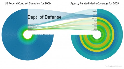
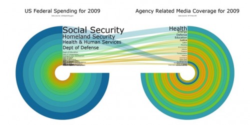
Zac from Georgia sent in a link to some interesting images that illustrate the mismatch between what the federal government spends money on and what the media cover. This image shows spending only via federal contracts (not all spending) compared to all articles in the New York Times in 2009 (granted, a very small sample of all media coverage, so keep that in mind):

Contract spending data is available here.

This time we have all spending, not just spending through contracts; the Department of Defense has dropped down to 4th place:


Gwen Sharp is an associate professor of sociology at Nevada State College. You can follow her on Twitter at @gwensharpnv.

Keeping a trend in perspective.

The sociologist down the hall pointed out that yesterday’s chart gave the impression of a whopping increase in TANF (Temporary Assistance to Needy Families) support for poor families. But I have been complaining since December 2008 that the welfare system is not responding adequately to the recession’s effects on poor single mothers and their children. I wrote then:

We now appear headed back toward a national increase in TANF cases. But the restrictive rules on work requirements and time limits are keeping many families that need assistance out of the program…. If the government can extend unemployment benefits during the crisis, why not impose a moratorium on booting people from TANF?

So it does seem contradictory that I would post a chart yesterday showing a huge increase in TANF family recipients, and continue the same complaint. So let me put it in better perspective. It’s a good lesson for me on the principles of graphing data, which I have made a point of picking on others for.

Height and width

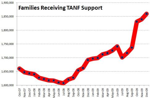
There were two problems with yesterday’s chart. First, the vertical scale only ran from 1.6 million to 1.9 million families. Second, the horizontal scale only ran for 26 months. I’ll correct each aspect in turn to show their effects. Here’s yesterday’s chart:

It sure looks like a dramatic turnaround. And any turnaround is a big deal. I wrote last year:

What should be striking in this is that the rolls are increasing even as the punitive program rules continue to pull aid from families according to the draconian term limits dreamed up by Gingrich, ratified by Clinton and endorsed by Obama — 2 years continuous, 5 years lifetime in the program. The current stimulus package includes more money for TANF, to help cover an expected growth in families applying — but no rule change to permit families to keep their support in the absence of available jobs.

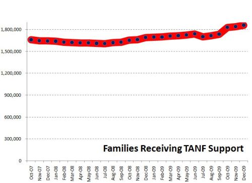
But, run the vertical axis down to zero, and the same trend is not so dramatic:

Now the big bounce since July 2008 is put in perspective. We’ve seen a 16% increase since that bottom point, but the response seems much more modest in light of the size and impact of the Great Recession we’ve come to know.

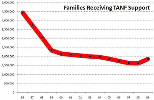
In fact, though, the longer-term view underscores how paltry that response has really been. Back the chart up to 1996, and you can see how small the increase has been compared with the pre-draconian reform period:

All three images are correct, but their emphasis is different. To me, the important take-home message from this trend is, “That’s it? The greatest economic recession since the Great Depression, and our welfare response was that measly uptick? Our system really is a shambles.”

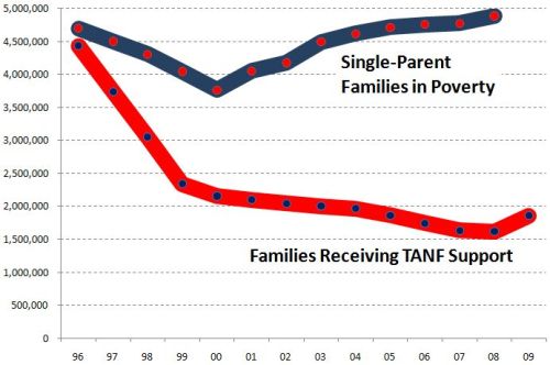
One important issue remains, however, and that is some measure of the need for welfare. So consider the number of single-parent families below the poverty line, compared with the number of families receiving TANF (formerly AFDC):

Now the story is much more clear.

After welfare reform in 1996, the number of families receiving welfare was cut by half in just a few years. At the same time, however, the number in poverty dropped. Since then, as the number in poverty has increased, the number on welfare has not. The two trends appeared to be uncoupled through most of the 2000s. In the last year we’ve seen the first increase in TANF numbers since 1996, but nowhere near enough to meet the increase in poor single-parent families.*

It is still the case that, although the stimulus bill allocated more money to TANF, the punitive rules and term limits have not been changed. So the system does not address longer-term poverty — something we should expect to see much more of in the next few years.

*We don’t have the official 2009 poverty rates yet, since they are compiled from a survey done in March 2010, to be released this fall.

Philip Cohen, PhD, is a professor of sociology at the University of North Carolina at Chapel Hill, where he teaches classes in demography, social stratification, and the family.  You can visit him at his blog, Family Inequality, and see his previous posts on SocImages here, here, and here.

Lisa Wade, PhD is an Associate Professor at Tulane University. She is the author of American Hookup, a book about college sexual culture; a textbook about gender; and a forthcoming introductory text: Terrible Magnificent Sociology. You can follow her on Twitter and Instagram.

Sanguinity sent in an interesting, if disheartening, report by Insight Center for Community Economic Development. The report looks at the assets owned by women of color and the wealth gap between them and men of different racial/ethnic groups.

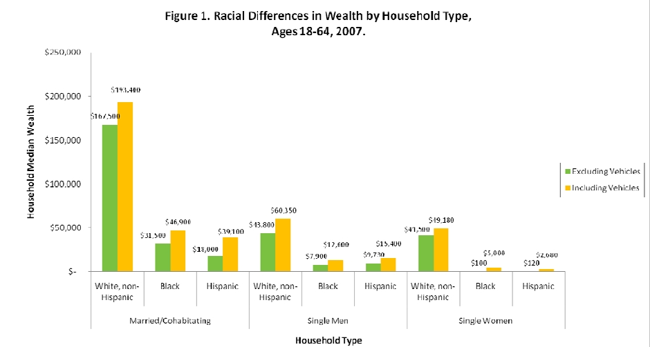
An overview of wealth (the value of all assets minus the value of debts) broken down by race/ethnicity and type of household:

Of course, the most striking finding there are the major disparities by race, particularly how much wealth White non-Hispanics have compared to all other groups (largely due to owning more valuable homes). Notice that single White men and women have higher median household wealth than married Black or Hispanic couples. This is astounding.

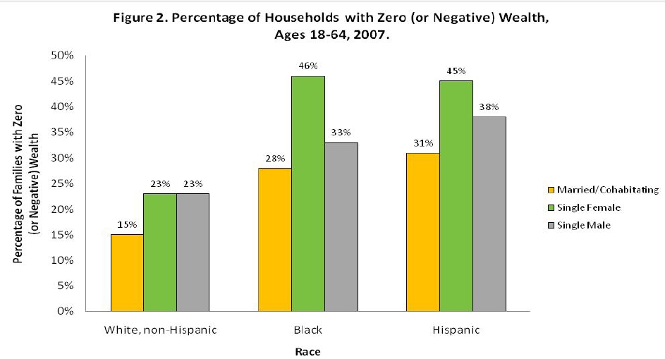
Blacks and Hispanics are more likely than Whites to have no wealth at all, or to have debts outweigh all assets; again, unmarried Whites are better off in this regard than are married Blacks and Hispanics:

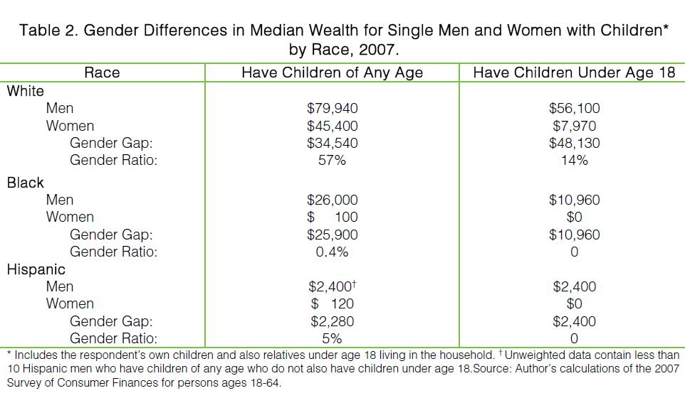
Among single parents, women appear to bear a disproportionate amount of the financial hardships of caring for children. White single mothers with children of any age (second column) have only 57% as much wealth as White single fathers; the equivalent ratio for Blacks is 0.4% and for Hispanics, 5%. Read that again: 0.4% and 5% as much wealth as single fathers from the same race! And take a look at the actual cash value: median wealth for Black women is $100, and for Hispanic women, it’s $120!

But then look at that third column! If you’re a single mother and have children under the age of 18 — who are more likely to be living with you than with their father — your financial picture is pretty dismal. Black and Hispanic women with children under age 18 have a median wealth of zero, meaning half have no wealth at all or owe more than all their assets combined are worth. Even White women, who are absolutely wealthy by comparison, have only 14% as much wealth as White single fathers with children under age 18.

Thinking about the implications of those numbers — the very meager financial resources available to many families, the particularly difficult situation of single mothers of all races, what this means for a family’s ability to cope with a crisis such as a car breaking down or a medical emergency, the ability to come up with deposits for an apartment — is mind-blowing.

The report has quite a bit of other information too, so if you’re interested in this topic, go check it out.

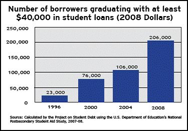
Data from The Institute for College Access and Success shows that the number of students who graduate with at least $40,000 in student loans increased nine-fold between 1996 and 2008.

Sally Raskoff at Everyday Sociologyoffers some explanations for the data:  (1)  College has been getting more expensive; among other reasons, states cut education budgets.  (2)  For-profit colleges have also become a larger proportion of all colleges and students in these colleges are more likely to take out loans.   (3)  Given a bad economy, students are less likely to have jobs while in school.  Other explanations?  Stories?

Lisa Wade, PhD is an Associate Professor at Tulane University. She is the author of American Hookup, a book about college sexual culture; a textbook about gender; and a forthcoming introductory text: Terrible Magnificent Sociology. You can follow her on Twitter and Instagram.

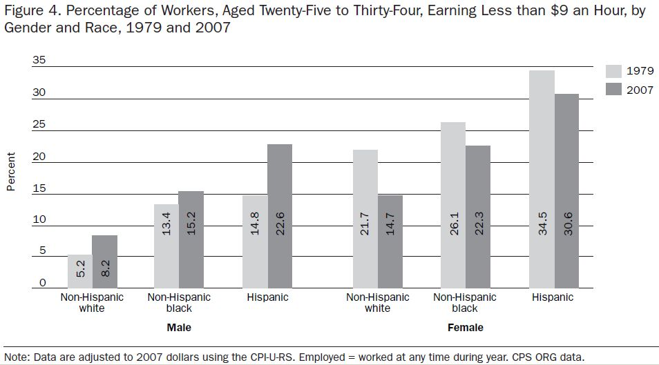
A full-time worker making nine dollars an hour cannot raise a family above the poverty line.  A paper by Sheldon Danziger and David Ratner demonstrates that fewer women survive on less than $9 an hour today than (its adjusted equivalent) in 1979.  The same cannot be said for men: The authors write:

…changes in the labor market over the past thirty-five years, such as labor-saving technological changes, increased globalization, declining unionization, and the failure of the minimum wage to keep up with inflation, have made it more difficult for young adults to attain the economic stability and self-sufficiency that are important markers of the transition to adulthood.

This is just more evidence of the shrinking of the middle class; solid working class jobs that will allow you to buy a modest home are disappearing. Hat tip to Family Inequality and Karl Bakeman’s blog.

Lisa Wade, PhD is an Associate Professor at Tulane University. She is the author of American Hookup, a book about college sexual culture; a textbook about gender; and a forthcoming introductory text: Terrible Magnificent Sociology. You can follow her on Twitter and Instagram.

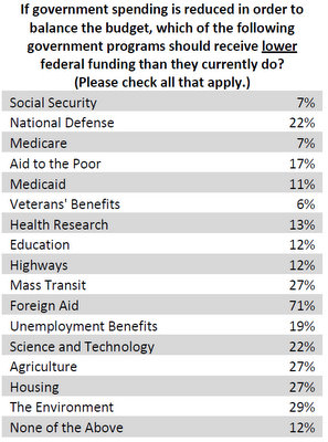
Sixty-two percent of Americans think that the country should reduce spending in order to cut the deficit.  What do they think we should cut?  Nothing really.

Well, nothing except foreign aid.

Kevin Drum at Mother Jones reminds us that foreign aid is about one percent of the U.S. budget.

…there were only four [other] areas that even a quarter of the population was willing to cut: mass transit, agriculture, housing, and the environment. At a rough guess, these areas account for about 3% of the federal budget. You could slash their budgets by a third and still barely make a dent in federal spending.

The Economist, via BoingBoing.

Lisa Wade, PhD is an Associate Professor at Tulane University. She is the author of American Hookup, a book about college sexual culture; a textbook about gender; and a forthcoming introductory text: Terrible Magnificent Sociology. You can follow her on Twitter and Instagram.

Existing data suggests that, for college students graduating during an economic recession, wage depression will follow them throughout their life.  The figure below shows that, for every one percentage point increase in the national unemployment rate, a college grad’s wages will drop by about six percent.  Five years later, their wages will still lag by five percent.   Fifteen years later they’ve recovered their losses to about three percent, but they’re still behind where they would have been.  And remember, this data is for each percentage point increase in the unemployment rate.

10_22_09_graph-1

Data borrowed from the Office of Management and Budget, via Matthew Yglesias.

For more happy graduation news, see here.

Lisa Wade, PhD is an Associate Professor at Tulane University. She is the author of American Hookup, a book about college sexual culture; a textbook about gender; and a forthcoming introductory text: Terrible Magnificent Sociology. You can follow her on Twitter and Instagram.

You might have heard that the U.S. added 290,000 jobs in April.  At the same time, the unemployment rate rose!  Bwhat!?

The unemployment rate doesn’t measure how many people are unemployed.  It sounds like it should, being that it includes the words “unemployment” and “rate” and all, but it doesn’t.  Instead, the unemployment rate measures how many people are looking for jobs.  When things are really bad, some people get discouraged and give up, or go to school instead, or stay home to take care of their kids and save day care money.

So the number of jobs and the unemployment rate are not directly correlated.  Ezra Klein posted this visual:

It shows unemployment rising as job growth remains negative, leveling off as (perhaps) people drop out of active job seeking, and than actually going up again there at the end in response to two months of solid job growth.

So it turns out that, in this case, a rise in the unemployment rate is good news.  It means some people are hopeful again.

Lisa Wade, PhD is an Associate Professor at Tulane University. She is the author of American Hookup, a book about college sexual culture; a textbook about gender; and a forthcoming introductory text: Terrible Magnificent Sociology. You can follow her on Twitter and Instagram.