culture: color

Spam Fiesta Peach Cups, Family Circle, 1956

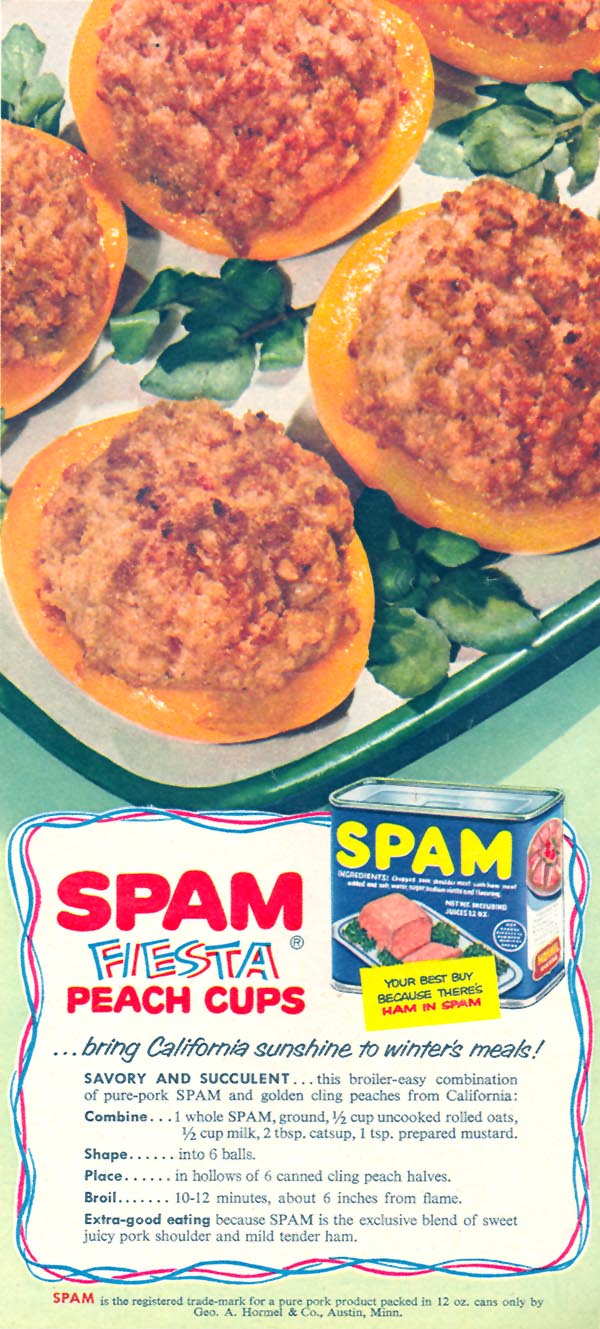
I can safely say that most readers of this blog probably think that broiled Spam + canned peaches looks and sounds unappetizing.  But this is only one of many creative food combinations that appeared in advertisers’ recipes and cookbooks during the 1950s and 1960s. Here’s another:

Yankee Doodle Pizza Pie, Women's Day, October, 1954


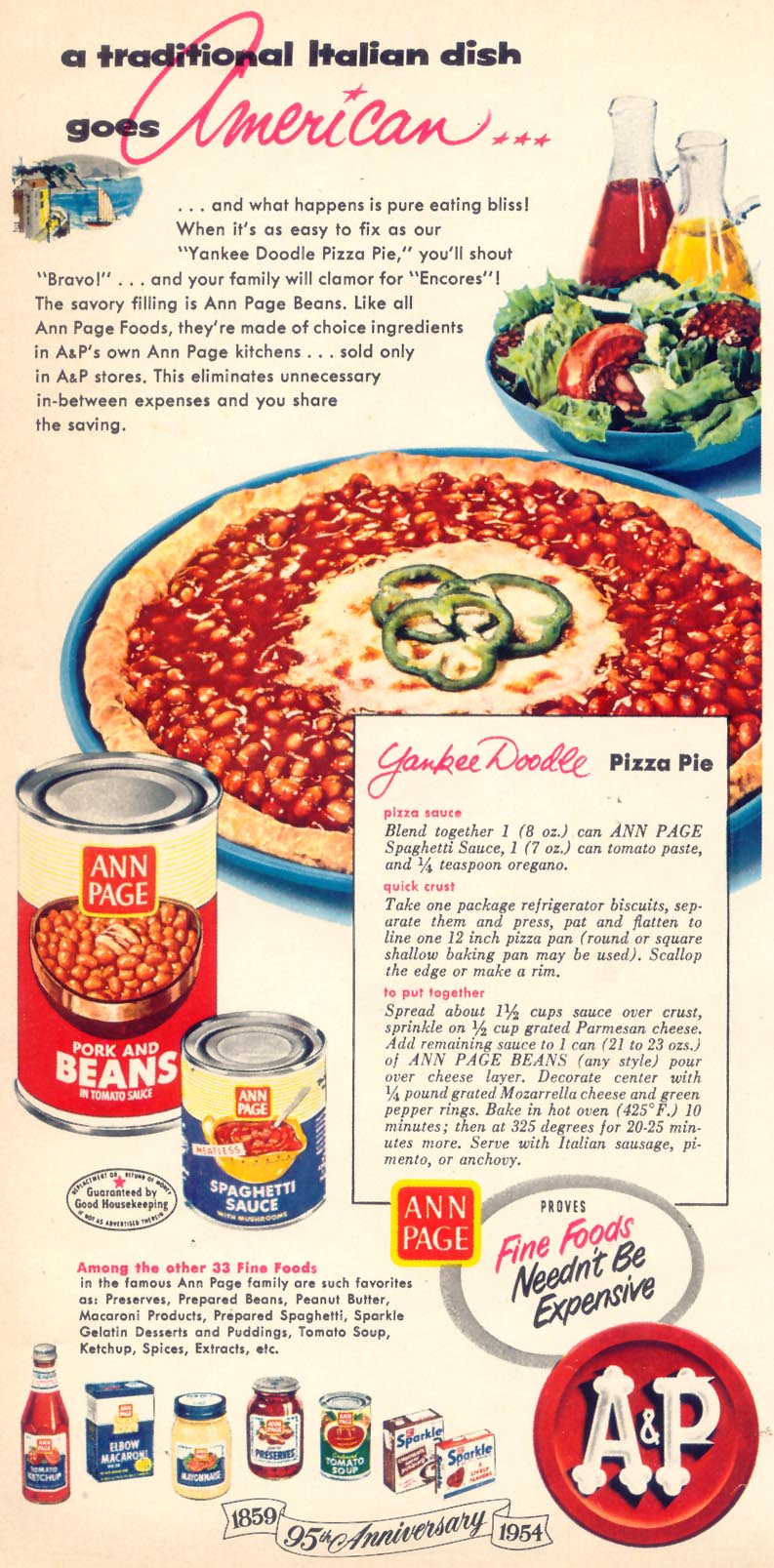
Why, yes, those are baked beans on pizza.

While there are plenty of interesting angles on these old recipes, from their use of color to their emphasis on saving money, I’d like to bring up the way that modern writers treat recipes from this period. James Lileks, for example, has an entire site, The Gallery of Regrettable Foods, which eventually spawned a book covering much of the same material.

As the index page to The Gallery of Regrettable Foods says,

What were they thinking? How did they eat this bilge? Good questions, but you won’t find them answered here. This is a simple introduction to poorly photographed foodstuffs and horrid recipes. It’s a wonder anyone in the 40s, 50s and 60s gained any weight; it’s a miracle that people didn’t put down their issue of Life magazine with a slight queasy list to their gut, and decide to sup on a nice bowl of shredded wheat and nothing else.

This [admittedly funny] type of snarky commentary has inspired other Web sites, such as Wendy McClure’s mockery of 1970s Weight Watchers recipe cards. The vintage_recipes community on LiveJournal frequently contains less formal versions of the snark.

Such modern commentary erases much of the historical significance and interest of these recipes. The radio program Engines of Our Ingenuity recently commented on the cookbook in episode 2403, with a special focus on recipes such as those shown above. As the transcript of episode 2403 suggests, many of these recipes relied on canned, gelled or prepared foods, highlighting both the Atomic Age’s fascination with technologically advanced cookery. But the mockery is way more popular these days.

These images could be used in a discussion about how “retro” images are regularly reappropriated as “cool” with little regard for their historical context.

The belief that men and women are “opposite sexes” doesn’t come out of thin air.  It doesn’t, very often, come out of our life experience either, as most people most of us know are not living stereotypes.  No, in fact we are TOLD that men and women are “opposite sexes” constantly.  Consider this submission from Andrea G.:

You can now buy One-A-Day vitamins for teens, boy and girl teens that is (and in case you can’t tell which one is which, they’re color-coded).  According to Women’s Health News, the vitamins “for him” have more magnesium and the vitamins “for her” have more calcium and iron.

(1) Notice the obnoxious invisibility of dad (my emphasis):

Did you know there are gender specific teen multivitamins to address the top health concerns of moms and teens?

This is annoying, of course, because it reproduces the idea that dads don’t care about or aren’t paying attention to their kids.  But it’s also kind of ridiculous because, as long as we’re going by stereotypes, if there’s one social group less concerned with health than men, it’s teenagers.

(2)  I will leave aside whether teenaged female and male bodies are so dramatically different that they need different vitamins and minerals (I am not convinced), and instead just point out that One-A-Day has gendered what vitamins are for.  Check out the first bullet point in the close-up (in case you can’t tell which is which, the “For Him” is in block letters with stripes across his torso and the “For Her” is in cursive with spirally curves):

So boys need vitamins for muscles and girls need vitamins for clear skin?

I bet these vitamins will sell like hotcakes.

Thanks Andrea!

Muriel M.M. brought my attention to the catalog for Galls, a company that makes equipment and uniforms for public safety officers (military, police, firefighting, etc.). Muriel, an EMT, says,

The thing about their products is they don’t change much. Over the ten years I’ve received the catalog I can pretty much tell you what’s going to be in it: guns, batons, handcuffs, clothing such as boots, coats, uniforms, etc. Medical equipment and fire equipment are sold such as sirens, lights, latex gloves, breathing equipment. The list goes on and on.

But the newest version of the catalog Muriel received has something new: handcuffs now come in colors, not just silver. The options are blue, brown, gray, orange, yellow, and pink (light and bright!):

There are a couple of interesting things here. For one, it’s an attempt to provide a little (very limited) individualization to people who have to wear standard uniforms. Of course, it’s a superficial type of customization, similar to getting a cell phone of a particular color, but it provides at least some sense that the product reflects the personality or tastes of the user…something companies figured out long ago could boost sales (how many colors do cell phones come in these days?). Given that, I wonder how many police departments would allow officers to use brightly-colored handcuffs. Officers are allowed to buy customized items, but they can’t just go buy a different color of uniform; it may be that little personalized “touches” like this are allowed, though.

It’s also interesting to think about what the reaction might be to an officer who showed up at work with pink handcuffs. I wonder how many female officers would want to bring attention to their gender by using a product marked by the stereotypical feminine color. It also made me think of this post about cops in Thailand being punished by being forced to wear pink Hello Kitty armbands. I’m assuming a person would buy pink handcuffs to express their taste, but after looking at the old post, it made me wonder if anyone would ever put pink cuffs on male suspects just to try to annoy them. I bet one of my relatives who is a police officer would totally do that, except that it would require him to carry pink cuffs around all the time, which he would never, under any circumstances, do. He flipped out because his son liked a pink ball once.

NEW! Ben O. sent us a link to a similar product, Petals Workwear for Women.  The company makes pink products for female construction workers.

Hard hat:

cat_hard_hat_1335_normal1

Tool belt:

cat_toolbelt_79_normal

Protective ear wear:cat_hearing_protection_970_normal

Protective eye wear:cat_eye_protection_1455_normal

NEW (Aug. ’10)! Garland Walton sent along these pink boxing accessories: gloves, tape, and a mouth guard.  All in pink!

See also our post with a cartoon riffing on how people seem to think that pinkification is the answer to gender inequality.

Muriel M. M. went to a Palin rally and sent us her pictures and thoughts.  She says that she waited three and a half hours to hear Palin speak and then left in frustration; so there will be no pictures of Palin.  She did, however, make some observations about how people were showing support for Palin.

First, she thought the pins were interesting.   Notice the gender binary and heteronormativity in this first pin (the “hero” and the “mom”):

Muriel noted that in the “Read my Lipstick” pin (below), Palin is looking at the viewer, not where she is aiming.  It also reads “Change is Coming.”  I hope it’s not coming down the barrell of a gun.  Just saying.

The other pin (also below) reads “You Go Girl,” playing on the shallow when-women-do-what-men-do-we-should-be-proud-of-their-cute-adorable-selves version of feminism that actually trivializes women.

Second, Muriel reports that there was A LOT of pink at the event–“hats, ribbons, Tshirts… pins”–and that this is in stark contrast to Hillary Clinton events, which downplayed the femininity thing.

Finally, Muriel explains that women, often ones wearing no make-up at all, would hold “…lipsticks high in the air like you would do if you were at a concert and holding up a lighter.”

Fascinating.  Thanks Muriel!

More pins (found here):

I just saw one of these signs in my neighbors’ yard (image found here):

The reason it struck me is that a) I’m quite certain it’s the first time I’ve ever seen a pink campaign sign and b) it made me remember the criticisms of the Kerry/Edwards yard signs from the 2004 campaign (see this post). The Democratic candidates’ signs were described as lacking confidence, whereas the Republicans’ logo exuded masculinity and assertiveness, which supposedly reinforced stereotypes of Democrats as weak and uncertain and Republicans as aggressive and strong. It’s a sign of the many unexpected events of this campaign season that just four years later Republicans would feel comfortable putting out a pink yard sign because they’re actively playing up the femininity of one of the candidates. It’s not just that they’re emphasizing that she’s female; I’m pretty sure if Hillary Clinton had won the Democratic nomination, she wouldn’t have pink yard signs. I have a feeling that the Democrats, facing the stereotype that they’re weak and uncertain, wouldn’t want to take the chance of having yard signs in a color associated with femininity, even if they had a female candidate, but that’s just a hunch.

During WWII, many companies stopped producing the civilian goods that they were best known for. Instead, these companies contributed to the war effort by making products necessary for American soldiers. Scranton Craftspun Curtains, for example, switched from making lace curtains to camouflage covers, mosquito nets and parachutes. By touting their wartime conversions, companies kept their brands in the public’s mind, while achieving patriotic cachet.

Here’s a WWII-era ad for Scranton Craftspun Curtains. Click on the thumbnail to see it larger and read the narrative.

Scranton Craftspun curtains.
Scranton Craftspun curtains. Ad from Better Homes and Gardens, October, 1943.

The copy is written from the point of view of a trench soldier somewhere in Japan:

“Have you ever sat, inches from death, not daring to move a muscle, while Zeros zoomed overhead — looking for you — personally?

“Well — that’s my act out here. And it might be a whole lot worse, ’cause, you see, in between Tojo and me there’s a magic veil that even those dirty little squint-eyes can’t penetrate — a couple of yards of lace net that remind me of —

“Say, isn’t it the darndest thing what a fellow thinks of out here? Lace Curtains! Female stuff!

“Maybe. But, to me, Mom’s lace net curtains always spell home. Whenever it was curtain-washing time, round our house, it was like being caught with your camouflage down!

“And Mom loved her net curtains, too. Never forget her working on Pop for new ones for the living room. She, allowing that hers were five years old and completely out of style … and Pop telling her they were as good as new! That made her boil! She’d claim she’d never buy Scranton Craftspun ones again — they lasted too long, with their tied-in-place weave.

“I don’t guess Mom’s think much of my new net ‘curtains’ — and I’m sure she’d never go for swapping her window screens for my Scranton mosquito netting. But I have a hunch that this year she’ll be humming as she washes those old Scranton jobs — happy she’s helping keep that little extra something between Tojo and me.”
* * *

Right now, the great looms that gave you exquisite Scranton Craftspun* Curtains and Lace Dinner Cloths are weaving weapons of war for the boys out there … camouflage nets and mosquito netting. Skilled workers, who sewed in hems and headings, are building parachutes. For, Scranton’s new line is the front line. So why not hang up a couple of Bonds instead — just between Tojo and you.

You could spend a few hours talking about all the subjects and rhetorical devices brought up by this ad. The phenomenon of advertising without a product to sell is interesting, but you could go beyond that. You could talk about the gendering of war vs. housework, the racist characterization of the Japanese, the appeals to patriotism, the construction of a personalized, in-your-face theater of battle where homefront=front line, etc.

Multicult Classics posted these two Spanish-language Fruit of the Loom ads.  They are an extra nice example of the way that color is used to communicate gender:


Text: “Your world, now much more feminine.”

See also this post of kids with their stuff, these pictures of the Toys ‘R Us aisles, these breast cancer PSAs, and these guns marketed to women.

It’s obvious to us, today, that pink is for girls.  But it wasn’t until about the 1950s that our current gendered color scheme became widely accepted.  Before that, the colors were reversed.  In this excerpt for a vintage advice column (found here), we learn that:

“…the generally accepted rule is pink for the boy and blue for the girl.  The reason is that pink being a more decided and stronger color, is more suitable for the boy; while blue, which is more delicate and dainty is prettier for the girl.”

I found this vintage outfit in an antique store the other day and bought it, despite having no children. I thought it was a great example of how our “only girls wear pink and only boys wear blue” rule is arbitrary and wasn’t always as strictly enforced as it is today.

Of course, you could also use it in a discussion of how girls are allowed to appropriate “masculine” things (i.e., a girl can wear blue) in a way boys can’t usually do with things coded feminine (a boy wearing pink, for instance).

I suppose the pink bows on the ducks were supposed to make it appropriate for a girl?

UPDATE: Ok, according to several commenters, this is a boys’ outfit. The woman at the store was adamant that it was for a girl. I’m guessing it was the ruffles and the cute little duckies. That could be another topic for discussion–what clues were she and I looking at to decide what gender this outfit was manufactured for? Thanks for the correction, readers!

I am not convinced that most people are as carefree about the colors their kids are dressed in as some of the commenters are, though. Yes, both boys and girls might wear orange…but they’ll usually be different shades of orange, mixed with different other colors, with very different patterns. Go to a store selling kids clothes right now and stand in the middle between the girls’ and boys’ sections and look back and forth at the clothes (I did this recently). I don’t think there will be very many items that are not clearly gendered–where you think “I have no idea whether this was manufactured for a boy or a girl. The colors give me no clue.” And most parents would not take kindly to you giving their kids clothes for the “other” gender…Believe me, I’ve been dumb enough to think it wouldn’t matter, and it most certainly does, apparently. You might get away with giving a girl a t-shirt with a dinosaur or firetruck on it, but you give someone’s son a lavender t-shirt with a dragonfly on it? Well…go try it and let me know how it goes.