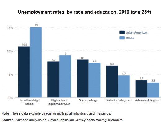
The Economic Policy Institute recently released a report looking at the impacts of the recession and its aftermath on the Asian American population. Due to the model minority stereotype, Asian Americans are often overlooked in discussions of the economic crisis or of poverty and inequality more broadly. It is true that Asian Americans have generally had lower unemployment rates than other racial/ethnic groups, due to their overall higher educational levels. However, if we look within educational levels beyond a high school diploma, Asian Americans have higher unemployment rates than comparable Whites, with the gap widest for those with bachelor’s degrees:
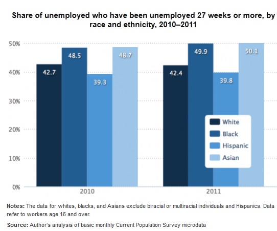
The economic difficulties faced by some Asian Americans is even more noticeable when we look at long-term unemployment (joblessness that lasts 27+ weeks, or more than about half a year). The proportion of the unemployed that fall into this category has risen for every group since 2007, with African-Americans and Asian-Americans more likely than Whites or Hispanics to be unemployed for long periods:
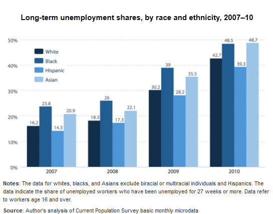
EPI then released an update to the report, incorporating 2011 data. Long-term unemployment has inched upward for every group; half of unemployed African- and Asian-Americans have now been out of work for at least 27 weeks:
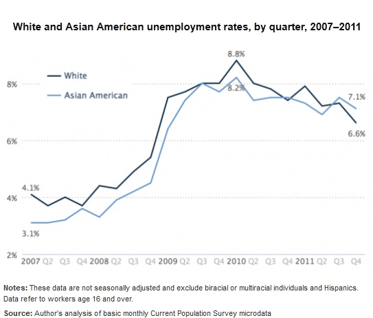
And in fact, despite their higher overall levels of education, Asian Americans now have a higher unemployment rate than Whites (though the rate for both groups is down from the peak in 2010):
For a discussion of factors that may contribute to these patterns among Asian Americans, such as their concentration in states particularly hard-hit by the recession and the proportion of the population that is foreign-born, see the full report.