The Massachusetts Senate race between Scott Brown and Elizabeth Warren has brought heightened attention to claims of Native American ancestry in the U.S.. Warren appears to have at times claimed such ancestry, Cherokee and Delaware in particular. The Washington Post provided a thorough round-up of the issue. From what we know thus far, there’s no clear evidence of her claim. Like many families, especially in Oklahoma, her family has a vague account of one or more American Indian ancestors. The vagueness doesn’t necessarily mean it isn’t true, nor does a lack of tribal records. However, there’s a well-known “Indian princess” syndrome, where notably large numbers of people in the U.S. claim a distant Native American ancestor, about whom the details are usually sketchy and inconsistent. Certainly some of these family oral histories are based in some truth, but others are likely apocryphal (though the individuals reporting them may truly believe them).

So Warren’s claim to some Native American ancestry is at least unverified, and there’s an interesting issue there in why so many Americans happily accept stories of native ancestry with little question.

But I was struck by opponent Scott Brown’s comment in one of his debates with Warren. Via abc News:

“Elizabeth Warren said she was a Native American, a person of color,” Brown said, gesturing toward Warren. “As you can see, she’s not.”

The statement implies that we can tell, just from looking, whether someone is really Native American. We can see, obviously, that she isn’t. This gets at a bigger issue about judgements of authenticity. Individuals often have preconceived ideas about what a Native American should look and act like; their Indianness is expected to be clearly visible, both physically and culturally.

Given this, I was particularly struck by a video Katrin recently sent in a link to the Represent series created by The 1491s. The videos challenge the viewer to recognize that American Indians and their cultures are still vital and vibrant. But they also illustrate the problem with assuming that anyone can easily tell who is or isn’t Native American, and how they integrate or represent that identity in their daily lives. Here are a few, but I’d check out the full set at the 1491s website.
Cross-posted at Racialicious.

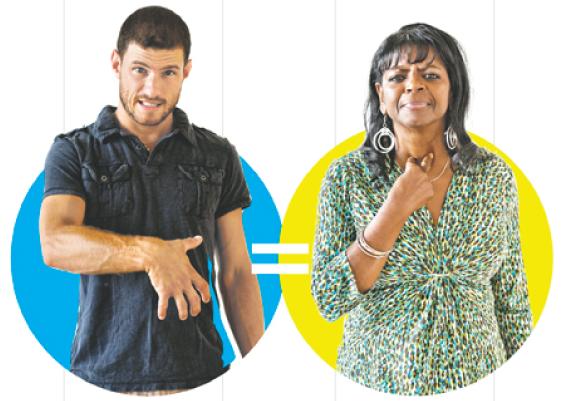
Frances Stead Sellers at the Washington Post has a fascinating account of the differences in Black and White American sign language.  Sellers profiles a 15-year-old girl named Carolyn who in 1968 was transferred from the Alabama School for the Negro Deaf and Blind to an integrated school, only to learn that she couldn’t understand much of what was being signed in class.

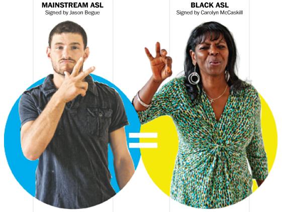
White American sign language used more one-handed signs, a smaller signing space, stayed generally lower, and included less repetition.  Some of the signs were subtlety different, while others were significantly different.

“Well-dressed”:

“Pregnant”:

As is typical, the White students in the class did not adapt to Carolyn’s vernacular; she had to learn theirs. So she became bilingual.  Sellers explains:

She learned entirely new signs for such common nouns as “shoe” and “school.” She began to communicate words such as “why” and “don’t know” with one hand instead of two as she and her black friends had always done. She copied the white students who lowered their hands to make the signs for “what for” and “know” closer to their chins than to their foreheads. And she imitated the way white students mouthed words at the same time as they made manual signs for them.

Whenever she went home, [Carolyn] carefully switched back to her old way of communicating.

These distinctions are still present today, as are the White-centric rules that led Carolyn to adopt White sign language in school and the racism that privileges White spoken vernacular as “proper English.”  For example, referring to the way she uses more space when she signs, student Dominique Flagg explains:

People sometimes think I am mad or have an attitude when I am just chatting with my friends, professors and other people.

The little girl who transferred schools and discovered that White people signed differently than her is now Dr. McCaskill, a professor of deaf studies. You can learn more about the racial politics of American sign language from her book, The Hidden Treasure of Black ASL.

Lisa Wade, PhD is an Associate Professor at Tulane University. She is the author of American Hookup, a book about college sexual culture; a textbook about gender; and a forthcoming introductory text: Terrible Magnificent Sociology. You can follow her on Twitter and Instagram.

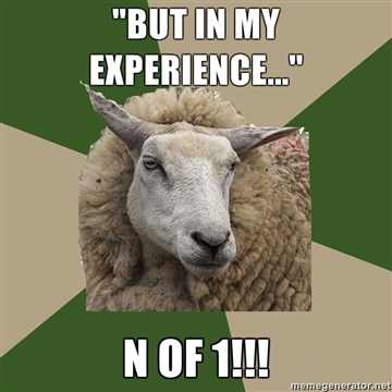
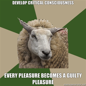
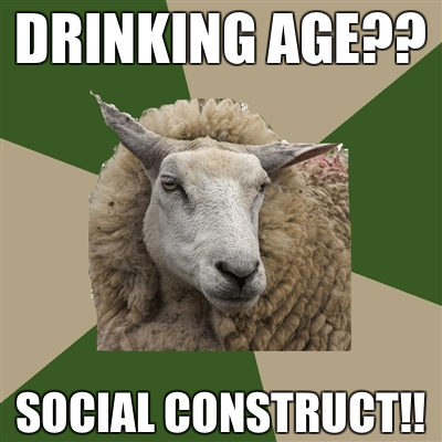
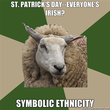
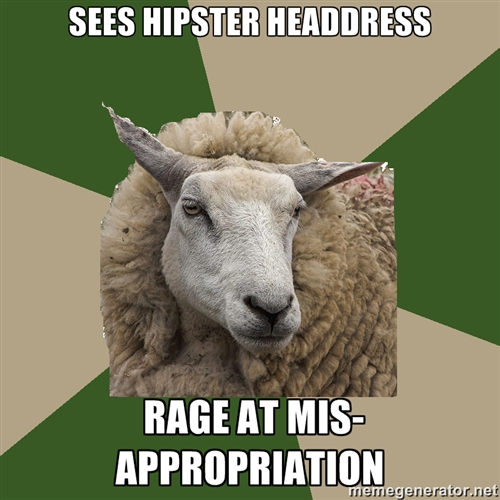
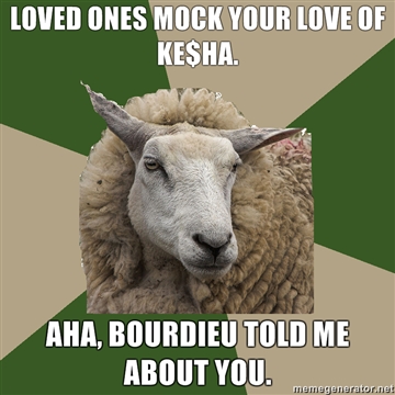
I tip my hat to sociology aficionado Holly, curator of Sociology Student Sheep.  The tumblr is a humorous, tongue-in-cheek look at the minds of earnest students of sociology.  No doubt, if you’ve ever hung out with sociologists, you’ll recognize at least a few.

Here are some of my favs (so hard to choose!):

Read them all here. She takes submissions everyone!

Lisa Wade, PhD is an Associate Professor at Tulane University. She is the author of American Hookup, a book about college sexual culture; a textbook about gender; and a forthcoming introductory text: Terrible Magnificent Sociology. You can follow her on Twitter and Instagram.

W.W. Norton has released a fun little animation answering this thorny question. It has to do with abundance and hoarding, and the technological innovations that underlie these things, as well as government’s willingness to redistribute wealth.

Enjoy:

See more of Norton’s videos at their YouTube channel.

Lisa Wade, PhD is an Associate Professor at Tulane University. She is the author of American Hookup, a book about college sexual culture; a textbook about gender; and a forthcoming introductory text: Terrible Magnificent Sociology. You can follow her on Twitter and Instagram.

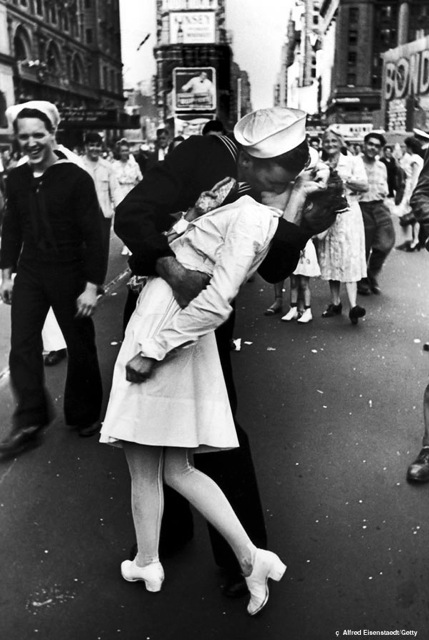
The photograph of a sailor kissing a woman on V-J Day in Times Square is an iconic one. Taken by photographer Alfred Eisenstaedt in Times Square on August 14, 1945, it is probably one of the most memorable images of WWII. As the Japanese surrender, the image seems to capture the jubilation at the end of a long war:

The image has become ubiquitous; you can buy it on posters and Valentine’s Day cards. Couples have re-enacted the famous image in Times Square. After the repeal of Don’t Ask Don’t Tell in 2012, the photograph was compared with one of a gay Marine kissing his boyfriend after returning from a tour.

Recently the people in the original photograph were identified. From their story, we now know that George Mendonsa was on a date with another woman when the Japanese surrendered. After a few drinks at a nearby bar, he went out on the street and grabbed Greta Zimmer Friedman for a kiss. According to the Mail Online,

“The excitement of the war being over, plus I had a few drinks,” he told CBS. “So when I saw the nurse, I grabbed her, and I kissed her.”

The article continues with an explanation of Friedman’s description of the experience:

“I did not see him approaching, and before I know it, I was in this vi[s]e grip.” Of course, that moment of wild elation, gratitude and passion was captured by LIFE photographer Alfred Eisenstaedt.

Later in the article, Friedman states,

That man was very strong. I wasn’t kissing him. He was kissing me.

Does a strong man grabbing a woman on the street in a “vise grip” and kissing her describe “wild elation, gratitude and passion”? Or does it describe a case of sexual assault? Feministing blogger Lori argues that the photograph does not capture the romantic moment that we believe it does. After reading her argument and studying the picture, I don’t think I could ever see it as anything other than the depiction of public sexual assault. As Lori argues,

 A closer look at the image in question shows corroborating details that become stomach-turning when properly viewed: the smirks on the faces of the sailors in the background; the firm grasp around the physically smaller woman in his arms such that she could not escape if she tried; the woman’s clenched fist and limp body.

Knowing the context has changed the meaning of the photograph. What was once read as the depiction of spontaneous romance at the end of WWII can now be read as one of spontaneous sexual assault.

The context of war also matters here. During war women typically hold roles that are supportive to men — supporting the war effort or supporting men sexually during war. As Cynthia Enloe argues in Maneuvers: The International Politics of Militarizing Women’s Lives, militarization relies on constructions of masculinity and femininity that make women both victims who need protection and objects to be sexually oppressed. The sailor in the photograph is hyper-conforming to wartime masculinity. He grabs the nearest nurse and kisses her to celebrate the end of war.

It is an iconic image, just not for the reasons we always thought it was.

Skipping through a set of images of North Korea by photographers David Guttenfelder and Vincent Yu, and another set from a 2010 LIFE slide show, I was reminded that the city is almost entirely devoid of advertising.  There is political propaganda everywhere, of course, but there is an overwhelming absence of the marketing for products characteristic of capitalist societies.  All of the print and electronic media is under state control, and the state administers and controls the economy as well.  Accordingly… there is almost no advertising.  The images in the slide show give us a peak into this world without ads.

Lisa Wade, PhD is an Associate Professor at Tulane University. She is the author of American Hookup, a book about college sexual culture; a textbook about gender; and a forthcoming introductory text: Terrible Magnificent Sociology. You can follow her on Twitter and Instagram.

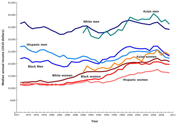
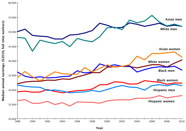
The Washington Post has a post up by Dylan Matthews that looks at the U.S. gender wage gap over time. It has several charts that illustrate trends in pay very clearly. Here’s a breakdown of median income (in constant 2010 dollars) by gender and race/ethnicity, for all workers, both full- and part-time:

The gap remains for full-time, year-round workers, too. Women have gained ground, but within every racial/ethnic category, women’s median income is lower than men’s and every other group earns significantly less than Asian and White men. However, there’s a clear racial earnings hierarchy visible in the chart as well, which isn’t getting nearly the attention that the gender wage gap is:

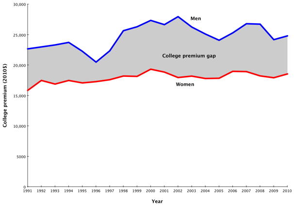
Moreover, the income bump received from earning a college degree is still higher for men than for women:

There are additional charts further breaking down differences in pay among men and women in the original post. As Matthews argues, and as Philip Cohen has posted about here at Soc Images, the data just don’t support the “impending female economic dominance” narrative that has become popular recently.

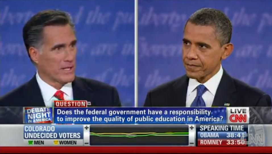
I watched the first U.S. Presidential debate of the election last night and I noticed something interesting about the coverage at CNN.  Notice that the live viewer information along the bottom includes the degree to which female (yellow) and male (green) Colorado undecided voters like or dislike what each candidate is saying (measured by the middle bar).

By choosing to display data by gender, CNN gives us some idea of how men and women agree or disagree on their evaluations of the candidates, but it also makes gender seem like the most super-salient variable by which to measure support.  They didn’t, for example, offer data on how upper and middle class undecided voters in Colorado perceived the debate, nor did they offer data on immigrant vs. non-immigrant, White vs. non-white, gay vs. straight, or any number of demographic variables they could have chosen from.

Instead, by promoting gender as the relevant variable, they also gave the impression that gender was the relevant variable.  This makes it seem like men and women must be really different in their opinions (otherwise, why would they bother highlighting it), strengthening the idea that men and women are different and, even, at odds.  In fact, men and women seemed to track each other pretty well.

It’s not that I don’t think gender is an interesting variable, it’s just that I don’t think it’s the only interesting one and making it seem so is problematic.  I would have loved to have seen the data parsed in other ways too, perhaps by rotating what variables they highlighted.  This would have at least given us a more nuanced view of public opinion (among undecided voters in Colorado) instead of reifying the same old binary.

Lisa Wade, PhD is an Associate Professor at Tulane University. She is the author of American Hookup, a book about college sexual culture; a textbook about gender; and a forthcoming introductory text: Terrible Magnificent Sociology. You can follow her on Twitter and Instagram.