Cross-posted at Reports from the Economic Front.

Presidential candidate Mitt Romney’s low federal tax rate — 14.1% — has called attention to the fact that our tax code favors people who make their money from investments rather than labor.  According to the conventional wisdom, this is as it should be.  It encourages people, like our job creators, to invest their money, thereby boosting growth and the well-being of all working people.  Sounds plausible, but the facts don’t support the policy.

BusinessWeek lays out the background and political context for our current low taxation rates on investment income as follows:

Since 1950 capital gains have generally been taxed at a lower rate than income, to spur investment. The rate under President George W. Bush went from 20 percent to 15 — the lowest ever — and was billed as a way to stimulate the economy. (If nothing’s done by Jan. 1 to change tax and budget provisions already passed by Congress, the rate will snap back to 20 percent, a scenario both parties hope to avoid.) Mitt Romney wants to ditch capital gains tax altogether for people earning less than $250,000. President Barack Obama, in his Affordable Care Act, increased the rate by 3.8 percent for high earners beginning in 2013, and has proposed the so-called Buffett Rule, which would among other things end an accounting interpretation that allows private equity and hedge fund managers (and Romney) to save money by paying tax on their earnings at the capital gains rate. Neither candidate, though, contests the Bush administration’s basic logic: that a lower capital gains rate encourages investment, which creates jobs and helps the economy grow. That doesn’t mean they’re right.

Leonard E. Burman, a tax expert, took on this issue in recent testimony before the House Committee on Ways and Means and the Senate Committee on Finance.   A good place to start is with who benefits from lower capital gains taxes.

Not surprisingly, as the figure below (which is taken from Burman’s testimony) shows, the benefits are extremely concentrated.  As Burman noted:

In 2010, the highest-income 20 percent realized more than 90 percent of long-term capital gains according to the TaxPolicyCenter.  The top 1 percent realized almost 70 percent of gains and the richest 1 in 1,000 households accrued about 47 percent. It is hard to think of another form of income that is more concentrated by income.
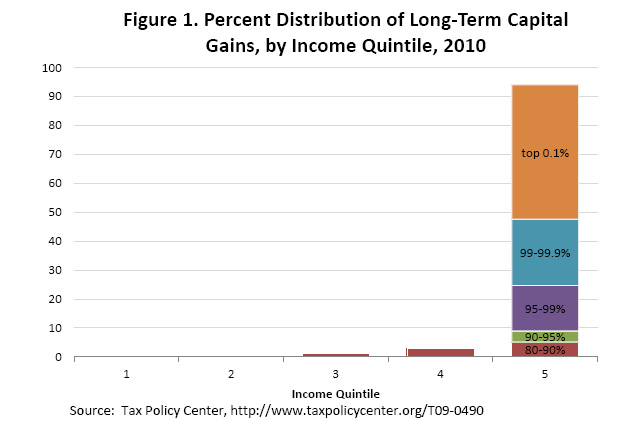
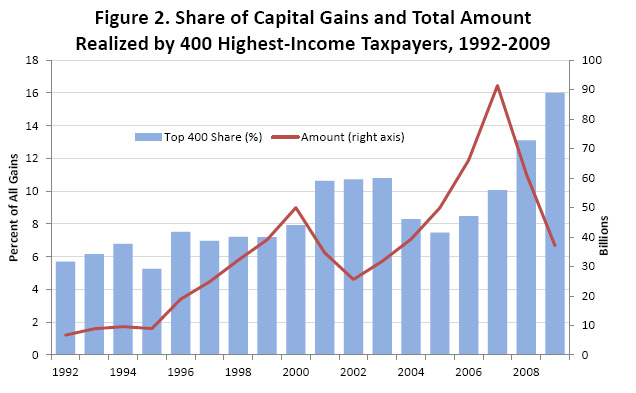
Moreover, as the next figure shows, the concentration of capital gains has grown over time.  Given that the rich fund political campaigns, this certainly helps to explain why both political parties are so determined to keep the rate low.
But, to the main question — do lower capital gains taxes actually boost growth? This is what Burman had to say in his testimony:

The heated rhetoric notwithstanding, there is no obvious relationship between tax rates on capital gains and economic growth. Figure 4 [below] shows top tax rates on long-term capital gains and real economic growth (measured as the percentage change in real GDP) from 1950 to 2011. If low capital gains tax rates catalyzed economic growth, we’d expect to see a negative relationship — high gains rates, low growth, and vice versa — but there is no apparent relationship between the two time series. The correlation is 0.12, the opposite sign from what capital gains tax cut advocates would expect, and not statistically different from zero. Although not shown, I’ve tried lags up to five years and using moving averages, but there is never a larger or statistically significant relationship.
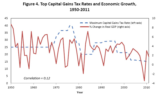
Burman notes that he posted this figure on his blog and offered the data to anyone interested, challenging readers to find support for lower rates.  “A half dozen or so people, including at least one outspoken critic of taxing capital gains, took me up on the offer, but nobody to my knowledge has been able to tease a meaningful relationship between capital gains tax rates and the GDP out of the data.”

As reported in a previous post, Thomes L. Hungerford, writing for the Congressional Research Service, came to the same conclusion about the lack of any relationship between the capital gains tax and GDP.  In fact, he concluded raising the top income and capital gains tax rates would likely reduce income inequality without causing harm to the economy.

So, if we are really concerned with the budget deficit, rather than slashing spending on social programs lets raise the top tax rates.  Wonder if this will come up during our presidential debates?

—————————

Martin Hart-Landsberg is a professor of Economics and Director of the Political Economy Program at Lewis and Clark College.  You can follow him at Reports from the Economic Front.
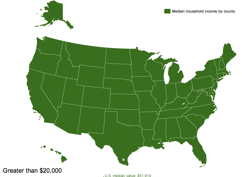
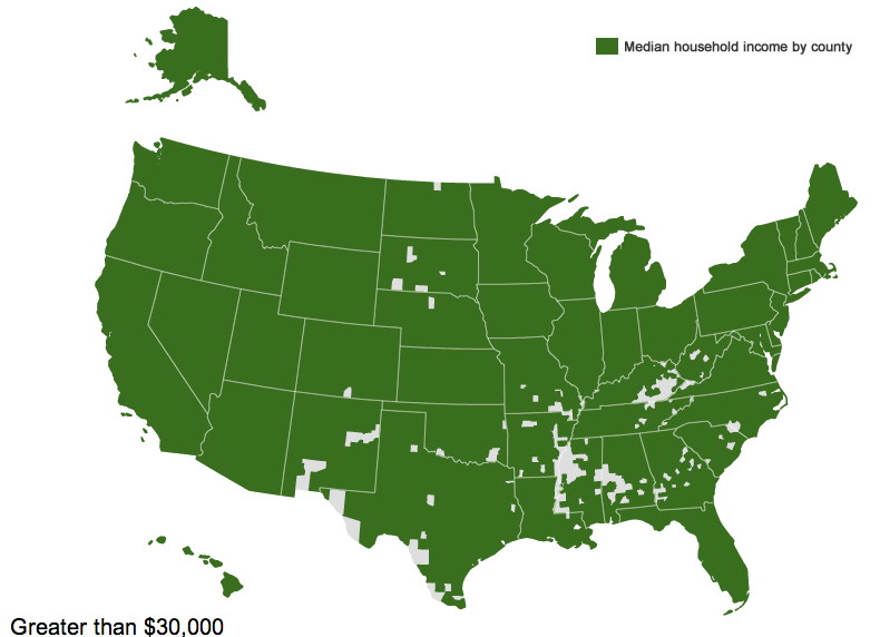
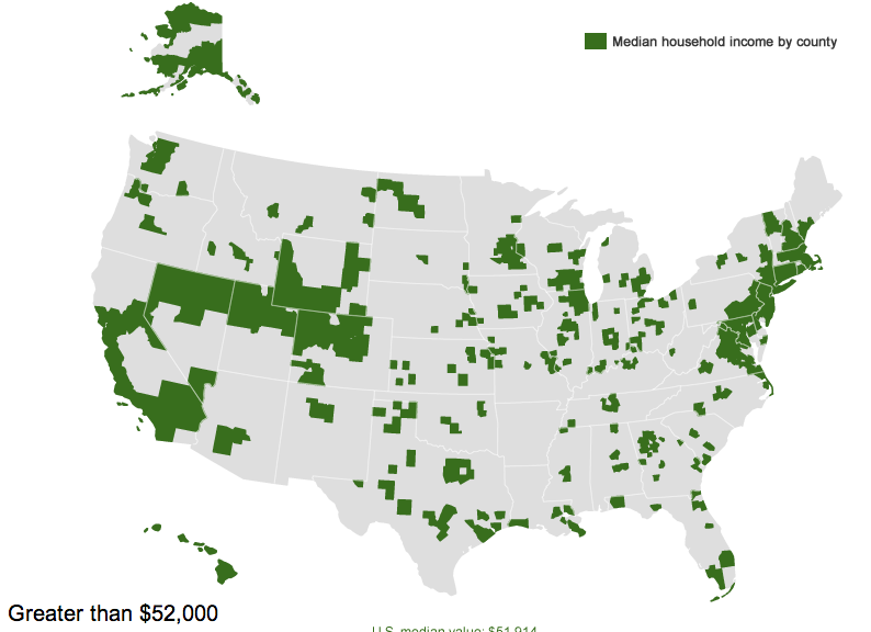
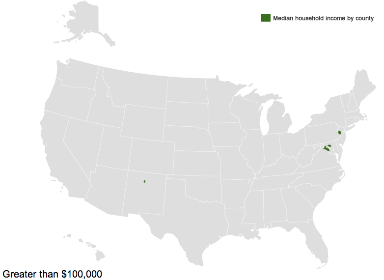
The Census Bureau has created an interactive map that lets you see median household income by county. Median household income for the entire U.S. is $51,914, but of course there is enormous variety around the country. The map lets you select an amount and see which counties have medians below that level.

Three counties — Owsley and Breathitt in Kentucky and Brooks in south Texas — have median household incomes below $20,000 a year (the white spot in Louisiana is water):

So half of households in those areas are living on less than $20,000 a year.

If we go up to $30,000 a year, we see a clear pattern. The counties are particularly concentrated in the South, especially along the Mississippi River, in Appalachia, in southern Texas, a few areas of New Mexico, and several counties in South Dakota that include Native American reservations:

If we look at the $52,000 mark — right at the overall U.S. median — we see, unsurprisingly, a lot of counties on the coasts or that have at least mid-sized cities in them, though there are certainly some counties that don’t fit that pattern:

On the upper end, there are six counties where the median household income is above $100,000 — Hunterdon, in New Jersey; Howard, in Maryland; Los Alamos, New Mexico; and three Virginia counties, Fairfax, Falls Church, and Loudoun:

You can see the Census Bureau’s table of median household income in every county in the U.S. here.

A few years back we featured a series of Playboy drawings from the 1960s and ’70s that trivialized the social movements of the time: feminism, the anti-war movement, native rights, and the civil rights movement.  You should really go take a look; they’re something else.

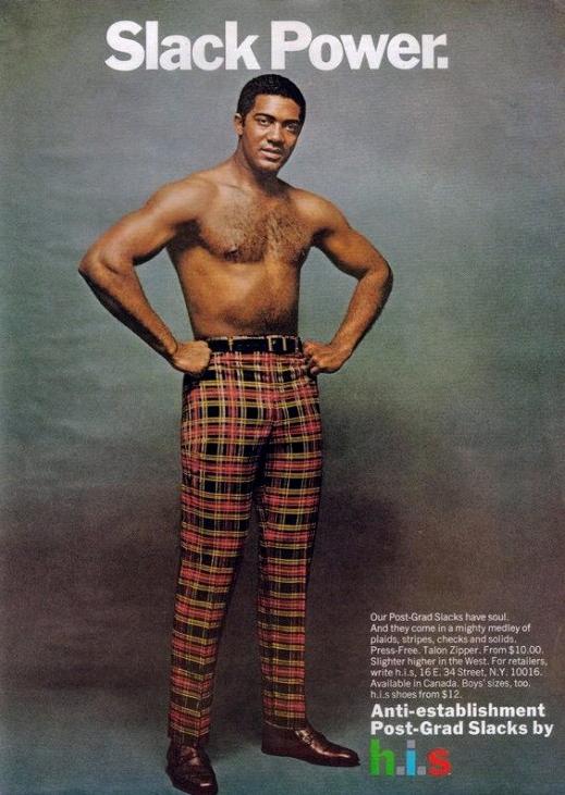
In any case, Peter from Denmark sent in another example from the same time period.  A 1970s JC Penney ad for pants; “slack power” is a reference to “Black power” and it’s no coincidence that an African American man is modeling.  Notice, too, that it calls the pants “anti-establishment” in the bottom right.

While companies like Komen are getting a lot of critical attention these days for turning cancer awareness into consumption, this strategy has been around a long time.

For examples of appropriation of feminism, see these framing consumption of clothes, make-up, jewelry, cigarettes, magazines, and cosmetic procedures as expression of freedoms.

Lisa Wade, PhD is an Associate Professor at Tulane University. She is the author of American Hookup, a book about college sexual culture; a textbook about gender; and a forthcoming introductory text: Terrible Magnificent Sociology. You can follow her on Twitter and Instagram.

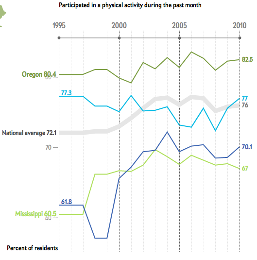
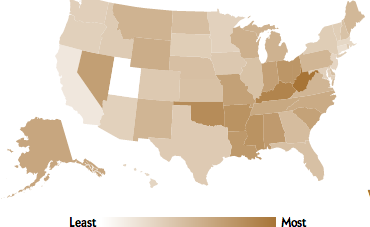
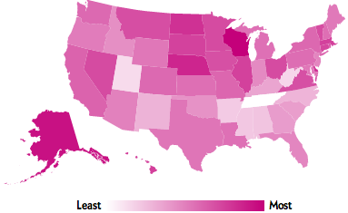
Mark Fischetti has posted an interactive graphic at Scientific American that lets you look at the prevalence of several behaviors or characteristics measured on the Centers for Disease Control and Prevention’s survey on risk factors. The graphic includes data on exercise, tobacco use, heavy drinking, binge drinking, and obesity. Commenters on the post suggested it’s unnecessarily snarky about obesity; that said, it provides a quick snapshot of several behaviors demographers often use to judge general trends in health. For each topic, a graph shows the state where it is highest and lowest; you can also select up to 3 additional states to compare.

For instance, the percent of people who took part in a physical activity in the last month is highest in Oregon and lowest in Mississippi; I added my home state of Oklahoma (dark blue) and current residence of Nevada (light blue) too:

You also get a map for each topic that shows where it’s most or least common. Here’s the map for smoking:

Sconnies, you may not be surprised to know that Wisconsin leads the nation in binge drinking:

I can’t embed the graphic, so you’ll have to go to Scientific American’s post to play around and compare your own state.

***TRIGGER WARNING for racism and enslavement***

During a dark period of world history, intellectuals pondered where to draw the line between human and animal.  They arrayed humans hierarchically, from the lightest to the darkest skin.  Believing that Africans were ape-like, they weren’t sure whether to include apes as human, or Africans as apes.

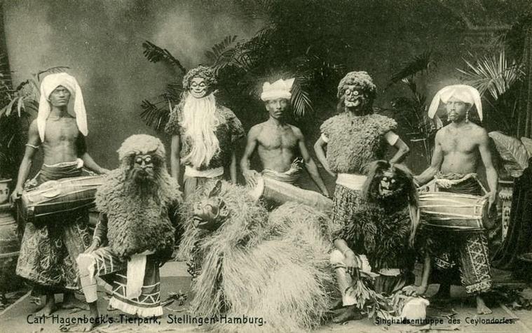
One artifact of this thinking was the “human zoo.”  Kidnapped from their homes at the end of the 19th century and into the next, hundreds of indigenous people were put on display for white Westerners to view.  “Often they were displayed in villages built in zoos specifically for the show,” according to a Spiegel Online sent in by Katrin, “but they were also made to perform on stage for the amusement of a paying public.”  Many died quickly, being exposed to diseases foreign to them.

This group of captives is from Sri Lanka (called  Ceylon at the time):

This photograph commemorates a show called “Les Indes,” featuring captives from India:

These captives are from Oromo in Ethiopia:

A German named Carl Hagenbeck was among the more famous men involved in human zoos.  He would go on expeditions in foreign countries and bring back both animals and people for European collections.  In his memoirs, he spoke of his involvement with pride, writing: “it was my privilege to be the first in the civilized world to present these shows of different races.”

The zoo in Hamburg still bears his name.

Lisa Wade, PhD is an Associate Professor at Tulane University. She is the author of American Hookup, a book about college sexual culture; a textbook about gender; and a forthcoming introductory text: Terrible Magnificent Sociology. You can follow her on Twitter and Instagram.

Cross-posted at Montclair SocioBlog.

Back in June, Mitt Romney said:

I want to make sure that we keep America a place of opportunity, where everyone… get[s] as much education as they can afford

After all, Mitt got as much education as he (his parents, really) could afford, so he thought it best if everyone had that same opportunity.

Opportunity – How much is that in American money?

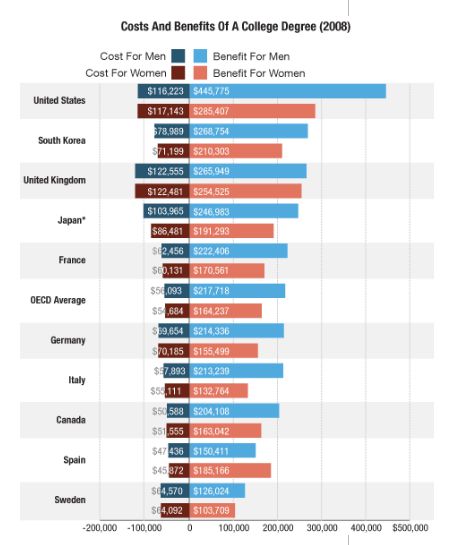
Yesterday, Planet Money  posted this graph showing the costs and benefits of a college education in several countries.

The title of the post summarizes the interpretation of the college-educated folks at Planet Money:

“College Costs More In America, But The Payoff Is Bigger”

But what if you look at the data from the other side?  Here’s the half-empty-glass title:

“College in the US Costs a Lot, and If You Can’t Afford It, You’re Really Screwed”

…or words to that effect.

What the chart seems to show is inequality — specifically, the inequality between the college educated and everyone else.  In advanced economies, like the those of the countries in the chart, education is important. But some of those countries, like the Scandinavian countries, have reduced the income sacrificed by non-college people relative to the college educated. Other countries favor a more unequal distribution of income.

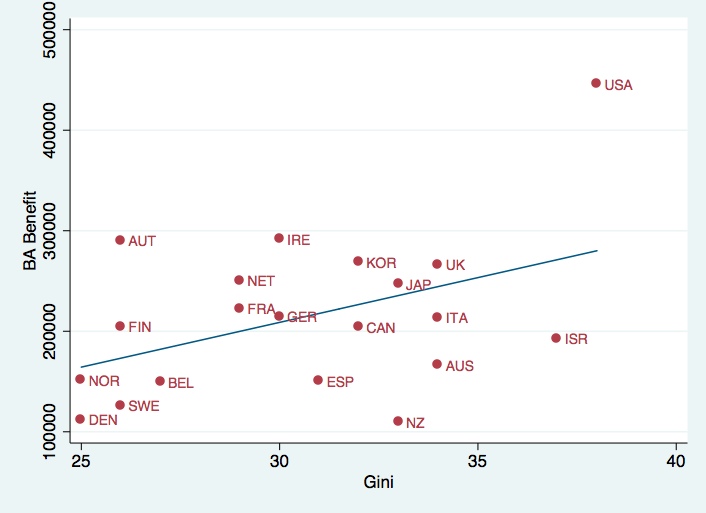
To look a little closer, I looked at the relationship between the payoff of a BA degree for men and a country’s Gini coefficient, a measure of inequality.  I used the ten countries in the Planet Money chart and added another ten OECD countries.

The correlation is 0.44.  The US is the clear outlier.  In the land of opportunity, if you’re a male, either you pay the considerable price of going to college, or you pay the price for not going to college.

With this inequality come the kinds of social consequences that Charles Murray elaborates in his latest book about non-educated Whites — disability, divorce, demoralization, death.

—————————

Jay Livingston is the chair of the Sociology Department at Montclair State University.  You can follow him at Montclair SocioBlog or on Twitter.

New York City’s stop-and-frisk policy has gotten intensified scrutiny recently. A stop and frisk refers to police officers stopping and searching individuals who are out in public. These stops don’t require a warrant; the police officer has to have reasonable cause to believe the person is engaged in criminal activity.

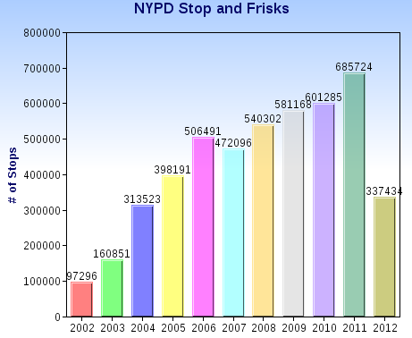
Critics point out that these stops are incredibly inefficient, and that relying on cops’ evaluations of who is suspicious opens the door to widespread racial profiling. The New York Civil Liberties Union analyzed the NYPD’s own data, which they are required to record about all stops. Over the past decade, literally millions of people have been the targets of stop-and-frisks, with steady growth in the use of the program. I made a chart of the data from 2002 through the first 6 months of 2012:

Yet all these stops have led to little discovery of actual crime. Overall, about 87-89% of stops lead to no evidence of wrong-doing.

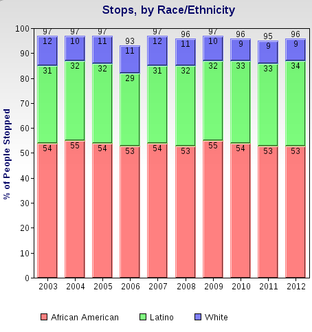
These stops have also disproportionately affected minorities. Here’s a breakdown by race/ethnicity, based on the NYPD data:

You can read more about the data on stop-and-frisks at the NYCLU website.

The Nation recently posted a video that discusses the impacts of stop-and-frisk on the lives of those targeted and on perceptions of the police, as well as police officers discussing the pressure to complete stop-and-frisks. The clip includes an audio recording that a 17-year-old made when he was being targeted for a stop-and-frisk after having just been stopped a couple of blocks earlier. As the video makes clear, these stops are about more than an inconvenience in citizens’ lives; they involve real harassment and fear of violence for those who find themselves the target of police suspicions:

A message written in 1914 and curled into a corked bottle was scooped out of the North Atlantic last month (NatGeo).  Not a love note, but a research instrument.The Glasgow School of Navigation sent 1,890 such bottles adrift, hoping to map deep ocean currents.  They were weighted to float just above the ocean floor.  The message inspires me to contemplate just how far our research methods have come in the last 98 years.

Via BoingBoing.

Lisa Wade, PhD is an Associate Professor at Tulane University. She is the author of American Hookup, a book about college sexual culture; a textbook about gender; and a forthcoming introductory text: Terrible Magnificent Sociology. You can follow her on Twitter and Instagram.