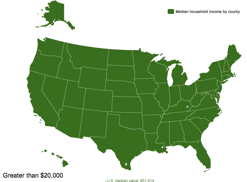
The Census Bureau has created an interactive map that lets you see median household income by county. Median household income for the entire U.S. is $51,914, but of course there is enormous variety around the country. The map lets you select an amount and see which counties have medians below that level.
Three counties — Owsley and Breathitt in Kentucky and Brooks in south Texas — have median household incomes below $20,000 a year (the white spot in Louisiana is water):
So half of households in those areas are living on less than $20,000 a year.
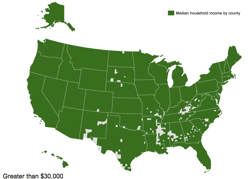
If we go up to $30,000 a year, we see a clear pattern. The counties are particularly concentrated in the South, especially along the Mississippi River, in Appalachia, in southern Texas, a few areas of New Mexico, and several counties in South Dakota that include Native American reservations:
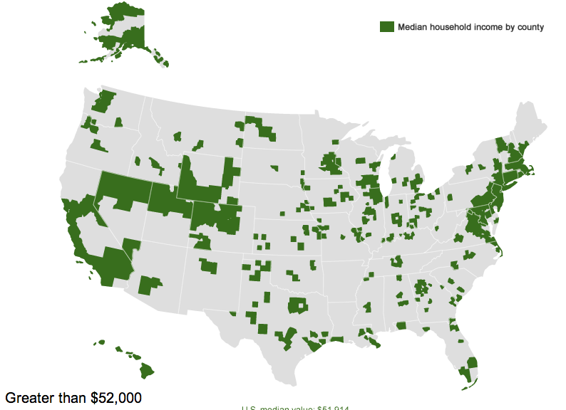
If we look at the $52,000 mark — right at the overall U.S. median — we see, unsurprisingly, a lot of counties on the coasts or that have at least mid-sized cities in them, though there are certainly some counties that don’t fit that pattern:
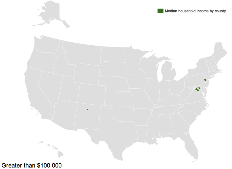
On the upper end, there are six counties where the median household income is above $100,000 — Hunterdon, in New Jersey; Howard, in Maryland; Los Alamos, New Mexico; and three Virginia counties, Fairfax, Falls Church, and Loudoun:
You can see the Census Bureau’s table of median household income in every county in the U.S. here.