The hidden curriculum refers to the unspoken and unofficial norms, behaviors, and values that kids learn at school in addition to the official curriculum of math, reading, science, and so on. These can include expectations about how to act in public (standing in line), how to interact with non-parental authority figures, patriotism (saying the Pledge of Allegiance each morning), and messages about social hierarchies (who it’s ok to ridicule, what it means to get different grades), and so on.

Gender is an important element of the hidden curriculum. Schools reinforce larger cultural messages about gender, including the idea that gender is an essential characteristic for organizing social life.

Marissa P. sent in a great example of this. Steve Bowler tweeted a photo of an assignment that his 8-year-old daughter’s teacher said she did incorrectly. The homework assignment had a list of toys or activities, and the kids were supposed to categorize them based on whether they were for boys, girls, or both, with equal numbers in each box. The assignment takes for granted the gendering of toys, and that there is a “correct” answer to the question of which gender they are appropriate for.

Bowler’s daughter did the assignment differently. After placing 3 items in the “boys” category and 2 in the “girls” group, she made additional boxes to add more things in the “both” column:

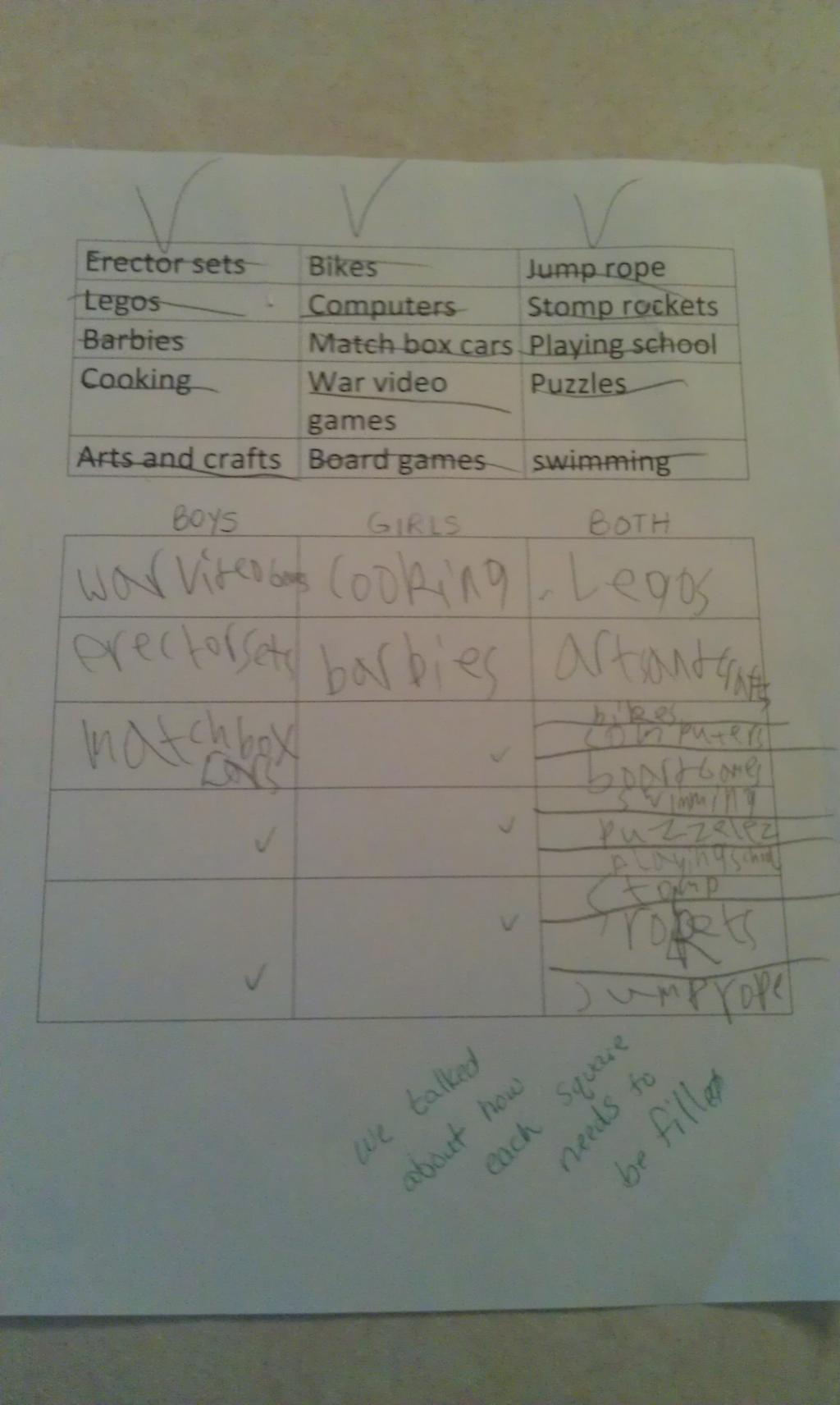
But at the bottom, the teacher notes that the assignment wasn’t done correctly. The point of the assignment is to categorize; the implicit message — that boys and girls are different types of people who like different types of things — isn’t questioned. A child sees this list of items and doesn’t gender them in the way the lesson took for granted; the reaction wasn’t to acknowledge her innovation and perhaps question the gendering, it was simply to say she did it wrong.

It’s one small example of the way that the hidden curriculum reinforces gendered messages, teaching kids expectations for gender and that gender itself is a coherent, meaningful characteristic.

Bowler, for the record, said he was proud his daughter failed the assignment and just wished she’d done even worse on it.

UPDATE: Reader Kama notes that the assignment accompanied a reading about a girl who wasn’t allowed to play basketball. The overall message of that story challenged the idea that girls can’t play basketball, requiring kids to categorize the toys and activities by gender as part of the lesson:

…this was assigned following reading a book about a girl who wanted to play basketball but was told it’s a boy’s sport.  She kept at it, got better, and earned the respect of the boys who were telling her off earlier.  According to the guy who posted the picture, the teacher was trying to discuss gender bias.  Did the teacher go about it the right way?  No, not really – especially when your end goal is showing that these biases are wrong.  That being said, this particular assignment doesn’t really fit with the idea of a hidden gender curriculum.  The teacher wasn’t trying to say that these are boy and girl toys, the teacher was trying (and failing) to point out that we are biased in our thinking about what’s for boys and what’s for girls.

Sorry for the misunderstanding on my part.

Gwen Sharp is an associate professor of sociology at Nevada State College. You can follow her on Twitter at @gwensharpnv.

In a fun five minutes, Mike Rugnetta manages to invoke John Stewart Mill and Judith Butler, plus discuss how “bronies” — male fans of My Little Pony: Friendship is Magic — challenge rigid rules of masculinity.

Thanks to Griff for sending the link!

Lisa Wade, PhD is an Associate Professor at Tulane University. She is the author of American Hookup, a book about college sexual culture; a textbook about gender; and a forthcoming introductory text: Terrible Magnificent Sociology. You can follow her on Twitter and Instagram.

The internet is exciting, in part, because it offers people an opportunity to produce as well as consume content.  This is why it’s sometimes called “democratizing”; it spreads around the power to influence our collective conversations.

One reaction to the new Honda Fit She’s illustrates a form of resistance through the production of media content.  The She’s is a 1950s throwback being marketed to women in Japan.  In addition to coming in several shades of pink and the inclusion of a heart in the logo, it has pink stitching inside, windows that cut ultraviolet rays (to prevent wrinkles) and a special air conditioning system designed to improve skin quality (to erase wrinkles).

A website, called IdeasForHonda, has emerged in response.  It mocks Honda’s stereotyping of women with satire, offering its own ideas for what women want. Here are some of the entries:

This is just part of  a wider internet response to the She’s and this type of reaction has prompted companies to make changes.  Recently, for example, Gap pulled a t-shirt with the phrase Manifest Destiny and we’ve posted about successful resistance to the Obama sock monkey, the Pretzel Crisps “You Can Never Be too Thin” ad campaign, Nivea’s “Re-Civilize Yourself” ads, and the Abercrombie push-up bikini for kids.  Here’s to democratization.

Lisa Wade, PhD is an Associate Professor at Tulane University. She is the author of American Hookup, a book about college sexual culture; a textbook about gender; and a forthcoming introductory text: Terrible Magnificent Sociology. You can follow her on Twitter and Instagram.

This month the Census Bureau released a supplemental poverty report to provide a broader picture of the poor in the U.S. The official poverty rate is based on a measure developed in the early 1960s. Researchers at the time determined that families spent about 1/3 of their income on food, so they calculated the lowest possible cost of a minimally nutritionally sufficient diet for a particular family size, multiplied it by 3, and the resulting number determined who was defined as poor. The amount has been adjusted for inflation but otherwise the measure is the same.

Critics argue this definition may no longer make sense. Since the 1960s, food has generally gotten cheaper while housing has become a much bigger portion of many families’ budgets. The measure doesn’t account for the different costs of living (especially for housing) in different parts of the U.S. It also doesn’t take government benefits a family might be receiving into account.

The supplemental measure is meant to address some of these problems; it will be released each year along with the standard poverty measure. It attempts to determine how much is needed to cover housing, food, clothing, utilities, and a bit for other needs (transportation, personal care items, etc.), while taking public assistance benefits into account.

The supplemental poverty measure (SPM) showed a somewhat higher poverty rate overall (16.1% vs. 15% with the official poverty rate). Because it takes benefits such as daycare subsidies, nutritional assistance programs, etc., into account, the SPM actually showed a lower poverty rate for children under 18 than the official rate does. However, adults were more likely to be defined as poor with the SPM. This is especially true for older adults. For those over 65, 8.7% are officially poor, but with the SPM, it’s 15.1%:

Dylan Matthews, at the Washington Post, created a graph to show the impact of some important expenses and government assistance programs on poverty, since the SPM takes benefits, and a greater range of expenses, into account in its measure. The graph shows how much each program/expense reduced the adjusted poverty rate, based on data presented in the report.

Social Security has the single biggest impact; it reduced the SPM by 8 percentage points. That is, if they had not included Social Security benefits in the measure, the SPM poverty rate would have been 24.1%, not 16.1%. On the other hand, taking Temporary Aid to Needy Families (TANF), the cash assistance program created in the welfare reform process in the 1990s, into account did little to affect the calculated poverty rate, indicating it does little to alleviate poverty (intentionally so, many would argue). Note the axis is percentage points, not percent:

At the bottom of the graph we see several items that increased the supplemental poverty rate: looking at how much income tax people paid (countering the myth that low-income people don’t pay income taxes), payroll axes, expenses related to work, and medical expenses, with out-of-pocket medical expenses being the largest factor.

There’s tons of data in the tables that show which groups would be more or less likely to be defined as poor in the official and supplemental poverty rates. Check out the full report.

Gwen Sharp is an associate professor of sociology at Nevada State College. You can follow her on Twitter at @gwensharpnv.

Barack Obama won just over 50% of the popular vote last week, but he earned 80% of non-white votes.  According to USA Today exit poll data, he secured 93% of the Black vote, 73% of the Asian vote, 71% of the Hispanic vote, and 58% of the non-white Other vote.

This data suggests are real and palpable difference between how (some) Whites and (most) non-Whites see the world, a difference that will become increasingly influential.

Earlier this month the Pew Research Center released an updated prediction for the racial/ethnic composition of the U.S. in 2050.  They expect that, by 2050, Whites will be a minority, adding up to only 47% of the population.  By that time, they expect Hispanics to account for 29% of the population, and Blacks and Asians to account for 13% and 9% respectively.

Paul Taylor and D’Vera Cohn, at Pew, observe that the demographics of the voting population will change a bit slower since the majority of the demographic change is from births and deaths, not immigration.  In 2011, for example, whites were 66% of those ages 18 and older, but only 56% of 18-year-olds.  In other words, it takes 18 years to grow a voter.

Whatever the pace of change, the era of winning U.S. elections by pandering to the worldview of a single group is ending.  Future politicians will likely have to put effort into attracting a wide range of voters, as Obama did on Tuesday.

Lisa Wade, PhD is an Associate Professor at Tulane University. She is the author of American Hookup, a book about college sexual culture; a textbook about gender; and a forthcoming introductory text: Terrible Magnificent Sociology. You can follow her on Twitter and Instagram.

There is growing talk that the economy is finally on its way to recovery — “A Steady, Slo-Mo Recovery” — in the words of Businessweek.

Here is how Peter Coy, writing in Businessweek, explains the growing consensus:

Job growth is poised to continue increasing tax revenue, which will make it easier to shrink the budget deficit while keeping taxes low and preserving essential spending. All this will occur without any magic emanating from the Oval Office. It would have occurred if Mitt Romney had been elected president. “The economy’s operating well below potential, and there’s a lot of room for growth” regardless of who’s in office, says Mark Zandi, chief economist of forecaster Moody’s Analytics.

Something could still go wrong, but the median prediction of 37 economists surveyed by Blue Chip Economic Indicators is that during the next four years, economic growth will gather momentum as jobless people go back to work and unused machinery is put back into service. “The self-correcting forces in the economy will prevail,” predicts Ben Herzon, senior economist at Macroeconomic Advisers, a forecasting firm in St. Louis.

Before we get lulled to sleep, we need some perspective about the challenges ahead.  How about this: we face a 9 million jobs gap between the number of jobs we have and the number we need, and this doesn’t even address the low quality of the jobs being created.

The chart below, taken from an Economic Policy Institute blog post, illustrates the gap.

As Heidi Shierholz, the author of the post, explains:

The labor market has added nearly 5 million jobs since the post-Great Recession low in Feb. 2010. Because of the historic job loss of the Great Recession, however, the labor market still has 3.8 million fewer jobs than it had before the recession began in Dec. 2007. Furthermore, because the potential labor force grows as the population expands, in the nearly five years since the recession started we should have added 5.2 million jobs just to keep the unemployment rate stable. Putting these numbers together means the current gap in the labor market is 9.0 million jobs. To put that number in context: filling the 9 million jobs gap in three years — by fall 2015 — while still keeping up with the growth in the potential labor force, would require adding around 330,000 jobs every single month between now and then.

Unfortunately, our “job creators” only created 171,000 net jobs in October. And that was considered a relatively good month.   The chart below, from the Center on Budget and Policy Priorities,  gives a sense of what we are up against.

Of course, weak job growth in the past doesn’t mean that we cannot have strong job growth in the future.  On the other hand, such a change would require consensus on radically different policies than those currently being discussed and debated by those in power.

—————————

Martin Hart-Landsberg is a professor of Economics and Director of the Political Economy Program at Lewis and Clark College.  You can follow him at Reports from the Economic Front.


Cross-posted at Montclair SocioBlog.

In a democracy, all votes are created equal — one person, one vote -– but apparently some votes are more equal than others.  Obama won the electoral college vote 62% – 38%, though his margin in the popular vote was much smaller: 51% – 48%.

A similar discrepancy happened in the vote for Congressional representatives.  The Republicans control the House of Representatives, where they have 54% of the seats. But if you add up all the votes for those seats, the Democrats come out slightly ahead (by about 500,000 votes).  More votes but fewer seats.

That discrepancy arises from the distribution of Democrats and Republicans in a state’s Congressional districts.  Take a hypothetical state with four districts, each with 200 people.  The popular vote splits evenly –- 400 Democrats, 400 Republicans. Here are the election results:

The Republicans have 50% of the popular vote but get 75% of the seats.
Less hypothetically, in North Carolina, Democratic candidates outpolled Republicans 2.22 million to 2.14 million.  But Republicans won 10 of the 14 seats.  The Democratic votes were crowded into four districts.  In three of those four districts, the Democrats won big – by an average of 133,000 votes.  (If the 7th district, where Democrats now have a slim lead, goes Republican, that average margin will be 177,000.)  Had some of the Democrats from one of those districts been mapped into the neighboring district, they might have won both, though by smaller margins.  The Republican districts had secure but smaller majorities.  Republican winning margins averaged 50,000 votes, less than half the margin where Democrats won.

My first thought was that this was pure Gerrymandering.  State legislatures get to draw the maps of their Congressional districts.  And many more state legislatures are controlled by Republicans.  In fact, some of the North Carolina districts have unusual shapes.  The NC-12, the thin blue line along Interstate 85 stretching nearly to the border, was created as a “majority-minority” district so that Black votes would not be diluted.  The downside for Democrats is that it packs those votes into that narrow corridor.  So the Democrats take that district by over 180,000 votes.  The Republicans with the neighboring districts but by much smaller margins – 23,000, 25,000, and 53,000.  In those four districts, the Democrats got 53% of the vote, but Republicans took three of the four seats.

The Democratic district snaking down through the middle of the state is the 4th, which contains “the Triangle” to the north, but now has that tail stretching down.  Democrats carried the district  by 170,000 votes.  Surrounding it is the 2nd (in pink), which Republicans carried by only 45,000 votes.

Similar differences crop up in Ohio and Pennsylvania. The popular vote is close, and in two of these states it goes to the Democrats.  But Republicans get most of the seats.  Republicans win their seats by less than half the margin of Democratic winners.  Here is a graph of the actual returns from Ohio, Pennsylvania, and North Carolina. (The Ohio total does not include the vote from the two uncontested districts, one Democrat, one Republican.  For the maps and election results, check out Politico.)

The Republican share of Congressional seats is far out of proportion to its share of the vote.  In Ohio and North Carolina, Democrats received more votes, but Republicans got 70-75% of the House seats.  It certainly is possible that Republican-dominated state legislatures drew the districts so as to cram Democratic voters into electoral ghettos.

I don’t know enough about the demography and geography of these states, but I do wonder why the districts are drawn this way.  A paper by Chen and Rodd (here) that uses 2000 election data argues that what looks like gerrymandering is in fact the result of “human geography.”  It’s not the legislatures that pack Democrats together, it’s the Democrats themselves.  They cluster in cities.  As for Democrats outside of cities,

many rural, small-town, and suburban precincts that lean Democratic are often subsumed into moderately Republican districts. . . . There are isolated pockets of support for Democrats in African-American enclaves in the suburbs of big cities and in smaller towns with a history of railroad industrialization or universities. However, these Democratic pockets are generally surrounded by Republican majorities, thus wasting these Democratic votes. As a result, the Democrats are poorly situated to win districts outside of the urban core.

Regardless of intent, the effect is to keep Democratic votes concentrated in the 4th.  If that blue tail of the NC-04 were subsumed into the pink NC-02, both districts might be blue.

In any case, Democrats have not always been on the wrong side of the seat/vote discrepancy.  John Sides at The Monkey Cage posted this graph showing the ratio for the last twenty-six elections.

Sides quotes Matthew Green on the general trends:

  • the winning party usually gets a “boost” in the number of seats
  • that boost used to be much larger

That trend might fit with the deliberate-gerrymander explanation, provided that in the earlier decades more state legislatures were controlled by Democrats.  But I’m not sure how it fits with Chen and Rodden’s human geography idea of “unintentional gerrymandering.”

—————————

Jay Livingston is the chair of the Sociology Department at Montclair State University.  You can follow him at Montclair SocioBlog or on Twitter.

Jay Livingston is the chair of the Sociology Department at Montclair State University. You can follow him at Montclair SocioBlog or on Twitter.

Yesterday NPR’s Morning Edition included a segment by Alix Spiegel about cultural differences in approaches to teaching and learning. Researchers have found interesting differences in how teachers and parents in the U.S. and Japan encourage kids to learn.

Americans tend to focus on intelligence as the source of school success; you do well because you’re smart, kids learn. But Jim Stigler’s observations in Japan indicated that teachers focused more on effort, on letting kids publicly struggle with problems until they finally got the right answer. From this perspective, learning doesn’t occur because you’re inherently smart; it occurs because you keep working at a difficult problem until you figure it out. Jin Li has also found that parents tend to socialize kids in the U.S. into thinking of their successes as a sign of their intelligence more than their hard work, while Chinese parents focus more on persistence and concentration.

These lead to different perceptions of what it means to struggle to learn. As Stigler explains, in the U.S., we often assume that learning comes easily to you if you’re smart, and if you struggle to learn, that you lack ability. This can lead to fatalism; students who don’t easily grasp a concept can quickly see it as impossible. But as Spiegel says,

Obviously if struggle indicates weakness — a lack of intelligence — it makes you feel bad, and so you’re less likely to put up with it. But if struggle indicates strength — an ability to face down the challenges that inevitably occur when you are trying to learn something — you’re more willing to accept it.

It’s an interesting report on differences in cultural perceptions of learning, what it means if you struggle to grasp something, and the implications this might have for students’ experiences of their own learning process. It’s worth a listen.

I couldn’t get the audio file to upload; you can listen to it at the NPR site. You can read the full transcript here.

Gwen Sharp is an associate professor of sociology at Nevada State College. You can follow her on Twitter at @gwensharpnv.