Search results for pink

This post originally appeared on Sociological Images in 2009.

Emily D. sent us a link to a post by Flowing Data linking to multiple efforts to visualize crime data. One of them featured an illustration (I split it into four parts for easy viewing).  I’m sure the graphic elides details in the data, but I still think it’s interesting.  I challenged some of my preconceived notions about who dies by gun, and you may find it surprising too.

The data is from 2004.  That year, an average of 81 people died from a gunshot wound each day.  In the figures below, each bullet represents 81 deaths; grey bullets are homicides, pink suicides, and yellow accidents or being killed by a police officer.

(Methodological note: Differences in gun deaths by age group could be a matter of lifecycle or it could be a cohort effect.  Since this data is a snapshot and not longitudinal, it’s hard to tell.  Also, when you’re comparing age groups, it’s important to remember that people in these four age groups are not evenly distributed across the population.)
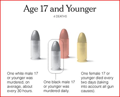
17

Five percent of the people who died due to guns was age 17 or younger (I say “only” advisedly).  People under 18 make up about 24% of the population.  Black men and white men are murdered at about the same rate (one a day, or one every 30 hours, respectively) which means that blacks are disproportionately victims of murder because they make up 12-13 percent of the population as opposed to the 80 percent of the population that is white.  Men are four times as likely as women to be killed. There were about half as many suicides as there were murders, and half as many accidents/police killings as well.
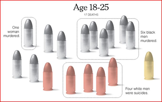
18-25

About 21 percent of all gun deaths were among people ages 18 to 25.  About 90 percent of all murder victims are men, and about half of those are black men.  Accidents/police action are occurring at about the same rate, but suicides have skyrocketed.  There are five times more suicides among people 18 to 25 than there were among those 17 and under.  Four-fifths of the people who choose to take their own life are white men (who make up less than 40% of the population).
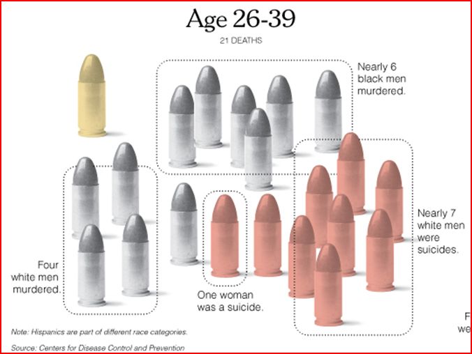
26-391

People 26 to 39 years old accounted for 26 percent of gun deaths.  The murder rate has a similar racial distribution.  Like before, the rate of accidents/police killings have stayed the same.  But suicide rates have continued to climb.  There are nearly twice as many suicides among this age group as there were in the previous one.  The majority of these are white men.  One in nine was a woman.
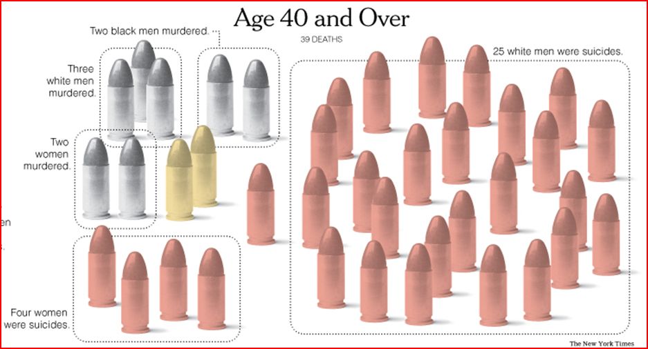
40

Among those 40 and over (48 percent of all gun deaths occur to someone over 40), there is a stark increase in the number of suicides.  There were 2,430 suicides, compared to 1,215 suicides among all other age groups combined.   Eighty-three percent of these suicides are committed by white men.  Murder has finally decreased and the racial and gender distribution is less uneven than before.  There are twice as many accidents/police killings among this cohort.

Media portrayals of gun violence tends to highlight women who are murdered (especially if you watch crime and law TV shows), black on white violent crime (if you watch the news), youth violence (take your pick), and murder over suicide.   This graphic challenges all of those notions.

This site lets you parse out data for homicides in Philadelphia by gender, age, time of day, and weapon, and this site lets you parse out similar data for homicide in Los Angeles county.

Lisa Wade, PhD is an Associate Professor at Tulane University. She is the author of American Hookup, a book about college sexual culture; a textbook about gender; and a forthcoming introductory text: Terrible Magnificent Sociology. You can follow her on Twitter and Instagram.


2013

2012

Cross-posted at Jezebel.

I’d love to draw your attention to The Alpha Parent, a blogger who has collected a stunningly large number of toys for infants that socialize girls into preening.

Some of the toys are purses/handbags that include pretend lipsticks, compacts, and related-items.  My Pretty Learning Purse includes a toy lipstick and a mirror; the Gund Sesame Street Abbey Purse Playset includes a compact and powder brush; the Lilliputiens Liz Handbag includes an eye shadow compact complete with three shades and an eye shadow applicator.

In case you were wondering if this is a trend, the Alpha Parent post features TWENTY examples of purses filled with such toys.

It also includes examples of toy make-up bags. Going beyond the inclusion of beauty items in infant toys, these make beauty the sole point of the play.  Here are just two of the NINE pretend make-up bags she collected, the Oskar & Ellen Beauty Box and the Learn and Go Make-Up and Go:

Since we wouldn’t want a baby to miss the point, companies also produce and sell vanities for infants. The Alpha Parent’s post included FOUR; here’s two, the Perfectly Pink Tummy Time Vanity Mirror and the Fisher Price Laugh and Learn Magical Musical Mirror:

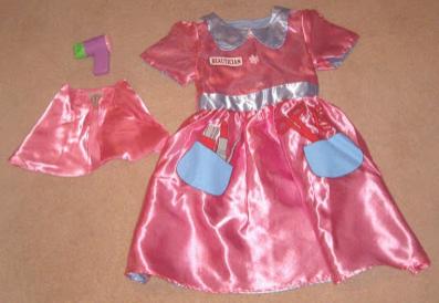
The Alpha Parent goes on to cover real nail polish made for infants, beauty-themed clothes for little girls, and a common category of dress up: beautician outfits.  I counted a surprising ELEVEN of these:

The latter reverses into a nurse’s uniform.

The Alpha Parent concludes:

Makeup toys prime girls for a lifetime of chasing rigid norms of physical attractiveness through the consumption of cosmetics and fashionable accessories.

They are also generally non-sex-transferable, meaning that parents are often loath to allow their boys to play with girl toys.  Gendered toys, then, increase the rate of toy purchasing, since parents of a boy and a girl have to buy special toys for each.

It’s a win-win for corporate capitalism.  Socialize the girls into beauty commodities by buying these toys now, plan on reaping the benefits with the real thing later.  Brainwash the boys in an entirely different way (the Alpha Parent notes tools and electronics), do the same with them simultaneously.

Lisa Wade, PhD is an Associate Professor at Tulane University. She is the author of American Hookup, a book about college sexual culture; a textbook about gender; and a forthcoming introductory text: Terrible Magnificent Sociology. You can follow her on Twitter and Instagram.

Back in 2009, Lisa posted about microscopes and telescopes in a Toys’R’Us catalog. In both cases, the pink version was the least powerful option.

Reader Claudia, who lives in Ireland, found a similar example. Back in October, a supermarket outside Dublin sent out a mailer that advertised boys’ and girls’ laptops. The boys’ version has 50 functions; the girls get just half as many:

Also, it looks more like a packet of birth control pills than a laptop.

Gwen Sharp is an associate professor of sociology at Nevada State College. You can follow her on Twitter at @gwensharpnv.

The internet is exciting, in part, because it offers people an opportunity to produce as well as consume content.  This is why it’s sometimes called “democratizing”; it spreads around the power to influence our collective conversations.

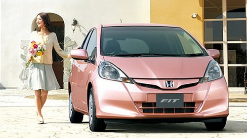
One reaction to the new Honda Fit She’s illustrates a form of resistance through the production of media content.  The She’s is a 1950s throwback being marketed to women in Japan.  In addition to coming in several shades of pink and the inclusion of a heart in the logo, it has pink stitching inside, windows that cut ultraviolet rays (to prevent wrinkles) and a special air conditioning system designed to improve skin quality (to erase wrinkles).

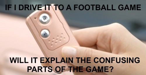
A website, called IdeasForHonda, has emerged in response.  It mocks Honda’s stereotyping of women with satire, offering its own ideas for what women want. Here are some of the entries:

This is just part of  a wider internet response to the She’s and this type of reaction has prompted companies to make changes.  Recently, for example, Gap pulled a t-shirt with the phrase Manifest Destiny and we’ve posted about successful resistance to the Obama sock monkey, the Pretzel Crisps “You Can Never Be too Thin” ad campaign, Nivea’s “Re-Civilize Yourself” ads, and the Abercrombie push-up bikini for kids.  Here’s to democratization.

Lisa Wade, PhD is an Associate Professor at Tulane University. She is the author of American Hookup, a book about college sexual culture; a textbook about gender; and a forthcoming introductory text: Terrible Magnificent Sociology. You can follow her on Twitter and Instagram.

Cross-posted at Montclair SocioBlog.

In a democracy, all votes are created equal — one person, one vote -– but apparently some votes are more equal than others.  Obama won the electoral college vote 62% – 38%, though his margin in the popular vote was much smaller: 51% – 48%.

A similar discrepancy happened in the vote for Congressional representatives.  The Republicans control the House of Representatives, where they have 54% of the seats. But if you add up all the votes for those seats, the Democrats come out slightly ahead (by about 500,000 votes).  More votes but fewer seats.

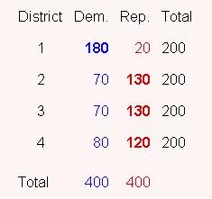
That discrepancy arises from the distribution of Democrats and Republicans in a state’s Congressional districts.  Take a hypothetical state with four districts, each with 200 people.  The popular vote splits evenly –- 400 Democrats, 400 Republicans. Here are the election results:

The Republicans have 50% of the popular vote but get 75% of the seats.
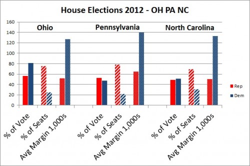
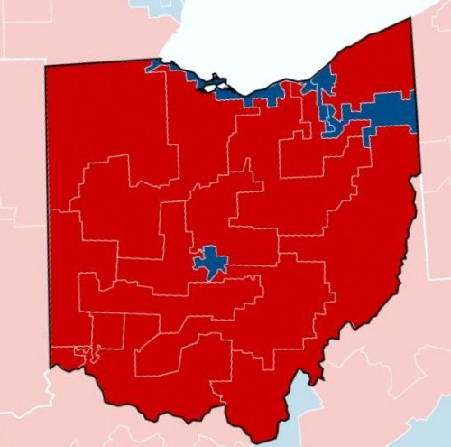
Less hypothetically, in North Carolina, Democratic candidates outpolled Republicans 2.22 million to 2.14 million.  But Republicans won 10 of the 14 seats.  The Democratic votes were crowded into four districts.  In three of those four districts, the Democrats won big – by an average of 133,000 votes.  (If the 7th district, where Democrats now have a slim lead, goes Republican, that average margin will be 177,000.)  Had some of the Democrats from one of those districts been mapped into the neighboring district, they might have won both, though by smaller margins.  The Republican districts had secure but smaller majorities.  Republican winning margins averaged 50,000 votes, less than half the margin where Democrats won.

My first thought was that this was pure Gerrymandering.  State legislatures get to draw the maps of their Congressional districts.  And many more state legislatures are controlled by Republicans.  In fact, some of the North Carolina districts have unusual shapes.  The NC-12, the thin blue line along Interstate 85 stretching nearly to the border, was created as a “majority-minority” district so that Black votes would not be diluted.  The downside for Democrats is that it packs those votes into that narrow corridor.  So the Democrats take that district by over 180,000 votes.  The Republicans with the neighboring districts but by much smaller margins – 23,000, 25,000, and 53,000.  In those four districts, the Democrats got 53% of the vote, but Republicans took three of the four seats.

The Democratic district snaking down through the middle of the state is the 4th, which contains “the Triangle” to the north, but now has that tail stretching down.  Democrats carried the district  by 170,000 votes.  Surrounding it is the 2nd (in pink), which Republicans carried by only 45,000 votes.

Similar differences crop up in Ohio and Pennsylvania. The popular vote is close, and in two of these states it goes to the Democrats.  But Republicans get most of the seats.  Republicans win their seats by less than half the margin of Democratic winners.  Here is a graph of the actual returns from Ohio, Pennsylvania, and North Carolina. (The Ohio total does not include the vote from the two uncontested districts, one Democrat, one Republican.  For the maps and election results, check out Politico.)

The Republican share of Congressional seats is far out of proportion to its share of the vote.  In Ohio and North Carolina, Democrats received more votes, but Republicans got 70-75% of the House seats.  It certainly is possible that Republican-dominated state legislatures drew the districts so as to cram Democratic voters into electoral ghettos.

I don’t know enough about the demography and geography of these states, but I do wonder why the districts are drawn this way.  A paper by Chen and Rodd (here) that uses 2000 election data argues that what looks like gerrymandering is in fact the result of “human geography.”  It’s not the legislatures that pack Democrats together, it’s the Democrats themselves.  They cluster in cities.  As for Democrats outside of cities,

many rural, small-town, and suburban precincts that lean Democratic are often subsumed into moderately Republican districts. . . . There are isolated pockets of support for Democrats in African-American enclaves in the suburbs of big cities and in smaller towns with a history of railroad industrialization or universities. However, these Democratic pockets are generally surrounded by Republican majorities, thus wasting these Democratic votes. As a result, the Democrats are poorly situated to win districts outside of the urban core.

Regardless of intent, the effect is to keep Democratic votes concentrated in the 4th.  If that blue tail of the NC-04 were subsumed into the pink NC-02, both districts might be blue.

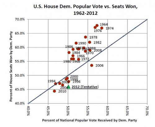
In any case, Democrats have not always been on the wrong side of the seat/vote discrepancy.  John Sides at The Monkey Cage posted this graph showing the ratio for the last twenty-six elections.

Sides quotes Matthew Green on the general trends:

  • the winning party usually gets a “boost” in the number of seats
  • that boost used to be much larger

That trend might fit with the deliberate-gerrymander explanation, provided that in the earlier decades more state legislatures were controlled by Democrats.  But I’m not sure how it fits with Chen and Rodden’s human geography idea of “unintentional gerrymandering.”

—————————

Jay Livingston is the chair of the Sociology Department at Montclair State University.  You can follow him at Montclair SocioBlog or on Twitter.

Jay Livingston is the chair of the Sociology Department at Montclair State University. You can follow him at Montclair SocioBlog or on Twitter.

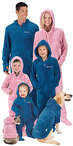
I’ve posted more than once, and gleefully, about the weird American habit we have of associating dogs with men and cats with women.

Well, Adrienne H. sent in a particularly humorous example: an advertising image from Pajamagram, featuring “hoodie-footies” for the entire family.  They are color-coded — pink for girls, blue for boys — all the way down to the dog and cat.

So, there you have it; I’m not crazy after all.

Lisa Wade, PhD is an Associate Professor at Tulane University. She is the author of American Hookup, a book about college sexual culture; a textbook about gender; and a forthcoming introductory text: Terrible Magnificent Sociology. You can follow her on Twitter and Instagram.

About a gazillion twitterers and three readers — Andi, Ria, and Jenna B. — have asked us to comment on the new Honda Fit She’s begin marketed in Japan. It’s a car. For ladies. It’s pink.  It reduces wrinkles. The apostrophe in the logo is a little heart. Etc.

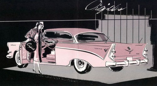
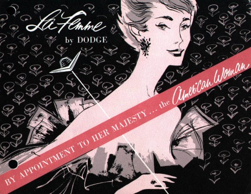
My only response to this is: “how very la femme!”  Dodge La Femme that is.

The Dodge La Femme  was sold for two years in the U.S. — 1955 and 1956 — and could be considered a fore mother to the She’s.  We originally posted about it in 2007.

Here is some of the advertising:

Pictures of a restored La Femme from a fan website show that the car was indeed two-tone pink, with pink rosebud patterned upholstery, and a matching umbrella, raincoat, a compact, and coin purse.

One of the reasons that the La Femme didn’t sell was because women were, frankly, offended.  Gender politics are different today, and they’re certainly different in Japan than they are in the U.S., so it’ll be fascinating to see how the She’s is received.

Lisa Wade, PhD is an Associate Professor at Tulane University. She is the author of American Hookup, a book about college sexual culture; a textbook about gender; and a forthcoming introductory text: Terrible Magnificent Sociology. You can follow her on Twitter and Instagram.