Companies donate to political campaigns in order to gain some leverage over policy making processes.  This fun interactive graphic (via) allows you to see which companies donate primarily to Republican and Democratic campaigns, and which straddle the political fence.  These are the companies with the largest total contribution:

Capture

The most Republican leaning:

Capturerep

The most Democratic leaning:

Capturedem

You can also search by type of company.  For example, media and entertainment:

Captureent

Transportation:

Capturetrans

Pharmaceuticals:

Capturepharm

UPDATE: Comments on this thread have been closed.

—————————

Lisa Wade is a professor of sociology at Occidental College. You can follow her on Twitter and Facebook.

tumblr_kpgy8xxhuW1qz7ng1o1_500-1

In the Bible (book of Genesis), God sends two angels to the cities of Sodom and Gomorrah. These angels were charged with the task of evaluating the rate of sin within the walls. If the people were completely overridden by sin, God would destroy them.

What if those angels were statisticians, with access to GIS and geomapping software? How would the story have been different?

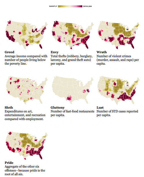
Some geographers at Kansas State University recently did an analysis of the spacial distribution of EVIL in the United States. Which part of the country is most afflicted by sloth? Lust? Greed? Envy? Wrath? Gluttony? Pride?

That’s right, folks – these geographers have operationalized sin, quantified it, then measured and mapped it. Pride is the aggregate distribution of all other sins, since it is supposedly the root of all evil (though one could also make a good case for apathy). Here’s how the sins are measured (and here’s a good view of the maps):

  • Greed: Average incomes versus total inhabitants below the poverty line
  • Envy: Total number of thefts (robbery, burglary, larceny, and stolen cars)
  • Wrath: Total number of violent crimes (murder, assault and rape) per capita
  • Lust: Sexually transmitted diseases per capita
  • Gluttony: Number of fast-foot restaurants per capita
  • Sloth: Expenditures on arts, entertainment and recreation versus rate of employment
  • Pride: An aggregate of the six other sins

By looking at sin at the aggregate level, what they’re doing here is examining sin as a social fact, as opposed to an individual trait. This would be a good extension of a lesson on Durkheim and suicide as a social fact. This study really shows why we really can’t truly measure concepts such as this across space and time, since the meaning of these individual acts will vary. Are the same acts categorized and labeled as rape in Montana as they are in New York? How violent does a person need to be before they are arrested for assault, and does that differ by region? Are we really measuring rates of STDs, or rates at which people get treatment for them? If my measure of gluttony is different than yours, can I apply my measure to your actions and call you gluttonous? Or should I be using your measures to evaluate your actions? Is this aggregate data showing different rates of sin, or is it just an effect of different meanings attached to the concepts?

This would also be useful in showing how we can’t extrapolate individual characteristics from aggregate data. For example, I live in Indiana (but teach in Kentucky). This region is low in envy, lust, wrath, and pride; average in gluttony, sloth, and greed; and not particularly high in any of the sins. Apparently I live in one of the more virtuous parts of the country.

I guess I can cancel that fire and brimstone insurance.

But does this aggregate data also indicate that I, Anomie, have greater odds of being virtuous? NO. The fact that I am virtuous in every way is merely a coincidence. You see, their data is not measuring individual sinful behavior. Rather, it’s measuring social facts, and structural conditions, that they hypothesize to be correlated with individual sinful behavior (but I take issue with some of the measures). For example:

  • I don’t have any STDS. CLEARLY I am not lustful. CLEARLY.
  • If you have more fast food restaurants within a five mile radius of your house than I do, are you more gluttonous than me? No. But at the aggregate level, this may be a good quick and dirty device. At least they didn’t use obesity rates as their measure.
  • And if I make $100k (one can dream) in Indiana, then move elsewhere to a job with the same salary, does that mean my greediness has changed along with my place of residence?

Now, excuse me while I get back to my slothful appreciation of art.

——————————

Angie Andriot, also known as Wicked Anomie, maintains the (mostly) sociology blog Wicked Anomie: Sociology Run Amok. On occasion, she likes to toss off her cape, hop offline, and play the role of Angie Andriot: Grad Student Extraordinaire – deftly juggling the writing of her dazzling dissertation at Purdue University with the imparting of wisdom to her lovely students at University of Louisville. She is particularly fond of symbolic interactionism. And cheese.

If you would like to write a post for Sociological Images, please see our Guidelines for Guest Bloggers.

Last week the New York Times featured an article and graphic (via) illustrating the way in which the increasing energy efficiency of electricity-drawing technologies correlates with an increase in overall use of energy nonetheless due to a rise in our consumption of those technologies.

1

But, “Americans now have about 25 consumer electronic products in every household, compared with just three in 1980”:

2One culprit of the rising electricity use is video game consoles:

Noah Horowitz, at the Natural Resources Defense Council, calculated that the nation’s gaming consoles, like the Xbox 360 from Microsoft and the Sony PlayStation 3, now use about the same amount of electricity each year as San Diego, the ninth-largest city in country.

But an even bigger culprit are those giant plasma screen TVs:

3

The energy-efficiency of video game consoles and televisions are both unregulated, compared to the efficiency of those appliances showing increasing energy efficiency in the first figure (refrigerators, air conditioners, and clothes washers).

So, consumption, overall, is going up:

4

The corporations that build TVs, game consoles, and other unregulated appliances are, of course, resisting any federal laws regarding their efficiency.  According to the article, there was little will under the Bush administration.  We will have to wait and see what happens now.

—————————

Lisa Wade is a professor of sociology at Occidental College. You can follow her on Twitter and Facebook.

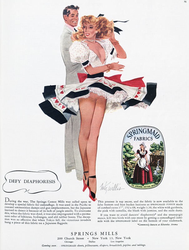
World War II was, among other things, an engine for the development of new technologies.  After the war, however, companies needed new markets for their products that would allow them to continue to reap profits.  We’ve posted below on this effort as related to food.  The 1948 ad below, for a scent-reducing and slimming camisole, is a great example of this in that the text makes it explicit (via):

0_2f753_b3c78add_XL

Text:

During the war, The Springs Cotton Mills was called upon to develop a special fabric for camouflage.  It was used in the Pacific to conceal ammunition dumps and gun emplacements, but the Japanese learned to detect it because of its lack of jungle smells.  To overcome this, when the fabric was dyed, it was also impregnated with a permanent odor of hibiscus, hydrangea, and old rubber boots.  The deception was so effective that when Tokyo fell, the victorious invaders hung a piece of this fabric on a Japanese flagpole.

This process is top secret, and the fabric is now available to the false bottom and bust bucket business as SPRINGMAID PERKER made of combed yarns… the white with gardenia, the pink with camelia, the blush with jasmine, and the nude dusty.

If you want to avoid dancers’ diaphoresis* and the steatopygic stance, kill two birds with one stone by getting a camouflaged camisole with the SPRINGMAID label on the bottom of your trademark.

* Commonly known as Rhumba Aroma.

And also, a quick google search shows, “ballerina bouquet” and “skater’s steam.”

—————————

Lisa Wade is a professor of sociology at Occidental College. You can follow her on Twitter and Facebook.

Max shoes advertises its sturdy laces with sexualized and racialized violence in this Swiss ad:

tumblr_kq99filXUo1qa2j4ro1_400

NEW! Penny R. sent in these ads for Bisazza tiles.  They were banned in England, but she saw them in a waiting room in the U.S. in a magazine called Wallpaper:Bisazza1Bisazza2Both via Copyranter (here and here).

—————————

Lisa Wade is a professor of sociology at Occidental College. You can follow her on Twitter and Facebook.

Behold “a visualization of the contiguous United States, colored by distance to the nearest [of the about 13,000] domestic McDonald’s” developed by Stephen Von Worley at Weather Sealed:

mcd_us_high

Von Worley writes:

As expected, McDonald’s cluster at the population centers and hug the highway grid.  East of the Mississippi, there’s wall-to-wall coverage, except for a handful of meager gaps centered on the Adirondacks, inland Maine, the Everglades, and outlying West Virginia.

For maximum McSparseness, we look westward, towards the deepest, darkest holes in our map: the barren deserts of central Nevada, the arid hills of southeastern Oregon, the rugged wilderness of Idaho’s Salmon River Mountains, and the conspicuous well of blackness on the high plains of northwestern South Dakota.  There, in a patch of rolling grassland, loosely hemmed in by Bismarck, Dickinson, Pierre, and the greater Rapid City-Spearfish-Sturgis metropolitan area, we find our answer.

Between the tiny Dakotan hamlets of Meadow and Glad Valley lies the McFarthest Spot: 107 miles distant from the nearest McDonald’s, as the crow flies, and 145 miles by car!

Suffer a Big Mac Attack out there, and you’re hurtin’ for certain!

Via a blog I’ve been borrowing a lot from lately, Chart Porn.

—————————

Lisa Wade is a professor of sociology at Occidental College. You can follow her on Twitter and Facebook.

Putting into stark contrast today’s push to look fashionable while pregnant (as well as the fact that pregnancy is in fashion), this vintage ad markets the ability of maternity wear to conceal your pregnancy:

laneday090119491062e7fc

Selected text:

Maternity clothes help to conceal your condition and keep you smart throughout your pregnancy. Adjust easily to your changing figure.

—————————

Lisa Wade is a professor of sociology at Occidental College. You can follow her on Twitter and Facebook.

This Associated Press interactive graphic (via) displays the number of uninsured by state and provides state-specific details on the rise of health insurance costs (for employers and employees) for each state.  The number of uninsured (darker = larger #s; note that this data is highly tied to the number of residents in each state):

Capture

Some data for Illinois:

Capture2

To interpret:  In Illinois, the amount of money an employer pays each year, on average, for a family has increased 65.3% over the last ten years, and the amount the employee pays has increased 88.4%.  Employees with families now spend, on average, $2,743 a year for their health insurance.  That translates into 7% of the family income (assuming a single breadwinner), up from 4% in 1996.  Over a million workers in Illinois are not so lucky; they have no health insurance at all.

This data reminds us that, in addition to many uninsured, many of us are already paying for health insurance, so the use of taxes to pay for government provided health care would not necessarily cost those who are already insured and may actually save them money.

—————————

Lisa Wade is a professor of sociology at Occidental College. You can follow her on Twitter and Facebook.