Some of you may have heard about the anti-Muslim protest outside a charity event in Orange County on February 13th. A local chapter of the Islamic Circle of North America (ICNA) Relief, a Muslim charity organization that raises money for women’s shelters, food pantries, disaster relief, and other humanitarian work, sponsored a fundraiser at the Yorba Linda Community Center.

Chrissy Y. sent in a video of the protest. It includes chants of “Go back home!”, “USA!”, and “terrorist!” amid loud boos as individuals walked into the center. At around 3:10 a woman accuses a man of beating his wife and being a child molester. Between the conflation of Muslim with being inherently un-American, the conflation of all Muslims with terrorists, and the reliance on the stereotype of Muslim men as brutal oppressors of victimized women, it is an ugly, ugly example of anti-Muslim sentiment:

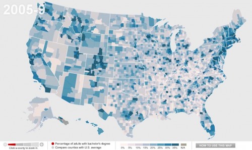
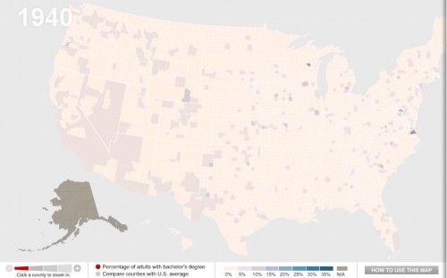
One of my colleagues, Kate Hahn, sent me a link to an interactive map at The Chronicle of Higher Education website that presents data on the proportion of U.S. adults with a bachelor’s degree over time. In 1940, in the vast majority of counties no more than 10% of the population had graduated from college (the national average was 4.6%):

Now the national average is 27.5%:

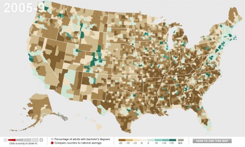
You can also compare counties to the national average. Green counties are above the national average, brown ones are below and, not surprisingly, we see clear regional variations in rates of college education, with Colorado and the Northeast doing particularly well and the South and Appalachian regions lagging:

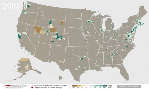
Wealthy counties (those with a median income of $60,000+) in general have higher than average rates of bachelor’s degrees, with the exception of a few counties in the Mountain West, Alaska, and a few scattered areas:

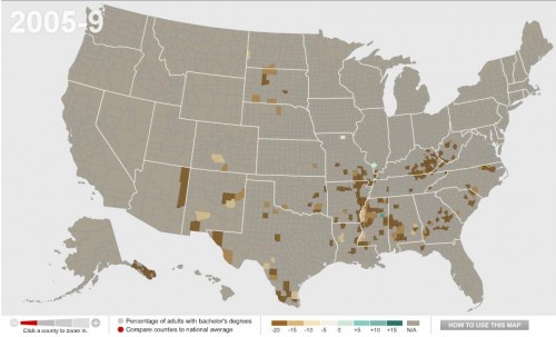
We see the opposite with poor counties (median income under $30,000):

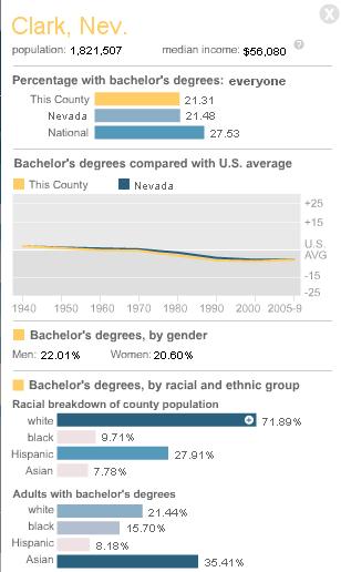
You can break down any of the comparisons by sex or race/ethnicity, and/or look only at  counties with 20% or more Hispanic or Black residents.  You can also select a particular county for more detailed information. For instance, here’s the info on Clark County, Nevada, where I live:

By comparing the maps over time, you can easily track a number of changes: the increase in college degrees overall, of course, but also changes in education such as the dramatic gains women have made in earning college degrees in the past few decades — the gender gap in college degrees was over 7 percentage points in 1980 but only about 1.5 points today.

You know how sometimes you see something and you just cringe and wonder how, how, something made it into the public sphere? Paul Fidalgo, of Near Earth Object, took a photo of this display illustrating the career ladder at McDonald’s. The display provides a rather unintended commentary on race and corporate hierarchies in general:
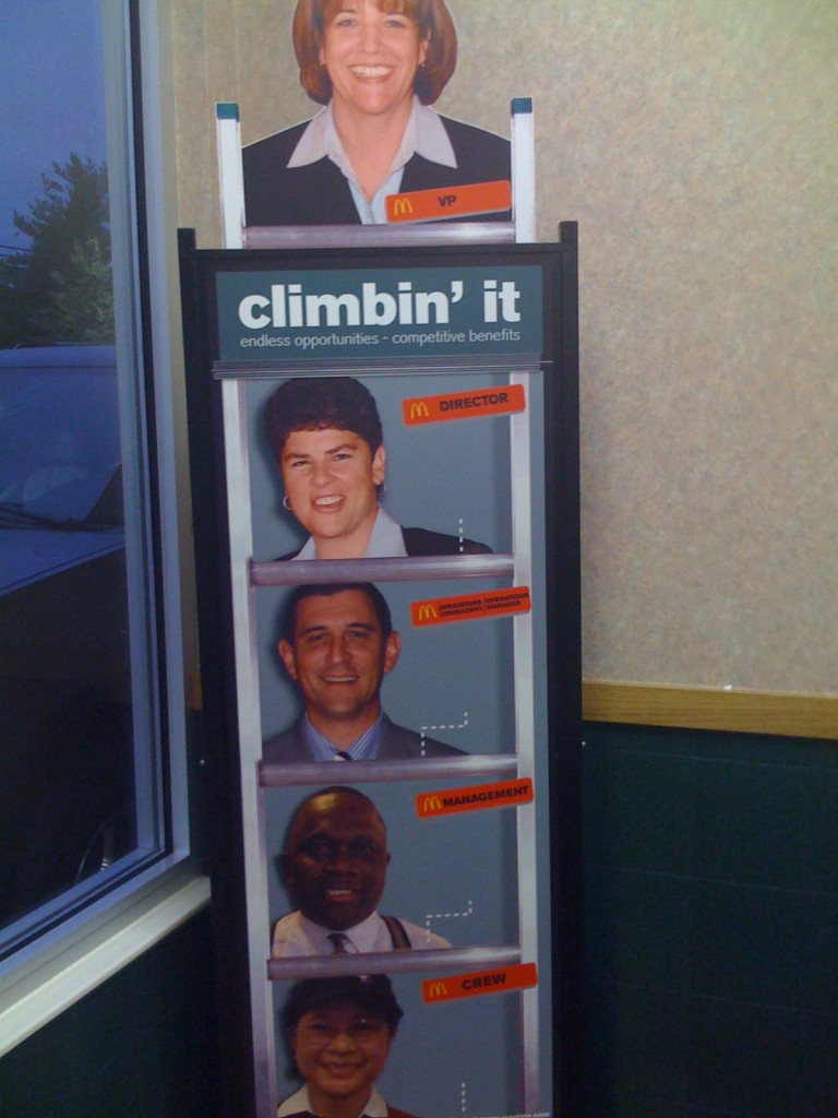
I suppose I should be happy, as the sky appears to be the limit for White women like me on the Ladder of Whiteness.

I was doing some googling, looking for data on the racial diversity of McDonald’s employees, since the company has touted itself as a leader in providing career opportunities to women and underrepresented minorities. I’m always surprised how corporations that carefully guard their brand in other ways, and talk about diversity issues, often seem to drop the ball when it comes to thinking about the cultural politics of representations of race and ethnicity in their materials.

[UPDATE: A number of commenters argue that McDonald’s has a better record on promoting women and minorities than most corporations. I’m not trying to argue there that they don’t — I was trying to find some data on their employees because I’ve also heard they stand out, as far as corporate America goes. That’s why I found the display surprising, as opposed to perhaps predictable.]

So anyway, my online search led me to 365Black, the website McDonald’s set up to appeal to African Americans:

Ok…uh, sure. Just exactly like the baobab tree.

I’d seen 365Black before — readers have sent it in, and we just couldn’t think of much to say so we’ve never posted about it. But then my googling took me to MeEncanta, the McDonald’s page for the Latino community. They offer this sticker (i.e., instruct you to download the image and print it on sticky-backed paper) to show off your Latin pride:

Alrighty…

And finally I arrived at Myinspirasian, which targets Asian Americans. On the page about Asian Pacific American Heritage Month they include information about contributions by Asian Pacific Americans, such as this:

Multimedia creations inspired by Asian Pacific Americans are the latest rage among kids, teens and young adults of all ages. The multimedia creations offer a variety of the trendiest ways to receive news, information, entertainment and services using the worldwide web.

No specifics are given, so you’ll have to figure out what these mysterious “multimedia creations” are. Also, “they have become household names in a host of sporting activities,” though apparently not the type of household names where McDonald’s could actually name one. The entire section is similarly vapid, completely lacking in anything other than non-specific statements that Asian Pacific Americans have, like, done stuff, and things. It reminded me of some of the very superficial celebrations of Black History Month we’ve seen.

But if you want, you can take the Asian Phrases Challenge, where you can hear various phrases spoken in either Mandarin or Cantonese, Filipino/Taglish, Indian/Hinglish, or Korean:

I’m not sure what the “challenge” aspect is, since it doesn’t do anything but play the phrases.

I just…I don’t know. You decide to make webpages entirely devoted to a particular demographic and this is the best you can do? And do these types of marketing projects actually work?

———————–

For more, see our previous post showing how people of color are subordinated visually in advertising materials.


Lester Andrist (of The Sociological Cinema) sent in a clip by Feminist Frequency’s Anita Sarkeesian. She looks at the way that the movies that are rewarded with Oscars tend to be highly centered around male characters and male-dominated plots. It seemed appropriate for Oscars day:

(Transcript after the jump below.)

Lester also pointed out The Girls on Film, a group that recreates male-centered scenes from movies with a female cast. They’re fun and also highlight the types of roles we do and don’t expect to see women in. Here’s Lester’s favorite, a recreation of a scene from J. J. Abrams’s Star Trek:


Transcript

As you might have guessed, I watch a lot of movies, some of my favourites are science fiction but also dramas, action, thrillers and I’ll even admit the occasional romantic comedy. If you go to the movies a lot too you might have noticed one thing that the vast majority of these films have in common, most of the movies seem to be stories about men. One of the primary reasons Hollywood continually churns out movies about men is because we live in a male centered society. Most simply, male centeredness is an aspect of patriarchy that shows us how most of our attention is placed and prioritized on men, men’s stories, the things men do and the things men don’t do. As a result, the images we see in the media often focus on male-centered stories.

One way to demonstrate the male centeredness is not only to look at the movies that are made but to look at which films are most honoured and celebrated. To do this I looked up the films that won the Academy Award for best picture over the past 50 years. Let’s see whose stories are being told?

Starting in 2009 is The Hurt Locker which although directed by a woman is still all about men
Slumdog Millionaire – men
No Country for Old Men – need I say more
The Departed – is about men
Crash – is an ensemble
Million Dollar Baby – is interesting because it’s pretty equally a story about a man and a woman
Lord of the Rings – men
Chicago – is woman centered
A Beautiful Mind – men
Gladiator – is about a man who fights other men
American Beauty – man
Shakespeare in Love – man
Titanic – is from a man’s perspective
The English Patient – man
Braveheart – man
Forrest Gump – man
Schindler’s List – man
The Unforgiven – is about men on horses
The Silence of the Lambs – is about a man who eats people, and this is interesting because although Jodi Foster’s character plays a pretty big role in the film, you would never describe it as a movie about an FBI agent who… you would describe it as a movie about Hannibal Lecter.
Dances with Wolves – man
Driving Miss Daisy – is about a man and a woman
Rain Man – is about a man and his brother
The Last Emperor – man
Platoon – man
Out of Africa – is woman centered
Amadeus – is about a man
Terms of Endearment – is woman centered
Gandhi – is about a man, albeit a pretty extraordinary one
Chariots of Fire – men
Ordinary People – is about a family
Kramer vs Kramer – is about a couple
The Deer Hunter – men
Annie Hall – is about a man and his love life
Rocky – is about a man who fights other men, again.
One Flew Over the Cuckoo’s Nest – man
The Godfather, Part II – men
The Sting – is about two con men
The Godfather, Part I – men
The French Connection – is about men
Patton – men
Midnight Cowboy – is a man
Oliver! – is a boy
In the Heat of the Night – is about men
A Man for All Seasons – man
The Sound of Music – is woman centered
My Fair Lady – is another interesting one because it’s pretty equally about both a man and a woman’s story
Tom Jones – man
Lawrence of Arabia – is so male centered that there aren’t even any female speaking roles in it
West Side Story – is about both a man and a woman
And finally in 1960 is The Apartment which is from a man’s perspective

So only 4 out of 50 are centered exclusively on women’s lives. The vast majority are stories about men and their lives and although a few are ensemble casts the women often play secondary or stereotypical roles.

Year after year we see men and men’s stories being created, produced, celebrated and awarded while women’s stories take a back seat or aren’t even represented. and it’s also Hollywood behind the scenes that is dominated by men. It’s astonishing that Kathryn Bigelow is the only woman to have ever won an academy award for best director in it’s 83 year history, and she won for “The Hurt Locker” in 2009, which is most definitely a male-centered film. In fact only 4 women have ever even been nominated for best director. And what’s more startling is that women only account for 7% of Hollywood directors. Hollywood executives, production companies, financial investors and backers are most interested in marketing to young men and funding stories that they, as men, can relate to. Thus they fund and produce the majority of Hollywood films to appeal to this demographic.

Obviously, I want to see a many, many more films centered on women’s stories, however it’s important to note that even women centric films can be sexist. For instance, in so called “chick flicks” depict women in stereotypical gender roles obsessed with shopping, love and finding “Mr. Right”. I want to see more films that depict women as full and complete human beings. And just so we are absolutely clear… I’m not saying stories centered on men are never good, interesting or important but I want to point out that they are disproportionally valued and most rewarded in our society.

Here are a few simple questions to keep in mind next time you are at the movies, to help you identify whether the story you are watching is male or female centered.

1. who has the most screen time
2. whose perspective do we see the scene from
3. whose story arc does the plot revolve around
4. do we see them make decisions
5. who do we most identify with


Squee sent in some rather odd commercials put together by the Norwegian Association of the Blind. The commercials encourage companies to hire blind individuals…by arguing that you can get away with doing things in front of, or to, blind workers because, you know, they won’t be able to tell anyway:

The message is a little strange, I think — trying to provide more employment opportunities for a group that may suffer from job discrimination by reinforcing the idea that if if someone is blind, they are completely clueless about what’s going on around them and, thus, their non-blind coworkers can act in ways that would be totally inappropriate if done to/around any other colleague.

Does that seem like an effective strategy to you?

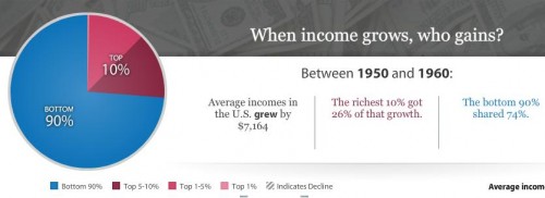
Via Shamus Khan, I found the Economic Policy Institute’s interactive graph that lets you see which Americans have earned most of the growth (or, more recently, suffered the losses) in U.S. incomes over time, based on IRS data (and reported in constant 2008 dollars):

You can select beginning and ending points and find out how incomes changed during that period and how the growth was distributed. For instance, the increase in average incomes between 1950 and 1960 were widely distributed:

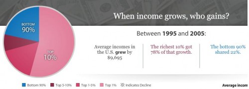
If we look at the 10-year span between 1995 and 2005, the increase was much more concentrated among the very wealthy:

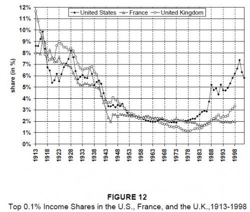
The data come from a study on historical income in equality in the U.S. by economists Thomas Piketty and Emmanuel Saez. They compare the share of income earned by the richest 0.1% of earners in the U.S., France, and the U.K.:

See our previous posts on Saez’s work here and here.

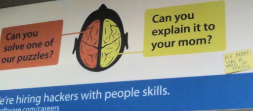
David F. sent in a fun example of public resistance to a gendered advertising message. ITA Software put up an ad on public transportation in Boston that plays on the idea of moms as particularly inept about technology. Universal Hub posted a photo taken of the ad on the Red Line, with a Post-It someone added:

Also see our earlier post on public resistance to a Pretzel Thins ad in New York.

Gwen Sharp is an associate professor of sociology at Nevada State College. You can follow her on Twitter at @gwensharpnv.

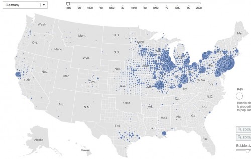
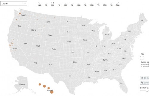
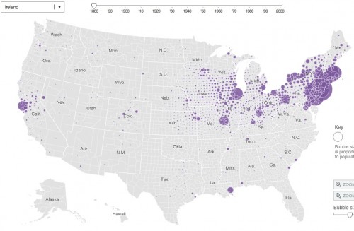
Jessica L., a doctoral candidate in sociology at Kent State and traveling adjunct instructor at Lewis University and Indiana University Northwest, let us know that the New York Times has an interesting interactive map that uses Census data from 1880 to 2000 to show where various immigrant groups have settled. You can select area of origin (some specific, such as China, others very broad, such as “All Africa”) and see where individuals from that area were living in the U.S. for different years (because of changes in Census categories and data gathering, information isn’t available for all groups for all years).

The German-born population in 1880:

If you go to the NYT site, you can roll over the circles to get the specific population.

The Japanese-born population in 1900, indicating immigration to Hawaii and, to a lesser extent, California and Washington to work in agriculture:

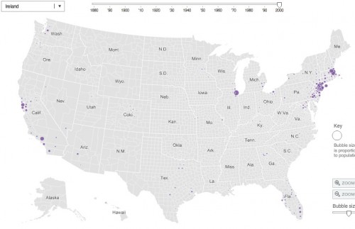
The map also lets you trace the rise and fall of some immigration streams. For instance, in 1880 there were 198,595 people born in Ireland living just in Manhattan alone:

By 2000, the Irish-born population in the U.S. was tiny, and only 4,147 of them lived in Manhattan:

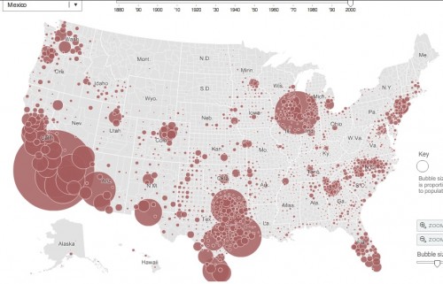
The Mexican-born population in 2000: