When the earthquake and tsunami hit Japan, the twin disasters received a lot of media attention. However, it didn’t take long before concerns about the situation at the Fukushima Daiichi nuclear reactors became a major focal point of media coverage. I remember first hearing about the explosion that damaged the outer containment building at one of the reactors. Every few hours brought more news accounts that seemed to indicate impending disaster — possible radiation clouds set to arrive in Tokyo within hours, evacuations of employees from the reactors, more explosions, the possibility that a full core meltdown would occur. Officials in the U.S. expressed concern about the 20-kilometer (12 1/2-mile) evacuation zone established by the Japanese government and suggested Americans evacuate a larger area.

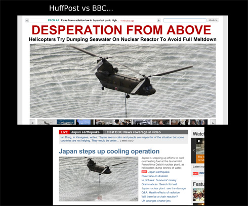
But criticisms have emerged of media — particularly much of the non-Japanese media — coverage of the problems at the nuclear reactor, suggesting the reporting was often inaccurate or that the severity of the situation and potential dangers were exaggerated, and as a result drew attention away from the destruction and suffering caused by the earthquake and tsunami. The blog Japan Probe posted screen captures illustrating the different tone of coverage of the attempt to dump water from military helicopters onto Reactor 3 as part of the efforts to keep the fuel rods cool. The first, from the Huffington Post, implies more of a sense of panic and looming disaster than does the title to a BBC article using the same photo:

Japan Probe also links to a New York Times map, titled “Forecast for Plume’s Path Is a Function of Wind and Weather,” that shows when various detecting stations could potentially be able to pick up what the NYT takes pains to say would be “extremely low levels” of radiation that would have “extremely minor health consequences” (that last phrase bolded). Here’s the scenario that was forecast for March 18:

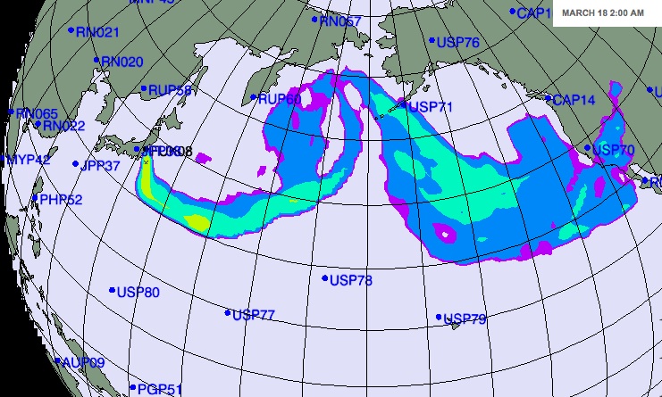
Scary, right? But then take a look at the color legend for the map:

The radiation levels indicated by different colors are reported in “arbitrary units.” So the different colors reflect differences in the potential level of radiation as it might hypothetically spread. But it’s based on a scale where the reader has no way to know whether the difference between purple, yellow, and red are actually meaningful and whether everything from 0.001 to 100 units, or a hundred billion gazillion units, all still count as “extremely low levels”of radiation, or if the red would indicate we’re all going to die.

I’m sure that the scientists who developed the model explained what the arbitrary unit was, but as provided in the NYT map, despite the text saying there is little to fear in terms of health, the map with the color coding seems likely to generate concern without providing much useful information.

UPDATE: Dmitriy T.M. just emailed me a link to a post about this topic at TechCrunch, which includes a clip from CNN in which Nancy Grace “schools” a meteorologist about how he’s totally wrong about radiation:


And the San Francisco Chronicle has a post up on SFGate summarizing some of the problems with coverage (via Talking Points Memo).

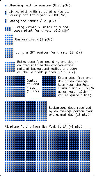
On the topic of concerns about radiation levels, my friend Kelly V. sent me a graphic put together by xkcd to put the level of radiation exposure from various sources into some context. The image is too large to fit in the space available here, but it’s worth clicking over to take a look. Here are two segments of it, but really, go look at the full image:

I’m certainly not in a position to adequately sort through the actual dangers posed by what’s going on at the Fukushima reactors, but it’s certainly worth questioning media coverage, especially insofar as that coverage drew attention away from the horrendous aftereffects of the earthquake and tsunami.

On a related note, and as a contrasting example, Dmitriy T.M. sent in a cartoon based on an idea by artist Kazuko Hachiya that explains the problem at the Fukushima Daiichi facility to kids through metaphors about constipation, pooping, and farting. So…there’s that. It’s unclear whether the video has really been shown on Japanese TV to actual children or not.

UPDATE: Reader Rei Tokyo, who lives in Tokyo, says the video has never been shown on local TV to their knowledge. I have a feeling this is more of an internet sensation outside Japan than within it.

From the blog Japan Probe I discovered that Ralph Lauren has partnered with the United Way to create a line of polo shirts they’re calling Japan Hope:

The shirts range from $98-110, and the website says “100% of all proceeds” will be donated to humanitarian efforts in Japan. The site does have a link to a United Way site that lets you make donations directly, without buying a shirt. However, looking over the information about the Japan Hope shirt, I have the same concerns I often do when I see humanitarianism-through-consumption efforts. Though we’re assured that “100% of all proceeds” will be donated, nowhere could I find out what that actually adds up to. Perhaps the donation from each shirt is sizable, but it may just as well be tiny. There’s no way to know what your actual contribution to Japanese relief efforts is. If you wanted to donate $50 and you buy this shirt, have you met your donation goal?

I honestly don’t really understand the point of these types of products. If you want to help out, why not just donate directly to a group involved in relief efforts? Why the need to get something for yourself in return? Maybe I’m underestimating the draw; perhaps such gimmicks actually bring in donations (of whatever size) from individuals who otherwise wouldn’t have contributed anything at all. (If any of our readers have any direct evidence one way or the other, I would love to hear about it.)

But I would feel more comfortable with this type of consumption-based giving if the companies engaged in it clearly provided a baseline idea of what the “proceeds” would be so consumers could have some sense of the size of their contribution. Without such information, I can’t help but wonder how many people greatly overestimate the positive effects of their purchase.

For more on potential problems with buying-as-activism, see my earlier post on the ethical fix.

Amy H. sent in a Dove ad from O magazine. The ad clearly means to say that women get “visibly more beautiful skin” because their body wash moisturizes dry skin. However, the placement of the women in front of the “before” and “after” text may unfortunately, based on a quick glance, inadvertently convey a different message:

I continue to be puzzled that multinational corporations with resources for large-scale marketing campaigns so often stumble in awkward ways when trying to include a range of racial/ethnic groups in their materials. This seems to occur by not sufficiently taking into account existing or historical cultural representations that may provide a background for the interpretation of images or phrases in the advertising. In this case, the arrangement of the models combined with the text above and below them unfortunately intersects with a cultural history in which White skin was seen as inherently “more beautiful” than non-White skin (not to mention thinner bodies as more beautiful than larger ones).

It would be possible to make this same ad, using these same models and basic idea, in a way that avoided any potential misinterpretation — all it would take, I think, would be to take the before-and-after pics and make them small off-set images on the side, so “before” and “after” couldn’t be read as referring to the women’s bodies. Given that advertising materials are often highly scrutinized, Photoshopped, market tested, and focus grouped, I can’t quite figure out how potentially problematic racial/ethnic connotations aren’t caught before such ads are released.

UPDATE: In my analysis, I gave Dove the benefit of the doubt in assuming this was a non-intentional aspect of the ad, largely because even in the “best case scenario” where this is entirely unintended, it is problematic. However, several readers suggest that we shouldn’t too quickly assume that instances such as these are accidental.

Gwen Sharp is an associate professor of sociology at Nevada State College. You can follow her on Twitter at @gwensharpnv.

Way back in November David M. sent in another example of the tendency to conflate curves with women of color. This ad for a bodyshaper that appeared in the magazine i-on Glasgow (via wishiwerebaking on Flickr) says that wearing their product will give you “Latino curves,” and the code for the discount is “Latino” (which perhaps should be “Latina,” but we have much bigger issues than that to deal with).

I’m putting it after a jump because one reader said it was slightly NSFW or, more specifically, some public libraries; it’s an image of a woman in a strapless bra and body shaper, so you don’t see any nudity.

This appears to be the company’s entire marketing scheme; I went to their website and the banner invites you to “Discover the secret of Sexy Latino Curves.” It took me a while to figure out the connection, but the About Us page explains:

Real Body Shapers was launched in 2009 by Dr Raquel Borges, a Latin American medic and Complementary Therapist living in Scotland. Originally from Venezuela, Dr Raquel knows body shapers are the confidence secret of all those sexy Latin American women.

Dr. Raquel helpfully continues,

“When I wear the body shaper, I feel instantly slimmer, curvier and more confident. I believe all women should experience that confidence. We are all under such pressure to achieve the so-called ‘perfect’ body, which is unattainable and goes against natural femininity. I say life’s too short not to take a little shortcut to sexy curves and super confidence. I just wear a body shaper and go join the fiesta …”

So on the one hand, bodyshapers make you instantly sexier, and being curvy is a characteristic of Latinas. But on the other hand, trying to meet that body shape is impossible and even unnatural…so you need to buy a product that does it for you. Problem fixed!

Incidentally, they have a couple of products for men. It’s not clear if wearing them makes men more Latino, as well.

UPDATE: A reader comments,

I’m tired of this “Latinos generalization”, I live in Latin America and here we are really different, there are people that are white, black, asian, amerindian, fat, thin, curvy, tall, short, smart, dumb etc… We aren’t just “People of color.”

Cross-posted at Jezebel.

Andi S.-R. noticed an interesting segment in a German textbook used to teach English. In the last few years, 12th-grade English classes have started including a section about gender, so textbooks have added chapters on the topic. Andi found a supplement from Klett, one of the major German publishers of educational materials, provided a supplement for covering gender that included a brainstorming exercises. While the idea was to foster discussion about gender stereotypes, Andi questions whether the sample comments provided as examples would help with that goal or would prime students to focus on stereotypical behavior by providing it as a model:

A second section helpfully suggests “bitchiness” as a quality students might associate with girls:

Again, the idea is to promote discussion, an excellent goal. But Andi succinctly points out the potential pitfalls of such a superficial approach:

…it’s unclear how students are supposed to know if these are “views” or “facts”, and having a discussion based on gut-feeling alone seems only likely to reinforce and teach as “facts” those stereotypes the students are familiar with, anyway.

Given the events in Japan and the ongoing concerns about the damaged Fukushima Daiichi nuclear reactors, I just wanted to point out that the New York Times has several very helpful images that explain the design of that type of nuclear reactor and what has happened over the last several days. The Union of Concerned Scientists has also posted several updates on their All Things Nuclear page.

The last decade or so had shown gradually increasing public support for nuclear energy. Just a year ago a Gallup poll of 1,014 U.S. adults showed the highest level of support since they first asked about nuclear power in 1994, with 28% saying they “strongly” and 34% saying they “somewhat” favor nuclear energy:

In November 2009, Ipsos MORI, a market research firm in the U.K., interviewed a representative sample of 2,050 people in Great Britain about their perceptions of the nuclear energy industry (at the request of the Nuclear Industry Association). Results of the question “How favorable or unfavorable is your opinion or impression of the nuclear energy industry?”:

Men viewed the nuclear industry more positively than women did:

Not surprisingly, the crisis in Japan has led to concerns about nuclear power in other countries; Germany, for instance, is at least temporarily shutting down all facilities built before 1980. There is likely to be increased scrutiny of older nuclear power facilities, in particular.

Sangyoub Park, an Assistant Professor of Sociology at Washburn University, sent in this map showing the location and age of reactors in the U.S. (via the U.S. Nuclear Regulatory Commission):

Though the current events in Japan would seem likely to decrease public support for nuclear energy, if the crisis at the Japanese nuclear facilities are contained with relatively little perceived harm, it’s possible we could see little long-term impact on public opinion. People might think that if a nuclear plant can be hit by an earthquake and a tsunami, suffer multiple explosions and fires, and not have a core meltdown, then they must be pretty safe. I’ll keep my eye out for polls on the subject over the next few weeks/months.

UPDATE: Sangyoub found a Gallup poll released this afternoon showing that the ongoing problems controlling the damage to nuclear reactors in Japan have increased public concerns about the possibility of a nuclear disaster in the U.S.:

This led to a dip in support for nuclear energy; the percent “somewhat” or “strongly” opposing nuclear power rose from 33% in 2010 to 38% now:

Related posts: the power of images in the environmental movement and Chernobyl, then and now.

We’ve posted before about the use of women’s bodies to sell real estate. But this Australian commercial for luxury housing, sent in by Nigel M., takes it to a whole new level. As Nigel said, “Even if I told you, you still wouldn’t believe me.” Let’s just say it includes a “lingerie model tied to a chair,” hot lesbians making out for male pleasure, and the phrase “speaking of broads.”

It’s a real gem:

For those keeping track of unemployment in the U.S., The Economist posted this graph showing job gains and losses by state, based on Bureau of Labor Statistics data:

According to the BLS, as of January 2011, the U.S. unemployment rate had dropped to 9.0%. The lowest unemployment rate is in North Dakota, at 3.8%, while the highest is still in Nevada, at 14.2%.

The BLS has detailed state-level employment data here.