

Katrin sent us a great example of anachronistic portrayals of Native Americans, this time in a German (?) ad for a muscle pain relief product. The slogan at the end, “Indians do not know pain,” plays on the idea of the stoic native:
I am trying to re-enter society after several days being sick, so I’m going with something short and simple today. Eden H. sent in this chart, found at Business Insider, that compares hourly minimum wages in a number of European countries to the U.S.:
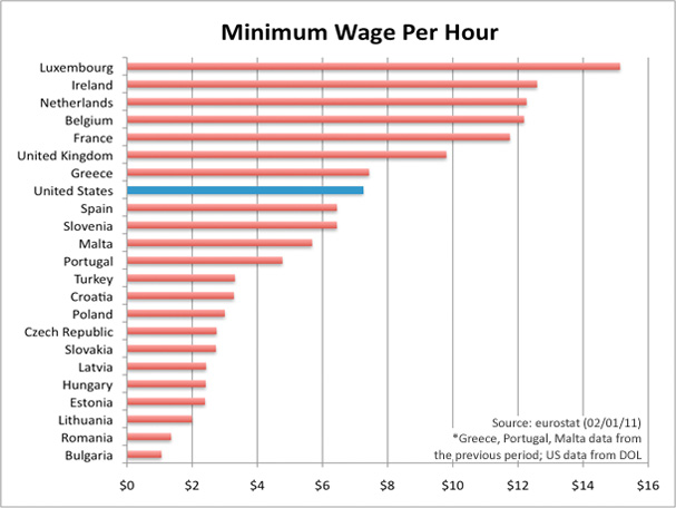
The European data are available from Eurostat (though note they report minimum wages in terms of Euros per month, not hour, so the data was converted for the chart).
Lauren S. sent in this ad for a used car dealership that ran in the London Free Press, a free newspaper in London, Ontario. The ad compares used cars to sexually experienced women with the lines, “You know you’re not the first. But do you really care?”:
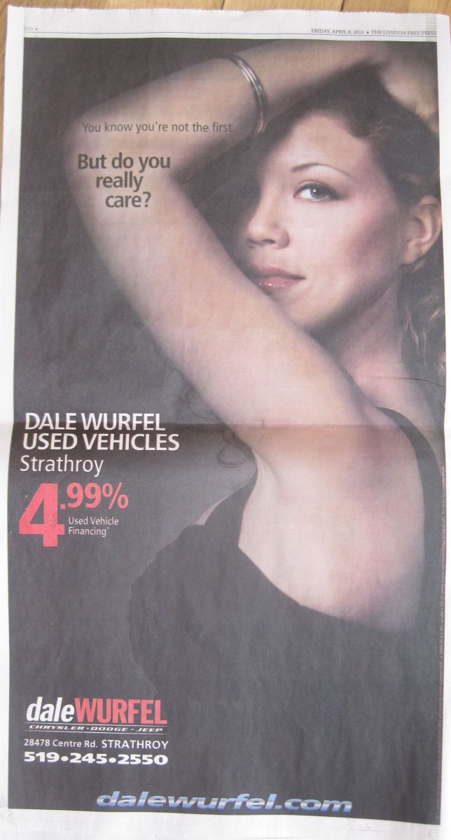 As Lauren points out, it’s blatant objectification of women, but “in addition to objectifying women to sell vehicles, this campaign suggests that a woman’s sexual past is equivalent to depreciation.”
I suppose someone could argue that the message that you shouldn’t “care” whether your women/cars are “used” rejects the sexual double standard, but the objectification and the implication that non-virgin women are “used” undermine any apparent rejection of that double standard.
It’s not the first time we’ve seen this type of ad for used cars; we previously posted a BMW ad, but in that case, I suspect (though we’ve never been able to confirm) that it might have been a spec ad made by an ad agency but never actually used by BMW. In this case, Lauren actually saw it in print.
UPDATE 1: Well, I must give Dale Wurfel some credit. He is apparently an equal-opportunity objectifier. He ran a second ad that uses a man instead of a woman:
 Via Wheels.
Of course, equal objectification doesn’t necessarily have equal effects. We live in a world with a sexual double standard. Calling a woman “used” resonates culturally in a way that it simply doesn’t for men, because we don’t punish men for sexual experience in the same way.
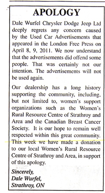
UPDATE 2: Lauren let us know that the car dealership issued an apology:
UPDATE: Comments closed.
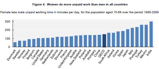
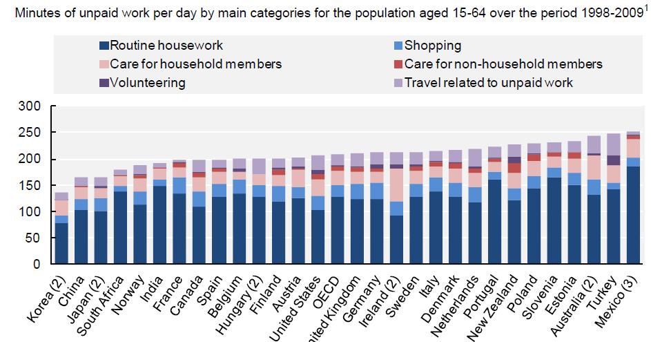
Deeb K. sent in a story from the New York Times about who does unpaid work — that is, the housework, carework, and volunteering that people do without financial compensation. Based on time-use surveys by the Organisation for Economic Co-operation and Development (OECD), this chart shows how many more minutes per day women in various nations spend doing such activities compared to men:
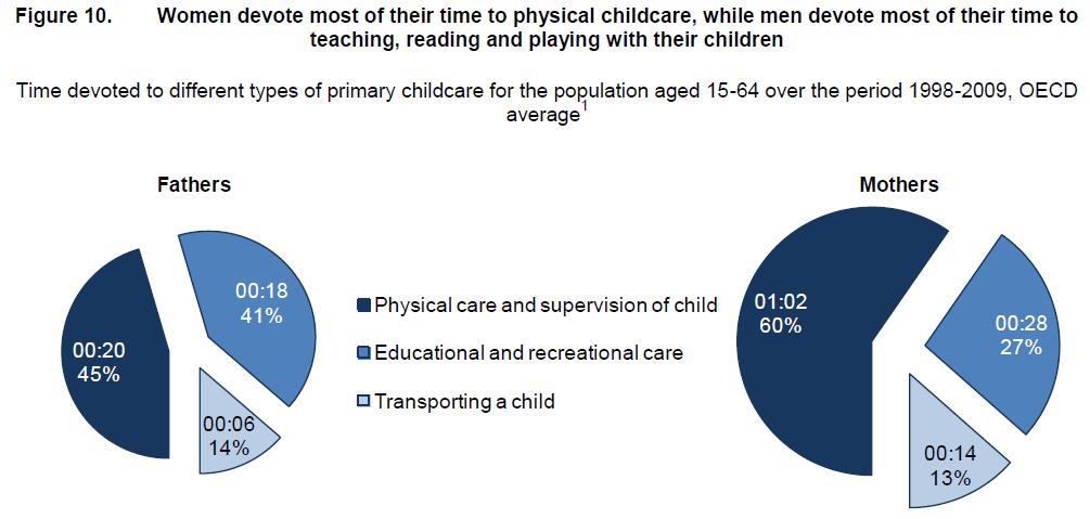
Childcare stuck out as an area with a particularly large gap:
On child care in particular, mothers spend more than twice as much time per day as fathers do: 1 hour 40 minutes for mothers, on average, compared to 42 minutes for fathers…On average, working fathers spend only 10 minutes more per day on child care when they are not working, whereas working mothers spend nearly twice as much time (144 minutes vs. 74) when not working.
The full OECD report breaks down types of unpaid work (this is overall, including data for both men and women):
The study also found that non-working fathers spend less time on childcare than working mothers in almost every country in the study (p. 19). And mothers and fathers do different types of childcare, with dads doing more of what we might think of as the “fun stuff” (p. 20):
Source: Miranda, V. 2011. “Cooking, Caring and Volunteering: Unpaid Work around the World.” OECD Social, Employment and Migration Working Papers, No. 116. OECD Publishing.

Kristie C. sent in a Hardee’s commercial for their turkey burger that is an example of something we’ve talked about before: the conflation of women with food products to be consumed and the sexualization of both women and food in ads. But watch closely! It’s very subtle, so you might miss it the first time.
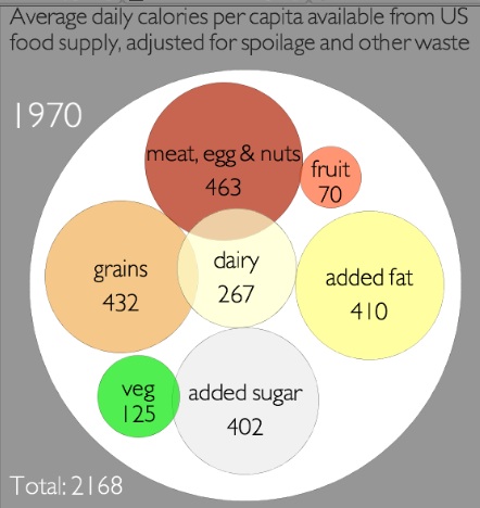
Jeff H. sent in a link to a graphic at Civil Eats that lets you see the rise in U.S. daily caloric availability between 1970 and 2008, and where the additional calories are coming from. They are based on USDA data on food available for human consumption, minus what is wasted through being thrown out, spoiling before making it to the store, etc., to approximate average daily calorie consumption. It’s a rough measure, and clearly actual consumption will vary widely, but the overall changes provide some insights into the changing U.S. diet.
Note: I sometimes used the word “consumption,” “consumed,” etc., in the post since availability is an approximation of it, but as a reader pointed out, I should have been more careful, so I’ve fixed it throughout the post.
In 1970, we consumed had available an average of 2,168 calories per day, and the single largest source was meat/eggs/nuts:
By 2008, we had 2,673 calories available on average. The big jumps were in added fat — there are 231 more calories a day available per person, and it’s now the single largest source of calories — and grains. I was surprised to see how small the increase in added sugars was…and calories available from vegetables and dairy actually went down:
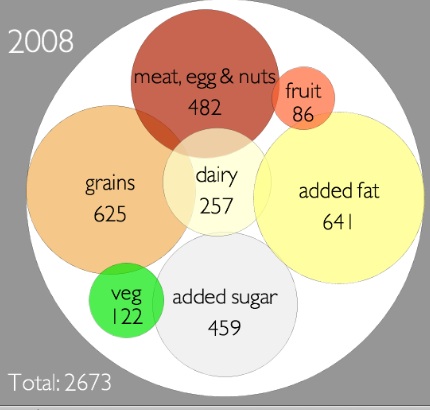
Overall, that’s an increase in available calories of 23.3% during this 38-year time frame.
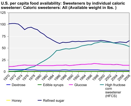
You can go to the Economic Research Service website and create charts or tables of caloric availability for specific food groups. For instance, the chart on changes in sweeteners shows the jump in use of high-fructose corn syrup, and an accompanying decrease in dextrose:
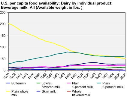
There’s a lot less whole milk than there used to be:
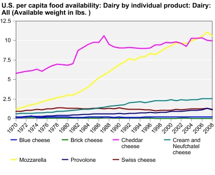
But we’ve grown to love mozzarella and make a lot more of it:
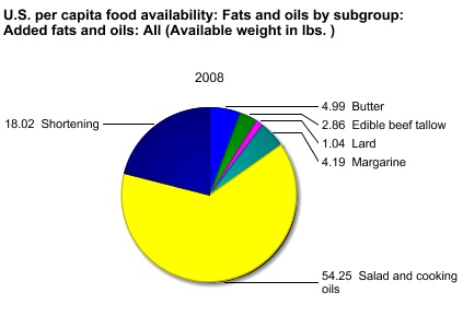
Or instead of looking at trends over time, you can get the breakdown for one particular year. Here are the sources of our added fats for 2008:
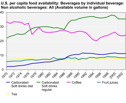
Non-alcoholic drinks (excluding milk):
I warn you, this is one of those things where it seems like you’ll just look for a second, and the next thing you know you’ve spent 45 minutes making customized charts of every possible category of food.
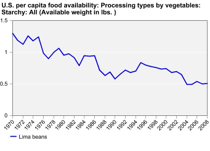
Also, we do not like lima beans:
UPDATE: Reader Chorda provides some context that I think is helpful:
The added fat looks impressive, but because fat has 9 calories per gram that increase ends up only being 25.6 grams of fat over the 1970 amount, or 0.903013 ounce. Yes, less than an ounce of fat can add 231 calories. On the other hand, the additional grains and sugar combined would be 62.51 grams of carbohydrates, or 2.20497 ounces dry weight and 250 new calories from carbohydrate sources.
Just over three ounces of food can make a difference of 481 calories. Eating that extra 3.1 ounces every day for a week is 3,367 calories. One pound of fat is equal to 3,500 calories.
Take two tablespoons of oil. Combine with three tablespoons flour and one tablespoon sugar. That is the largest difference between 1970 and 2008. Could you even get a single pancake out of that?
Well, I’m very late posting today, obviously. It was a long day. Anyway, Elliott J. sent in an AP news story that ran on Yahoo news. The article about the University of Connecticut women’s basketball team — which was in the Final Four of the women’s tournament — focuses not on their physical prowess, skill, or competitive spirit, but rather on the fact that they’re super excited to cheer on the UConn men’s team: 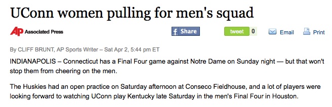 Of course, there’s nothing shocking about the fact that one team from a school might want other teams from the same school to win. But there’s a tendency to feminize female athletes and to highlight their relationships with and appreciation for men, to reassure audiences that they’re still appropriately feminine despite their interest in sports and amazing athletic abilities. In this case, we learn that these female athletes still support and cheer for their male colleagues…and though the women in the article say the teams support each other, only examples of the women rooting for the men are included, and despite my googling, I couldn’t find any stories about how much the UConn men’s team was pulling for the women’s team.
UPDATE: Reader twostatesystem was able to find an article about the men of UConn cheering on the women that I didn’t find in my quick googling (I tried variations on “UConn men cheer/support/pull for women” and couldn’t find anything at the time).
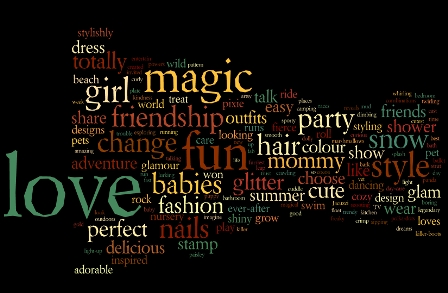
Alli, YetAnotherGirl, Molly W., and Laurence D. all sent in links (via The Mary Sue and Feminist Law Professors) to a post at The Achilles Effect on gendered language in children’s toy commercials. Crystal Smith created word clouds based on 658 words in 27 TV commercials generally aimed at boys (products included “Hot Wheels, Matchbox, Kung Zhu, Nerf, Transformers, Beyblades, and Bakugan”) and 432 words from 32 TV commercials generally aimed at girls (products: “Zhu Zhu Pets, Zhu Zhu Babies, Bratz Dolls, Barbie, Moxie Girls, Easy Bake Ovens, Monster High Dolls, My Little Pony, Littlest Pet Shop, Polly Pocket, and FURREAL Friends”).
This clearly isn’t a random sample of all toy commercials on all TV channels to all age groups; as Smith points out, it ignores toy companies that can’t afford TV ads, and it’s not a huge sample. However, given that these are popular toys that were being marketed during shows (such as cartoons) that are aimed at children, the word clouds provide a basic overview of gendered language in toy ads.
The word cloud for the boys’ list shows the emphasis on action and violence, with others depicted as opponents, a nemesis, or enemies:

For girls, the words are much more about appearance/fashion, relationships (friends, friendship, etc.), and playing mommy:
You can see larger versions at Wordle (girls and boys) and Smith says she has a reference list of all the commercials she a reference list of all the commercials available, which I requested. I’ll update the post with the list when I get it.
UPDATE: In response to my email, Crystal Smith cautioned, “This is a very small sample of brands that tend to appear frequently during kids’ cartoon blocks on TV. They are highly gendered toys, which explains the incredible contrast between the two lists.” She sent along the references; the girls’ list is available here, the boys’ list here.