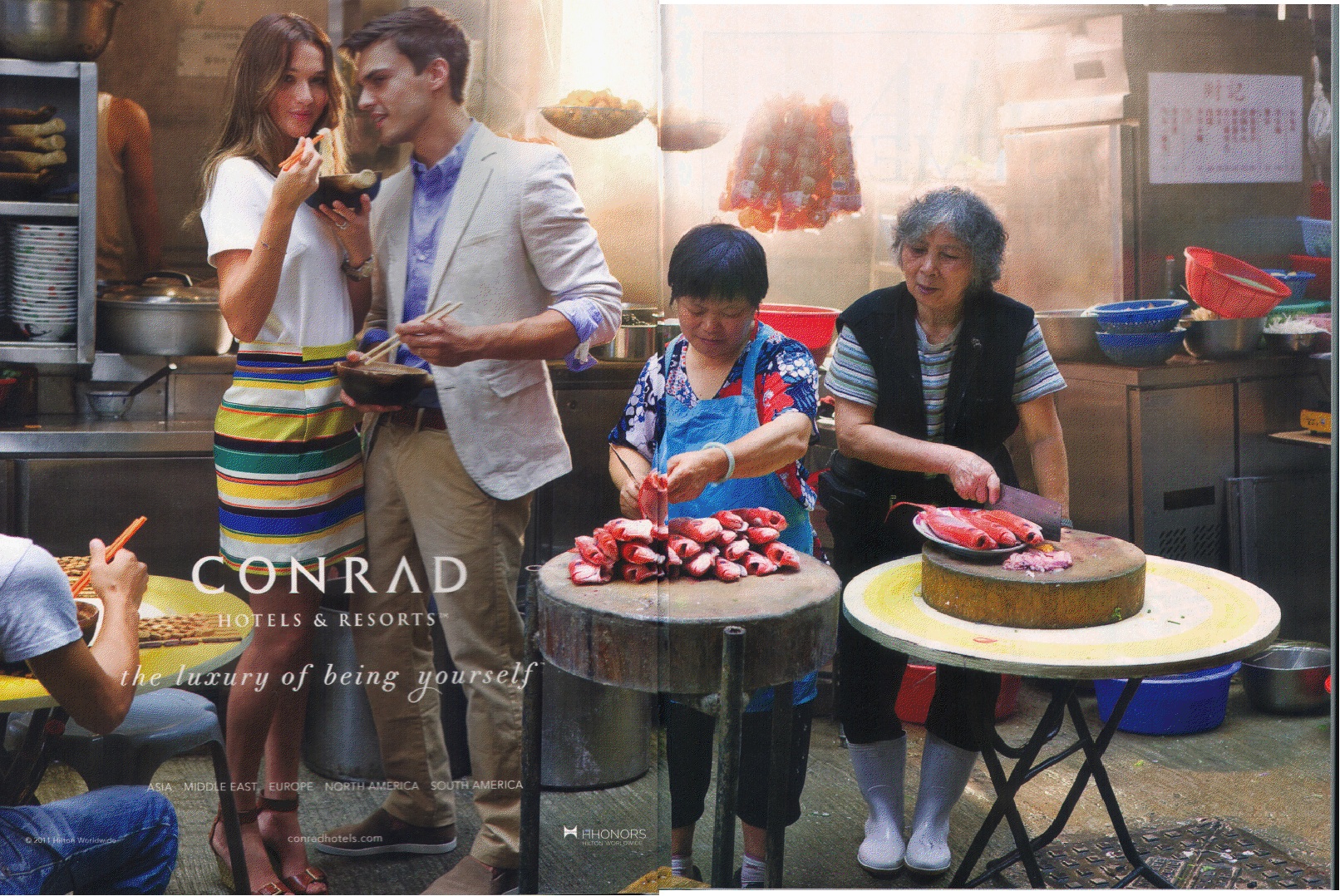
We’ve posted a number of times on the use of non-Western locations, and their residents, as background props in ads, catalogs, and fashion spreads, and the examples keep coming. A while back, Rebecca Smith-Mandin sent in this ad for Conrad hotels, in which the implicitly wealthy, White audience is invited to indulge in “the luxury of being yourself,” which includes the ability to have authentic, off-the-beaten-path experiences in far-flung locales, while remaining clearly distinct from them:

Similarly, last year Anna-Sara H. found this image in the German women’s magazine Freundin:

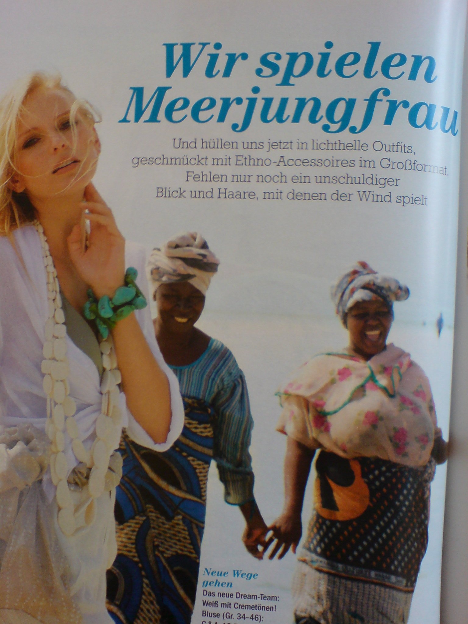
Anna-Sarah’s translation (which she says loses some of the poetic intent of the original):

We are playing mermaid. And wrap ourselves in light-bright outfits now, adorned with large-sized ethnic accessories. The only things missing are an innocent gaze and hair being played with by the wind.

In both cases, we see a very common trend in ads or photo shoots for fashion and luxury services: non-White individuals may be included in the photo shoot, but they are not used to model the use of the product or service itself. As Ashley Mears argues in her ethnography of modeling, Pricing Beauty: The Making of a Fashion Model, non-White bodies are generally seen as incompatible with the idealized fantasy of inaccessibility and sophistication that is the guiding aesthetic for fashion mag editorials and advertisements for luxury goods. In these images, we see that non-Whites are included in a way that superficially increases diversity in a magazine’s pages, without disrupting the assumption that the imagined consumer — the subject of these images — is White.

A couple of years ago, Lisa posted about the ubiquity of McDonald’s in the U.S., highlighting a map that showed the distance from the nearest McDonald’s. As a follow-up to that, Data Pointed posted a map that illustrates the unevenness of its market dominance across the country. If we plot the markets dominated by the top 8 hamburger-based chains (in terms of sales), we see that though McDonald’s is the single largest burger chain in most of the U.S. (all the black territory), other chains outsell McDonald’s in many markets, with the Sonic-dominated Southern Plains the most obvious:

In fact, there are relatively few places where McDonald’s has an outright majority of the market share; in most areas, the combined sales of its 7 largest competitors are more than McDonald’s:

This illustrates the importance of the ubiquity shown in the map Lisa originally posted. McDonald’s might like to truly dominate every market; it ideally would probably like to have a monopoly on them. But it doesn’t have to in order to successful and to exert incredible market power. It doesn’t need to control every individual market in order to exert enormous influence on the fast food industry, from setting the standard for labor practices to influencing which varieties of potatoes farmers grow for the french fry market. The “be everywhere” model allows it to win the larger burger chain war, even if it loses some regional market battles.

Yesterday, in honor of May Day, Anna North at Buzzfeed Shift posted a set of photos on the history of women in the (mostly U.S.-based) labor movement. One that I found particularly interesting was this 1918 poster urging women to be both thrifty and productive industrial workers as they play their role in winning World War I:

Note how patriotism is clearly connected to the idea of women having more opportunities:

To woman, the possession of a home, the opportunities of education for herself and her children, the betterment of her own social conditions, should always be the dominating thought.

But the poster simultaneously warns them against using their freedom for their own pleasure at the expense of the nation:

…restlessness urges the breaking up of home life and the shifting of occupations. It is for her to think well before jeopardizing the future for the sake of temporary gain…it is hers to show industrial stability and check the dangerous tendency to shift about and gamble with the future. America’s women can best serve American by being steadfast — bending to their task and holding it — and by saving all they can from today’s pay envelope for future needs.

So women are encouraged to think of themselves as empowered workers, with increased opportunities available to them, but only to the degree that this makes them reliable, productive workers and thrifty citizens, drawing on ideas of women’s special role in the home. Just as women are the “custodians” of their homes, they must also ensure “industrial stability” by sticking with their jobs for the good of the nation — a choice which might, of course, conflict with a woman’s efforts to improve her own or her family’s social conditions by, say, taking a job that pays more or has better working conditions. The poster encourages women to consider their opportunities, but ties those opportunities tightly to the common good of the nation and the family, ultimately warning women against too much pursuit of individual self-interest.

NASA has posted a series of pairs of satellite images that show a range of changes around the world. They’re great for illustrating human-environment interactions; some of the changes are directly human-caused, while others, while others show the changing consequences of floods and fires as our settlement and agricultural patterns change.

For those of us living in Las Vegas, these images of the shrinking Lake Mead reservoir, which provides water and electricity, is not reassuring. The reservoir has gotten smaller due to multiple factors, including a long-term drought and more water being taken from the Colorado River upstream:

Deforestation in Niger, as land has increasingly been turned over to agriculture:

Here, we see increasing urban growth around Denver International Airport, which now takes up 53 square miles of what used to be farmland:

Algal blooms due to agricultural and household runoff into Lake Atitlan, Guatemala:

Changes to the Sonoran coastline in Mexico due to shrimp farming:

The dramatic shrinking of the Aral Sea, largely due to the amount of water taken out of rivers for irrigation:

The full set of 167 paired images is really striking, and if viewed in the “all images” layout, you can select among various topics, focusing on cities, water, human impacts, and so on.


Capital punishment in the U.S. has gotten renewed attention recently, with Connecticut’s governor signing a bill repealing the death penalty this week and Californians set to vote on a ballot initiative in November that would get rid of capital punishment in the state.

Think Progress recently reposted a map showing the legality of the death penalty across the U.S. (now out of date since the change in Connecticut), as well as data on the number of people on death row per state (dark red boxes) and the number executed since 1976 (white boxes):

Talking about capital punishment in the U.S. hides a significant amount of variation. While the death penalty is technically available in most states, its use is very uneven. In many states where the death penalty is legal, prosecutors rarely push for it, and the vast majority of death penalty sentences are never actually carried out (for instance, notice that while over 700 people are currently on death row in California, the state has a much lower number of executions since 1976 than many other states). The exception is the South, which accounts for a disproportionate number of death penalty sentences and carries out such sentences at a much higher rate than other states.

In a podcast just posted at Office Hours, David Garland, author of Peculiar Institution: America’s Death Penalty in an Age of Abolition, discusses why capital punishment persists in the U.S. and also highlights the unevenness in its application. It’s a really great summary of the various factors that lead to the patterns we see in the map.

We’ve posted in the past about stereotypes about Africa. For instance, Binyavanga Wainaina’s video describes common tropes used when non-Africans write about Africa, while Chimamanda Adichie discusses the problem with the limited narratives we hear about African people and nations.

In another great example of challenging such stereotypes, Dolores sent us a video in which four young men highlight common portrayals of Africans — and specifically, African men — in movies. It’s really great:

Via Colorlines.

Erin Hatton sent in a 1937 redlining map of Philadelphia, so I decided to update our earlier post on segregation and redlining in the city.

—————

One historical cause of residential segregation was redlining. Lenders would color-code different neighborhoods on residential maps; red was generally the color used to designate a neighborhood as “dangerous,” meaning mortgages would not be approved in those areas, since they were considered to be high-risk areas for mortgage defaults. This was generally a blanket rule: people found themselves unable to get mortgages to buy property in redlined areas, regardless of their income or the value of the particular house they wanted to buy. And a high proportion of Black (and sometimes White immigrant) residents generally meant that a neighborhood would be automatically tagged as a high-risk area.

The University of Pennsylvania Redlining in Philadelphia project provides an example of a map created to guide lending in Philadelphia. The map was created in 1934 by J.M. Brewer, who owned a real estate consulting company and later was chief appraiser for Metropolitan Life Insurance.

This legend was adapted from the original for the U. of Pennsylvania website:

The legend looks like the “colored” areas are coded yellow, but it’s actually red on the map. Brewer created another map in 1935 and helped draw the federal Home Owners’ Loan Corporation (HOLC) map of Philadelphia in 1937.

Erin Hatton sent a link to that 1937 HOLC map, which reflects the governmental institutionalization of racism, marking some groups as inherently undesirable:

If you go to Redlining Philadelphia and click on areas of the map, it links to the survey sheets used to rate each neighborhood. All include a section on detrimental elements and a demographics breakdown, with areas to note the presence of immigrants, African Americans, poor families, and so on, such as this section of a survey sheet for area 22, giving a security grade of D:

African Americans were not the only group targeted by redlining. For instance, the survey sheet for area 5 mentions the “danger of Jewish encroachment”:

Redlining made it difficult for Blacks (and some White ethnics) to buy homes. Racial discrimination meant Blacks often couldn’t buy homes outside Black neighborhoods, but Black neighborhoods were often redlined by lenders, meaning Blacks couldn’t get mortgages to buy houses inside them, either. As a result, African Americans were disproportionately barred from one of the major avenues to acquiring wealth (building equity through home ownership), leading to increasing racial disparities in wealth and home ownership over time.

Also check out our post on segregated Durham.

The Pew Hispanic Center has released a new report on trends in migration from Mexico. For the first time in 40 years, immigration from Mexico has slowed:

This is a notable change, as Mexican immigration has been the single largest immigrant flow to the U.S. form a single country, in overall numbers (though in the late 1800s, German and Irish immigrants made up a larger percent of all immigrants annually than Mexicans make up today). The report attributes this change to a range of factors, from changing economic conditions in Mexico, the recession’s effects on the U.S. economy, border enforcement, and the dangers of border crossings.

Indeed, we may now be seeing more people moving from the U.S. to Mexico than vice versa:

The change is due primarily to a drop in undocumented immigration, which peaked around 2007 and has dropped off significantly since:

There’s a lot more information available on changes in border enforcement and socio-economic changes in Mexico, so check out the full report.