Today I thought we’d do another round-up of gendered children’s stuff, since we’ve gotten a number of submissions. So here we go.

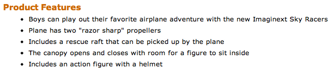
Missy C. noticed that the manufacturer’s product description listed on Amazon for one of the Fisher Price Imaginext Sky Racers took for granted that the toy was for boys, not, say, “kids”:

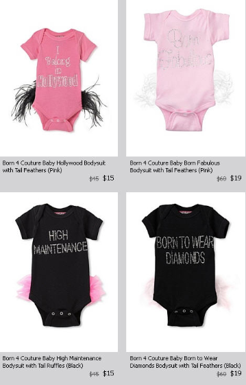
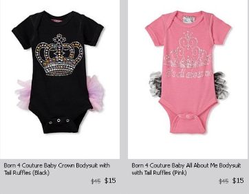
Monica C., meanwhile, noticed another example of the association of girls with a diva-ish princess center-of-attention persona when looking at onesies for sale at My Habit. Options included “born fabulous,” “high maintenance,” “born to wear diamonds,” and “it’s all about me,” among others:

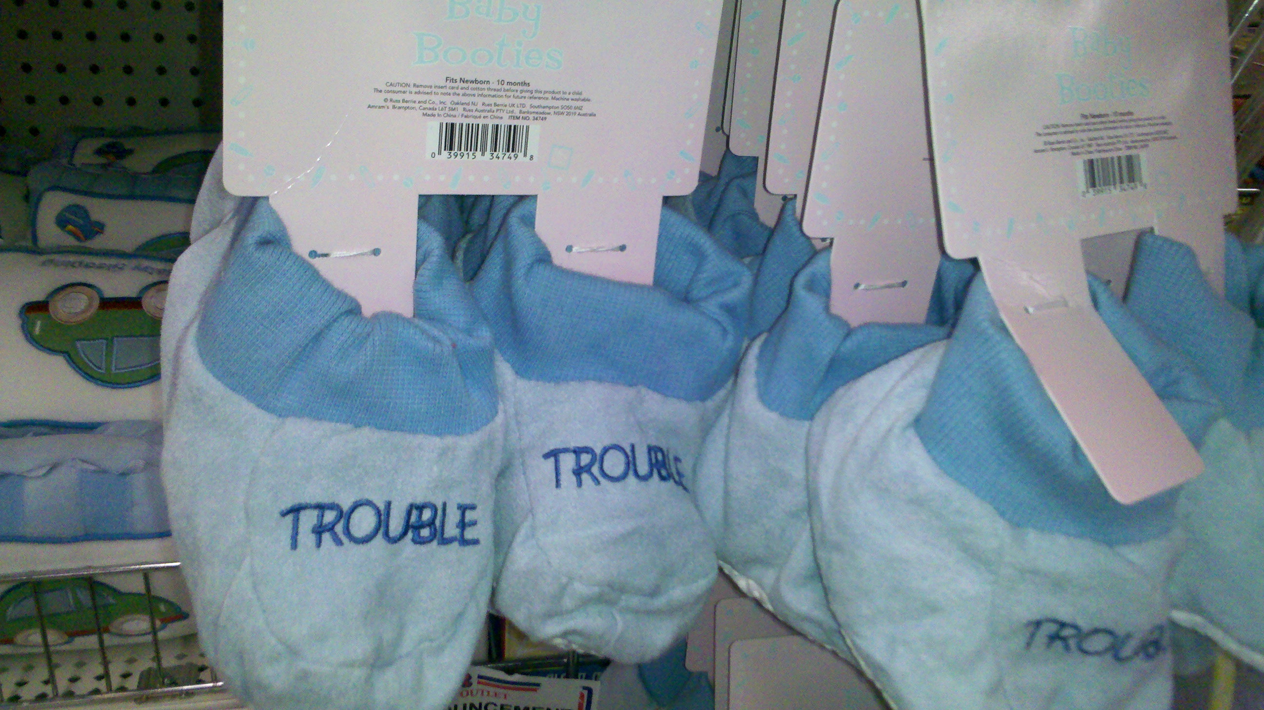
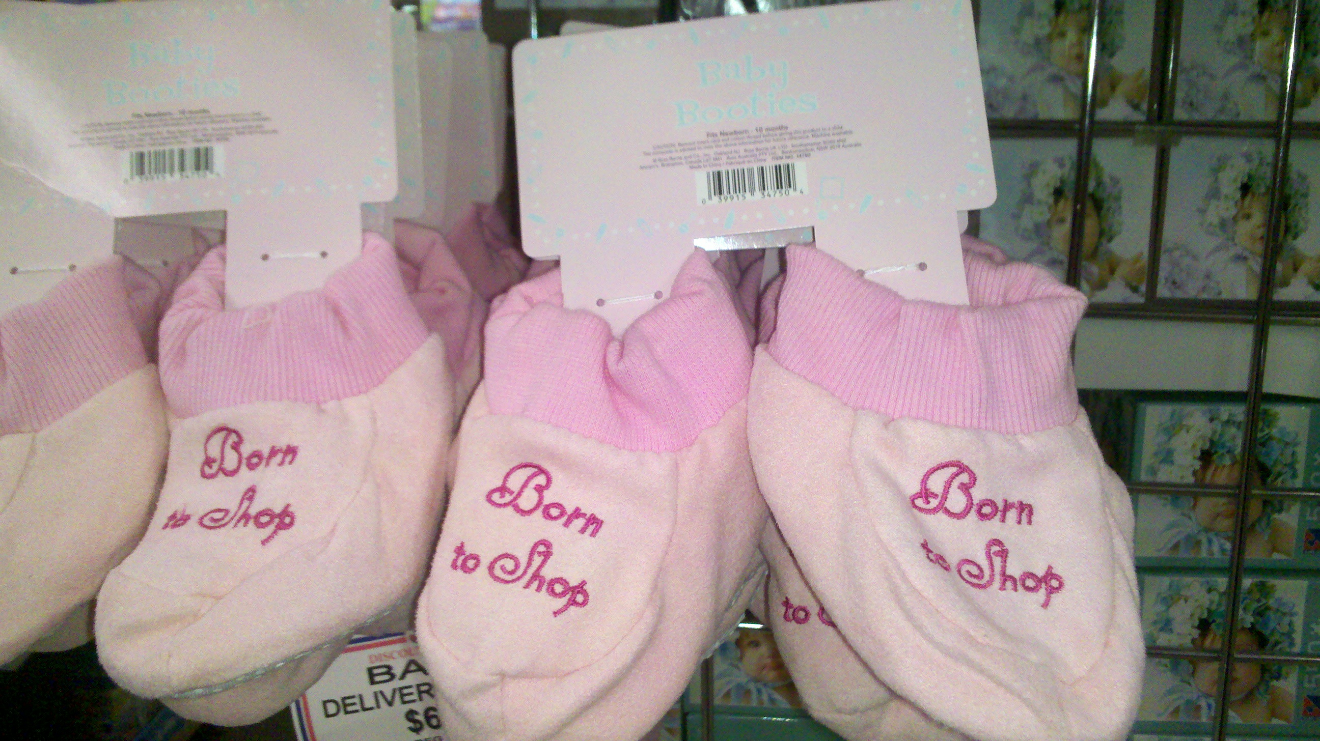
Similarly, Melanie J. saw some baby booties for sale at retail chain JR’s in North Carolina that reinforce the idea that boys are mischievous while girls are materialistic:

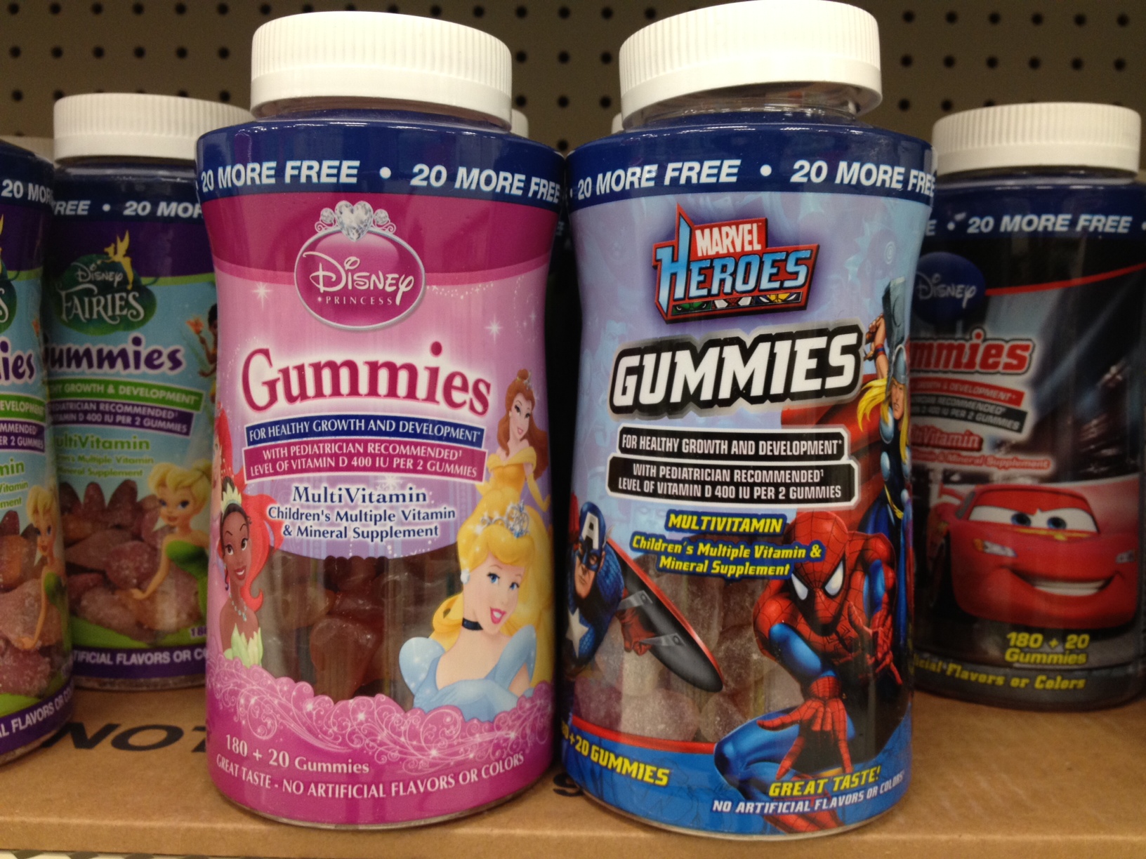
You can buy them gendered vitamins as well. Nathan, who writes at 1115, sent in this photo he took at Target:

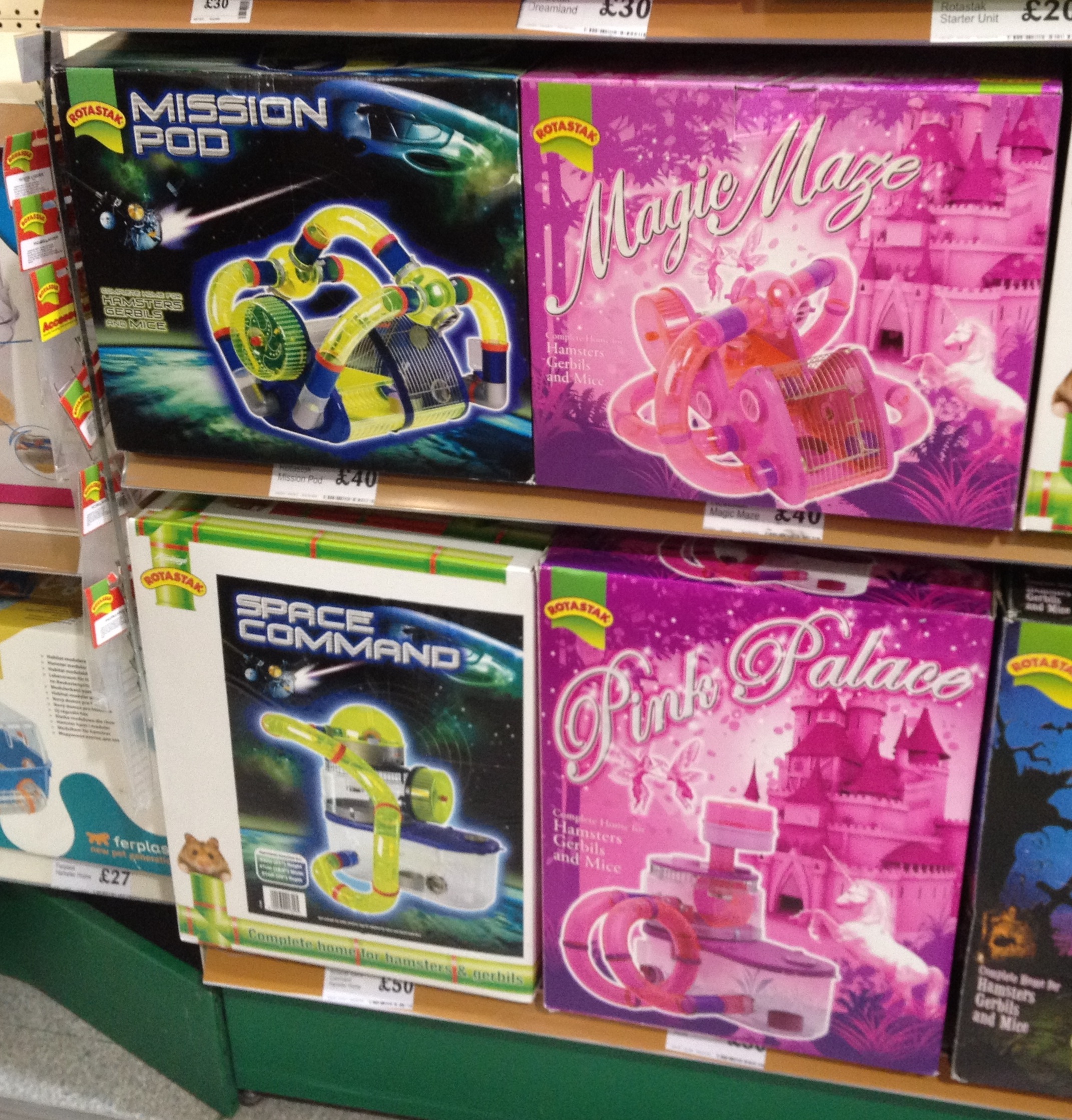
Pete & Emily in Norwich, UK, noticed that you can now allow your hamsters to inhabit gendered worlds too, if you’d like; they sent us this photo they took at a pet store:

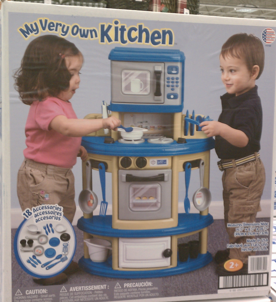
But we do have two counter-examples this time! Jackie H. took a photo of a kitchen set she saw for sale at Meijer, which shows both a boy and a girl using it:

And Isabeau P.S., Jesse W., and Anne Sofie B. all sent in images from the catalog for Swedish toy maker Leklust (two of the images were discussed at Mommyish):


Last week, the Census Bureau announced that as of July 1, 2011, for the first time the majority (50.4%) of babies under age 1 in the U.S. were not non-Hispanic Whites. Animal New York posted a video by Jay Smooth discussing the reactions to and implications of this news:

You can see the NYT article Jay Smooth parodies here, but note that the graph is mislabeled. The line labeled “White” actually only represents the data for non-Hispanic Whites, while the line labeled “Non-White” includes births to White Hispanics, so the terminology they used doesn’t accurately reflect what the graph illustrates.

The National Bureau of Economic Research recently released a paper by  Emin Dinlersoz and Jeremy Greenwood about unionization in the U.S.. They argue that economic shifts that changed the relative prevalence of different types of occupations partially explain decreasing union membership.

So what occupations are growing, and which are declining? Jordan Weissmann, at The Atlantic, adapted two graphs from the NBER paper that illustrate larger economic changes. Of the twenty fastest-declining occupations (in terms of % decrease), many are factory or industrial production jobs — machine operators of various types fare especially poorly (also, sorry, fellow sociologists):

The color of the graph indicates the level of unionization for each occupation; blue = less than 20%, green = 20-40%, red = over 40%. Nine of these occupations were over 40% unionized; their decline means the loss of many decently-paid jobs that provided benefits to employees without high levels of formal education.

So which occupations are growing, then? Take a look (though note this reflect % change, not overall # of employees):

Notice that top category: numerical control machine operators. Those words reflect a profound shift in manufacturing in the U.S. Numerical control machine operators program and operate computerized machinery, which requires a very different type of human operation than the classic assembly line machinery did — less input of physical labor and more technical management and troubleshooting.

Many of the other fastest-growing occupations require specialized, and often lengthy, higher education or licensing: health-diagnosing practitioners, teachers, scientists, physical therapists, and dentists, for instance. And unionization is consistently low in these types of occupations, contributing to overall declines in the prominence of unions in the U.S. over time.

NPR’s Planet Money blog posted this image showing changes in major categories of federal spending over the past 50 years. Notably, though defense spending (which includes veteran benefits) is still the largest category of federal spending, it’s a much smaller proportion of the total budget than it was in the ’60s; spending on interest on our debt has also fallen quite a bit since the ’80s. On the other hand, spending on Social Security, Medicare and Medicaid (which didn’t even exist in 1962), and safety net programs (including food stamps and unemployment) have grown. The somewhat reduced “everything else” category includes everything from education to space exploration to agriculture and more:

Via The Sociological Cinema; data available at the Office of Management and Budget.

Network effect is a concept from economics that explains situations in which something becomes more valuable as more people use it. The classic example is the telephone; as more people and businesses adopted telephones, they became more useful (you could call a larger number of people you might wish to contact). More usage increased the value of the product, both for existing users and potential users. Social media work much the same way — an issue Google has faced as they try to pull enough users into Google+ to make it competitive with Facebook.

Over the weekend Matthew Hurst posted a video at Data Mining that illustrates the network effect…with dancers using an open area at the Sasquatch music festival. The video starts out a little slow; one guy starts dancing in the field, and a second guy joins him. For about a minute, it’s just the two of them. At 0:54, a third dancer appears. Through all of this, the surrounding crowd mostly ignores them, showing no inclination to participate. But at 1:12, a couple more people arrive, following immediately by more, and suddenly we’ve reached a tipping point: that open area is now a highly desirable spot to dance. People start running in from all directions, and many who had been ignoring the dancers suddenly jump up and join. It’s a great illustration of instances in which use drives more and more use:

Many of you may have seen a video featuring Reverend William Barber speaking out against North Carolina’s Amendment One, which banned same-sex marriages (and which was approved by voters on Tuesday). The video is heartfelt and passionate, and is also a great example of the importance of how we frame issues in social movements.

Reverend Barber argues that media coverage of the amendment has asked the wrong questions. Whether same-sex couples should be allowed to get married isn’t the core issue here, he says; what’s really at stake is whether the majority should get to vote on which rights will be guaranteed to those in the minority, a decision he sees as a dangerous standard in a nation that has used it previously to exclude racial/ethnic minorities, women, and the poor from the full benefits and protections of citizenship. This reframes the amendment from an issue about same-sex marriages to a broader question about rights, equal protection, and the dangers of codifying inequality into our governing documents:

Yesterday Native Appropriations featured a presentation about Urban Outfitters, cultural appropriation in fashion, and the struggle to get the clothing chain to stop labeling clothing as “Navajo.” The presentation is great both for explaining this particular case — which included the Navajo nation sending a cease-and-desist letter demanding that Urban Outfitters stop using the term Navajo in its marketing — and also because it shows how one particular story spread through social media, which increasingly have the ability to bring mainstream media attention to stories that otherwise might have gone unnoticed.

Yesterday I stumbled upon a really great interactive graphic posted by the Guardian that summarizes the degree to which a number of rights and benefits are available to gays and lesbians in the U.S., by state. Each state is represented as a segment radiating out from the center of the circle; each colored ring represents a particular right, benefit, or protection:


  • Light blue = whether state has a law addressing discrimination or bullying in the school system
  • Purple = state-level hate-crime laws
  • Pink = protection against housing discrimination
  • Green = protection against employment discrimination
  • Blue = right to adopt (lighter shade indicates individuals are allowed; darker shade means gay and lesbian couples are allowed to jointly adopt)
  • Yellow = right to visit partner in the hospital
  • Red = marriage

The different shades indicate differences in the scope of coverage (say, full marriage rights vs. domestic partnership — and it has been updated to reflect yesterday’s passage of the bill outlawing same-sex marriage in North Carolina — or whether a law bans discrimination based on sexual orientation but not gender identity); the Guardian website explains each issue. Their post also allows you to hover over a state and get a more detailed summary. Here’s the info for Nevada, for instance:

The graphic also lets you scale states by population if you want to get a better sense of the proportion of the U.S. population living in areas that do or do not provide these protections.