Cross-posted at Family Inequality.
Things that make you say… “peer review”?
This is the time of year when I expect to read inflated or distorted claims about the benefits of marriage and religion from the National Marriage Project. So I was happy to see the new State of Our Unions report put out by W. Bradford Wilcox’s outfit. My first reading led to a few questions.
First: When they do the “Survey of Marital Generosity” — the privately funded, self-described nationally-representative sample of 18-46-year old Americans, which is the source of this and several other reports, none of them published in any peer-reviewed source I can find — do they introduce themselves to the respondents by saying, “Hello, I’m calling from the Survey of Marital Generosity, and I’d like to ask you a few questions about…” If this were the kind of thing subject to peer review, and I were a reviewer, I would wonder if the respondents were told the name of the survey.
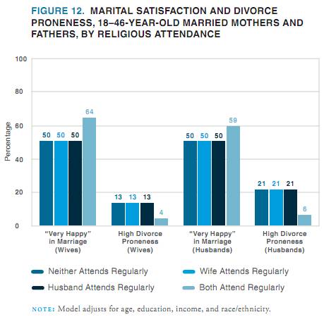
Second: When you see oddly repetitive numbers in a figure showing regression results, don’t you just wonder what’s going on?
Here’s what jumped out at me:
If a student came to my office with these results and said, “Wow, look at the big effect of joint religious practice on marital success,” I’d say, “Those numbers are probably wrong.” I can’t swear they didn’t get exactly the same values for everyone except those couples who both attend religious services regularly — 50 50 50, 13 13 13 , 50 50 50, 21 21 21 — in a regression that adjusts for age, education, income, and race/ethnicity, but that’s only because I don’t swear.*
Of course, the results are beside the point in this report, since the conclusions are so far from the data anyway. From this figure, for example, they conclude:
In all likelihood, the experience of sharing regular religious attendance — that is, of enjoying shared rituals that endow one’s marriage with transcendent significance and the support of a community of family and friends who take one’s marriage seriously— is a solidifying force for marriage in a world in which family life is increasingly fragile.
OK.
Anyway, whatever presumed error led to that figure seems to reoccur in the next one, at least for happiness:
Just to be clear with the grad student example, I wouldn’t assume the grad student was deliberately cooking the data to get a favorable result, because I like to assume the best about people. Also, people who cook data tend to produce a little more random-looking variation. Also, I would expect the student not to just publish the result online before anyone with a little more expertise had a look at it.
Evidence of a pattern of error is also found in this figure, which also shows predicted percentages that are “very happy,” when age, education, income and race/ethnicity are controlled.
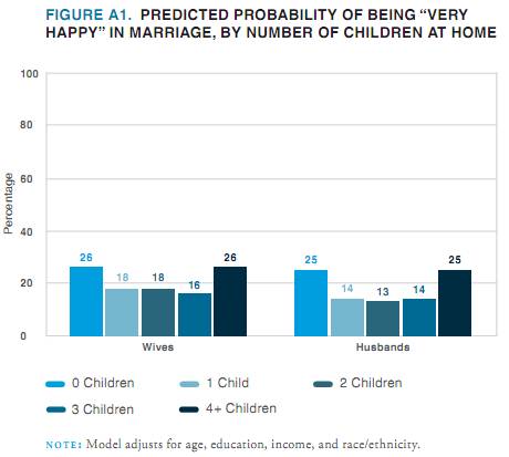 Their point here is that people with lots of kids are happy (which they reasonably suggest may result from a selection effect). But my concern is that the predicted percentages are all between 13% and 26%, while the figures above show percentages that are all between 50% and 76%.
So, in addition to the previous figures probably being wrong, I don’t think this one can be right unless they are wrong. (And I would include “mislabeled” under the heading “wrong,” since the thing is already published and trumpeted to the credulous media.)
Publishing apparently-shoddy work like this without peer review is worse when it happens to support your obvious political agenda. One is tempted to believe that if the error-prone research assistant had produced figures that didn’t conform to the script, someone higher up might have sent the tables back for some error checking. I don’t want to believe that, though, because I like to assume the best about people.
* Just kidding. I do swear.

