Lower_Manhattan_1999_New_York_City

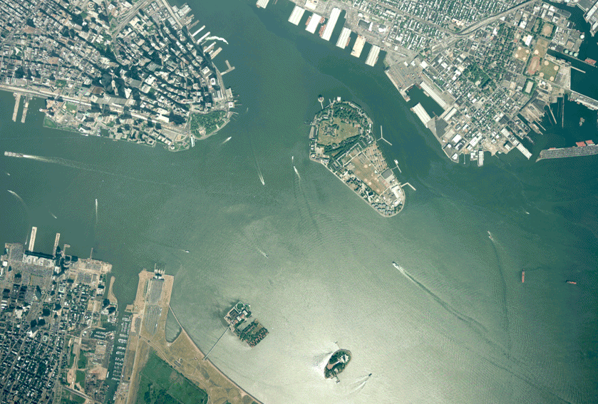
Is that? Oh my god. The Statue of Liberty, I said in my head, the words hanging in the whirring jet cabin on its descent to LaGuardia. The figure was so small, its features imperceptible and shrouded in shadow – a dark monolith amidst the gently churning Atlantic. The sudden apprehension of our altitude came with a pang of vertigo.

The plane yawed and a second shape swam into my oval window. Is that…  the Statue of Liberty? The original figure and its twin were, in fact, a pair of buoys in the bay. I leaned back in my seat and snickered to myself.

It goes without saying that in this instance my sense of scale, perspective and distance, let alone rudimentary geography, were fundamentally (if comically) off.

Finding one’s way in an unfamiliar city for the first time always involves an initial phase of bewilderment: the more familiar one is with their home terrain, the more alien the new place appears. Indeed, across my handful of excursions in and around Queens while attending #TtW16, this distortion pervaded my perception of space.

Queens being laid out in a grid of storefronts and residential apartments that rarely exceed four stories surely makes it one of the more approachable entry points for first-time visitors to New York. And even if it weren’t, with Google Maps, the problem of orienting oneself would seem to have been effectively solved. Spoiler: this is not so!

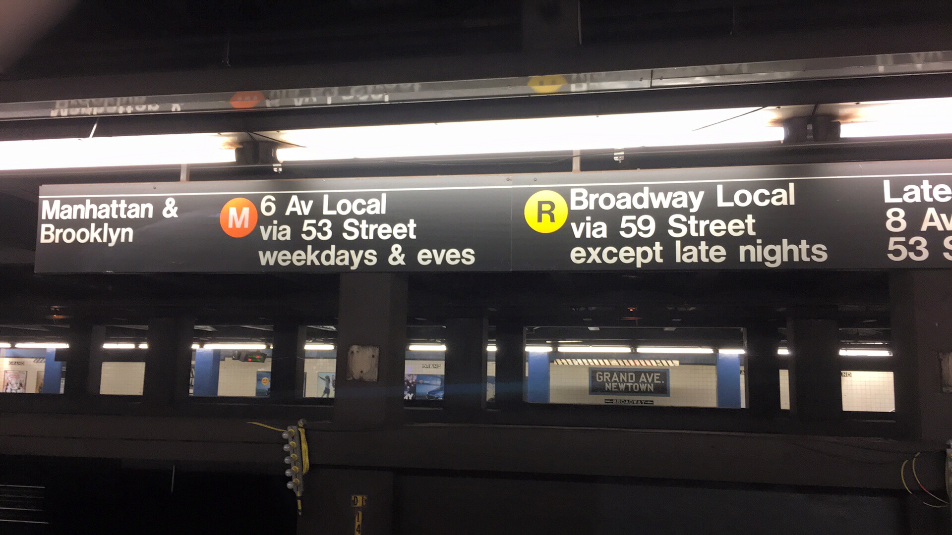
This visit marked my first time traveling outside the Midwest (and the first time leaving my hometown in years) and despite my access to interactive maps and world-class urban planning I still could not get my bearings. Nowhere was my confusion more pronounced than venturing into the subway system. Though my experience of being lost wasn’t limited exclusively to the underground passageways – on the first day, for instance, I couldn’t locate a coffee shop a mere 5 minutes walk from the airbnb – my time in the subways offers as an exceptional case of it.

While getting turned around on the subway, as I did a lot, was mildly disconcerting and at times annoying, I was never scared; losing track of where you are on the subway is essentially a local rite of passage. Still after going in circles around Queens for the second time, I put more faith in Google Maps, as well as a remote interlocutor living in New York: namely my father, who I hadn’t seen since childhood nor spoken with in over a decade.

Riding the subway, swaying as the car shuttered and sparked around me, my only real ‘fear’ was a fear of missing out – on sights and rendezvous. Nonetheless I jumped back and forth between erratically panning around Google Maps for reference points and checking Messenger for the latest directions from my dad. Each stop on the route brought a moment of relief as the internet returned with refreshed location data and new messages, followed by a scramble to process the new information before we started moving again and the connection evaporated back up into the cloud.

Image taken by Author

Reflecting on the experience of reading my father’s delayed messages alongside Google’s accurate but inscrutable maps, the absent-but-eager dad seems a useful metaphor for characterizing certain interactions with digital devices and services. This ‘dadness’ or paternalism as I see it isn’t the effect of any specific aesthetic choice(s) by the designers as it is a quality that permeates the more utilitarian aspects of smartphones and tools like maps (digital and otherwise). In other words, these tools by dent of their empirical aura, elicit and reinforce a trust in a remote, arbitrary, comforting and pacifying, if no less sought after authority. One that I and many others are quite willing to accept in uncertain situations.

Just as reading my dad’s directions began to take on an absurd metaphorical quality when I failed to apprehend them – I want to understand you but we just can’t seem to connect! – my inability to interpret Google’s subway maps and the various indicators on the subway itself I took, initially, as a personal (if minor) failing. Of course the issue wasn’t (solely) one of personal map reading or of navigation design. Taking the promise of an empirical source as given was inherently naive, though that fact was soon made obvious by my experience; indeed at points I even stuck with Google Maps intentionally just to prove to myself that it was.

Having no good reason to rely on this tool didn’t dissuade me from deferring to it like a novice hiker might refer to a knowingly defective compass: as a pure placebo. By treating the maps, signs, and even my father’s correspondence, as placebos, my mind was freed up to, among other things, disregard them as necessary or as I pleased, to disassociate myself from my trouble following them. Doing so also came in especially handy on the Sunday after TtW, the last day of my stay in New York.

The night before I’d left my bag at the bar and among its contents was my phone charger. I got my bag back from the bar when it opened after noon but my phone had already died. It was 1:30pm when it reached 40% full, but by this time I’d already accepted a meeting with my father might not happen. I was determined to see Manhattan before I left that evening, in no small part because having done so would mean I’d successfully traversed (one small sliver of) the subway. An imminently attainable goal, for sure.

Long story short, having tried out the other “placebos,” I recalled a SciFri interview with a pair of researchers, one of whom had gained notoriety for rendering New York’s subways as circles, breaking from the more literal representations of traditional designs. I opened the circle map for New York on my phone and in minutes I’d located myself and correctly predicted the next stop. It just clicked for me and the feeling was very satisfying. Anyway after a few stops I got off at 40th & Broadway. Coming up the stairs I noticed the buildings were taller right away and one had a video screen running its length. I turned left and there was the Statue of Liberty no lol, but it was Times Square! Half an hour of walking and short rides downtown, I even met up with my dad.

As affirming as having a better grasp of the subway was, to attribute that to the circle maps being that much more intuitive or to myself would be silly and too neat. Yes it was surely a combination of map UX, general acclimation to the subway’s interface, tips from a couple people I met on the subway, guidance from my father, not to mention the reassuring and warm welcome from everyone I’d hung out with at TtW! – but also some amount of dumb luck from trial-and-error and the “image of the city” that I was consciously and unconsciously forming in my mind.

None of which lessened my appreciation for the practical utility of orienting technologies like maps, if less as tools in my case then as placebos, without which it’s hard to imagine even getting “on-line” at all.

Nathan is on Twitter.

Headline Pic via: Source

 Front page of one of Columbia’s local papers the day after the resignations
Front page of one of Columbia’s local papers the day after the resignations

The story emerged for me two Thursdays ago, when a colleague at the University of Missouri, where I work, asked if I wanted to accompany her to find a march in support of Jonathan Butler, a graduate student on hunger strike with demands that president Tim Wolfe resign over his inaction towards racism on campus. We encountered the protest as it moved out of the bookstore and followed it into the Memorial Union, where many students eat lunch. This was the point at which I joined the march and stuck with it across campus, into Jesse Hall, and finally to Concerned Student 1950’s encampment on the quad where the march concluded. Since then I’ve been trying to read up on what led up to this march, sharing what I find as I go. This task became much easier after Wolfe’s announcement on Monday that he would resign, and the national media frenzy that followed. At first, however, learning about the march that I had participated in proved far more difficult than I expected.

Once a story becomes national, journalists collate the facts and package them into a consumable narrative. Prior to that, however, interested parties have to scour a complex and fragmented landscape to answer a deceptively simple question: what’s going on here? This is because “news” is no longer the exclusive purview of corporate media conglomerates, or even local ones, but moves – or transmediates – through an ecology of personal networks, digital platforms, and large and small media organizations.

Twitter’s curated Moments offer a convenient but shallow glimpse at the story

For example, local news coverage of the protests – and, save for the story earlier this year of Mizzou student body president Payton Head’s encounters with hate speech, it seemed all coverage was local or regional within my state – alluded to the incidents that contributed to the unfolding events, but didn’t provide an easy thread to follow. Butler and Concerned Student 1950’s list of demands were referenced in many local news stories, but not in their entirety and without links to the full list of demands. Social media was similarly fragmentary, but Jonathan Butler’s Twitter and Facebook accounts (where he reposted an open letter to the university administration and the list of demands) helped clarify some things. The difficulty of following a story when it is still largely local seems like a well known problem. It was a problem in Ferguson early on, and as a lifelong resident of Columbia observing and participating directly in the protests, the problem really hit home for me again this week.

An exhaustive timeline that could capture the details became a daunting task. In what follows, I recount the story as I encountered it, through local press, national media, from Jonathan Butler’s public correspondence on social media, and friends involved with Butler’s/Concerned Student 1950’s protests.

  • In September, Mizzou student body president, Payton Head, was accosted with racial slurs on campus. Head recalled the incident in a Facebook post, which eventually went viral and garnered national attention. I heard this story through my coworker friend who would eventually invite me to the march.
  • Weeks later, Concerned Student 1950, a group of students named after the year the first black student was admitted to MU, blocked UM System President Tim Wolfe’s car during the homecoming parade, in protest of MU’s inaction to address recent instances of racism (including Head’s) experienced on campus. I went to the parade to follow a march organized by local churches and the community group Race Matters advocating diversity and inclusion, but didn’t learn of Concerned Student 1950’s separate encounter with UM President Tim Wolfe until days later.
  • New UM Chancellor, R. Bowen Loftin, released a statement denouncing “incidents of bias and discrimination on and off campus.” This was followed by a campus wide announcement of the development of mandatory diversity and inclusion training. I and everyone else at the University received an email of the announcement.
  • Fast forward to the week before last, when my coworker friend mentioned that Jonathan Butler, a Mizzou graduate student, went on hunger strike in protest of UM System’s negligence to meaningfully address harassment targeting racial and religious minorities on campus, including but not limited to a swastika drawn in feces on a bathroom wall and racial slurs launched at the Legion of Black Collegians. Tim Wolfe’s silence at the homecoming parade was also noted.
  • On that Thursday (November 5th), Concerned Student 1950 held a demonstration in support of Butler’s hunger strike (then in its 4th day without an official response) protesting UM System’s insufficient response to the aforementioned acts of harassment and Tim Wolfe’s continued silence on the matter. The demonstration involved a march through campus, with stops at key administrative and symbolic centers.

The march left me with a lot of questions. Searching our local newspapers’ websites, most reports focused on Butler’s hunger strike, but only made passing reference to Concerned Student 1950’s list of demands (I found them eventually, in a PDF linked at the bottom of a story.) At this point I gave up searching news reports and looked up Jonathan Butler on Twitter. There he’d posted the list of demands and letter to UM President Wolfe, which promised  direct action if their demands weren’t met by October 28.

Butler’s Twitter and Facebook accounts became primary sources for Concerned Student 1950’s public communications. Through them I learned of more stories of harassment on campus, in-person slurs and anonymous slander from Yik Yak among them, and stumbled upon a link to an informative timeline at The Maneater, MU’s independent student press. The timeline mentioned additional contributing events, from the graduate student walkout following the University’s failure to meet their demands for permanent reinstatement of graduate health benefits; to MU’s discontinuation of refer and follow privileges and the ensuing Pink Out Day protest to reinstate them along with Planned Parenthood partnerships; Racism Lives Here rallies; and a sit-in at Jesse Hall.

At the beginning of my inquiry into this story, finding a smoking gun around the corner felt inevitable, but in the course of tracing the events, the more it appeared like death by a thousand unaddressed cuts. Local media’s and social media’s fragmentary qualities only exacerbated this impression, which was further complicated by the fact that much of the news broke first on personal social media accounts:

By the time Wolfe and Chancellor Loftin had resigned on Monday and Butler’s hunger strike came to an end, local, regional, national, and citizen media was descending, in its various corporeal-social media forms, upon Concerned Student 1950’s campsite at Mizzou. While the fact that individual reporters would eventually come to clash with the student activists being documented may not be surprising, understanding the dynamics propelling this documentation point to the heightened stakes of media representation and the contested ground they signify for radical social movements.

Screenshot of video capturing contested media participation (via: https://www.youtube.com/watch?v=xRlRAyulN4o)

In this twist in the story (‘twist’ in the sense of a recurring trope in protest documentation) that finds overzealous documenters rebuffed by protesters — and the free speech extremism that ensued is important not only as a tale of actual ethics in journalism (or the lack thereof), but also about the effects of the attentional economy and what it rewards and reinforces for the media(s) that indulge it. The drive to collate the facts of a story and package them into a familiar narrative imminently consumable by a mass audience has common and uncontroversial costs, e.g. simplifications, mischaracterizations, and outright lies. However, while there’s plenty to debunk in news reports, it’s arguably in the framing of coverage, within individual reports but especially in the kinds of stories media outlets choose to spotlight, that breeds the greatest misrepresentations. Whether such attention-oriented coverage ultimately raises public awareness of these incidents (and occasionally their underlying social/structural origins) that otherwise might have remained invisible to a national/international audience, the price of this visibility is more often than not a decontextualized view from nowhere.

Here the students’/faculty’s attempts to create space between themselves and the journalists documenting their activity could be understood, I argue, as the Movement trying to exercise a degree of control over the construction of its own narrative against readily shareable (viral) packaging. The implications of this struggle for narrative control might also be instructive for an alternative to the current national (oversimplified)/local (underdeveloped) media dichotomy. An alternative system that afforded members of a community or a specific movement the ability to package their narrative for consumption by outsiders (who may still be locals) would be a modest improvement. A more radical system, one that actively repelled or short circuited viral transmission by retaining the story’s necessary local context and details, could allow communities and movements to disperse their stories without sacrificing as much control of the narrative*, its local roots, and its recirculation by various media entities. What that looks like, though, deserves an essay of its own…stay tuned.

Nathan is invariably in medias res on Twitter.

* Perhaps part of the problem, as this essay argues, is in our tendency to impose a traditional, linear narrative onto phenomena witnessed in everyday life.

Image Credit: “Spinoza in a T-Shirt” – The New Inquiry

While listening to a techie podcast the other day, one of the hosts, who happens to be the designer of a popular podcast app, got into a discussion about his design approach. New features in a forthcoming version necessitated new customization settings, but introducing them was complicated by a paradox he affectionately dubs the “power user problem.” He describes the problem (at 26 minutes in) as this:

If you give people settings, they will use them. And then they will forget that they used them. And then the app will behave differently from the default because they changed settings and they forgot that they changed them. And then they will write in or complain on Twitter or complain in public that my app is not working properly because of a setting they changed.

For this reason, the designer defends his inclination to keep user customization to the minimum necessary.

Through iteration, user feedback, and intuition, the designer had arrived at what seemed to him a reasonable compromise between customization and simplicity. Yet, in accomplishing this goal, the design inadvertently leaves some users, even so called power users, out of the loop. (And, in fairness to the designer, he is hardly the first to make this point.)

That is, as a result of its pragmatic simplicity, the design precludes users who cannot navigate/tweak the system from enjoying the product’s full functionality. Therefore, this particular software fails to adhere to “inclusive design,” or design that attempts to resolve the counterposed aspects of technical functionality and accessibility for a physically, biographically, and experientially diverse user population.

Inclusive design has been a rallying cry for disability rights communities, and reads like a gold standard for widespread technological accessibility. However, a recent piece on design and embodiment pushes inclusive design and its proponents to think about what “inclusivity” looks like in practice.

Bodies that are farther from the standard body bear the weight of [environmental] forces more heavily than those that are closer to the arbitrary standard. But to resolve this design problem does not mean that we need a more-inclusive approach to design. The very idea of inclusion, of opening up and expanding the conceptual parameters of human bodies, depends for its logic and operation on the existence of parameters in the first place. In other words, a more inclusive approach to design remains fundamentally exclusive in its logic (emphasis added).

The article, a self-described manifesto for “designs that do not know what bodies aren’t,” presents a real challenge to the conventional wisdom of software design, which has – much like mass market clothing and architectural design – always assumed a default user, with customization options provided as-needed (if at all). On the flip side, allowing user configuration of every conceivable part of the interface would only exacerbate customer support and still doesn’t accommodate everyone (hence the power user problem). This is the central question of the manifesto: how can design trouble its own exclusionary boundaries without creating new ones?

Image Credit: “Spinoza in a T-Shirt” – The New Inquiry

The author identifies the jersey knit cotton T-shirt as one example of design that comes close to solving this problem. That is, the cotton T-shirt adapts to its user.

The jersey knit cotton T-shirt—a product found across the entire price point spectrum—is accessible and inhabitable by a great number of people. Jersey knit cotton is one of the cheaper fabrics, pliable to a broad range of bodies. Jersey knit cotton T-shirts really don’t know what a body isn’t—to this T-shirt, all bodies are T-shirt-able, all bodies can inhabit the space of a T-shirt, though how they inhabit it will be largely determined by the individual body.

This example raises the question: what would the software equivalent of the jersey knit cotton T-shirt look like? What qualities would constitute a software design approach that, as the article says, “create[s] built environments that are pliant, dynamic, modular, mobile?”

Before identifying software that adapts like a t-shirt to its user, looking at a couple examples of highly customizable (but ultimately insufficiently adaptable) software may be helpful to set the parameters.

Web browsers, even the simplest ones, allow considerable customization. Most browsers let you install extensions that augment the browser’s default functionality, whether it’s visual themes or ad blocking. But as useful as blocking annoying, battery draining ads is, for those less technically savvy who don’t install AdBlock, their attention and their data effectively subsidize their more technically savvy peers. Therefore, traditional web browser design (and, indeed, website design) assumes that, among other things, the user either knows how to customize their environment to meet their needs (through extensions, like AdBlock and similar resource managers) or that the user has a reliable, relatively fast data connection (or imminent access to power outlets).

Web browser extensions allow considerable customization, but for whom?

Email clients are another highly customizable technology, but like browsers, control over how one interacts with email depends heavily on one’s willingness and capacity to tinker. Many social media apps use email as their first contact and dumping ground for notifications: Facebook, for instance, has notifications for seemingly everything… there are, in fact, 61 different kinds of email notifications Facebook can send users, many of which are enabled by default. The user who lacks the technical know-how, time or patience to disable these notifications may be inundated with emails relative to the more technically savvy user. Not only do these more casual users pay Gmail/Google and Facebook more data and attention, but are often incessantly hounded by their phones, which by default notify them of every email they receive. The solution to user frustration, advocated by designers and their software, is for us to dig into the settings or to acquiesce to more surveillance and algorithms; even Google’s reconfigured tabbed inbox and its offshoot, Inbox, don’t obviate customization, but mandate customization as the default mode of interaction.

Enjoy customizing Facebook email notifications... all 61 of them, enabled by default
Enjoy customizing Facebook email notifications… all 61 of them, enabled by default

For a more timely example, following the horrific on-air slaying of two TV news anchors in Virginia last week, many people tracking the story on Twitter were exposed to the footage due to Twitter’s auto-playing videos. That videos on Twitter auto-play by default reflects what its design expects: that the viral videos users encounter are likely to be banal, that the user isn’t personally triggered by graphic content, and/ or that users know how to disable auto-play content via settings. Therefore, to misrepresent user requests for adequate warning and control over the nature of their exposure as self-coddling isn’t just wrong, it overlooks how conventional design/designers deprive users of making these decisions for themselves.

If these examples demonstrate what typical inclusive software design misses, Popcorn Time, the “Netflix of piracy,” provides a refreshing alternative, one that comes close to a truly adaptable design approach.

Image Credit: Wikipedia

To start with, Popcorn Time is open source, but unlike typical open source software that requires installation of external libraries or knowledge of the command line, Popcorn Time is as easy to install as a web browser; just download and go. The most popular version is less than 30 megabytes, installation requires a reasonable 114MB of disk space, and versions are available for every major desktop and mobile operating system.

A Netflix-like thumbnail gallery represents Popcorn Time’s central interface metaphor for browsing movies and TV shows. Content can be additionally sorted by metadata (popularity, year, rating) and filtered by genre via prominent, unambiguous menus. If the desired content isn’t featured in the main menu, built-in text search is conveniently accessible, fast, and accurate.

Popcorn Time’s intuitive interface offers a model for what open source design should aspire to


As intuitive as Popcorn Time’s interface may be, evaluated on this criteria alone, the program would be little more than an open source Netflix clone. What distinguishes Popcorn Time from other commercial video streaming services is its affordances for video distribution and playback.

That is, Popcorn Time facilitates streaming a la peer-to-peer torrents. Compared to centralized services like Netflix, p2p distribution offers several obvious advantages, namely service reliability and redundancy. If you’ve ever tried to stream something from Netflix on a weeknight, especially in a neighborhood served by one oversaturated node, you know what a frustrating experience it can be. Videos intermittently stutter and stop, frames drop, the stream oscillates between standard and high definition. You’re lucky if you finish what you started. Centralized distribution favors those areas and users with the best connection to the distributor’s servers and necessarily privileges those users with more reliable connections. Netflix therefore assumes a fast and reliable Internet connection. Popcorn Time does not.

Where high usage of centralized services like Netflix often degrades video streaming for users, Popcorn Time leverages peer-to-peer distribution, which improves the more users there are


Popcorn Time not only provides, in my admittedly anecdotal experience, a consistently more reliable streaming experience, but also allows one to queue up and download content for later playback. By allowing the user to decouple video playback from its transmission, Popcorn Time accommodates (if imperfectly[i]) a wide range of socio-technical contexts and users for whom streaming isn’t feasible.


Playback options – streaming or downloading – allows users to adapt Popcorn Time to their situation


Like a T-shirt, Popcorn Time requires no expert knowledge of how it works in order to try it out or use it successfully. Crucially, as a networked technology, Popcorn Time does not presume a basic level of technical knowledge or speed of connection[ii].  By enabling multiple modes of interaction – intuitive and reliable p2p streaming and also downloads for when streaming isn’t feasible – Popcorn Time allows the user to adapt it to them, rather than demand the user adapt to its standard.

That a handful of volunteer developers and designers have brought adaptable design to something as relatively complex as video torrenting suggests the failure of mainstream inclusive software has less to do with resources or compassion on the part of designers than, as indicated by “Spinoza in a T-Shirt,” with the misguided, if often well-intentioned goals embedded within inclusive design itself.

Rather than try to “fix” software designed to meet the demands of certain (power) users and shareholders, it might be more fruitful to reimagine software whose default user is not a composite of focus testers, the designers and their imagined user types, and demographic/usage data, but a potentiality of users willing to adapt software to their particular needs and desires.

Everyday encounters with software are characterized by degrees of banality, annoyance, frustration, and anxiety. As a recent essay on email, “the most reviled communication experience ever,” testifies:

Email is just as “everyday” as coffee pots and doorknobs, but most people don’t fantasize about throwing their espresso machine into a black hole or sawing the knobs off all their doors. Don [Norman, design expert and author of the classic handbook The Design of Everyday Things] has no love for email: ‘The problem is in trying to make email do everything when it’s not particularly good at anything,…’

As a utilitarian messaging protocol developed by “programmers trying to make their lives easier,” email in many ways epitomizes the insufficiency of customization as a substitute for adaptable design.

Instead of offering suggestions myself, I would like to open up this topic for discussion. Taking on the perspective of would-be designers, how might we redesign email or some other instance of everyday software design to afford true adaptability?

Nathan promises not to steal your software ideas, he just wants less email. @natetehgreat

[i] While Popcorn Time embodies adaptable design, it falls short in two ways. First, and this is a major omission, Popcorn Time affords no interaction by users who are blind. Secondly, to download, rather than stream, the user must have installed a separate torrent client of their choice. The program’s download button is also relatively small and nonobvious for those unfamiliar with magnet links. Alas, even Popcorn Time, for all it gets right, still presumes a particular user: sighted and somewhat technically savvy.

[ii] Xiao Mina’s informative paper, “Mapping the Sneakernet,” and her post, “Moving Beyond the Binary of Connectivity,” are the basis of this point.


At the end of a press conference in January, Microsoft announced HoloLens, its vision for the future of computing.

YouTube Preview Image


The device, which Microsoft classifies as an augmented reality (AR) headset, incorporates a compilation of sensors, surround speakers, and a transparent visor to project holograms onto the wearer’s environment, a sensory middle ground between Google Glass and virtual reality (VR) headsets like Oculus Rift. Augmented and virtual reality headsets, like most technology saddled with transforming our world, reframe our expectations in order to sell back to us our present as an aspirational, near-future fantasy. According to Microsoft’s teaser site, HoloLens “blends” the digital and “reality” by “pulling it out of a screen” and placing it “in our world” as “real 3D” holograms. Implicit in this narrative is that experience as mediated with digital screens has not already permeated reality, a possibility the tech industry casts perpetually into the future tense: “where our digital lives would seamlessly connect with real life.”

image credit: Microsoft teaser site

While technology remains in flux, the presence of a screen endures, even in devices like HoloLens that purport to supplant them. Yet in light of how mobile devices made their predecessors feel anachronistic, futurist speculation anticipates the next big thing that might displace (“disrupt”) screens. Majority opinion has long gravitated around the emergence of a holodeck or matrix, a virtual space indistinguishable from reality, with AR/VR headsets their forerunners. A less common but persuasive theory sees the key to the future in the materialization of data itself. Where pop evolutionary psychology seeks solace in a return to our ancestral roots, this futurism proposes an ostensibly postdigital paradigm, one fit to exploit the natural physiology humans evolved over the course of millennia and therefore unleash humanity’s full creative potential.

Of postdigital futurists, the most outspoken is arguably Bret Victor. Formerly a Human Interface Inventor at Apple and the lead designer of Al Gore’s Our Choice iPad app, Victor has executed designs and argued extensively for the “humane representation of thought,” a framework for digital design premised on “amplify[ing] human capabilities.”

Victor outlined his concerns with digital media in A Brief Rant on the Future of Interaction Design, an essay in response to Microsoft’s earlier future vision. The rant draws distinctions between the tactile qualities of material objects, such as hammers and paper books, and the flat interfaces of screens. Victor’s dissatisfaction with touchscreens is evident, but he ultimately refrained from making specific recommendations, instead gesturing toward the potential of experimental digital interfaces (including holograms) that might one day foster digital media with greater material sensibilities.

image credit: Victor’s presentation

In a 2013 talk, entitled “The Humane Representation of Thought: a trail map for the 21st century,” Victor expands on his earlier hypothesis. The talk opens with a brief summary of the history of knowledge work as Victor sees it, which helps illustrate his view of technology and its place in our lives:

We invented this lifestyle, this way of working, where to do knowledge work meant to sit at a desk and stare at your little tiny rectangle and make little motions with your hand. It started out as sitting at a desk, staring at papers or books, and making little motions with a pen and now it’s sitting at a desk, staring at a computer screen, making little motions on your keyboard. But it’s basically the same thing.

image credit: Victor’s presentation

The prevalence of screens, if not all 2D representations of knowledge, seems to stand as a bitter reminder for Victor of how, in spite of the technical and social churn happening around them, the norms of knowledge work as an exclusive occupation have remained mostly static. Following his gloss of knowledge work, Victor concludes:

And this is basically just an accident of history. This is just the way our media technology happened to evolve and then we kind of designed a way of knowledge work for that media that we happened to have.

 image credit: Victor’s presentation
image credit: Victor’s presentation

Over the course of his talk, dotted with diagrams and anecdotes inflected by evolutionary axioms, Victor makes the case for a kind of dynamic material, data-driven simulations made “tangible” with the inclusion of “real,” manipulable matter. With availability of this digital material (‘smart sand’ as Wired dubbed it), users could simulate data in a form that occupies physical space, one in which users could experiment and explore stimuli as humans did prior to the invention of computers, typewriters, textbooks, or even symbolic language.

dynamic
image credit: Victor’s presentation]


The suggestion that our present technology isn’t up to the task of mining the depths of human ingenuity is not merely convenient speculation for a profession whose industry depends on exponential device sales, it has become a self-justifying ideology pursued and evangelized for its own sake. As innocuous as this pursuit seems, its influence on designers at the upper echelons of dominant tech companies has real consequences for users. According to Victor himself, his guidance directly influenced the design of certain aspects of the iPad and the Apple Watch, products from a company that consistently sets the standard for the rest of the industry.

In deeming real technologies that more closely imitate material interaction, postdigital futurism too often falls prey to fetishism of the “real.” The advent of new technologies, from touchscreens to social media has arguably opened up new and varied ways and contexts in which to interact with the world. Emulating prior invention in design however doesn’t make the artifact more real. If anything, excessive imitation induces an uncanny valley that only gets more eerie the “better” it gets, a facsimile that invites the very social commentary that dismisses digital interaction as a distraction, an inferior substitute for “real life.”

Preceding the HoloLens demo at Microsoft’s event (at 1hr 57m in), the presenter informs the audience, like a magic show emcee: “you’re going to see through Loraine’s eyes. You’re going to see exactly what she’s seeing…”

image credit: Microsoft teaser site


As the audience observing the trick, we’re meant to take this statement as fact: we see onscreen what she is seeing. To do so however requires us to engage in the conceit that we experience reality more or less the same. Although our lives and experiences share broad commonalities, perception of realty varies based on those experiences, making them subjective and not readily interchangeable. To accept the presenter’s conceit is to indulge in the fantasy that digital technology levels the playing field, a utopian worldview which frequently dismisses differences in skill level, knowledge, and experience and insinuates that digital experience exists in a separate, virtual (“cyber”) space.

Postdigital futurism, like its virtual reality twin, acknowledges the influence of technological meditation on reality, but deflects responsibility for the nature of the mediation away from its designers. For as populist as a technology that dynamically responds to users seems, to label it as more natural, humane, real presumes (a) that designers know what’s best for users and (b) that the experience of one kind of interaction could be universalized. These presumptions not only rank experiences as more or less “real,” they echo the same knowing paternalism that just as often moralizes encroachments on agency, from Facebook’s manipulation of our sociality to the NSA’s mission of total surveillance chartered under the guise of “homeland security.” Just as we should ask, whose homeland, whose security?, we should ask, technological affordances for whom?. Just as we ought to avoid analysis that ranks ‘physical’ experience over its digital corollary, we should question rhetoric that prizes a particular kind of digital interaction over others.

While judgement of augmented and virtual reality headsets will have to wait until their release, if early reports are an indication, interacting with holograms is more conspicuous than tapping on screens. As the Verge’s preview notes, “It’s basically incredible to see these digital things in real space.” Mundane activities that we perform almost unconsciously through screens feel enchanted, otherworldly as holograms superimposed onto the environment. Although the promise and actual experience that these devices might afford deserves evaluation of its own, to insinuate that holograms or some other future ideal might yield a more “real,” “natural” or authentic experience than our already augmented reality resembles less prophecy than the apocryphal projections of their creators, magicians deceived by the allure of believing their own illusions.

As futurists try to extract digital artifacts from the screen, they downplay its existing relationship to humanity as one primarily between our fingers and the screen. If one of the promises of technology is its capacity to act as an extension of our bodies, turning it into matter would place it distinctly outside of the body. As envisioned, this hyper-real augmentation of reality would seemingly constrain the possible desires expressible through it to ones representable as objects. What this vision ignores is how thoroughly we are already entangled with digital technology, its logic burrowed into us, even in moments away from screens; to disentangle us from it and shackle it to material artifacts would not necessarily amplify human ability so much as constrict our complex relationship with and interactions mediated through technology, a quintessential element of being human.


Nathan Ferguson is a recent creative writing graduate who resides in a hologram called the Midwest. You can tweet him @natetehgreat, read his infrequently updated blog or browse his more frequently updated pinboard.