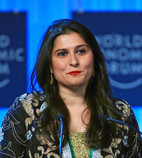
Tag Archives: nation: United States

Race and Politics in Appalachia

Cross-posted at Montclair SocioBlog.

In recent Democratic primaries in Appalachian states, Obama lost 40% of the vote.  The anti-Obama Democrats voted for candidates like “uncommitted” (Kentucky), an unknown lawyer (Arkansas), and a man who is incarcerated in Texas (West Virginia).

Could it be that there’s racism at work in Appalachia?  Or is the anti-Obama vote based entirely on opposition to his policies?

The 2008 Presidential election — Obama v. McCain — offers some hints.  For those with short memories, the Bush legacy — an unpopular war and an economic catastrophe — may have hurt the GOP.  In that election, the country went Democratic.  The Democrats did better than they had in 2004, the Republicans worse.  But not everywhere.  The Times provides this map:

Still, it’s possible that those voters in Appalachia preferred the policies of candidate Kerry to those of candidate Obama.  As Chris Cilizza says in in a Washington Post blog (here), the idea that race had anything to do with this shift is…

…almost entirely unprovable because it relies on assuming knowledge about voter motivations that — without being a mindreader — no one can know.

Cilizza quotes Cornell Belcher, the head of a polling firm with the Monkish name Brilliant Corners:

One man’s racial differences is another man’s cultural differences.

Right.  The folks in Appalachia preferred John Kerry’s culture.

I’m generally cautious about attributing mental characteristics to people based on a single bit of behavior.  But David Weigel, in Slate, goes back to the 2008 Democratic primaries – Obama versus Hillary Clinton.  A CNN exit poll asked voters if race was an important factor in their vote. In West Virginia and Kentucky, about 20% of the voters in the Democratic primary said yes.  Were those admittedly race-conscious voters more anti-Obama than other Democrats?

As Weigel points out, this was before Obama took office, before voters really knew what policies he would propose.  Besides, there wasn’t all that much difference in his policies and those of Hillary Clinton.

Cilizza is right that we can’t read voters’ minds.  But to argue that there was no racial motivation, you have to discount what the voters said and what they did.

The U.S.: #1 in Health Costs

Cross-posted at Montclair SocioBlog.

In case you wondered about what we in the U.S. pay for health care compared with those unfree unfortunates who suffer under various forms of socialized medicine, here are some graphs from 2009 showing the advantages of what is sometimes called “the best health care system in the world.”

The graphs are from the International Federation of Health Plans. I’ve selected only four — to show the relative costs* of

  • an office visit
  • a day in the hospital
  • a common procedure (childbirth without complications)
  • a widely used drug (Lipitor)

You can download all the charts here, but be warned: it gets boring. We’re number one in every chart, at least in this one category of how much we shell out.

Since we have the best health care in the world, this must mean that you get what you pay for. Our Lipitor must be four to ten times as good as the Lipitor that Canadians take.

Hat tip: Ezra Klein.

———————–

*These amounts are what providers are paid by governments or other insurers, not what the patient pays, which in many Eurpean countries is essentially nothing. See the footnotes for the tables in the original document. Or look at the comments on this at Boing Boing, a discussion which is remarkably civil (do they monitor comments?).

Vibrant Subcultures: Clown Egg Edition

Here’s a neat story that reminds us that beneath “mainstream” culture are rich, unique, and sometimes whimsical sub-cultures:

In 1946 a clown aficionado named Stan Bult began collecting the faces of clowns painted onto blown out chicken eggs.  It became a U.K. tradition and, because it is considered a great breach of etiquette to steal another clown’s face, the eggs served as  a sort of “registry.”  The tradition crossed the pond in 1979 when Leon “Buttons” McBryde began a collection in the U.S.   Linda, McBryde’s wife, paints the eggs herself (they use goose) and they’ve now collected over 700 unique clown faces.

Here are some examples from the British collection:

Clown Eggs via Learn Something Every Day.

—————————

Lisa Wade is a professor of sociology at Occidental College. You can follow her on Twitter and Facebook.

Cuban Kitchens After 50 Years of U.S. Trade Embargo

The presence of vintage cars on Cuban roads is one of the  most iconic consequences of the 50-year-old U.S. trade embargo on the communist country.  Cubans, however, have had to preserve many other types of items that Americans routinely replace, while making do with the gradual deterioration that comes with age.

Offering another peek into this life, Ellen Silverman has been photographing Cuban kitchens.  NPR describes how they capture, among other things, the “grand, but crumbling” architecture,” mismatched kitchenware, and vintage appliances:

See many more photographs by Ellen Silverman (of Cuban kitchens and more) at her webpage.

—————————

Lisa Wade is a professor of sociology at Occidental College. You can follow her on Twitter and Facebook.

Presidents Who Kill People are Popular

Cross-posted at OrgTheory.

David Henderson and Zachary Gouchenour have a paper on the topic of presidential ratings. The finding is simple. American war casualties, as a fraction of the population, positively correlate with how historians rate U.S. presidents. More death = better presidents. The regression model includes some controls, like economic growth. Here’s the chart:

This is consistent with sociological research on state building, which has traditionally linked wars, bureaucratic growth, and tax collection. See, for example, Charles Tilly’s classic work “Warmaking and Statemaking as Organized Crime.”  My one criticism of the paper is that there is no measure in the regression that controls for “big legislation” (i.e., New Deal). Historians like law passing and it might account for some variation. I have a hunch that is how variation on the right hand side of the figure would be explained.

Henderson and Gouchenour then spin out the policy implication. Greatness rankings by historians may prompt presidents to start more wars. The historians may have more blood on their hands than we care to admit.

Adverts: From Black Power/Grad Skool Rulz

—————————

Fabio Rojas is an Associate Professor of Sociology at Indiana University. He is the author of two books: From Black Power to Black Studies: How a Radical Social Movement Became an Academic Discipline and Grad Skool Rulz: Everything You Need to Know about Academia from Admissions to Tenure.  Rojas’ academic research addresses political sociology, organizational analysis, and computer simulations.

From Appearance to Identity: How Census Data Collection Changed Race in America

Cross-posted at Global Policy TV.

Publicizing the release of the 1940 U.S. Census data, LIFE magazine released photographs of Census enumerators collecting data from household members.  Yep, Census enumerators. For almost 200 years, the U.S. counted people and recorded information about them in person, by sending out a representative of the U.S. government to evaluate them directly.

By 1970, the government was collecting Census data by mail-in survey. The shift to a survey had dramatic effects on at least one Census category: race.

Before the shift, Census enumerators categorized people into racial groups based on their appearance.  They did not ask respondents how they characterized themselves.  Instead, they made a judgment call, drawing on explicit instructions given to the Census takers.

On a mail-in survey, however, the individual self-identified.  They got to tell the government what race they were instead of letting the government decide.  There were at least two striking shifts as a result of this change:

  • First, it resulted in a dramatic increase in the Native American population.  Between 1980 and 2000, the U.S. Native American population magically grew 110%.  People who had identified as American Indian had apparently been somewhat invisible to the government.
  • Second, to the chagrin of the Census Bureau, 80% of Puerto Ricans choose white (only 40% of them had been identified as white in the previous Census).  The government wanted to categorize Puerto Ricans as predominantly black, but the Puerto Rican population saw things differently.

I like this story.  Switching from enumerators to surveys meant literally shifting our definition of what race is from a matter of appearance to a matter of identity.  And it wasn’t a strategic or philosophical decision. Instead, the very demographics of the population underwent a fundamental unsettling because of the logistical difficulties in collecting information from a large number of people.  Nevertheless, this change would have a profound impact on who we think Americans are, what research about race finds, and how we think about race today.

See also the U.S. Census and the Social Construction of Race and Race and Censuses from Around the World. To look at the questionnaires and their instructions for any decade, visit the Minnesota Population Center.  Thanks to Philip Cohen for sending the link.

—————————

Lisa Wade is a professor of sociology at Occidental College. You can follow her on Twitter and Facebook.

Is the American Income Gap Exceptional?

Cross-posted at Montclair SocioBlog.

This graph tracks the share of income going to the top 1% in seven countries.  It’s from a paper by two Swedish economists, Jesper Roine and Daniel Waldenström (pdf).”’

The trend was towards greater equality up to 1980 — the share of the 1% was shrinking.    Since then, the 1% have increased their share of the income pie in all seven countries.  But the graph seems to show important differences, especially in recent decades.  Here is a  cropped version of the graph showing the 1980-2004 years.  I have added straight lines connecting those two points for Sweden and for the U.S.
Both changes are increases, but are they the same or are they different?  The answer is crucial.  The U.S. and Sweden have different economic policies.  If the changes are no different between countries, then inequality is just one of those inevitable things that’s happening no matter what governments do.  But if the growth of inequality in the US is much greater than in Sweden, maybe government policy can in fact mitigate the trend towards inequality.
The Swedish 1% share went from a little under 5% to about 7.5%.  In the U.S., the 1% share increased from about 7% to 16%.* You might see those increases as very similar.
In fact, Allan Meltzer in the Wall Street Journal takes precisely that view.  He stretches out the graph to de-emphasize the vertical differences, and adds a title implying that all countries are “together” in this shift of income to the top 1%.
He adds this explanation:
As the . . . chart . . . shows, the share of income for the top 1% in these seven countries generally follows the same trend line. That means domestic policy can’t be the principal reason for the current spread between high earners and others. Since the 1980s, that spread has increased in nearly all seven countries. The U.S. and Sweden, countries with very different systems of redistribution, along with the U.K. and Canada show the largest increase in the share of income for the top 1%. [emphasis added]
If your pay went from $5 an hour to $7.50 an hour while your co-worker’s went from $7 to $16, you might think that your co-worker had gotten a substantially heftier raise.  But if so, that’s because you’re not the Wall Street Journal.
Meltzer’s main point in the article is that we should not raise taxes on the very wealthy.  However, as Bruce Barlett points out (here), if the rich are getting just as rich in high-tax countries like Sweden and the Netherlands as they are in low-tax countries like the U.S., we may as well raise taxes on them. They’ll be doing just as well, like their Swedish and Dutch counterparts, and the nation will have more revenue to put towards Medicare, education, deficit-reduction, etc.But Meltzer is wrong.  Sweden and the Netherlands are very different from the U.S.  As the graph shows, the income share of the 1% in the U.S. is twice that of the 1% in Sweden and 3 times that of the 1% in the Netherlands.  And it has risen more rapidly.  Yet Meltzer claims that inequality trends are similar everywhere.

So who are you going to believe – the Wall Street Journal or your lying eyes?

The Unsustainable Recovery

Cross-posted at Reports from the Economic Front.

The Great Recession ended in June 2009, which means we have been in economic expansion for almost 3 years.  Lately the news has been filled with reports of positive economic trends, but how seriously should we take these reports?

One indicator worth looking at is median household income (the red line below).  Unfortunately its trend suggests little reason for cheer. In January 2012, median household income was $50,020.  That was 5.4% lower than it was in June 2009.  Even worse, as the chart below reveals, after a brief uptick it headed back down again.

untitled.jpg

It is true that employment is finally growing, a development reflected in the decline in the unemployment rate (the blue line above).  Unfortunately, this has done little to boost wages.  In fact, real wages actually fell in 2011.  The first chart below highlights the downward turn.  The second chart reveals just how far per capita earnings remain below historical trend.

us-real-wages_thumb.gif

real-wage-and-salary-disbursements-per-capita.jpg

This situation helps to explain why growth has been so anemic.  As the Wall Street Journal wrote:

Many economists in the past few weeks have again reduced their estimates of growth.  The economy by many estimates is on track to grow at an annual rate of less than 2% in the first three months of 2012.  The economy expanded just 1.7% last year.  And since the final months of 2009, when unemployment peaked, the economy has expanded at a pretty paltry 2.5% annual rate.

Without a dramatic change in median household income, growth will remain slow and even the limited employment gains we currently celebrate will likely prove impossible to sustain.  Given the current political climate, it is hard to see how this expansion will be either long lasting or bring meaningful improvements in majority living and working conditions.