discourse/language

Jo B. sent us a link to Icebreaker, a New Zealand clothing company. One of their products is wool underwear. As she pointed out, there are some distinct differences in how the men’s and women’s underwear lines are depicted.

The men’s line is called beast. When you go to the site, there’s a little intro part. The following phrase shows up on the banner at the top:

As Jo says,

The overall idea seems to be that men have some kind of innate, primordial aggression (thought I’m not sure how this is supposed to relate to woollen underwear).

Indeed, socialization “cages” men’s true nature, but just barely–its hold is “frail and fragile” and, I presume, could burst forth if you aren’t really careful. I don’t quite follow how the city “brings the beast alive,” or how reconnecting with nature “balances” the beast; since the beast is supposedly men’s real nature, I think reconnecting them with nature would bring out the beast, but whatever. I’m clearly applying too stringent a level of logic. Also, for the record, if all it takes to reconnect with nature is a natural material (made from a domesticated source), then cotton, angora, and mohair would work just as well.


The women’s line is called Nature. When you go to its site there’s also an intro, but without any useful summary of what women are like to compare to the Beast.

Again from Jo:

The female models are slim, delicate, and tend to pose in a way that suggests passivity (static poses, arms held behind body…) and instability (balancing on her toes).  The images in the female range focus more on being attractive, while the men’s range is about being active and aggressive.

The marketing campaign also reinforces the difference in the way we talk about men and women and their association with nature. When we connect men to nature, it’s in an aggressive, predatory sense (the beast). When women are associated with nature, it’s often in a way that implies harmony, an appreciation for the natural world, perhaps some intuitive sense that women have (or, you know, their connection to the moon and stuff because of menstrual cycles). The background is part of this; the grey background of the men’s line doesn’t look nearly as peaceful as the serene white background for the female models.

Thanks, Jo!

FYI:  Jo sent an email to the company complaining and this was their response:

Hi Josephine,

Apologies for the delayed reply. I am writing on behalf of Jeremy Moon to thank you for taking the time to give us your views about Icebreaker’s marketing of its underwear lines for men (Beast) and women (Nature). We understand your concerns, and we really appreciate the level of thought you have put into sharing them with us.

Gender representations are a sensitive issue in marketing, and Icebreaker certainly had no intention of promoting negative or damaging images of men or women in our Winter 08 campaign.

In most of our collections, our marketing approaches to men and women are almost identical. We aim to make Icebreaker garments as stylish as possible, but our clothes are based on performance above all – regardless of the gender of the wearer.

In our Bodyfit, Icebreaker_GT and Superfine collections, for example, women are photographed in exactly the same way as men – pushing their physical boundaries in the outdoors. Our marketing for the garments in these core collections centre on photographs of athletic-looking women skiing, hiking and climbing mountains. None of the images are of women in a passive or decorative role: they’re of women who are confident, independent, adventurous and strong.

We chose a different approach for our underwear ranges. For obvious reasons, we couldn’t adopt our usual approach of showing women taking part in outdoor sports – clearly they wouldn’t play sport in their underwear alone. The other factor we took into consideration is that Nature and Beast, although both underwear collections, are very different ranges.

Men tend to buy underwear for its practical benefits. Our aim was to position Beast as a premium range that has the same performance factors (such as breathability, a critical benefit for underwear) as Icebreaker’s outdoor clothing and yet is sufficiently stylish to be worn at work. Our marketing approach refers not to aggression, but to energy – the same energy (or performance benefits) that works equally well in both outdoor and urban environments. You’ll notice our marketing refers to “creative energy” and also the “harmoniousness” of nature.

The Nature range is our most feminine range by far, and much of our marketing focuses on the way it looks – its styles and its nature-inspired designs. Nature is made from the lightest, most luxurious grade of 100% pure merino, as we understand customers’ concerns against wearing traditional wool (rather than merino) against their skin, so our marketing talks about concepts like “100% pure”. While the photography for the rest of our collections is based around the outdoors, Nature images are designed to show off the styling and softness of the garments.

Our campaigns are designed to be edgy, and we’re very sorry if in this instance you feel our approach conveyed the wrong messages. Please be assured this was not our intention. Thank you for writing, and be assured we will bear your concerns in mind when planning future campaigns. I hope this email helps lesson your disappointment with our brand,

Regards
Alice

Gwen Sharp is an associate professor of sociology at Nevada State College. You can follow her on Twitter at @gwensharpnv.


MissCegenation (see her take over at Reciprocal Crap Exchange), Miguel E. (of El Forastero), Breck C. (also of Reciprocal Crap Exchange), Rachel N., Laura M.D., and Z. (of It’s the Thought that Counts) all sent in links to Burger King’s “Whopper Virgins” viral video campaign (we’ve never had so many people send in the same thing; clearly it touched a nerve):

There are several interesting things going on here. One is the exoticization of the “whopper virgins.” The taste tests were conducted in Thailand, Romania, and Greenland. We’re clearly supposed to find it charmingly cute that they’re unfamiliar with hamburgers. They don’t even know how to eat them! We get to see people taking their “first bite of a hamburger,” and wonder at their unfamiliarity with how to pick one up and eat it. This short video about the Thailand taste tests illustrates this with the dramatic voiceover about people who have “never even seen a burger. Who don’t even have a word for burger.”

There’s also a certain level of ethnocentrism here; note the comment that these are people who “really live outside of things.” That all depends on what you mean by “things,” which here seems to be defined by exposure to TV and hamburgers. The implicit understanding, of course, is that these are people who live in a backward, “traditional” culture, which is fascinating to outsiders but, ultimately, very bizarre. However, I am sure that if asked these people would feel they live “inside of” many things, just not the things considered important to this marketing team.

You might also use this to talk about the pervasiveness of advertising. As the video makes clear, they went to Thailand, Romania, and Greenland in hopes of finding people who hadn’t been exposed to Burger King or McDonald’s advertising, since it would be “impossible” to find such people in the U.S.

I also think the documentary element to the video is fascinating. I’m assuming the teams did travel to these areas, and the video claims they are all “real people,” not actors (who are, apparently, imaginary). But I have a suspicion that some elements were staged. Of course the taste-tests were staged, but I notice that almost everyone in the videos is wearing “traditional” clothing. I might be wrong, but it doesn’t strike me as the type of clothing people would wear every day–they seem like pretty fancy clothes that you’d wear for special occasions, but maybe I’m wrong. If anybody knows more about how people in these areas usually dress, let me know. Of course, it’s entirely possible that people dressed up in their fancier clothes entirely on their own because they wanted to look nice when being filmed. But I wonder if they were encouraged to dress in clothing that would make them seem more exotic, rather than showing up in a t-shirt (which is, by now, fairly universal, though I’m certain there are still groups who have not adopted t-shirts).

The second half of the video, where the Burger Team goes to villages in each country and makes them Whoppers, is also interesting in the way it portrays the team as philanthropists giving these communities a unique cultural experience. I mean, I guess they are, and I don’t want to fall into the trap of romanticizing “traditional” groups and implying that they should be shielded from “modern” innovations because it would ruin their culture. And it doesn’t seem like the marketing team is really trying to build brand loyalty, since it’s unlikely they’re going to be opening stores in any of these areas (although they do make sure to wrap the burgers in Burger King wrappers). It does, on the other hand, make the video seem more like a documentary and less obviously like a commercial, which adds to its effectiveness as a viral ad. I dunno. Maybe this is just an example of a corporation doing something nice, and I can’t get over my general distrust of marketers.

Another interesting angle you might bring up in discussion is the spread of fast-food culture and standardized, relatively cheap production processes in general, often referred to as “McDonaldization.” There’s also an entire book on the subject of McDonald’s in Asia, called Golden Arches East: McDonald’s in East Asia (edited by James L. Watson). I sometimes assign the chapter “McDonald’s in Hong Kong: Consumerism, Dietary Change, and the Rise of a Children’s Culture” in my intro classes to talk about cultural change; it’s fascinating how McDonald’s is to some degree undermining parental authority by appealing directly to children and empowering them to demand their favorite meals.

Laura sent us a link to a story about criticism of the campaign, found here.

And just an aside here: What’s the difference between a “village” and a “small town”? The word village seems to bring up certain assumptions about both quaintness and backwardness (and cultural isolation). I grew up in a town of slightly less than 300 people. Nobody ever called it a village. Is it a village if you don’t have paved roads, and a small town if you do? I’m just askin’.

Thanks to everybody who sent the video in!

The United States is highy individualistic.  Most advertisers appeal to our indivdual self-interest, as do politicians when trying to “sell” public policy.  The idea that we should do something for the greater good is not, somehow, as appealing an appeal.

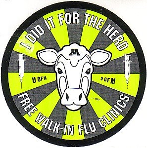
In light of this, it is interesting to see a counter-example.  Chris Uggen posted this image of a sticker he received after he got his flu shot from the University of Minnesota health clinic.


Most of the time we are encouraged to get a flu shot so that we, personally, do not get sick.  In this case, we are encouraged to get a flu shot for the good of the greater community.  This is a nice example of the way that a collectivist ideology can be used in place of an individualist ideology.

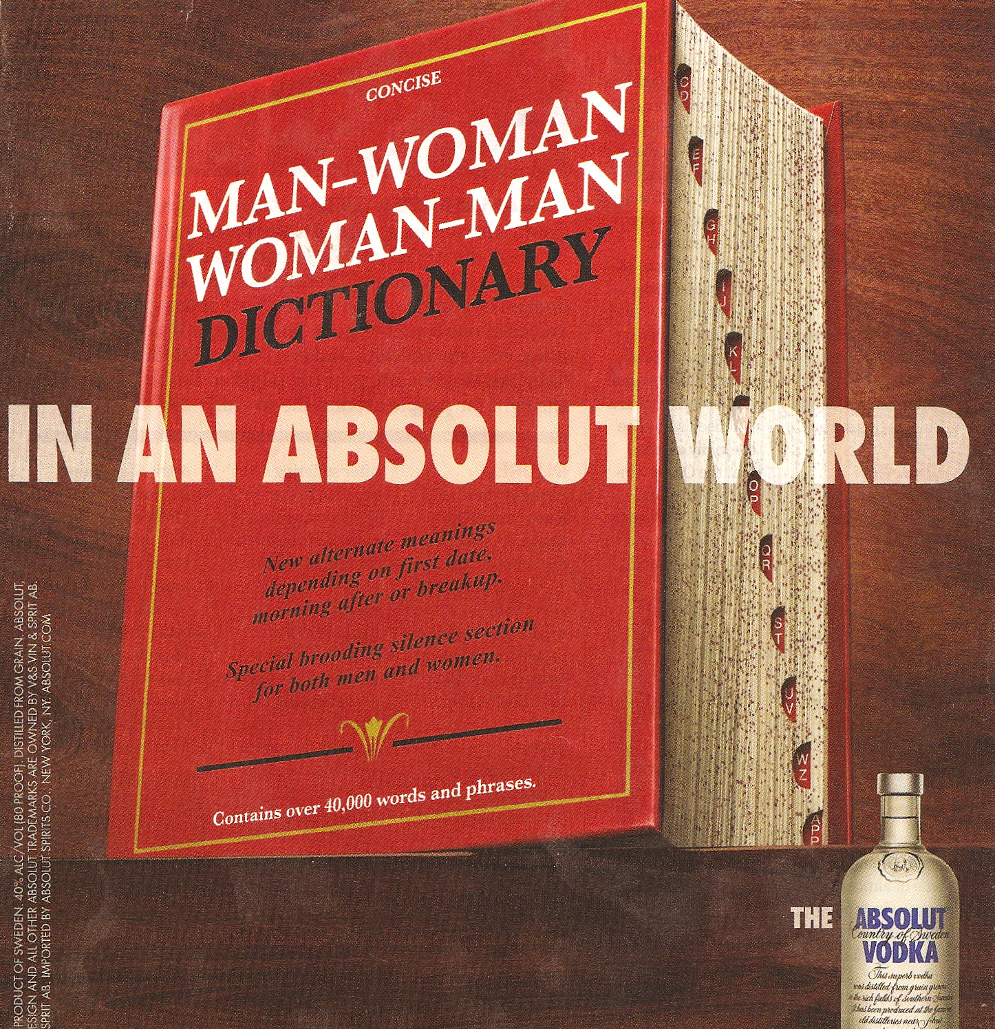
I found this Absolut Vodka ad in Entertainment Weekly:

It draws on that whole Men Are from Mars, Women Are from Venus ideology in which men and women are so different we can barely understand each other without expert help.

UPDATE: Commenter ihdl pointed out this German dictionary, titled Woman-German, German-Woman: Quick Help for the Clueless Man:

And Emberiza noted that a Man-German, German-Man is available as well:

Thanks for pointing them out!

Blanca and Stephanie brought this video, called “The Race Flag,” to my attention. In it, a referee penalizes African Americans who use “the race card” too eagerly (go here if the video doesn’t show up right):

See more funny videos at Funny or Die

It’s an interesting clip that plays on the idea of African Americans as over-sensitive, bitter whiners who see racial insult (or at least claim to) where none was intended. It might be useful for sparking a discussion about what we mean by “playing the race card.” For instance, what’s the difference between playing the race card…and pointing out actual incidents of discrimination? Obviously the difference, based on this video, is that playing the race card means the person is over-reacting and making ridiculous accusations. But “over-reacting” is a subjective term, and the idea of playing the race card assumes that there wasn’t any actual discrimination or prejudice. But most of the time we don’t have video cameras that can clearly catch everyone’s intentions and actions on tape for review. Concerns about playing the race card tend to ignore the very real fact that minorities often do face discrimination and prejudice (as well as backhanded compliments like “You’re so articulate!”) in the workplace. While I’m sure there are African American workers who make unwarranted accusations of racism (just as there are examples of almost any behavior you can think of), I’m also quite certain that there are employers and coworkers who engage in discriminatory actions but then deny any racist intent and accuse anyone who complains of playing the race card.

I’d also point out that Whites use the race card, too: I cannot tell you how many of my White students have told me that they did not get a job, into a particular college, etc., because they are White. Sometimes they say a manager/friend/etc. told them the company “had” to hire a minority “to meet quota.” Other times they’ve simply inferred, from the fact that they can see no other possible explanation for not getting said job/college acceptance letter/etc., that it must have been because they are White.

You might pair this with the chapter “‘Racing for Innocence’: Whiteness, Corporate Culture, and the Backlash against Affirmative Action,” by Jennifer L. Pierce, from White Out: The Continuing Significance of Racism (2003).

Apparently the same people who made that video made this one, which laughs at the idea of the Republican Party trying to woo African Americans (found here):

See more funny videos at Funny or Die

I’ll leave the commentary on that one to our readers, if they feel so inclined.

Thanks, Blanca and Stephanie!

Even in an era when children’s obesity is a significant problem (though a commenter points out that this is contested), the ever-upping of serving sizes at McDonald’s doesn’t appear to be skipping kids.  Stephen W. took this picture at a McDonald’s in Pennsylvania this week. 

Now McDonald’s doesn’t just offer Happy Meals, but Mighty Meals.  Mighty Meals include a double cheeseburger instead of a hamburger or cheeseburger or a 6-piece McNugget instead of a 4-piece. 

By the way, a Mighty Meal with a double cheeseburger has 780 calories.

And, really, what kid doesn’t want to be mighty?  McDonald’s will sink pretty low for a few extra pennies.

Thanks for the tip and the picture, Stephen!

I think this is a great example of discursive, and other, manipulation.  I’ll focus on the discursive.  This advertisement is for Dupont and it’s suggesting that Dupont is awesome because it engages in “open science.”  See if you can discern, from the ad, what exactly “open science” is:

[youtube]http://www.youtube.com/watch?v=KynnzHJS-K4[/youtube]

I certainly couldn’t.  It has something to do with scientists working together and Dupont tells us it’s responsible for some pretty great things.  But what is it?  And why do I feel so goddamn good about it?

Well part of the reason is certainly the pretty colors, lovely voice-over, and cartoon-y images… but it’s also the word “open.”  The word “open” is pretty much universally positive.  It’s like the word “choice” or “life.”  These are good words.  So if you label something with a word like that, it must be good, right?

Well, no.  Of course not.  It’s just labelling.  Most of you are probably vehemently pro-life or pro-choice and against the other, despite the fact that both labels have comforting words. 

Anyway, if anyone knows what “open science” is, I’d be glad to know!

Marc sent in a link to some sexist vintage ads found at Blog of Hilarity [note: I had an actual link to Blog of Hilarity, but commenter LillyB pointed out that when she clicked on it, she got warnings from her AntiVirus about the site; I just had the same thing happen, so I decided for safety’s sake to remove the link]. Some of them I’ll be adding to other posts, but I thought these deserved their own post.

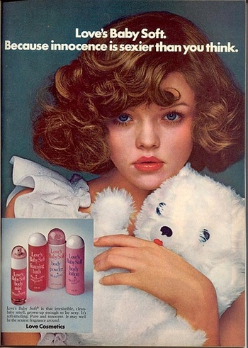
This one, for Love’s Baby Soft, is so creepy I can hardly stand to look at it:

The shape of the bottles, the sexualization of young girls…ick. A teddy bear? Really? The text below the bottles:

Love’s Baby Soft is that irresistible, clean-baby smell, grown-up enough to be sexy. It’s soft-smelling. Pure and innocent. It may well be the sexist fragrance around.

Notice it’s not grown up…it’s grown up enough. Jean Kilbourne uses this, or a similar Love’s Baby Soft, ad in her documentary Killing Us Softly 3 when she discusses how young girls are sexualized and adult women are encouraged to infantilize themselves.

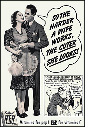
Here’s an ad for Kellogg’s PEP vitamins:

I know I always look super cute when I’m scrubbing the kitchen.

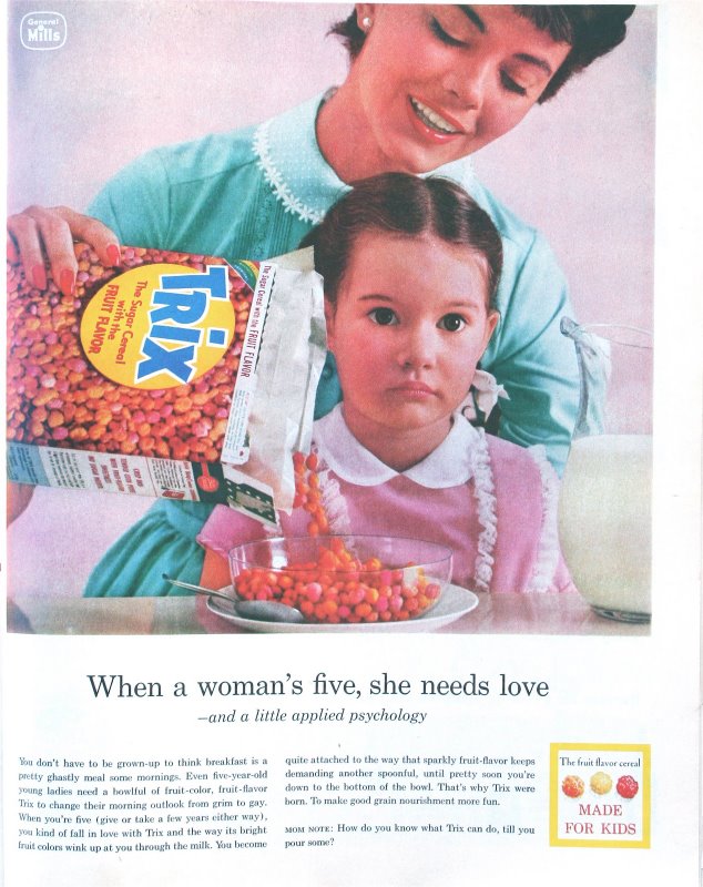
Finally, this Trix ad seems sort of creepy to me, and I’m not even sure why. Maybe it’s the way the girl is staring at the camera, or that her pupils seem fixed and dilated:

The text isn’t exceptionally interesting, but it does use the word “gay” in the original sense of “happy,” something a company would certainly not do today.

Thanks, Marc!