nation: Britain/the U.K.

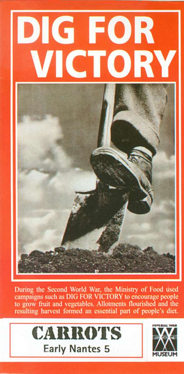
Food shortages during World War II required citizens and governments to get creative, changing the gastronomical landscape in surprising ways.   Many ingredients that the British were accustomed to were unavailable.  Enter the carrot.

According to my new favorite museum, the Carrot Museum, carrots were plentiful, but the English weren’t very familiar with the root.  Wrote the New York Times in 1942: “England has a goodly store of carrots. But carrots are not the staple items of the average English diet. The problem…is to sell the carrots to the English public.”

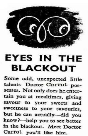
So the British government embarked on a propaganda campaign designed to increase dependence on carrots.  It linked carrot consumption to patriotism, disseminated recipes, and made bold claims about the carrot’s ability to improve your eyesight (useful considering they were often in blackout conditions).

Here’s a recipe for Carrot Fudge:

You will need:

  • 4 tablespoons of finely grated carrot
  • 1 gelatine leaf
  • orange essence or orange squash
  • a saucepan and a flat dish

Put the carrots in a pan and cook them gently in just enough water to keep them covered, for ten minutes. Add a little orange essence, or orange squash to flavour the carrot. Melt a leaf of gelatine and add it to the mixture. Cook the mixture again for a few minutes, stirring all the time. Spoon it into a flat dish and leave it to set in a cool place for several hours. When the “fudge” feels firm, cut it into chunks and get eating!

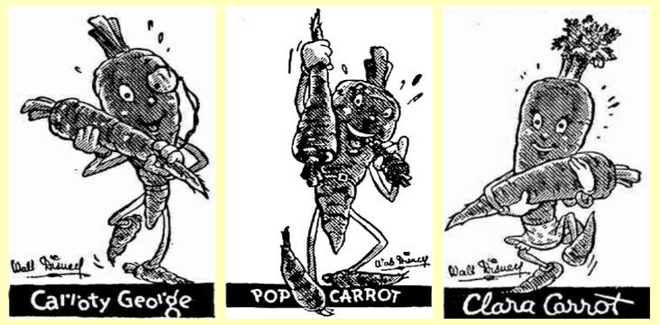
Disney created characters in an effort to help:

The government even used carrots as part of an effort to misinform their enemies:

…Britain’s Air Ministry spread the word that a diet of carrots helped pilots see Nazi bombers attacking at night. That was a lie intended to cover the real matter of what was underpinning the Royal Air Force’s successes: the latest, highly efficient on board,  Airborne Interception Radar, also known as AI.

When the Luftwaffe’s bombing assault switched to night raids after the unsuccessful daylight campaign, British Intelligence didn’t want the Germans to find out about the superior new technology helping protect the nation, so they created a rumour to afford a somewhat plausible-sounding explanation for the sudden increase in bombers being shot down… The Royal Air Force bragged that the great accuracy of British fighter pilots at night was a result of them being fed enormous quantities of carrots and the Germans bought it because their folk wisdom included the same myth.

But here’s the most fascinating part.

It turns out that, exactly because of the rationing, British people of all classes ate healthier.

…many poor people had been too poor to feed themselves properly, but with virtually no unemployment and the introduction of rationing, with its fixed prices, they ate better than in the past.

Meanwhile, among the better off, rationing reduced the intake of unhealthy foods.  There were very few sweets available and people ate more vegetables and fewer fatty foods.  As a result “…infant mortality declined and life expectancy increased.”

I love carrots. I’m eating them right now.

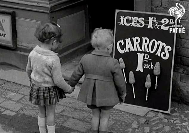
To close, here are some kids eating carrots on a stick:

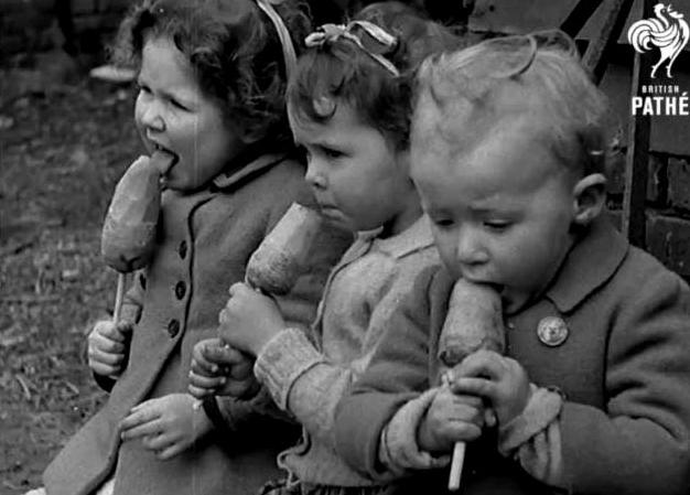
Via Retronaut.  For more on life during World War II, see our posts on staying off the phones and carpool propaganda (“When You Ride ALONE, You Ride With Hitler!”) and our coverage of life in Japanese Internment Camps, women in high-tech jobs, the demonization of prostitutes, and the German love/hate relationship with jazz.

Lisa Wade, PhD is an Associate Professor at Tulane University. She is the author of American Hookup, a book about college sexual culture; a textbook about gender; and a forthcoming introductory text: Terrible Magnificent Sociology. You can follow her on Twitter and Instagram.

Cross-posted at Reports from the Economic Front.

The Supreme Court has ruled favorably on the legality of the Affordable Care Act.  Actually, despite its name, the Act has more to do with extending and attempting to improve private health insurance coverage than it does with improving care or reducing its cost.

Unfortunately for us, the effort to improve our health care system has remained within bounds set by the needs of private health care providers and insurers.  As President Obama made clear from the start of his push for health care reform, there would be no consideration of a universal system.

Critics of such a universal system are always quick to argue that only market forces driven by the private pursuit of profit can ensure an efficient health care system.  Of course, in determining whether this is true, we need to recognize that efficiency is a complex term and that our health care system, like all systems, produces multiple outcomes.  The most obvious ones are private profit as well as the quality and cost of the relevant health care.

In terms of private profit there can be no doubt that our health care system functions well.  However, the story is quite different if we evaluate it in terms of quality and cost.  The fact that we continue to embrace a private health care system makes clear which measures of efficiency are considered most important and by whom.

The following map shows the countries, colored green, that have adopted a universal health care system.

mf-healthcaremap-p-thumb-615x314-91612.jpg

As Max Fisher explains:

What’s astonishing is how cleanly the green and grey separate the developed nations from the developing, almost categorically. Nearly the entire developed world is colored, from Europe to the Asian powerhouses to South America’s southern cone to the Anglophone states of Australia, New Zealand, and Canada. The only developed outliers are a few still-troubled Balkan states, the Soviet-style autocracy of Belarus, and the U.S. of A., the richest nation in the world.

The handful of developing countries that provide universal access to health care include oil-rich Saudi Arabia and Oman, Latin success story Costa Rica, Kyrgyzstan, and, famously, Cuba, among a few others. A number of countries have attempted universal health care but failed, such as South Africa, which maintains a notoriously inefficient and troubled public plan to complement the private plans popular among middle- and upper-class citizens…

That brings us to another way that America is a big outlier on health care. The grey countries on this map tend to spend significantly less per capita on health care than do the green countries — except for the U.S., where the government spends way more on health care per person than do most countries with free, universal health care. This is also true of health care costs as a share of national GDP — in other words, how much of a country’s money goes into health care.

The OECD just published a major study on the health care systems of its 34 member nations.  It found that:

 Health spending accounted for 17.6% of GDP in the United States in 2010, down slightly from 2009 (17.7%) and by far the highest share in the OECD, and a full eight percentage points higher than the OECD average of 9.5%. Following the United States were the Netherlands (at 12.0% of GDP), and France and Germany (both at 11.6% of GDP).

The United States spent 8,233 USD on health per capita in 2010, two-and-a-half times more than the OECD average of 3,268 USD (adjusted for purchasing power parity). Following the United States were Norway and Switzerland which spent over 5,250 USD per capita. Americans spent more than twice as much as relatively rich European countries such as France, Sweden and the United Kingdom.

combined1.jpg
What does all of this mean in terms of health outcomes?  According to the OECD report:

Most OECD countries have enjoyed large gains in life expectancy over the past decades. In the United States, life expectancy at birth increased by almost 9 years between 1960 and 2010, but this is less than the increase of over 15 years in Japan and over 11 years on average in OECD countries. As a result, while life expectancy in the United States used to be 1½ year above the OECD average in 1960, it is now, at 78.7 years in 2010, more than one year below the average of 79.8 years. Japan, Switzerland, Italy and Spain are the OECD countries with the highest life expectancy, exceeding 82 years.

One possible explanation for this lagging performance, highlighted in an earlier OECD report, is that the U.S. ranked 26th in terms of the number of practicing physicians relative to its population, 29th in terms of the number of doctor consultations per capita, 29th in terms of the number of hospital beds per capita, and 29th in terms of the average length of hospital stay.  At the same time, the “U.S. health system does do a lot of interventions… it has a lot of expensive diagnostic equipment, which it uses a lot. And it does a lot of elective surgery — the sort of activities where it is not always clear cut about whether a particular intervention is necessary or not.”

Private health care providers and insurers are clear about how they measure health care efficiency.  And as long as we rely on them to set the terms of the debate we will continue to suffer the consequences.

In a previous post I discussed how the U.S. became more religious in the 1950s, in part in response to its the Cold War enemies (atheist communists).  In fact, the U.S. is among the most religious countries in the world.  Using data from the International Social Survey Programme, Sociologist Tom Smith paints wildly different religious portraits of 28 nations (full text).

When asked whether they “know that God really exists and… have no doubt about it,” 61% of Americans say “yes.”  Of the 28 nations studied, only four were more likely to say “yes” to this question: Poland, Israel, Chile, and the Philippines. Here’s how we look compared to similar countries:

Here’s all 28 in rank order (borrowed from LiveScience).  Notice how wide the divergence is.  In Japan, the least religious country according to this measure, only 4% say they have no doubt God exists.  In The Philippines, 84% have no doubt.

% Have No Doubt God Exists:

  • Japan: 4.3 percent
  • East Germany: 7.8 percent
  • Sweden: 10.2
  • Czech Republic: 11.1
  • Denmark: 13.0
  • Norway: 14.8
  • France: 15.5
  • Great Britain: 16.8
  • The Netherlands: 21.2
  • Austria: 21.4
  • Latvia: 21.7
  • Hungary: 23.5
  • Slovenia: 23.6
  • Australia: 24.9
  • Switzerland: 25.0
  • New Zealand: 26.4
  • West Germany: 26.7
  • Russia: 30.5
  • Spain: 38.4
  • Slovakia: 39.2
  • Italy: 41.0
  • Ireland: 43.2
  • Northern Ireland: 45.6
  • Portugal: 50.9
  • Cyprus: 59.0
  • United States: 60.6
  • Poland: 62.0
  • Israel: 65.5
  • Chile: 79.4
  • The Philippines: 83.6

Americans are also particularly likely to believe in a “personal God,” one who is closely attentive to the lives of each and every person.

Quite interestingly, the U.S. is in the minority in that Americans tend to become increasingly religious as they age.  In most countries, people become less religious over time.  This graph (confusingly labeled), shows changes in DISbelief over the life course.  The U.S. is the only country among these in which disbelief declines:

Lifetime Change in Religiosity (from increase in disbelief to increase in belief):

  • The Netherlands: -14.0
  • Spain: -12.4
  • Australia: -12.0
  • France: -11.3
  • Norway: -11.0
  • Great Britain: -10.1
  • Switzerland: -8.2
  • Germany (East): -6.9
  • Denmark: -6.1
  • Czech Republic: -5.5
  • Sweden: -5.5
  • Germany (West): -5.4
  • New Zealand: -4.0
  • Italy: -2.7
  • Poland: -1.8
  • Japan: -1.5
  • Ireland: -0.9
  • Chile: +0.1
  • Cyprus: +0.2
  • Portugal: +0.6
  • The Philippines: +0.8
  • Hungary: +1.0
  • Northern Ireland: +1.0
  • United States: +1.4
  • Israel: +2.6
  • Slovakia: +5.6
  • Slovenia: +8.5
  • Latvia: +11.9
  • Russia: +16.0

Rates of atheism — a strong disbelief in God — also vary tremendously.  East Germany is the most atheist, with more than half of citizens claiming disbelief.  The country is a stark contrast to the atheist among them, Poland and the U.S. (only 3% atheist), Chile and Cyprus (2%), and The Phillipines (1%).

% Atheist:

  • East Germany: 52.1
  • Czech Republic: 39.9
  • France: 23.3
  • The Netherlands: 19.7
  • Sweden: 19.3
  • Latvia: 18.3
  • Great Britain: 18.0
  • Denmark: 17.9
  • Norway: 17.4
  • Australia: 15.9
  • Hungary: 15.2
  • Slovenia: 13.2
  • New Zealand: 12.6
  • Slovakia: 11.7
  • West Germany: 10.3
  • Spain: 9.7
  • Switzerland: 9.3
  • Austria: 9.2
  • Japan: 8.7
  • Russia: 6.8
  • Northern Ireland: 6.6
  • Israel: 6.0
  • Italy: 5.9
  • Portugal: 5.1
  • Ireland: 5.0
  • Poland: 3.3
  • United States: 3.0
  • Chile: 1.9
  • Cyprus: 1.9
  • The Philippines: 0.7

As a post-9/11 American watching another election cycle, I can’t help but notice how so much of our rhetoric revolves — sometimes overtly and sometimes not — around people who are the wrong religion.  Notably, Muslims.  And yet, the U.S. and many Muslim countries are alike in being strongly religious, at least in comparison to the many strongly secular countries.

This is odd because stands in contrast to recent data on American attitudes.  Within the U.S., people express much less tolerance for atheists than they do Muslims (homosexuals, African Americans, and immigrants). Weirdly, we think we have more in common with more secular nations like Great Britain than we do with countries like Pakistan or Saudi Arabia. In certain ways, the opposite might be true.

Thanks to Claude Fischer for the graphs.  Fischer, a sociologist at UC Berkeley, is the author of Made in America: A Social History of American Culture and Character.

Lisa Wade, PhD is an Associate Professor at Tulane University. She is the author of American Hookup, a book about college sexual culture; a textbook about gender; and a forthcoming introductory text: Terrible Magnificent Sociology. You can follow her on Twitter and Instagram.

Apple’s profits more than quintupled in the last five years, but their tax burden has risen much more slowly.  Last year, just 9.8% of their profits went to taxes.   “By comparison,” writes economist Marty Hart-Landsberg, “Wal-Mart was downright patriotic — paying a tax rate of 24 percent.”

How does the company do it?  Hart-Landsberg summarizes the New York Times: “The answer is tax loopholes and a number of subsidiaries in low tax places like Ireland, the Netherlands, Luxembourg and the British Virgin Islands. ”  More details at Reports from the Economic Front.

Lisa Wade, PhD is an Associate Professor at Tulane University. She is the author of American Hookup, a book about college sexual culture; a textbook about gender; and a forthcoming introductory text: Terrible Magnificent Sociology. You can follow her on Twitter and Instagram.

Florence Colgate recently won the title of Britain’s Most Beautiful Face.  The competition, which attracted more than 8,000 contestants, was sponsored by Lorraine Cosmetics.  The company compared each face to a mathematical algorithm representing beauty.  Florence, who is blonde and blue-eyes, came out on top:

[youtube]https://www.youtube.com/watch?v=YQjFFTezh5I[/youtube]

An example of the formula from the Daily Mail:

A woman’s face is said to be most attractive when the space between her pupils is just under half the width of her face from ear to ear. Florence scores a 44 per cent ratio. Experts also believe the relative distance between eyes and mouth should be just over a third of the measurement from hairline to chin. Florence’s ratio is 32.8 per cent.

So, it’s science, right?  Well, that plus (at least) a little bit of racism.  Carmen Lefèvre, a psychologist, was quoted explaining why Florence was so “classically” beautiful:

Florence has all the classic signs of beauty. She has large eyes, high cheekbones, full lips and a fair complexion. Symmetry appears to be a very important cue to attractiveness.

How did “fair complexion” get mixed up in there?

Not an isolated incident either.  Tom Megginson, of Work That Matters, reported on Britain’s Most Beautiful Face and added in another example of “objective” measures of beauty conflating light with pretty and dark with ugly.  This time it’s an app called Ugly Meter. You take a picture of your face and it tells you if you’re hot or not.  What Megginson noted was the overt colorism.  One attractiveness finding read:

For what it’s worth, he also scanned in some famous faces and found it to be, let’s just say, inexplicable and inconsistent:
Okay, well it might be right about Barbie. (Ha! I beat you to it, commentors!)

Ugly Meter, by the way, is offering a cash prize for the ugliest face.  So… the world is keepin’ it balanced, I guess.

Lisa Wade, PhD is an Associate Professor at Tulane University. She is the author of American Hookup, a book about college sexual culture; a textbook about gender; and a forthcoming introductory text: Terrible Magnificent Sociology. You can follow her on Twitter and Instagram.

Here’s a neat story that reminds us that beneath “mainstream” culture are rich, unique, and sometimes whimsical sub-cultures:

In 1946 a clown aficionado named Stan Bult began collecting the faces of clowns painted onto blown out chicken eggs.  It became a U.K. tradition and, because it is considered a great breach of etiquette to steal another clown’s face, the eggs served as  a sort of “registry.”  The tradition crossed the pond in 1979 when Leon “Buttons” McBryde began a collection in the U.S.   Linda, McBryde’s wife, paints the eggs herself (they use goose) and they’ve now collected over 700 unique clown faces.

Check out this example from the British collection.

Clown Eggs via Learn Something Every Day.

Lisa Wade, PhD is an Associate Professor at Tulane University. She is the author of American Hookup, a book about college sexual culture; a textbook about gender; and a forthcoming introductory text: Terrible Magnificent Sociology. You can follow her on Twitter and Instagram.

Urban Demographics posted some graphs from the UN’s State of the World’s Cities 2010/2011 report on global urbanization trends. A snapshot of urbanization in 11 countries:

You can see a few other notable trends here that illustrate various national trajectories, as Phil McDermott at Cities Matter points out. For instance, notice that while Russia underwent rapid urbanization between 1950 and 1980, it has leveled off since then. Similarly, Indonesia’s urbanization slowed significantly in the late ’90s and has continued at a much slower pace since then. We also see quite different patterns between the world’s two most populous nations: While China’s urbanization rate sped up in the early ’90s (after urbanization actually dipped in the ’70s), India has experienced fairly slow urbanization.

Credit Suisse released a report on urbanization and emerging markets, if you’re interested in the impacts of urbanization on a wide array of economic development indicators, from electricity and steel consumption to projections of future housing needs to incomes and standards of living.

Norton Sociology recently posted an image that illustrate differences in rates of imprisonment in a number of countries. Imprisonment rates are influenced by a number of factors — what is made illegal, how intense law enforcement efforts are, preference for prison time over other options, etc. The U.S. does not compare favorably, with 74.3 per 100,000 10,000 of our population behind bars (click here for a version you can zoom in on, and sorry for the earlier typo!):

Here’s a close-up of the breakdown of the U.S. prison population:

Via Urban Demographics.