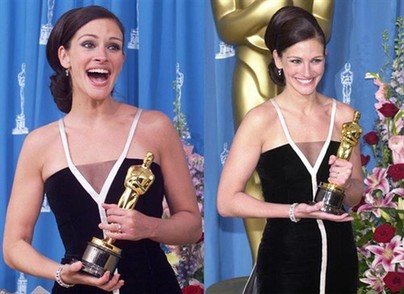
history

The caption to the photo said, “New York plastic surgeon Jacob Sarnoff drew this vision of total transformation–entitled ‘diagrammatic illustration of common deformities amenable to plastic surgery’–in 1936.”

I found this in Venus Envy: A History of Cosmetic Surgery, by Elizabeth Haiken (1997), page 13.


These two images were used in a 1927 ad for Wimbledon. Lisa actually sent them to me a couple of years ago but has never posted them, so I’m doing it. The point of showing the two images next to each other was to stress how liberated women were by 1927–they aren’t wearing stuffy old dresses to play tennis, and men aren’t shocked by the sight of a leg.

I use these, along with some of the “You’ve Come a Long Way, Baby” Virginia Slims ads, to show how “women’s liberation” is used by advertisers to sell products, as well as to imply that “now” (whenever “now” is) is always better than “then” (some indeterminate point in the past) and that the struggle for equality and freedom is over.

The 30-second (or so) videos below have been interspersed with MTV’s regular programming as part of Black History Month. MTV got Cornel West to be their superstar academic and expert on the Black American experience. The videos serve as the occasion for some interesting questions:

First, how do we evaluate the use of Black musicians, actors, and personalities by MTV? Is “representation” enough? Or does contemporary representation look uncomfortably like the representation of the past? (If you haven’t seen it, watch Spike Lee’s Bamboozled.)

Second, what does it mean that Cornel West signed on with MTV with what is, in effect, a mutual endorsement? Do we approve of Cornel West using his significant influence and importance in this way? Is this good from a reformist perspective? Problematic from a radical perspective? Did he “sell out”?

Third, how effective are these spots? I know little about the audience of MTV, but I imagine there are a lot of people who do not know who Cornel West is and are not inclined to offer him immediate respect. Cornel is idiosyncratic. Does your average MTV viewer see a gap-toothed, afro-wearing guy with odd mannerisms called “Professor” (which, we know, could mean anything) as authoritative? Or a buffoon?

Further, what do we think of the spots themselves? Is their content helpful? Do they teach us anything? Do we like what they teach us? Or is it just more empty lip-service to Black Americans?

Watch and tell us what you think:

[vimeo]https://vimeo.com/63979709[/vimeo]

[vimeo]https://vimeo.com/63979813[/vimeo]

Thanks to Richard for the heads up on this one.

Lisa Wade, PhD is an Associate Professor at Tulane University. She is the author of American Hookup, a book about college sexual culture; a textbook about gender; and a forthcoming introductory text: Terrible Magnificent Sociology. You can follow her on Twitter and Instagram.

Before ADD/ADHD, ritalin was prescribed to tired, overworked mothers. This 1967 ad claimed that ritalin could cure “Tired Mom Syndrome”:

Amazing!

Thanks to my friend, Jake L!

Text: “Back then, you didn’t look through your closet for something to wear. You wore your closet. You’ve come a long way, baby.”

Find your voice with Virginia Slims.

This is a Virginia Slims ad from 1978. The picture above is of a woman hanging laundry out to dry and the text says, “Back then, every man gave his wife at least one day a week out of the house. You’ve come a long way, baby.”
I’m using this when I talk about the commodification of the women’s movement and how freedom has been turned into something you buy. I also like the vague “back then,” used to make now seem so much better in every way.

The image below is the cover of a comic book designed to teach adults about birth control (it seems to have been published in 1956 and again in 1962). Find it all online here.

Found here via copyranter.

These photos are from a February 7th New York Times story in the Style section (p. E1 and E6) about changes in what male fashion models look like. This first picture shows some male models from the 1990s.

These three photos show the new ideal: very thin, lanky, and pasty.


This image illustrates what class inequality would look like if our level of income/wealth were reflected in our height (click to enlarge). Class inequality was first described this way by economist Jan Pen. The image was reproduced for an Atlantic article (view here). Even though the illustration is for 1971 and Britain, it would be useful, especially if we had evidence that income inequality is greater now than in 1971 and greater in the U.S. (or wherever you are) than in Britain (which I think is true… anyone?). An excerpt explaining the illustration is included below. (By the way, what first looked to me like a dark green blob behind the tallest guy is actually the foot of the next tallest guy.)

Excerpt:

Suppose that every person in the economy walks by, as if in a parade. Imagine that the parade takes exactly an hour to pass, and that the marchers are arranged in order of income, with the lowest incomes at the front and the highest at the back. Also imagine that the heights of the people in the parade are proportional to what they make: those earning the average income will be of average height, those earning twice the average income will be twice the average height, and so on. We spectators, let us imagine, are also of average height.

Pen then described what the observers would see. Not a series of people of steadily increasing height—that’s far too bland a picture. The observers would see something much stranger. They would see, mostly, a parade of dwarves, and then some unbelievable giants at the very end.

As the parade begins, Pen explained, the marchers cannot be seen at all. They are walking upside down, with their heads underground—owners of loss-making businesses, most likely. Very soon, upright marchers begin to pass by, but they are tiny. For five minutes or so, the observers are peering down at people just inches high—old people and youngsters, mainly; people without regular work, who make a little from odd jobs. Ten minutes in, the full-time labor force has arrived: to begin with, mainly unskilled manual and clerical workers, burger flippers, shop assistants, and the like, standing about waist-high to the observers. And at this point things start to get dull, because there are so very many of these very small people. The minutes pass, and pass, and they keep on coming.

By about halfway through the parade, Pen wrote, the observers might expect to be looking people in the eye—people of average height ought to be in the middle. But no, the marchers are still quite small, these experienced tradespeople, skilled industrial workers, trained office staff, and so on—not yet five feet tall, many of them. On and on they come.

It takes about forty-five minutes—the parade is drawing to a close—before the marchers are as tall as the observers. Heights are visibly rising by this point, but even now not very fast. In the final six minutes, however, when people with earnings in the top 10 percent begin to arrive, things get weird again. Heights begin to surge upward at a madly accelerating rate. Doctors, lawyers, and senior civil servants twenty feet tall speed by. Moments later, successful corporate executives, bankers, stock­brokers—peering down from fifty feet, 100 feet, 500 feet. In the last few seconds you glimpse pop stars, movie stars, the most successful entrepreneurs. You can see only up to their knees (this is Britain: it’s cloudy). And if you blink, you’ll miss them altogether. At the very end of the parade (it’s 1971, recall) is John Paul Getty, heir to the Getty Oil fortune. The sole of his shoe is hundreds of feet thick.