health/medicine

Hmmm… which Midol ad will you hate/love the most?

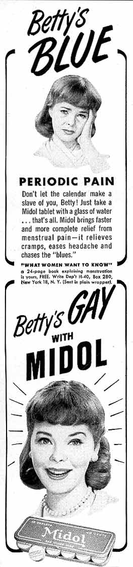
This one is from the 1960s (found here via Pam’s House Blend):

This one is from the 1990s (found at Feministing):

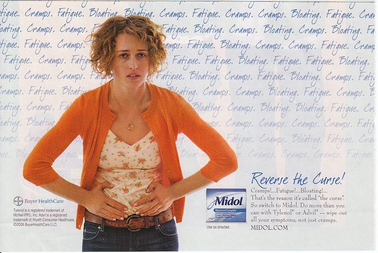
This is a brand new ad campaign from Midol (found at MultiCultClassics).  The text says “Reverse the Curse!”  The curse, of course, being women’s punishment for original sin. 

I found most these images at Photo Basement, but all were originally posted at The November Coalition’s Random History of Alcohol Prohibition page.

“Good for the engine, but not for the engineer. Good for commercial purposes, but not as a beverage.”

The white man’s burden isn’t infantile non-whites in need of oversight, it’s saloons.

Connecting drinking alcohol with nationalism and the downfall of America.

Again, being anti-alcohol is patriotic.

Do you love drink more than you love your children? Or America?

But we see many of the same themes in the anti-Prohibition campaign:

So now if you love your kids and want them (and, implicitly, America) to be secure, you’ll repeal Prohibition.

“Protect our youth. Stamp out Prohibition. Love our children.”

At first I wasn’t sure if this was pro- or anti-Prohibition (asking people to vote to repeal it, or to overturn the repeal). But according to this history of Prohibition, Democrats came out with a “wet” (anti-Prohibition) platform as a way of drawing “ethnic” (i.e., European immigrant) and working class votes. So the message here is that we need to protect our children (and wives?) from the hordes of gangsters and bootleggers who emerged because of Prohibition, and their way to do this is to vote Democratic.

Thanks for the tip, Miguel!

Gwen Sharp is an associate professor of sociology at Nevada State College. You can follow her on Twitter at @gwensharpnv.

Please welcome Guest Blogger Elizabeth Allen.  Elizabeth wrote about commercial for a gastric band (found via Shakesville), an alternative to gastric bypass surgery, on her own blog, Blog of Eternal Stench.  We liked it so much (and like so much of her other stuff, too), that we asked to reproduce it here on Sociological Images.  Enjoy!

This horrid TV commercial on the Realize Gastric Band site equates the controversial stomach reduction surgery known as gastric banding with happiness, success and fulfillment. It does so with dramatized examples of 1) a fat man playing with his karate-learning kidsy and 2) a fat woman slow-dancing with her [also fat] romantic partner. The fat man in 1) says, “I want to watch my little warrior do karate” or something very similar. The fat woman in 2) says, “I want to kiss him [romantic partner] under the Eiffel Tower.”

The commercial goes on to tell viewers how the Realize Band can help them get what they want. “Ask your doctor if bariatric surgery is right for you,” the voiceover encourages. The commercial concludes with how wonderful the Realize Band is, especially since you can track your success and have a support group. Incidentally, “tracking your success” is accompanied by a picture on a user’s computer screen of a line graph showing a steady trend downward. We also see an animated female morphing from fat to less fat.

This ad is offensive for so many reasons. Where do I start?

1. The fat man and fat woman who have exciting goals in life do NOT have to undergo bariatric surgery in order to achieve them. In fact, bariatric surgery has nothing to do with their goals, which are about the people they love. Being fat does not impede one’s ability to love, support and show affection for one’s loved ones. Being less fat is not necessary in order to truly prove one’s devotion to another person.

However, the commercial for the Realize Band obviously wants to encourage potential consumers that, if they really loved their families, they would undergo controversial, risky and damaging surgery. In this way, the Realize Band perpetuates the old chestnut that a person’s weight/physicality/shape/size represents a moral issue. According to this commercial’s subtext, being fat is a deep personal failing and horrible vice.

2. I object to ads for medical procedures that motivate the consumer to say, “I want this product. Doctor, give it to me!” While I’m all for being an aggressive, assertive, inquisitive consumer and searching out a range of treatment options for any condition, I do not think that people who suggest treatments they have seen on TV are truly being informed consumers. As I illustrate in point 1, TV ads such as this one for the Realize Band work in impressions, rather than information. Realize Band’s commercial here exploits feelings of guilt, inadequacy and shame to motivate people to use its product. Feelings of personal worthlessness stemming from emotional manipulation never make a good basis for choosing a particular medical treatment.

3. The concept of “tracking your success” gives the false impression that the Realize Band will have a wholly beneficial effect on one’s life, which could not be further from the truth. Gastric reduction or bypass surgery creates a host of health effects in those who have it.

–For example, since one’s stomach has been drastically reduced and/or routed around, one loses the ability to easily absorb nutrients and minerals. One can’t just take supplements to combat these deficiencies. Anemia may result from iron deficiency. You may need intravenous iron infusions for the rest of your life.

–One’s stomach often becomes much more sensitive to spicy, hard or dense foods. One may get bad heartburn or what the business likes to call “productive burping.” Actually, “productive burping” isn’t just about embarrassing noises emanating from your gut; it’s about throwing up. Gastric bypass or banding surgery increases the chances of the survivor throwing up a whole lot.

–If a survivor of gastric surgery throws up a lot, stomach acid flows frequently across the teeth. Like people with bulimia, survivors of gastric bypass or banding may suffer rapid degradation of their dental enamel. This is not the picture of an unqualified success.

4. While the Realize Band commercial shows a picture of “success,” i.e., steady weight loss, in the form of the downward trending line graph and the shrinking woman, the story is rarely this straightforward. Gastric bypass or banding surgery often results in an initial weight loss. However, very few people keep off all of the weight that they shed. In fact, they may slowly gain it back. For example, one study associates laparoscopic bands, like the Realize Band, with “inadequate weight loss” and “uncontrollable weight regain” in some patients. Another recent long-term study of people who have had gastric bypass surgery found that about half of participants regained weight within 2 years after their surgery. A study with a 10-year perspective on gastric-bypass survivors notes, “Significant weight gain occurs continuously in patients after reaching the nadir weight.” It is very rare for a person who has had gastric surgery to go from size 22 to size 12, which it looks like what is happening in the commercial’s illustration.

5. The fat man and the fat woman look perfectly happy as they are. Maybe if they stopped internalizing the medical community’s hatred of their shapes and realized that their size does not limit their capacity for humane, compassionate, joyful existence, they truly would reach their stated goals.

Myra M. F. sent us these four breast cancer awareness ads to compare and contrast (find them here).  They are all super pink-ified (because men don’t get breast cancer… oh wait, they do), but the first two use stereotypical femininity and the latter two challenge them.

(1)  Ah the lovely young middle-aged woman (I stand corrected), the ruffley white blouse, the slight head tilt, and the fashionable breast cancer scarf.  You too can look oh so good while you fight breast cancer!  Go Ford!

(2)  “Expose the Truth.”  Those awesome knockers on that gorgeous anonymous babe could someday be victims of breast cancer.  And we can’t have that!  Support breast cancer research!

Consider how different these next two are:

Here we see a woman who accepts some conventional definitions of femininity (make-up, pearls, earrings and, of course, pink), but rejects the idea that women should be ashamed to lose markers of femininity (“We can live without our hair.  We can live without our breasts.”) and instead looks bravely towards a cure (“We cannot live without our hope for a cure.”)  Plus, this image is about action (a race) instead of fashion (a scarf), suggesting that it is also a rejection of the idea that to be feminine is to be passive or powerless.

And this image actually mocks the symbolic ribbon and, I will add, bracelet activism (how feminine are ribbons and bracelets?), in favor of appropriating a masculine symbol (heavy machinery) by turning it pink and putting it to work against breast cancer.  The text at the bottom says: “Stop breast cancer!  It’s in our power!” 

Four ads, all with the same message, all mobilizing femininity, but in two very different ways. 

Thanks again to Myra!

The graph below, from the New York Times, challenges a stereotype about Asian-Americans and their choice of major in college.  The author writes:

The report found that contrary to stereotype, most of the bachelor’s degrees that Asian-Americans and Pacific Islanders received in 2003 were in business, management, social sciences or humanities, not in the STEM fields: science, technology, engineering or math.


The article also discusses the way in which the category “Asian-American/Pacific Islander” makes invisible the dramatic discrepancy between the educational attainments of Asians who’s families immigrated from different places.  For example, they write:

…while most of the nation’s Hmong and Cambodian adults have never finished high school, most Pakistanis and Indians have at least a bachelor’s degree.

The SAT scores of Asian-Americans, it said, like those of other Americans, tend to correlate with the income and educational level of their parents.

And, to a great degree, the success of a given Asian immigrant group in this society is correlated with the wealth of the nation from which they immigrated.


The relationship between clear skin and sexuality has an interesting history.  In an effort to establish dermatology as a medical subspeciality, aspiring dermatologists strategically linked, in the popular imagination, young women’s acne and lasciviousness.  Doctors argued that acne was a sign of sexual desire or God forbid, masturbation or worse.  Parents worried, then, that this would make their daughters unacceptable marriage partners (at a time when that was disasterous for women) and so would pay a great deal of money to doctors who would promise to cure their daughters of this scarlet dot.  Thus, dermatology was born.

Later, of course, acne became seen as a boy’s issue… But since we had different expectations for boys (in terms of both beauty and sexuality), acne was seen as a “stage” to be endured instead of a “problem” to be cured.  This is more or less like it was when I was a kid in the 1980s.

But today, of course, clear skin is linked to sexual attractiveness, especially for women (thanks, in part, to our friend evolutionary psychology).  And, with dermatologists at their beck and call, upper class teenagers (and adults) no longer have to endure bad skin. Thus, science, sex and skin care seem like natural bed fellows.  Consider this ad:

It’s a subtle threat: “Why not wake up in great skin.” Why would we care?  Who is laying next to you?  Does he know what you look like without make-up?  Without beer goggles?  Without make-up and beer goggles!? And what happens if he finds you disgusting in the bright light of morning?  (This, of course, is a very effective marketing tool because sexual attractiveness is linked to happiness. There is a price to pay for not finding a mate and, we are told over and over and over, that price is very high.)

I also see in the ad a perpetuation of the medicalization of sexual desirability (whether that be “purity” or “beauty”). The “3-step skin care” and “consultation” is a subtle medicalizing and scientizing of the make-up industry.  Lots of make-up companies use the notion of “science” to market their product (i.e., “Prescriptives”) and many of them link this with what is “natural” as well (i.e., Aveda).

Thanks to Jason for sending along the image!

The propaganda below, from World War II, was distributed by the U.S. government.  In the posters, venereal disease (later known as sexually transmitted disease, and even later as sexually transmitted infections) is personified as a woman. Remember, venereal disease is NOT a woman. It’s bacteria or virus that passes between women and men. Women do not give it to men. Women and men pass it to each other. When venereal disease is personified as a woman, it makes women the diseased, guilty party and men the vulnerable, innocent party.

In this ad, the soldier is made innocent with the label “The Young, The Brave, The Strong.” The first girl is labeled “prostitution.” She says to the soldier: “Two girls I know want to meet you in the worst way.” The two women on the stairs, with the faces of skeletons, are labelled “syphilis” and “gonnorhea.”

Text: “Warning: These enemies are still lurking around.” The women are labeled “syphillis” and “gonnorhea.”

This one is my favorite. A female skeleton in an evening gown walks with her arms around Hitler and Hirohito. The text reads: “V.D. Worst of the Three.”

Here are three more:

At least some of these can be found here. Thanks to the unbeatablekid pointing out a source in our comments.

NEW: Marc sent us a link to these images (all found here):

A matchbook:

A pamphlet distributed to soldiers:

Thanks, Marc!

These dolls have been available for purchase for at least 6 years (when I first found out about the website) and I’m surprised they haven’t made it on Soc Images yet!

I want to clarify that while these dolls are created for the use by the anti-choice movement, I’m not trying to make a pro-choice argument here. Rather, I think it is interesting to think about how fetal development is depicted (especially to children), and how these micropreemie dolls compare to medical depictions of fetal development. Not to mention that these are among some of the creepiest things I’ve ever seen.

According to the website:

Micropreemie models are life size portrait models of real micropreemie human babies.

[…]

All models are portraits of real babies. Models 6 weeks and 7 weeks are original one of a kind sculpts. They can have a hat and tiny blanket. They are fragile and not poseable. Models eight weeks and over have jointed bodies and come dressed or undressed. All are medically accurate in size and human development.  They have been checked for accuracy by Physcians, [sic] Neonatal Intensive Care Nurses, Dulas and the actual parents of the babies represented here. We recommend dressed models for use with children. Children are naturally drawn to these models.

The comparison pictures are from this website.

6 weeks gestation:

7 weeks gestation:

8 weeks gestation:

10 weeks gestation:

12 weeks gestation:

And some other random micropreemie images from the website:

8-18 weeks gestation:

In apples and cups:

And there is one non-white micropreemie on the website:

Size comparison with gummy bear and quarter:

Featured accessories: (yes, that is a micropreemie in a baby bottle. Yikes!)