gender: masculinity

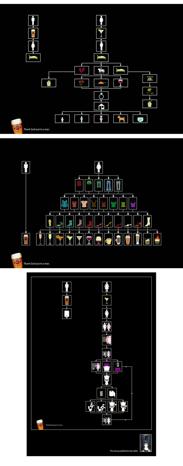
Christoph B. sent in these Goldstar Beer ads, found at BuzzFeed, that show the differences between men and women:

I know that I, for one, immediately start thinking about marriage every time I meet a guy. My new male neighbor waved at me the other day, and I ran out and bought a wedding dress, just in case.

The other thing here is the assumption that a) the viewer is definitely a man and b) of the two options, the “man’s” life is always preferable. I suppose in the second two ads that might be reasonable–although I never experience all that many problems using public restrooms, but whatever–but why is it automatically better to have sex with no emotional attachments or expectations of ever interacting again? I doubt that all men enjoy such encounters, any more than all women are thinking of marriage every time they have sex with someone.


Gwen Sharp is an associate professor of sociology at Nevada State College. You can follow her on Twitter at @gwensharpnv.

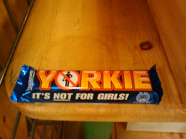
Both Cole S. and Toban B. found this Nestle’s candy bar (Cole saw it at World Market):


The Yorkie website was down (the error message said for routine maintenance) when I tried it, but Toban managed to snag some quotes from it earlier that indicate how the bar is being marketed to men. The bar is described as “a big, solid, chunky eat, uniquely for men,” and the site goes on:

Yorkie is positioning itself as a chocolate bar for men who need a satisfying hunger buster. With five solid chunks of chocolate, it’s a man sized eat…

[Earlier] advertising reflected this with macho imagery – lorry drivers who take it one chunk at a time…
Yorkie still holds these values today but was relaunched in 1994 as a hunger satisfying bar.

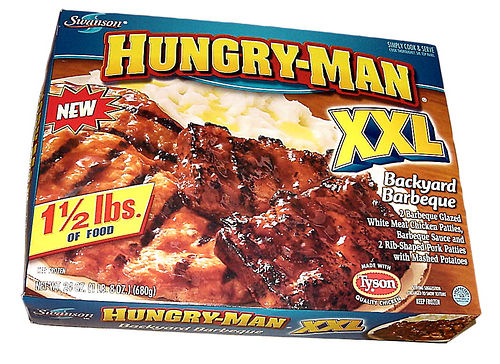
It’s similar to the way that Hungry Man frozen dinners are marketed: the association with working-class male appetites, which presumably require big, “solid” meals to satisfy them after their hard days of work. Clearly any candy bar this serious isn’t appropriate for women. Oh, excuse me…not a candy bar, a hunger-satisfying bar. Women eat chocolate for emotional reasons or to bask in the luxury of the taste; men eat chocolate just to fill their stomachs. Notice that the advertising doesn’t focus on the types of things we generally see in Dove or Hershey’s ads for chocolate bars: the chocolate being rich, smooth, delicious, etc., which imply that eating chocolate is an indulgence rather than just a practical way to satisfy your hunger.

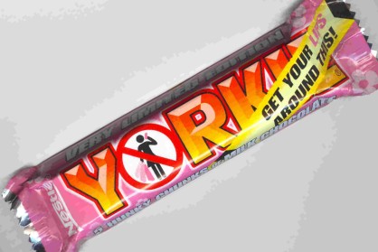
Also, in our comments Trevor pointed us to a conversation about a pink version of the Yorkie.  I am completely perplexed.  Along the top it says “VERY LIMITED EDITION.”  Along the bottom is says “5 HUNKY CHUNKS OF MILK CHOCOLATE.”  Along the top, diagnolly, it reads: “GET YOUR LIPS AROUND THIS!” 

So is it a girl version?  I can’t tell.  The female figure is still crossed-out with the “no” symbol.  I don’t know what pink thing she is holding.  I am perplexed.

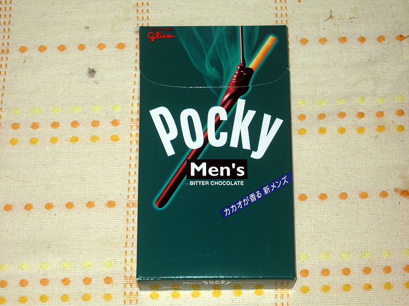
Also note, Men’s Pocky (thanks Lis Riba): 

Candy, like other high-sugar products, are often gendered female.  Perhaps that’s why this candy marketing is making such a big point of making candy manly?  Notice that the Men’s Pocky is “bitter,” i.e., not too sweet.  That seems to be happening a lot these days, as in the new Snickers and Twix marketing, see here, herehere, and here.

NEW! Keely W. sent in a commercial for Mars’ new candy bar aimed at women, Fling (found here).  The message: You shouldn’t (sexually) indulge a lot, but you can (sexually) indulge just a little… with the help of Mars Co., of course.


Bern K. and Megan P. sent us another example of androcentrism (see herehere, here, and here), one that is nicely combined with the representation of women as annoying naggers, and the social construction of diamonds as men’s best friend.  Bern writes:

It starts off with promise, showing that it’s ridiculous for a man to buy his wife a vacuum cleaner for their anniversary. It finishes, unfortunately, by suggesting that the only way to get out of the doghouse is to buy his wife diamonds.

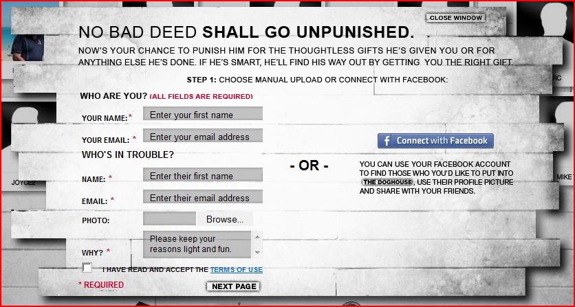
In the 5-minute commercial, men are punished by their wives for being insensitive or insulting by being sent to the “doghouse.”  In this five minute advertisement for JC Penney, men who have been sent to the doghouse are punished by being forced to do feminine tasks: fold laundry, eat quiche, and drink chai lattes.  There is some irony in that the main dude was sent to the doghouse for buying his wife a vacuum for their anniversary.  Apparently he wouldn’t want to be caught dead vacuuming… which is exactly why the gift might be considered insulting.  After all, when you give a woman a cleaning product for a gift, it means you think it’s HER JOB.

The video:

The website include the sound of a woman nagging and giving inconsistent orders (“speak less,” “talk more”).

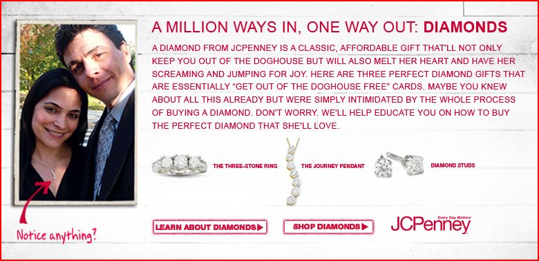
How to get out of the doghouse? Buy your wife diamonds (at JC Penney):

I like how it says that she’ll be “screaming and jumping for joy.”  Gah, women are so shallow and annoying.

There’s more!  The website is interactive.  You can actually put people in the doghouse.  If you are on Facebook, you can upload someone’s profile picture and have it show up on the website.  A fascinating new way to merge advertising and social networking sites.

NEW (Jan. ’10)!  JC Penney apparently thought this campaign was so delightful that they updated it. Joel P. sent us the link. It’s really quite obnoxious (for all the reasons discussed above):

[youtube]https://www.youtube.com/watch?v=_U45oxUyiMc[/youtube]

Jezebel also has a nice analysis.

Lisa Wade, PhD is an Associate Professor at Tulane University. She is the author of American Hookup, a book about college sexual culture; a textbook about gender; and a forthcoming introductory text: Terrible Magnificent Sociology. You can follow her on Twitter and Instagram.

No longer just for the lovely, Unilever’s “Fair and Lovely” is being marketed to men (see here and here for ads for “Fair and Lovely”).  The marketing is interesting on at least three levels:

(1) The ads exploits men’s insecurity about their appearance, just as they do for women.

(2) However, they masculinize the product with the “Fair and Handsome” name and, in the second commercial, by emphasizing the sporty-fighty-ness of the men using the product (see also our posts on make-up for menmasculinizing hair product, and selling hair dye to men).

(3) Though I don’t understand the language, the imagery of the arrows representing “Fair and Lovely” bouncing off of men’s skin seems to affirm the idea that men are inherently and biologically different from women… so much so that there would need to be a totally different product (kind of like the old “P.H. balanced for a woman” argument). Do correct me if I’m mistaken.

[youtube]http://www.youtube.com/watch?v=MgBevCTBTJw&feature=related[/youtube]

Via MultiCultClassics.

Lisa Wade, PhD is an Associate Professor at Tulane University. She is the author of American Hookup, a book about college sexual culture; a textbook about gender; and a forthcoming introductory text: Terrible Magnificent Sociology. You can follow her on Twitter and Instagram.

I use TV dinners to show my students that nearly everything, even things they’d never expect, are awash in race, gender, and class meaning.

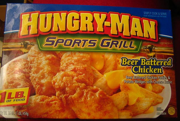
Hungry-Man is probably the most obviously meaning-laden of the TV dinners.  It is aimed directly at men, of course, with one and a half pounds of food, an excellent blue box, and a strong font in all capital letters.  But it also advertises a particularly working-class masculinity.  In these two boxes, notice the references to “backyard barbeque” and “sports” (XXL).  The food itself, barbeque chicken and pork, mashed potatoes, and beer battered chicken, reinforces this class message.  But this is also about race, as the working-class masculinity is implicitly white.

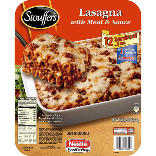
Stouffer’s, in contrast, is more moderate.  The font for the brand is cursive, for the meal in lower-case.  Without being over the top, it still passes as masculine.

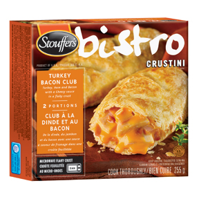
Stouffer’s bistro, in contrast, is a feminine version.  References to a “bistro” makes you think of France (a notoriously feminized country) and the meal here is a “crustini” (something a “real” man would never eat).

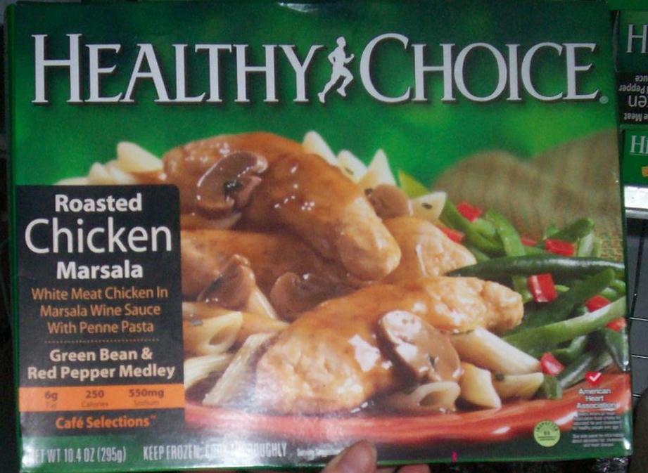
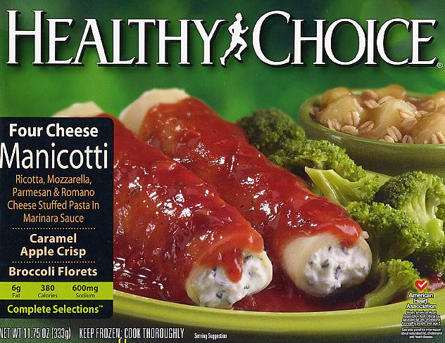
Healthy Choice seems to go further towards neutralizing its brand.  The green color is neutral and using the term “healthy,” instead of “diet” or a similar word, keeps the brand from being too feminine.  Plus, there’s a running MAN in the logo.  Still, there’s a feminine feel to the food choices.  The first meal is “Roasted Chicken Marsala… in Wine Sauce with Penne Pasta [and] Green Bean and Red Pepper Medley.”  The second includes “Caramel Apple Crisp” and “Broccoli Florets.”  Descriptions of truly manly food would not include “wine,” “medley,” “crisp,” or “florets.”

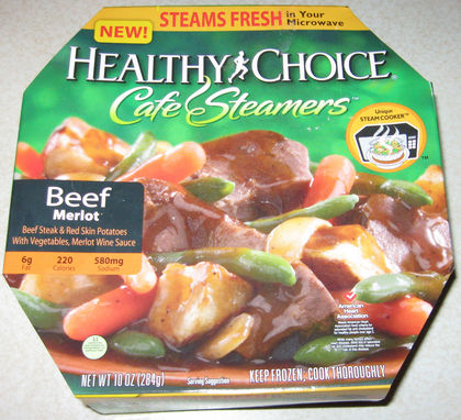
The Cafe Steamers sub-brand further feminizes Healthy Choice.  Notice the cursive font and the double reference to “merlot.”

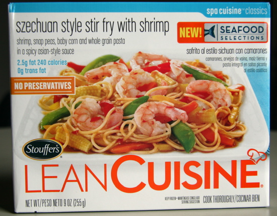
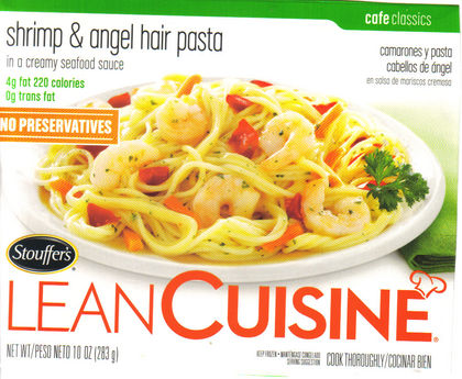
Lean Cuisine is the most feminized brand.  Between the turqoise and orange color scheme, the reference to slimness with the word “lean,” and the delicate all lower-case font on the boxes, the fact that the product is aimed at women is clear.  There is also a class message.  Who eats “Szechuan Style Stir Fry with Shrimp”?  Not the same guy that eats “Backyard Barbeque.”

Remember when FOX News first got all entertain-y and we were all horrified by how unprofessional it was and then, next thing we knew, even CNN was all entertain-y and it was the beginning of the end?

Well, apparently, like all news went the way of FOX, all men’s hygiene product companies are going the way of Axe. Consider this Edge commercial (and compare it to the first Axe commercial in this post):

Also, those cans are mighty phallic.


Camilla P. sent us this international sampler of Coke Zero ads. She says all of them that she found use the whole “zero” is manlier than “diet” strategy (see the first two below), except the one in Australia which links a sip of Coke Zero with orgasm (see the third video).

From Britain:

From Brazil (we’d love someone to translate, although we think we get the gist):

From Australia:

If you liked that, see this remarkable Orangina commercial.


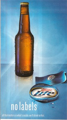
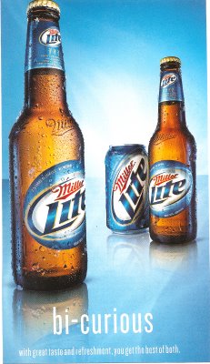
I found these two Miller Lite ads in QVegas, a magazine aimed at the GLBT community.

It would be interesting to pair with these ads for Skyy vodka to illustrate how companies make different ads to target different audiences. If you find an ad offensive or dumb, it’s not necessarily an ineffective ad, it’s that you probably aren’t the target consumer and it’s not supposed to appeal to you.

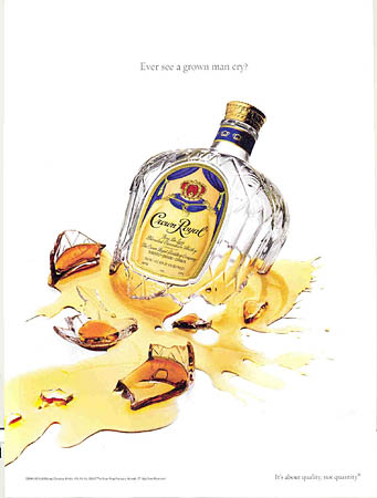
NEW! Philip D. sent in a link to a post by Sister Toldja at Me, Myself An Eye about slightly different versions of ads for Crown Royal. This one is presumably aimed at a general audience:

cr

Text: “Have you ever seen a grown man cry?”

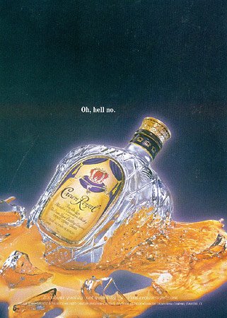
Sister Toldja suspects that this one is targeted more specifically at African Americans:

crb

Text: “Oh, hell no.”

Now, just to be clear, I’m not arguing these are racist ads. I just think they would provide a good example to start students thinking about the fact that a) advertisers actively market to various groups by trying to appeal to them in specific ways that may differ from an ad made for a “mainstream” or “general” audience (i.e., one that would presumably appeal to just about everybody) and b) they do this by playing on stereotypes or cultural assumptions about what different groups like (or are like). What separates these two ads into “mainstream” and “Black” ones? Simply the presence of a phrase that many people associate with African Americans (although I have to admit I mostly associate it with one of my male cousins more than anyone else). You might start with this example, which is fairly innocuous, I think, and then start asking students to think about other ways advertisers might indicate who an ad is supposed to appeal to (men or women, gay or straight, or more broadly to “everyone”). When do these efforts become problematic?