cultural imperialism/(neo)colonialism

Geographer Derek Watkins put together an interesting visualization of the expansion of the U.S. by showing the distribution of post offices between 1700 and 1900. The distribution of post offices reflects a number of important social and political events — the sudden emergence of post offices on the West Coast in the late 1840s, around the time of the gold rush and California becoming a state, patterns in Kansas and Nebraska in the 1870s clearly showing how population growth followed railroad lines, and so on:

Posted: Visualizing US expansion through post offices. from Derek Watkins on Vimeo.

You can read Watkins’s caveats about the data (it doesn’t include closures of some post offices during that time, and he was unable to determine the location of about 10% of post office branches) here. Thanks to Jeremy Freese, at Scatterplot, for posting it!

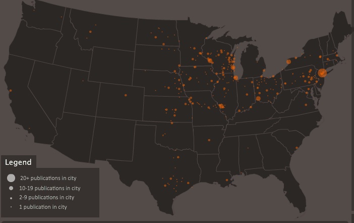
Dmitrity T.M. and Larry Harnisch (of The Daily Mirror) let us know that Stanford University’s Rural West Initiative put together a map showing the spread of newspapers across the U.S. between 1690 and 2011, based on Library of Congress listings. The results illustrate many of the same major social and political changes and trends as the post office map:

The Growth of US Newspapers, 1690-2011 from Geoff McGhee on Vimeo.

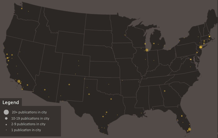
The website allows you to see the map for any individual year, and awesomely, you can filter by language, illustrating a number of periods of high immigration and common destination locations. Here’s the map of German-language newspapers in 1900:

And Spanish today:

Cross-posted at North Atlantic Books Communities.

Edward Said famously argued that the West uses the East as an inverted mirror, imagining them to be everything the West is not.  In a book titled Orientalism, he showed us how this perceived binary separating the Semitic East and the Christian West has traditionally manifested itself in art through romanticized scenes of Eastern cultures presented as alien, exotic, and often dangerous.

European painters of the 19th century turned to backdrops of harems and baths to invoke an atmosphere of non-European hedonism and tantalizing intrigue. Ingre’s 1814 Grande Odalisque , for example, depicts a concubine languidly lounging about, lightly dusting herself with feathers as she peers over her shoulder at the viewer with absent eyes. The notions of hedonistic and indulgent sex are bolstered by hints to opium-induced pleasure offered by the pipe in the bottom right corner. Images like this prompted viewers to imagine the Middle East as a distant region of sex, inebriants, and exciting exotic experiences.

Orientalism continues to inflect popular culture, but because we see ourselves differently now, we see them differently as well.  The rise of Islamic fundamentalism in the East, and the corollary Islamophobia of the West has shifted the focus to violence coupled with religious fervor. Take for example an image from a February New York Times article entitled “Afghan Official Says Women’s Shelters are Corrupt.”

The story is about the Afghan government’s desire to take over all Western-established shelters which they claim are “more concerned with the budget than the women.” It’s an article about bettering women’s support, community and safe havens, an act many Westerners would deem progressive in a way they wouldn’t usually view the region. However, the photo that was chosen for this article offers all the classic stereotypes held about the Middle East by depicting entirely veiled women who are shut indoors surrounded only by symbols of religion. The viewer sees two women, in both a hijab and niqab, separated onto two beds with looks of utter despondency; one looks down at her hands while the other stares off into the space ahead of her. In the center of the room is a young girl, blurred by the long exposure of the camera which attempted to capture her in the act of seemingly fervent prayer. Behind the praying young woman is an even younger girl sitting on a bed with a baby on her lap. Rather than depicting the officials who are rallying for female empowerment and institutional improvement, the photo that was chosen paints an image of silenced religious females.

Often imagery is more powerful and memorable than words and in some cases the photographs chosen to accompany the news are less than representational of the story at hand. This instance is typical of the Western media’s predilection for reinforcing Western notions about the East through imagery, instead of finding common ground between two regions that many believe are naturally separated by ideology. Thus orientalism lives on, transformed from its roots but maintaining its destructive stereotypes.

Adam Schwartz is an undergraduate at University of California, Berkeley entering his final year in the Media Studies program. He is currently preparing to write his thesis analyzing the gender and racial implications of the American Apparel advertising campaigns. When he isn’t in school he can be found biking along the beautiful California coast or working for the Berkeley Student Cooperative.

Lisa Wade, PhD is an Associate Professor at Tulane University. She is the author of American Hookup, a book about college sexual culture; a textbook about gender; and a forthcoming introductory text: Terrible Magnificent Sociology. You can follow her on Twitter and Instagram.


Are you confused about what “Great Britain” really is?  Do you become perplexed when asked to discern the difference between Britain, England, and the U.K.?  And what the heck is Wales!?  (Apologies to Wales.)  You are not alone!  CGP Grey offers an entertaining explanation that both clears up the questions, and makes us feel less stupid for not understanding them in the first place.  And you’ll learn some stunning facts about the residuals of empire.  Enjoy:

And if that wasn’t enough, here’s Grey’s historical rendering of how Scotland became a part of Great Britain.

Via Blame it on the Voices.

Lisa Wade, PhD is an Associate Professor at Tulane University. She is the author of American Hookup, a book about college sexual culture; a textbook about gender; and a forthcoming introductory text: Terrible Magnificent Sociology. You can follow her on Twitter and Instagram.

I argued earlier that Avatar was not a story about a heroic people, the Na’vi, but a white savior.  I summarized:

Sully is not only a superior human being, he is also a superior Na’vi. After being briefly ostracized for his participation in the land grab, he tames the most violent creature in the sky, thereby proving himself to be the highest quality warrior imaginable per the Na’vi mythology.  He gives them hope, works out their strategy, and is their most-valuable-weapon in the war. In the end, with all Na’vi contenders for leadership conveniently dead, he assumes the role of chief… and gets the-most-valuable-girl for good measure. Throngs of Na’vi bow to him.

Avatar was heralded as a break-through movie for its technological achievements, but its theme is tired.  With the aim of pointing to how Avatar simply regurgitated a strong history of white, Western self-congratulation, Craig Saddlemire and Ryan Conrad re-mixed the movie with other similar movies, including Blind Side, Dancing with Wolves, Blood Diamond, The Last Samurai, Out of Africa, Stargate, and Indiana Jones and the Temple of Doom.

They go through several features of these narratives: awe at the “native” landanimalspeople, the decision that they are helpless and doomed without White, Western intervention, the designation of a White savior who devotes him or herself to their rescue, native self-subordination, and more.  It’s pretty powerful. Thanks to Lizzy Furth for sending the video along!

See also: Formula for a successful American movie.

Lisa Wade, PhD is an Associate Professor at Tulane University. She is the author of American Hookup, a book about college sexual culture; a textbook about gender; and a forthcoming introductory text: Terrible Magnificent Sociology. You can follow her on Twitter and Instagram.

A recent Soc Images post on cultural appropriation highlighted issues of control over the production and representation of images of Indigenous peoples. On a related note, an image I captured during a recent visit to the Canadian Museum of Civilization (or as one of my professors has called it, the “Canadian Museum of Colonization”) highlights similar issues regarding the representation of Indigenous knowledges. This poster was displayed in the “First Peoples’ Hall” of the museum in a section dedicated to “Ways of Knowing”:

Two points are particularly striking. Firstly, the poster portrays the “preservation” of Indigenous knowledges as a project of colonizers and non-Indigenous anthropologists. Rather than attributing control over the production and representation of Indigenous knowledges to Indigenous peoples themselves, the poster depicts colonial “explorers” and anthropologists as the primary agents in these endeavors. Indigenous peoples themselves are merely portrayed as informants, leaving interpretation and presentation to colonizers and anthropologists. In recent years, numerous Indigenous scholars have written about the oppressive nature of this type of approach to Indigenous peoples and knowledges, pointing out how academic disciplines such as anthropology have been essential tools in the study and subjugation of Indigenous peoples as “primitive Others.”

Secondly, the poster presents Indigenous knowledges as static and unchanging, ignoring their dynamic nature and the ongoing experiences of Canada’s Indigenous communities. Canadian Indigenous scholar Andrea Smith* has argued that in settler societies such as Canada, false notions of the disappearance or threat of extinction of Indigenous peoples and their knowledges are at the foundation of cultural imaginations and serve as justifications for the appropriation of Indigenous lands and cultures. In this case, the threat of extinction is implied in the need for Indigenous knowledges to be “preserved in writing.”

This poster provides an entry point for questioning power relations inherent in the production and presentation of knowledge at the Canadian Museum of Civilization and similar institutions. This example demonstrates how the museum portrays a particular view of Canada and its relationship with Indigenous communities, one which ignores the historical and continuing reality of colonialism and its implications.

* Smith, A. (2006). Heteropatriarchy and the three pillars of white supremacy: Rethinking women of color organizing. In A. Smith (Ed.), Color of Violence: The Incite! Anthology (66-73). Cambridge, MA: South End Press.

—————————

Hayley Price has a background in sociology, international development studies, and education. She recently completed her Masters degree in Sociology and Equity Studies in Education at the University of Toronto with a thesis on Indigenous knowledges in development studies.

If you would like to write a post for Sociological Images, please see our Guidelines for Guest Bloggers.

Nicole sent in this Australian commercial for P&O Cruises. Nicole was struck by the obvious racial divide, in which the privileged customers are all White, while non-Whites serve them, either literally (and with a smile!) or as a form of cultural entertainment:

It’s another example of a common tourism marketing theme, in which supposedly “traditional” and/or “native” cultures are provided as cultural experiences to “modern” tourists. This commercial just stands out because of the particularly stark division of the world into those who are entertained and attended to, and those who do the attending.

A while back Kale let us know that the New York Public Library had made their images collection available online.The collection has images on a huge array of topics, from fashion to the military to slavery to insects to a whole category for stilts, and including political cartoons, illustrations from publications, photographs, and so on.

Kale found the collection particularly interesting as a way to look at historical racism and rhetoric about race relations in publications aimed at White readers. This 1875 cartoon, titled “A Privilege?”, presents segregation as actually protecting African Americans from the scourge of alcohol:

Text:

A PRIVILEGE?

Wife, “I wish you were not allowed in here.”

It’s a fascinating example of the use of institutionalized racial inequalities that hurt African Americans to, instead, garner sympathy for White women and children and present African Americans as, really, better off.

Another, published in Life in 1899, implies African American men are burdens on their families, making their wives take on the role of providing for everyone:

Text:

Parson Featherly: De Lawd hab took yo’ husban’ an’ lef’ yo’ wid six chilluns; but ‘membah, Sistah, dat dar’s some good in all de Lawd does.

“I does, Parson. I realizes dat dar’s one less for me to perwide foh.”

This 1860 cartoon from Harper’s Weekly shows an African American woman (presumably a slave) in the South using the “Bobolitionists” — that is, abolitionists, who wanted to outlaw slavery — as a threat, a type of monster that will come steal him if he’s not good:

Text:

“Now den Julius! If yer ain’t a good litte nigger, mudder’l call de big old Bobolitionist and let um run away wid yer.”

I’m sure it must have been very comforting to some readers to think of slaves viewing abolitionists as threats rather than potential allies.

Other cartoons mock African Americans’ physical attributes, marking them as laughable or even grotesque:

Text:

“Would de gemman in front oblige by removing de hat?”

“Would de same gemman oblige by puttin’ de hat on agin?”

(Details.)

Text:

“Now we’ll see ef dat sawed off Peterson man kin escape de issue dis time.”

(Details.)

There are also examples that criticized U.S. race relations, such as this 1848 cartoon from Punch [Note: a reader thinks this might be about France, which banned slavery in 1848, but the NYPL has it listed as relevant to U.S. slavery, so there may be so lost context here]:

Enjoy!

[Note: A commenter has expressed concern that I ended this post with “Enjoy!” I apologize for my insensitivity. I meant it in terms of “Enjoy browsing this fascinating archive,” of which racist imagery is only a small part, not, I hope it would be clear, “Enjoy looking at racist cartoons!” I wasn’t thinking about how it might appear immediately after those set of images, and I should have been more careful.]

Emory University has a very detailed database about the Atlantic slave trade, titled Voyages: The Trans-Atlantic Slave Trade Database, which I don’t believe we’ve posted before (my apologies if we have). It includes nine maps providing information on major points of departure and destination ports for the trans-Atlantic trade; here’s a general overview:

Initially the vast majority of slave voyages were organized by firms or individuals in Spain and Portugal; however, over time the slave trade was dominated by groups from northern Europe. Great Britain eventually played a major role, and over 1/3 of documented slave voyages were organized there.The description of Map 6 explains, “vessels from the largest seven ports, Rio de Janeiro, Bahia, Liverpool, London, Nantes, Bristol, and Pernambuco carried off almost three-quarters of all captives removed from Africa via the Atlantic Ocean.”

This map shows where voyages were organized, and the % of all documented African slaves that voyages from that country/area transported:

In the U.S., students generally learn about slavery in relation to cotton plantations and, to a lesser extent, tobacco. However, overall those two crops played a relatively minor role in the growth of the global slave trade. It was the growing taste for sugar, and the creation of sugar plantations, particularly in the Caribbean and South American coastal areas, that produced such an enormous demand for African slaves in the Americas. According to the Voyages website, less than 4% of all Africans captured were sold in North America.

The website also has a database of thousands of documented trips in the trans-Atlantic slave trade, including everything from point of origin, destination, number of slaves, % who died during voyage, length of trip, and so on. Some include many more details than others, as you’d expect. You can also create tables to display the variables you’re interested in. Here’s the table showing the slave trade, broken into 25-year intervals and by destination. We can clearly see that the slave trade made one big jump in the late 1500s (going from 4,287 in the 1551-1575 interval to 73,865 between 1576 and the end of the century) and another huge jump in the late 1600s, with the height of the slave trade occuring in the 1700s through the mid-1800s:

You can also create various graphs and charts. Here is a graph of the % of slaves who died during the trip, by year:

I presume the extremely high numbers in the 1550s must be skewed by some ships that sank or met some other disaster that led to the death of everyone aboard.

Over time, ships carried larger numbers of individuals per trip:

The individuals taken as part of the slave trade were predominantly male:

Documented types of resistance from captives or from Africans trying to free them:

You can spend quite a bit of time on this, I warn you — creating timelines, graphs, and so on. It’s taken me an hour to write this post because I keep getting distracted creating charts and tables. Overall, the site is a fantastic resource for both specific information and for helping illuminate the enormity of the Atlantic slave trade. Thanks to Shamus Khan for the tip.