age/aging

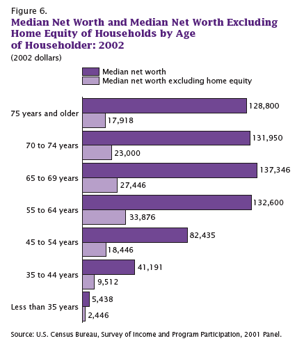
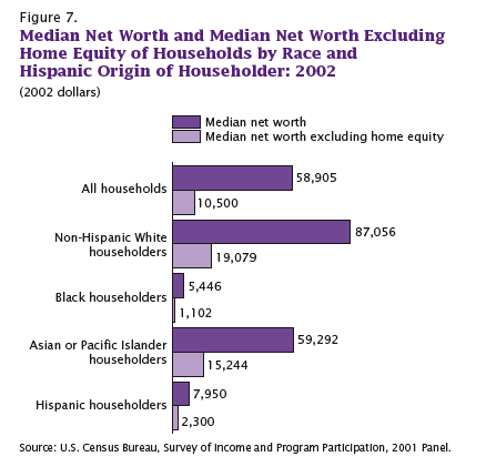
The following graphs all show how much of American’s wealth is (or, um, was) in the form of home equity. They are all based on 2002 data, several years before housing prices hit their peaks, which means by the time the housing bubble burst, home equity was an even larger proportion of all net worth.

It’s not that I didn’t already know the economy was in trouble. That’s obvious–I live in Vegas, all I have to do is drive around a little and see all the houses sitting empty. But looking at these images I kept thinking, “a good portion of that home equity wealth is just gone.” On paper, we had all this wealth, and people borrowed based on it…and a lot of it is simply gone. Just…poof. Gone!

This one shows what percent of all net worth in the U.S. falls into various categories.

Here we have median net worth in 2002 for different age groups…and then the lighter purple bar, which is median net worth if you took out home equity:

A similar breakdown, except by race, not age this time. Notice how much Blacks and Hispanics lag behind Asians, and how much they lag behind non-Hispanic Whites in terms of net worth:

On the up side, if the stock market keeps going down, then home equity as a percent of our net worth will go up again because we’ll have lost so much in stocks. So, you know, look on the bright side!

All of these graphs came from “Net Worth and the Assets of Households: 2002,” written by Alfred O. Gottschalck and published by the U.S. Census Bureau in April 2008.


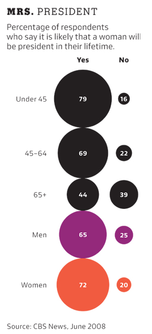
This figure, part of this New York Times story, illustrates the percentage of people (grouped by age and sex) who think that it is likely a woman will be president in their lifetime:

I’ll admit, it makes me feel like a crotchety old cynic.

This commercial I recently saw on Comedy Central for Progene male enhancement supplement warns men who are “not 20 anymore” that, without their product, they won’t be able to satisfy a woman.

[youtube]https://www.youtube.com/watch?v=tphU_5g1A-w[/youtube]

Here’s a screenshot of a graph from the video which purports to show how men’s sexual performance declines with age:

Of course, we women “know it’s not your fault,” “it’s natural.”

Obviously you could could use this for a discussion of the increasing scrutiny men’s bodies are put under (much as women’s long have). But it’s also a good example of the way sex is often discussed; the implication here is that the only way to satisfy a woman sexually is to be able to have sex like a 20-year-old man, and the emphasis is clearly on penile-vaginal intercourse as the main source of sexual pleasure (though it does come with the handy DVD about the female orgasm). I might also use it when I talk about the ways we construct biology and treat some “natural” processes as inevitable and unalterable while attempting to change others.

For the unbelievers, I know this ad may very well look fake, but I swear to you I saw it on TV. Multiple times, because it was during a show I’d recorded, so I had the opportunity to rewatch it to my heart’s content.

Gwen Sharp is an associate professor of sociology at Nevada State College. You can follow her on Twitter at @gwensharpnv.

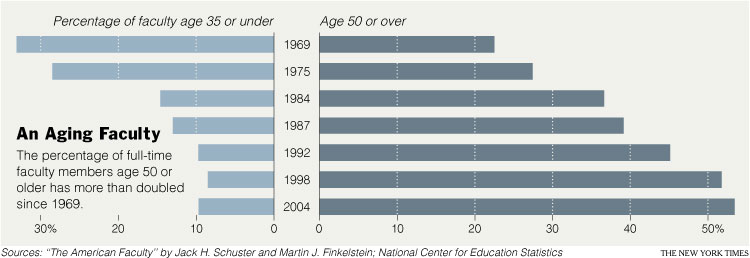
In a New York Times article today, Patricia Cohen describes the changing demographics of the American professoriate. It had two main points:

(1) Profs are WAY OLDER now then they used to be.

(2) The older ones appear to be more liberal than the younger ones, so we can expect academia to be more moderate as the older profs retire. This table shows how “liberal,” “moderate,” and “conservative” professors report being by age and academic field (click to enlarge so you can see it better).

Cohen summarizes this table as follows:

‘Self-described liberals are most common within the ranks of those professors aged 50-64, who were teenagers or young adults in the 1960s,’ they wrote, making up just under 50 percent. At the same time, the youngest group, ages 26 to 35, contains the highest percentage of moderates, some 60 percent, and the lowest percentage of liberals, just under a third.

I’m not sure I buy it.

First, notice that they’re comparing two groups (26-35 and 50-64) and making a claim about a trend instead of a claim about group difference. You can’t do that. Look at the data on the age group between them (36-49), they are all over the place, not neatly sitated between the age groups that sandwich them. (This also points to the always interesting question of how the data looks if you chop up your continuous variables–in this case, age–differently.)

Second, if you stick to group differences, they are comparing the youngest group and the second to oldest group in their data. Why? If you compare the youngest to the oldest group, the data looks a bit different.

Third, their interpretation of the overall “trend”–that is, the average difference across all fields–is obscuring some really interesting variation by subfield! So maybe the overall interpretation works for the social sciences, but wow look at the physical and biological sciences! Again, here we see a choice about reporting that obscures one finding in favor of another. The choice to emphasize averages/means/medians versus ranges/variety has consequences for how we understand our world.

Finally, there is the possibility that what it means to be “liberal,” “moderate,” and “conservative” differs in a systematic way across age groups. The reporter doesn’t address this at all.

There’s are also some really interesting assumptions about what counts as “political” in the article. Cohen points to the fact that quantitative research is somehow thought to be inherently less ideological than pure theory or qualitative research. And she quotes Marxist sociologist Erik Olin Wright saying: “in the late ’60s and ’70s, the Marxist impulse was central for those interested in social justice.” “Now,” Cohen adds, “it resides at the margins.” But it seems to me that it is Cohen who is assuming that quantitative research isn’t justice-oriented. Her example of a not-so-politicized younger professor is Sara Goldrick-Rab, also a sociologist, who says, “My generation is not so ideologically driven.” But whose projects, detailed in the story, include college opportunities for low-income students and the way that welfare reform decreased college attendance by the poor. Goldrick-Rab also complains about the lack of support for women academics who are also mothers. Those all sound damn political to me. But Cohen writes, partially quoting Goldrick-Rab: “They [older professors] want to question values and norms; ‘we [younger professors] are more driven by data.’ ” In this sentence, Cohen puts values and data on opposite ends of a spectrum. (It’s also interesting how she opposes Goldrick-Rab’s quote to her own words, we have no idea what Goldrick-Rab meant to oppose to being data-driven.)

I am troubled by the reproduction of the binary between “objective” and “normative” “science.”

I love, however, seeing the places and people of my alma mater described! Go Wisconsin!!!

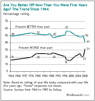
Jay Livingston over at Montclair Socioblog reports on a report by the Pew Center. First this image:

Jay writes:

When Reagan asked this question in the 1980 presidential debates, most people, according to Gallup felt that yes, they were better off – 52% vs. 25% who felt they were worse off. That’s puzzling, considering the apparent success of Reagan’s question – he won the election handily.

The interesting result from the Gallup numbers is that when Reagan left office – after the “Reagan recovery” cherished by anti-tax, anti-regulation conservatives – the numbers were identical. If you look at actual changes in median family income, you see a slight decline in the Carter years and an increase in the Reagan years. But these changes aren’t reflected in how people felt, at least not as measured by Gallup.

This year’s numbers show optimism at its lowest ebb since Gallup started asking the question in 1964. “Better off” still tops “worse off,” but by only 41% to 31%. Even more surprising to me was the proportion of these self-identified middle-class Americans who rate their quality of life as low (five or less on a ten-point scale).


The following images are from an ad campaign by Evan Williams bourbon. Each features the tag line “The longer you wait…the better it gets.” The first is a scanned image of a print ad (sorry for the torn edge):

These images are from the Evan Williams website:

The images from the website also feature the “Before Aging: After Aging” slogan, which presumably applies to the increasing social demand for hypersexual feminine performance as time passes (and certainly not to an acceptance or appreciation of the fact that individual women age). I particularly enjoy this last ad, since it makes an observation that, in the old days, women wore frumpy sweaters, but now, thanks to “aging,” we can all expect women to wear asymmetrical lime-green halter tops with beads of moisture dripping into their copious cleavage.

And if that’s not a recipe for progress, I don’t know what is.

NEW! Here’s another one:

longer-you-wait

At the Los Angeles Times, found via Scatterplot.

Here is an image for the website from Just for Men’s Touch of Gray line:


This product covers most, but not all, of a man’s gray hair. From the website:

Why use Touch of Gray? A little gray to show your experience, but not so much
that it hides your vitality.

There are a range of shades available and you can control how much gray is hidden.

The website has a total of four images of men with women. As Vanessa V., who sent this one in, pointed out, none of the women have a “touch of gray.” Nor could she imagine a product like this marketed to women.

Here is another example of an ad that gives men permission to age in a way women never are.

Other men’s hair dye posts: here, here, and here.

Thanks, Vanessa!

NEW: Corey O. found a Just for Men commercial that references Woodstock (sadly, I can’t find a video of it). Corey says,

It has everything you could want in an advertisement: classic rock soundtrack, co-opted counterculture, mixed messages about aging, demonstrations of male virility, minorities on the margins, gender disparity, and attempts to sell a “natural” look. The total package. What really got to me, though, was the gender aspect. Can you imagine a line of hair dye marketed toward women which is meant to leave some grey intact? I don’t think that Just for Men can either — in contrast to the silver-streaked men, none of the women in the ad are sporting a natural look and some look like they’ve had rather recent visits from the botox fairy. This ad is a nice way of illustrating the double-standard that women face in regards to aging: while men can benefit from grey hair as an illustration of their maturity without sacrificing their virility, women must always strive to look as young as possible. Because this is an ad for men’s hair dye, however, it also illustrates that while men may benefit from less scrutiny of their appearance than women, their appearance is also satisfactory only with the use of beauty aids.

I also like the appropriation of Woodstock and the counter-culture movement of the ’60s.

Thanks, Corey!

Gwen Sharp is an associate professor of sociology at Nevada State College. You can follow her on Twitter at @gwensharpnv.