In a humorous article, Gloria Steinem asked, “What would happen, for instance, if suddenly, magically, men could menstruate and women could not?” Men, she asserted, would re-frame menstruation as a “enviable, boast-worthy, masculine event” about which they would brag (“about how long and how much”). She writes:
Street guys would brag (“I’m a three pad man”) or answer praise from a buddy (“Man, you lookin’ good!”) by giving fives and saying, “Yeah, man, I’m on the rag!”
…
Military men, right-wing politicians, and religious fundamentalists would cite menstruation (“men-struation”) as proof that only men could serve in the Army (“you have to give blood to take blood”), occupy political office (“can women be aggressive without that steadfast cycle governed by the planet Mars?”), be priest and ministers (“how could a woman give her blood for our sins?”) or rabbis (“without the monthly loss of impurities, women remain unclean”).
…
Of course, male intellectuals would offer the most moral and logical arguments. How could a woman master any discipline that demanded a sense of time, space, mathematics, or measurement, for instance, without that in-built gift for measuring the cycles of the moon and planets – and thus for measuring anything at all?
Perhaps in homage to this article, the artist Käthe Ivansich developed an installation titled “Menstruation Skateboards” for the Secession Museum in Austria. Drawing on the same sort of re-framing, the exhibition was marketed with ads with bruised and bloody women and tag lines like “I heart blood sports” and “some girls bleed more than once a month.” See examples at Ivansich’s website.
The exhibition included skateboards that generally mocked sexist language and re-claimed the blood of menstruation. This blood, the message is, makes me hardcore. The art project nicely makes Steinem’s point, showing how things like menstruation can be interpreted in many different ways depending on the social status of the person with whom it is associated.
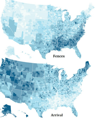
The New York Times (here) has maps (chloropleths, if you want to show off your vocabulary) showing the popularity of the nominees for best picture. The maps look like different countries. “Fences,” for example, did best in the Southern swath from Louisiana to North Carolina but nowhere else except for Allegheny County, PA (it was filmed in Pittsburgh, where the story is set). In those same areas, “Arrival” and “Manchester by the Sea” basically don’t exist. The maps of “Fences” and “Arrival” look like direct opposites.
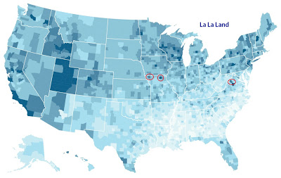
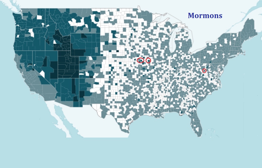
The map that puzzled me was “La La Land.” It’s big in LA, of course (like “Fences” in Pittsburgh). But its other strongholds are counties with a high proportion of Mormons: Utah plus Mormonic counties in neighboring states – Idaho, Wyoming, New Mexico, Colorado, and Nevada.
The maps match even for distant counties in Missouri and Virginia, where those dark spots on the map might indicate only 5-10% of the population. Most counties in the US are below 3%.
How to explain the “La La Land” – Latter Day Saints connection? The movie is rated PG-13, but so are “Fences,” “Arrival,” and “Lion.” And “Hidden Figures” is PG. But then, the cast of “La La Land” has very few non-Whites and zero aliens. That might have something to do with it.
Or maybe it’s just because Ryan Gosling grew up with seriously Mormon parents. He is no longer a Mormon and says he never really identified as one. He has long since left the church. He is neither a singer nor a dancer but has to sing and dance in this film. His character is supposed to be a jazz purist, but the music he plays is what you might call Utah jazz (one of the great oxymorons of our time). But those minor quibbles mean little compared with the fact the for the first years of his life, he was raised as a Mormon.
Facts about all manner of things have made headlines recently as the Trump administration continues to make statements, reports, and policies at odds with things we know to be true. Whether it’s about the size of his inauguration crowd, patently false and fear-mongering inaccuracies about transgender persons in bathrooms, rates of violent crime in the U.S., or anything else, lately it feels like the facts don’t seem to matter. The inaccuracies and misinformation continue despite the earnest attempts of so many to correct each falsehood after it is made. It’s exhausting. But why is it happening?
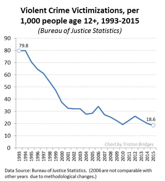
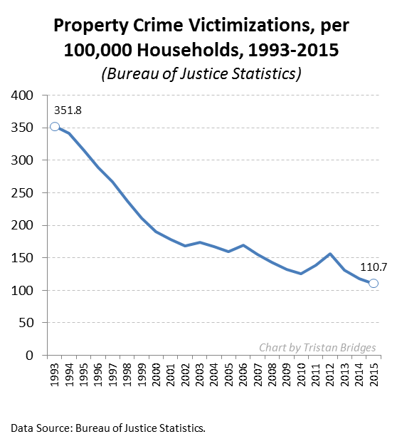
Many of the inaccuracies seem like they ought to be easy enough to challenge as data simply don’t support the statements made. Consider the following charts documenting the violent crime rate and property crime rate in the U.S. over the last quarter century (measured by the Bureau of Justice Statistics). The overall trends are unmistakable: crime in the U.S. has been declining for a quarter of a century.
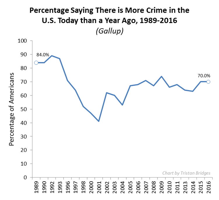
Now compare the crime rate with public perceptions of the crime rate collected by Gallup (below). While the crime rate is going down, the majority of the American public seems to think that crime has been getting worse every year. If crime is going down, why do so many people seem to feel that there is more crime today than there was a year ago? It’s simply not true.
There is more than one reason this is happening. But, one reason I think the alternative facts industry has been so effective has to do with a concept social scientists call the “backfire effect.” As a rule, misinformed people do not change their minds once they have been presented with facts that challenge their beliefs. But, beyond simply not changing their minds when they should, research shows that they are likely to become more attached to their mistaken beliefs. The factual information “backfires.” When people don’t agree with you, research suggests that bringing in facts to support your case might actually make them believe you less. In other words, fighting the ill-informed with facts is like fighting a grease fire with water. It seems like it should work, but it’s actually going to make things worse.
To study this, Brendan Nyhan and Jason Reifler (2010) conducted a series of experiments. They had groups of participants read newspaper articles that included statements from politicians that supported some widespread piece of misinformation. Some of the participants read articles that included corrective information that immediately followed the inaccurate statement from the political figure, while others did not read articles containing corrective information at all.
Afterward, they were asked a series of questions about the article and their personal opinions about the issue. Nyhan and Reifler found that how people responded to the factual corrections in the articles they read varied systematically by how ideologically committed they already were to the beliefs that such facts supported. Among those who believed the popular misinformation in the first place, more information and actual facts challenging those beliefs did not cause a change of opinion—in fact, it often had the effect of strengthening those ideologically grounded beliefs.
It’s a sociological issue we ought to care about a great deal right now. How are we to correct misinformation if the very act of informing some people causes them to redouble their dedication to believing things that are not true?
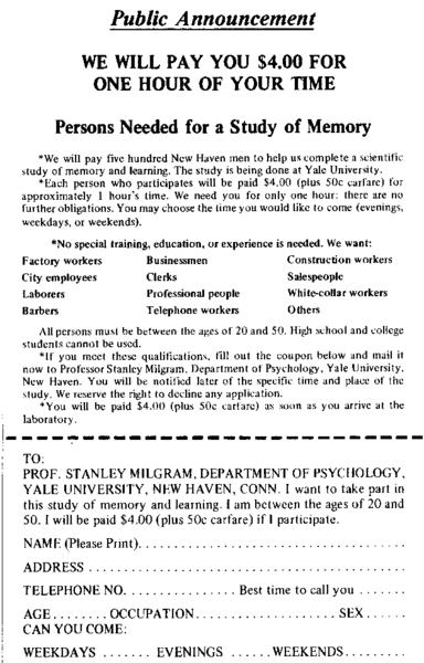
Bewildered by Nazi soldiers’ willingness to perpetuate the horrors of World War II, Stanley Milgram set out to test the extent to which average people would do harm if instructed by an authority figure. In what would end up being one of the most famous studies in the history of social psychology, the experimenter would instruct study subjects to submit a heard, but unseen stranger (who was reputed to have a heart condition) to a series of increasingly strong electric shocks. The unseen stranger (actually a tape recording) would yelp and cry and scream and beg… and eventually be silent. If the study subject expressed a desire to quit administering the shocks, the experimenter would prod four times:
1. Please continue.
2. The experiment requires that you continue.
3. It is absolutely essential that you continue.
4. You have no other choice, you must go on.
If, after four prods, the subject still refused to administer the shock, the experiment was over.
In his initial study, though all participants at some point required prodding, 65 percent of people (26 out of 40) continued to submit the stranger to electric shocks all the way up to (a fake) 450-volts, a dose that was identified as fatal and was administered after the screaming turned to silence. You can watch a BBC replication of the studies.
I love gender and sexual demography. It’s incredibly important work. Understanding the size and movements of gender and sexual minority populations can help assess what kinds of resources different groups might require and where those resources would be best spent, among others things. Gary J. Gates and Frank Newport initially published results from a then-new Gallup question on gender/sexual identity in 2012-2013 (here). At the time, 3.4% of Americans identified as either lesbian, gay, bisexual, or transgender. It’s a big deal – particularly as “identity” is likely a conservative measure when it comes to assessing the size of the population of LGBT persons. After I read the report, I was critical of one element of the reporting: Gates and Newport reported proportions of LGBT persons by state. As data visualizations go, I felt the decision concealed more than it revealed.
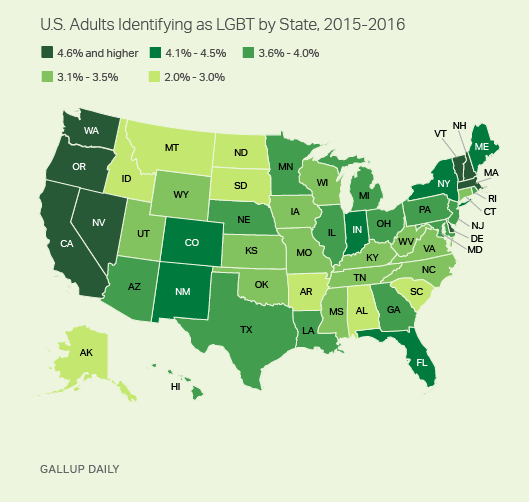
From 2015-2016, Gallup collected a second round of data. These new data allowed Gates to make some really amazing observations about shifts in the proportion of the U.S. population identifying themselves as LGBT. It’s a population that is, quite literally on the move. I posted on this latter report here. The shifts are astonishing – particularly given the short period of time between waves of data collection. But, again, data on where LGBT people are living was reported by state. I suspect that much of this has to do with sample size or perhaps an inability to tie respondents to counties or anything beyond state and time zone. But, I still think displaying the information in this way is misleading. Here’s the map Gallup produced associated with the most recent report:
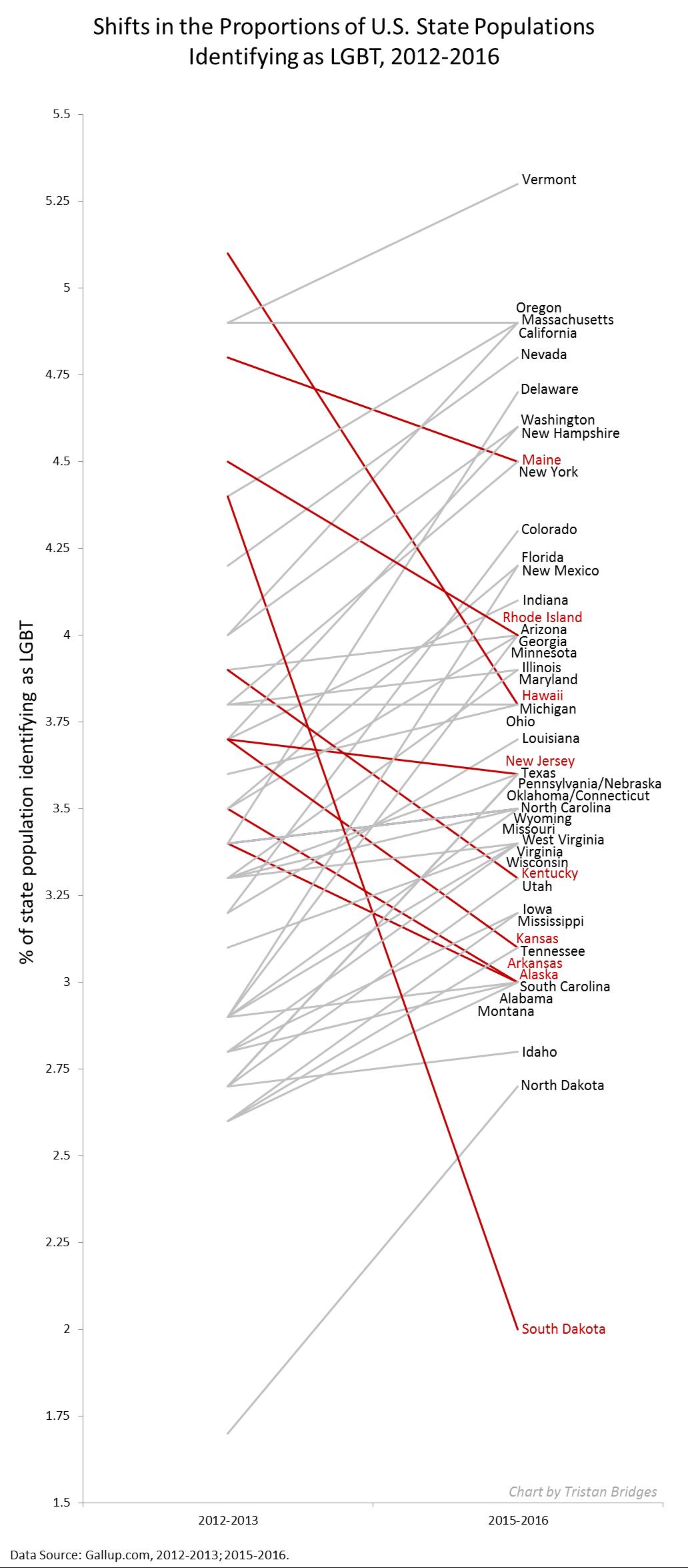
During the 2012-2013 data collection, Hawaii led U.S. states with the highest proportions of LGBT identifying persons (with 5.1% identifying as LGBT)–if we exclude Washington D.C. (with 10% identifying as LGBT). By 2016, Vermont led U.S. states with 5.3%; Hawaii dropped to 3.8%. Regardless of state rank, however, in both reports, the states are all neatly arranged with small incremental increases in the proportions of LGBT identifying persons, with one anomaly–Washington D.C. Of course, D.C. is not an anomaly; it’s just not a state. And comparing Washington D.C. with other states is about as meaningful as examining crime rate by European nation and including Vatican City. In both examples, one of these things is not like the others in a meaningful sense.
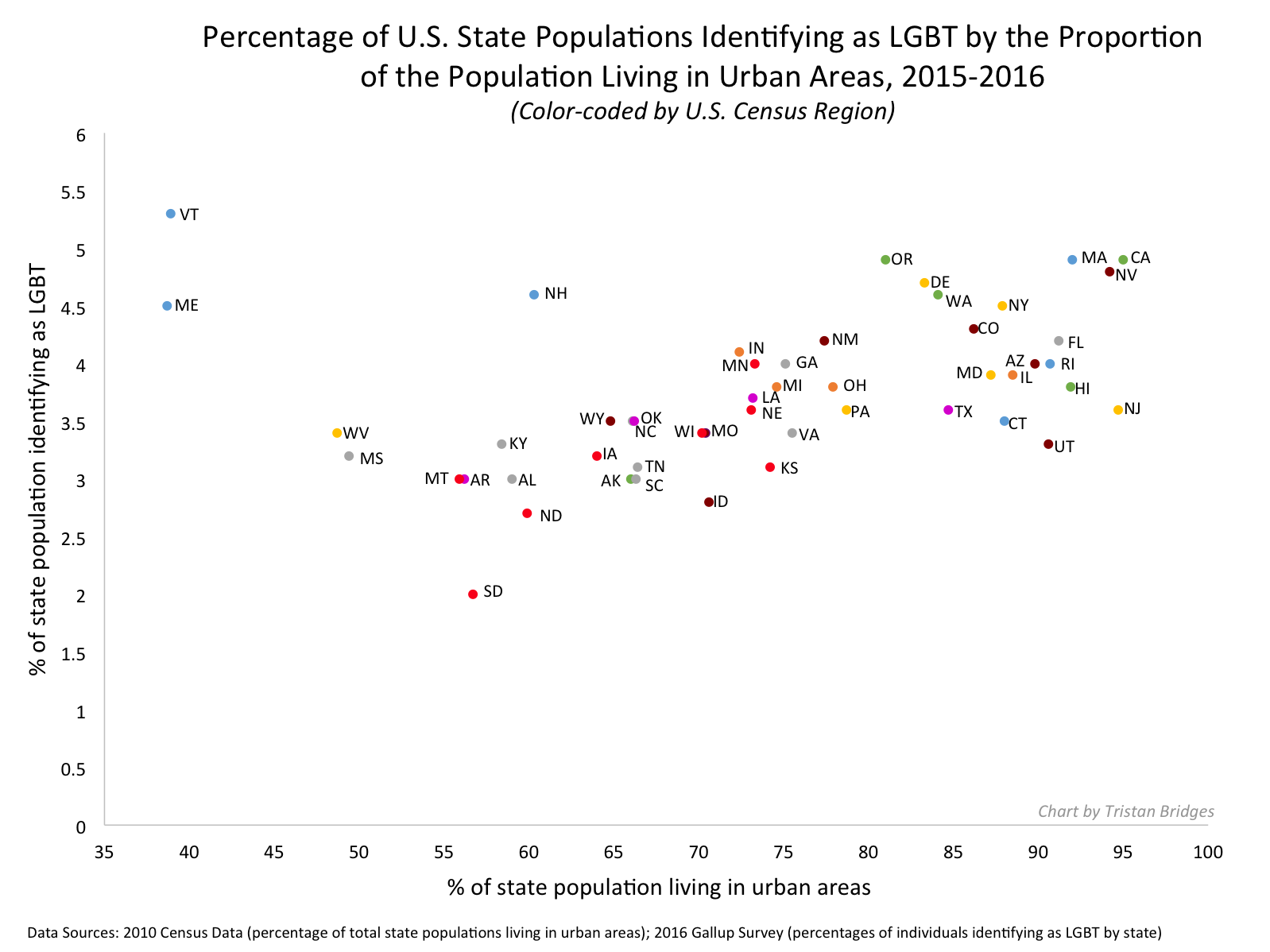
In my initial post, I suggested that the data would be much more meaningfully displayed in a different way. The reason D.C. is an outlier is that a good deal of research suggests that gender and sexual minorities are more populous in cities; they’re more likely to live in urban areas. Look at the 2015-2016 state-level data on proportion of LGBT people by the percentage of the state population living in urban areas (using 2010 Census data). The color coding reflects Census regions (click to enlarge).
Vermont is still a state worth mentioning in the report as it bucks the trend in an impressive way (as do Maine and New Hampshire). But I’d bet you a pint of Cherry Garcia and a Magic Hat #9 that this has more to do with Burlington than with thriving communities of LGBT folks in the towns like Middlesex, Maidstone, or Sutton.
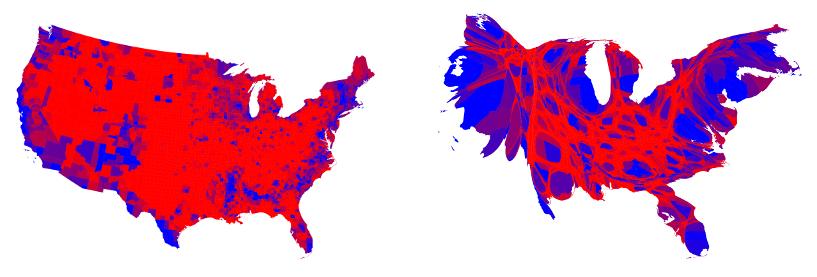
I recognize that the survey might not have a sufficient sample to enable them to say anything more specific (the 2015-2016 sample is just shy of 500,000). But, sometimes data visualizations obscure more than they reveal. And this feels like a case of that to me. In my initial post, I compared using state-level data here with maps of the U.S. after a presidential election. While the maps clearly delineate which candidate walked away with the electoral votes, they tell us nothing of the how close it was in each state, nor do they provide information about whether all parts of the state voted for the same candidates or were regionally divided. In most recent elections traditional electoral maps might leave you wondering how a Democrat ever gets elected with the sea of red blanketing much of the nation’s interior. But, if you’ve ever seen a map showing you data by county, you realize there’s a lot of blue in that red as well–those are the cities, the urban areas of the nation. Look at the results of the 2016 election by county (produced by physicist Mark Newman – here). On the left, you see county level voting data, rather that simply seeing whether a state “went red” or “went blue.” On the right, Newman uses a cartogram to alter the size of each county relative to its population density. It paints a bit of a different picture, and to some, it probably makes that state-level data seem a whole lot less meaningful.
Maps from Mark Newman’s website: http://www-personal.umich.edu/~mejn/election/2016/
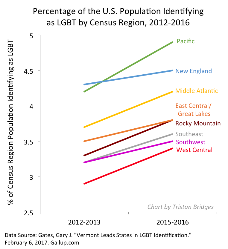
The more recent report also uses that state-level data to examine shifts in LGBT identification within Census regions as well. Perhaps not surprisingly, there are more people identifying as LGBT everywhere in the U.S. today than there were 5 years ago (at least when we ask them on surveys). But rates of identification are growing faster in some regions (like the Pacific, Middle Atlantic, and West Central) than others (like New England). Gates suggests that while this might cause some to suggest that LGBT people are migrating to different regions, data don’t suggest that LGBT people are necessarily doing that at higher rates than other groups.
The recent shifts are largely produced by young people, Millennials in the Gallup sample. And those shifts are more pronounced in those same states most likely to go blue in elections. As Gates put it, “State-level rankings by the portion of adults identifying as LGBT clearly relate to the regional differences in LGBT social acceptance, which tend to be higher in the East and West and lower in the South and Midwest. Nevada is the only state in the top 10 that doesn’t have a coastal border. States ranked in the bottom 10 are dominated by those in the Midwest and South” (here).
When we compare waves of data collection, we can see lots of shifts in the LGBT-identifying population by state (see below; click to enlarge). While the general trend was for states to have increasing proportions of people claiming LGBT identities in 2015-2016, a collection of states do not follow that trend. And this struck me as an issue that ought to provoke some level of concern. Look at Hawaii, Rhode Island, and South Dakota, for example. These are among the biggest shifts among any of the states and they are all against the liberalizing trend Gates describes.
Presentation of data is important. And while the report might help you realize, if you’re LGBT, that you might enjoy living in Vermont or Hawaii more than Idaho or Alabama if living around others who share your gender or sexual identity is important to you, that’s a fact that probably wouldn’t surprise many. I’d rather see maps illustrating proportions of LGBT persons by population density rather than by state. I don’t think we’d be shocked by those results either. But it seems like it would be provide a much better picture of the shifts documented by the report than state-level data allow.
A different version of this post was originally published at Timeline.
To get some perspective on the long term trend in divorce, we need to check some common assumptions. Most importantly, we have to shake the idea that the trend is just moving in one direction, tracking a predictable course from “olden days” to “nowadays.”
It’s so common to think of society developing in on direction over time that people rarely realize they are doing it. Regardless of political persuasion, people tend to collapse history into then versus now whether they’re using specific dates and facts or just imagining the sweep of history.
In reality, sometimes it’s true and sometimes it’s not true that society has a direction of change over a long time period. Some social trends are pretty clear, such as population growth, longevity, wealth, or the expansion of education. But when you look more closely, and narrow the focus to the last century or so, it turns out that even the trends that are following some path of progress aren’t moving linearly, and the fluctuations can be the big story.
Demography provides many such examples. For example, although it’s certainly true that Americans have fewer children now than they did a century ago, the Baby Boom – that huge spike in birth rates from 1946 to 1964 – was such a massive disruption that in some ways it is the big story of the century. Divorce is another.
The most popular false assumption about divorce – sort of like crime or child abuse – is that it’s always getting worse (which isn’t true of crime or child abuse, either). In the broadest sense, yes, there is more divorce nowadays than there was in the olden days, but the trend is complicated and has probably reversed.
It turns out, however, that the story of divorce rates is ridiculously complicated. For one thing, there is no central data source that simply counts all divorces. The National Center for Health Statistics used to divorces from states, but now six states don’t feel like cooperating anymore, including, unbelievably, California. Even where divorces are counted, key information may not be available, such as the people’s age or how long they were married (or, now that there is gay divorce, their genders). Fortunately, the Census Bureau (for now) does a giant sample survey, the American Community Survey, which gives us great data on divorce patterns, but they only started collecting that information in 2008.
The way demographers ask the question is also different from what the public wants to know. The typical concerned citizen (or honeymooner) wants to know: what are the odds that I (or someone else getting married today) will end up divorced? Science can guess, but it’s impossible to give a definitive answer, because we can’t actually predict human behavior. Still, we can help.
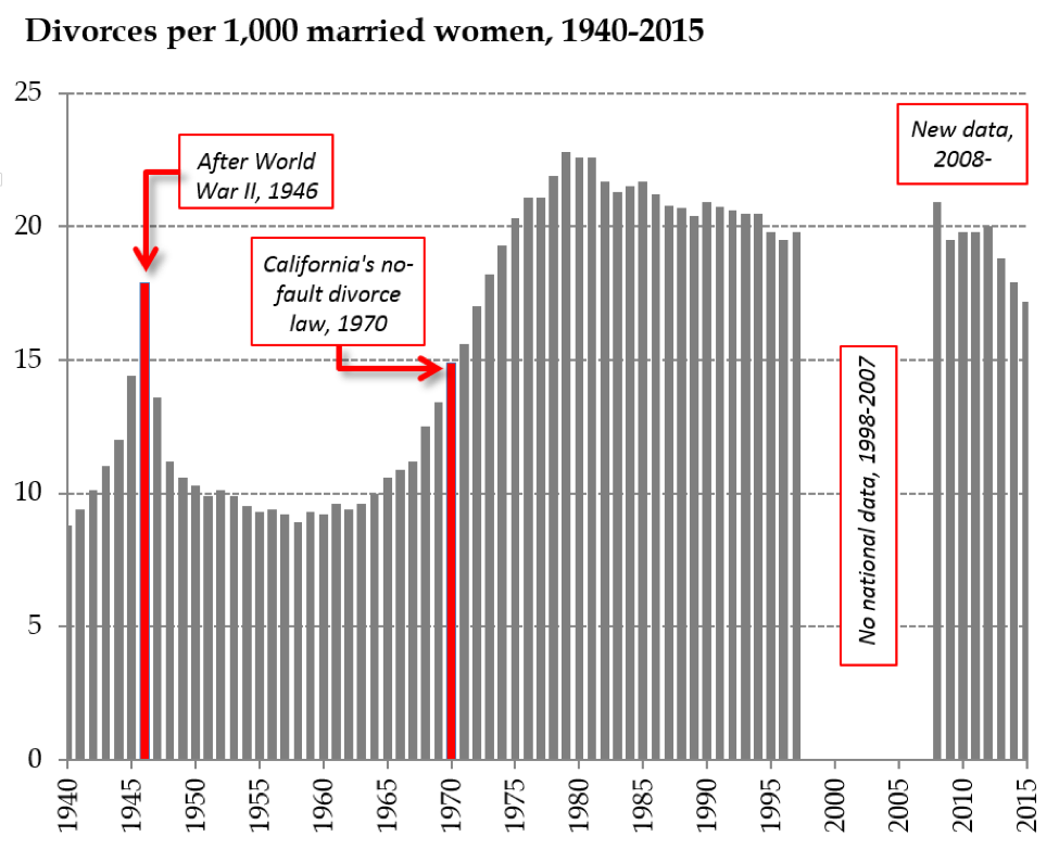
The short answer is that divorce is more common than it was a 75 years ago, but less common than it was at the peak in 1979. Here’s the trend in what we call the “refined” divorce rate – the number of divorces each year for every thousand married women in the country:
The figure uses the federal tally from states from 1940 to 1997, leaves out the period when there was no national collection, and then picks up again when the American Community Survey started asking about divorce.
So the long term upward trend is complicated by a huge spike from soldiers returning home at the end of World War II (a divorce boom, to go with the Baby Boom), a steep increase in the sixties and seventies, and then a downward glide to the present.
How is it possible that divorce has been declining for more than three decades? Part of it is a function of the aging population. As demographers Sheela Kennedy and Steven Ruggles have argued, old people divorce less, and the married population is older now than it was in 1979, because the giant Baby Boom is now mostly in its sixties and people are getting married at older ages. This is tricky, though, because although older people still divorce less, the divorce rates for older people (50+) have doubled in the last two decades. Baby Boomers especially like to get divorced and remarried once their kids are out of the house.
But there is a real divorce decline, too, and this is promising about the future, because it’s concentrated among young people – their chances of divorcing have fallen over the last decade. So, although in my own research I’ve estimated that estimated that 53% of couples marrying today will get divorced, that is probably skewed by all the older people still pulling up the rates. Typical Americans getting married in their late 20s today probably have a less than even chance of getting divorced. The divorce will probably keep falling.
Rather than a conservative turn toward family values, I think this represents an improving quality of marriages. When marriage is voluntary – when people really choose to get married instead of simply marching into it under pressure to conform – one hopes they would be making better choices, and the data support that. Further, as marriage has become more rare, it has also become more select. Despite more than a decade of futile marriage promotion efforts by the federal government, marriage is still moving up the income scale. The people getting married today are more privileged than they used to be: more highly educated (both partners), and more stably situated. All that bodes well for the survival of their marriages, but doesn’t help the people left out of the institution. If less divorce just means only perfect couples are getting married, that’s merely another indicator of rising inequality.
Putting this trend back in that long term context, we should also ask whether falling divorce rates – which run counter to the common assumption that everything modern in family life is about the destruction of the nuclear family – are always a good thing. Most people getting married would like to think they’ll stay together for the long haul. But what is the right amount of divorce for a society to have? It seems like an odd question, but divorce really isn’t like crime or child abuse. You want some divorces, because otherwise it means people are stuck in bad marriages. If you have no divorce that means even abusive marriages can’t break up. If you have a moderate amount, it means pretty bad marriages can break up but people don’t treat it lightly. And if you have tons of divorce it means people are just dropping each other willy-nilly. When you put it that way, moderate sounds best. No one has been able to put numbers to those levels, but it’s still good to ask. Even as we shouldn’t assume families are always falling apart more than they used to, we should consider the pros and cons of divorce, rather than insisting more is always worse.
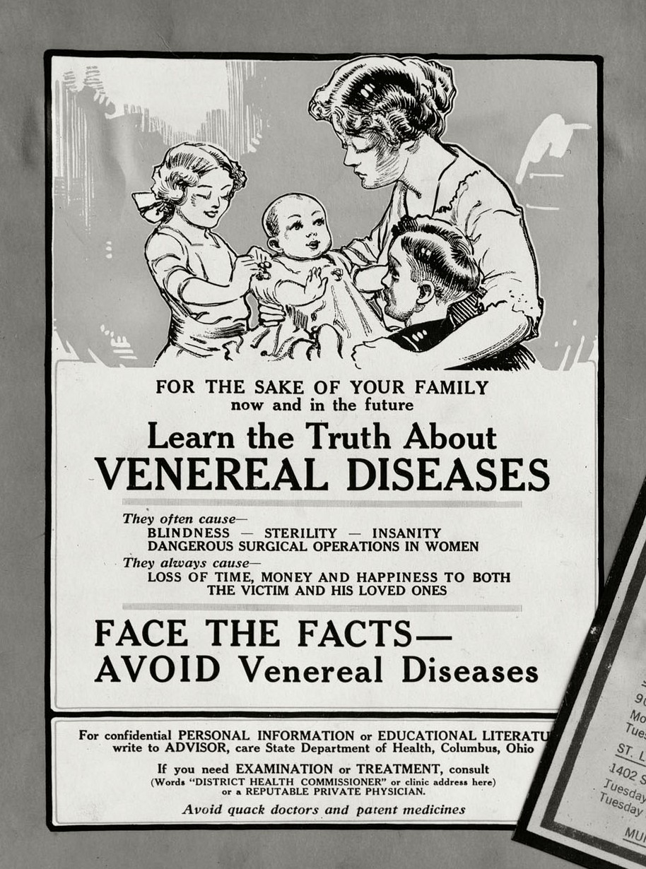
Monica C. sent along images of a pamphlet, from 1920, warning soldiers of the dangers of sexually transmitted infections (STIs). In the lower right hand corner (close up below), the text warns that “most” “prostitutes (whores) and easy women” “are diseased.” In contrast, in the upper left corner, we see imagery of the pure woman that a man’s good behavior is designed to protect (also below). “For the sake of your family,” it reads, “learn the truth about venereal diseases.”
The contrast, between those women who give men STIs (prostitutes and easy women) and those who receive them from men (wives) is a reproduction of the virgin/whore dichotomy (women come in only two kinds: good, pure, and worthy of respect and bad, dirty, and deserving of abuse). It also does a great job of making invisible the fact that women with an STI likely got it from a man and women who have an STI, regardless of how they got one, can give it away. The men’s role in all this, that is, is erased in favor of demonizing “bad” girls.
Zakiya Luna MSW PhD, Alex Kulick MA, and Anna Chatillon-Reed on February 15, 2017
Why did people march on January 21, 2017? As a team of sociologists interested in social movements, we know there are many possible answers to this seemingly simple question.
As a team of sociologists we have developed a multi-method, multi-site research project, Mobilizing Millions: Engendering Protest Across the Globe.* We want to understand why people participate in a march of this scale, at a critical historical juncture in our political landscape. Within weeks of discussion of the first march, there were already “sister” march pages national and internationally. While it is beyond the scope of this post to discuss all of the project findings thus far, the predictability of the racial tensions visible in social media or the role of men, local opportunities and challenges we do offer some early findings.
In the project’s first phase, we had team members on the ground in Washington D.C.; Austin, TX; Boston, MA; Los Angeles, CA; New York, NY; Philadelphia, PA; Portland, OR; Santa Barbara, CA and St. Louis, MO. We are currently conducting a survey about the motivations and experiences that brought millions of people to the marches worldwide. We recruited respondents from marches in the aforementioned cities, and online. This has resulted in responses from around the world. Our preliminary findings from the observations and survey highlight that 1) there were a range of reasons people attended marches and 2) across and within sites, there were varying experiences of “the” march in any location.
One striking similarity we observed across sites was the limited visible presence of social movement organizations (SMOs). For sure, SMOs became visible in social media leading up to the event (particularly for the DC march). Unlike at social movement gatherings such as the US Social Forum or conservative equivalents, the sheer number of unaffiliated people dwarfed any delegations or representatives from SMOs. Of our almost 60-member nation-wide team across sites only a handful had encountered anyone handing out organizational material, as we would see at other protest. This is perhaps what brought many people to the march—an opportunity to be an individual connecting with other individuals. However, this is an empirical question as is what this means for the future of social movement organizing. We hope others join us in answering.
Second, while the energy was palpable at all of the marches so was the confusion. As various media sources reported, attendance at all sites far exceeded projections, sometimes by 10 times. Consequently, the physical presence of the expanded beyond organizers’ expectations, which in many places required a schedule shifted. At all marches there were points where participants in central areas could not move and most people could not hear scheduled speakers even if they were physically close to a stage. Across the sites, we also observed how this challenge stimulated different responses. In multiple locations, people gathering spontaneously created their own sub-marches out of excitement as happened in DC when a band started playing on Madison street and people followed. Or, while waiting, waiting participants chanted “march, march.” Still, in many locations, once the official march started, people created sub-marches out of necessity because the pre-planned march route was impassable. When faced with standing for an hour to wait their “turn” to walk or create an alternative, they chose the latter.
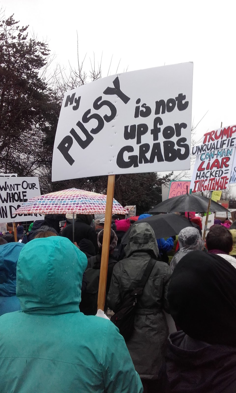
Creativity was visible in artistic forms as well. While there were professionally printed signs (and T-shirts), there was a wealth of handmade signs at the marches. As expected, a slew that referenced phrases the president-elect had said noting, for example, “this pussy grabs back.” Yet there was also a range of other signs ranging from simple text to complicated storyboards (see below).
Across sites, we also saw many differences: including which types of organizations sponsored (or “supported” or “ were affiliated with”) that march.
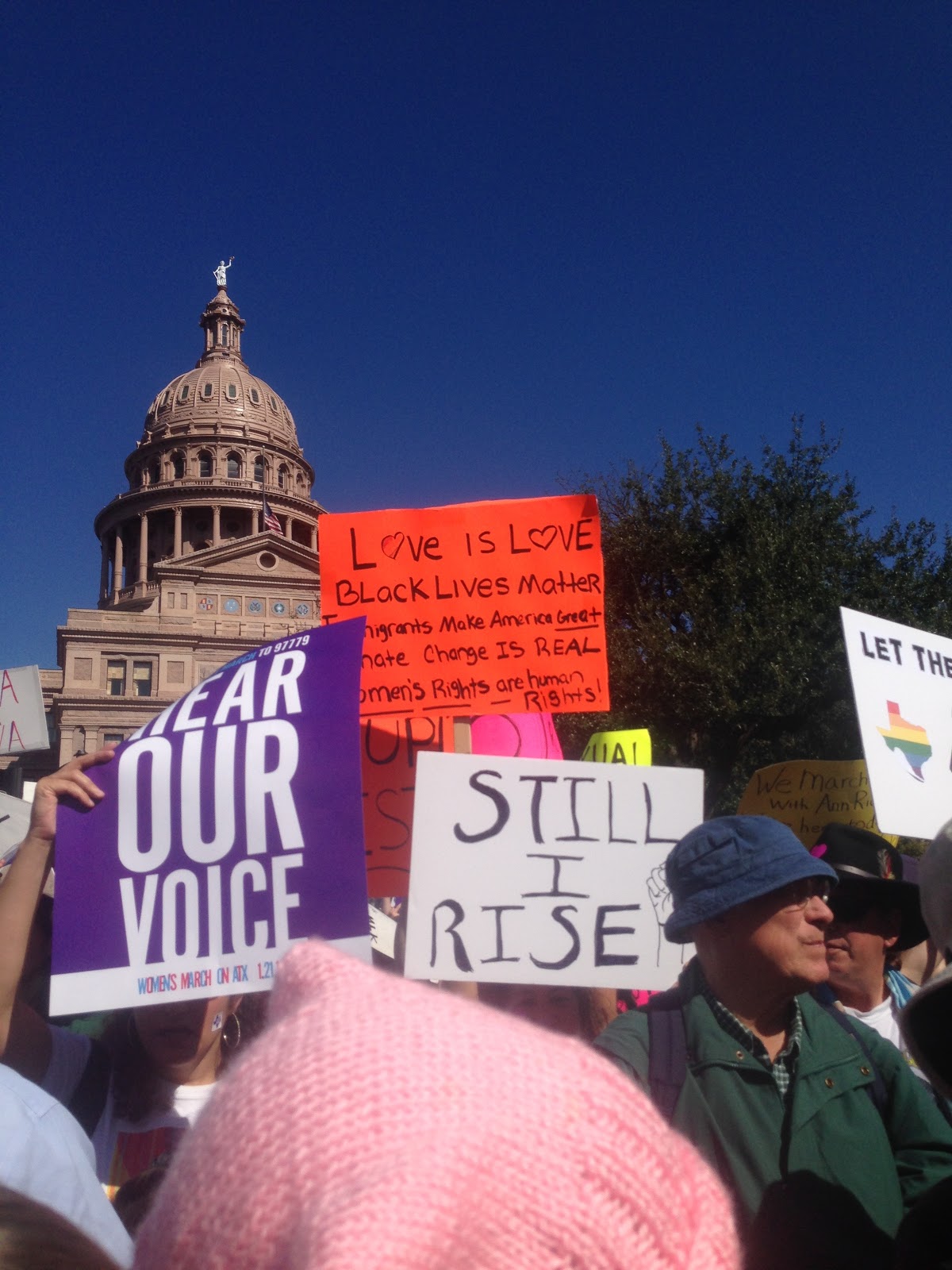
At the Austin, Texas march, marchers’ signs and chants reflected a wide variety of concerns, including women’s reproductive health care, Black Lives Matter, and environmental justice. The emotional tenor was frequently celebratory, though it varied from one point in the march to another across a crowd reported to be more than 40,000. Many speeches at the rally immediately following the march connected the actions of the Texas state legislature–on whose front steps the march began and ended–to the broader national context.
Photo of Austin, TX by Anna Chatillon-Reed.
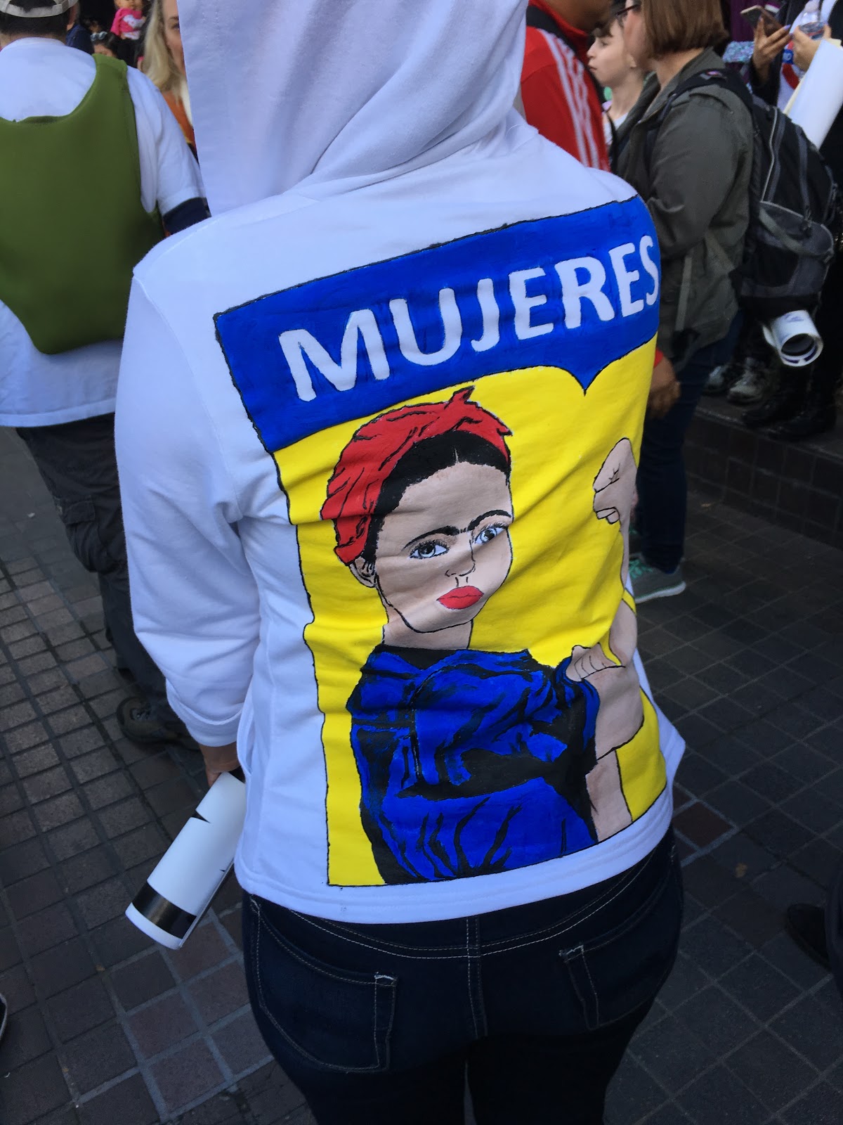
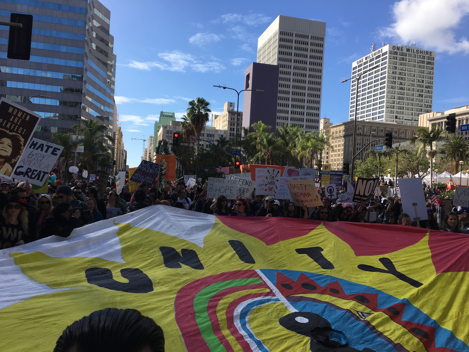
The Los Angeles March numbers suggest it exceeded DC participation. There was a noticeable presence of signs about immigration and in Spanish, which is not surprising considering the local and state demographics.
Photo of Los Angeles by Fátima Suarez.Photo of Los Angeles by Fátima Suarez
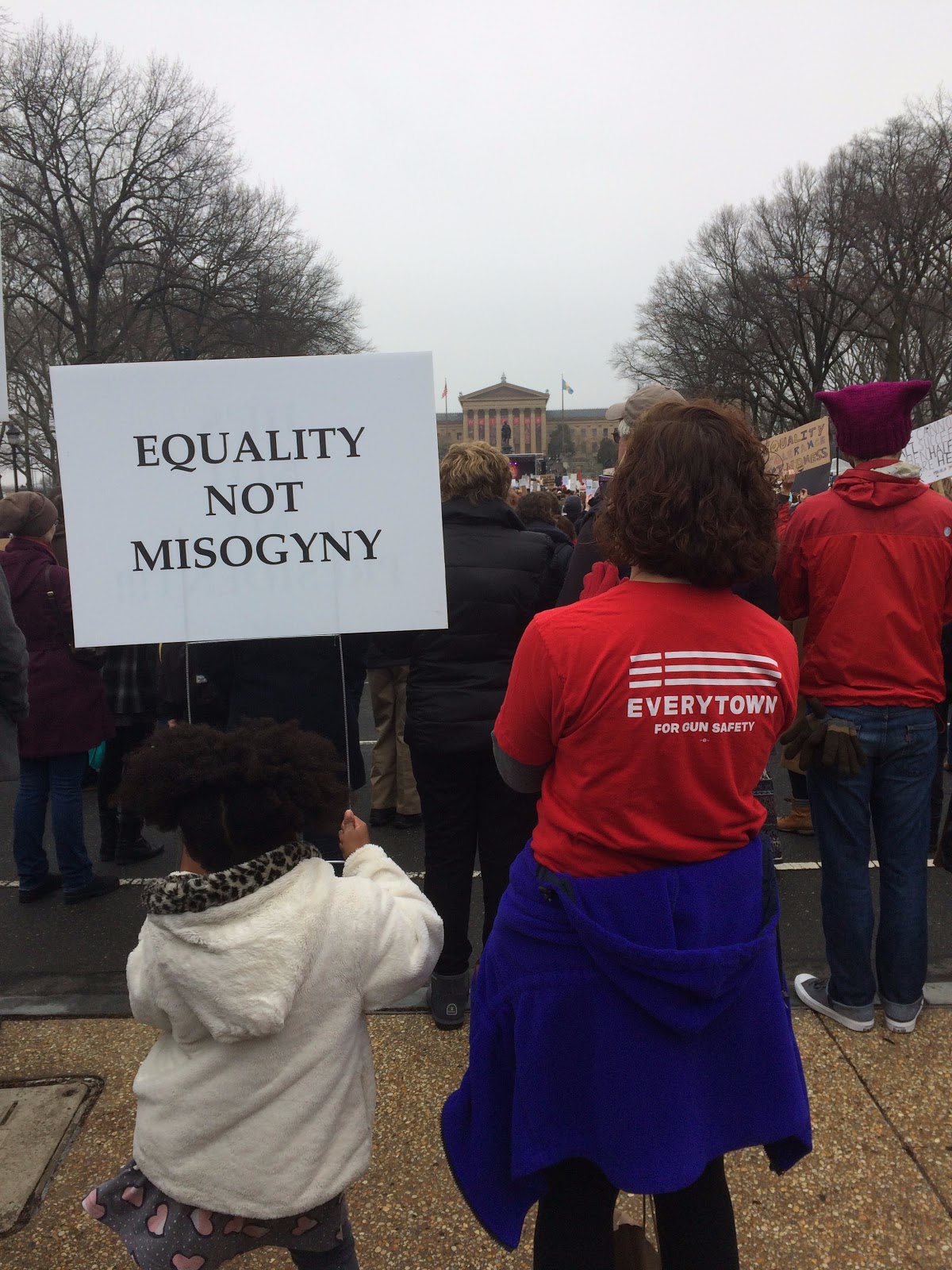
The Philadelphia, PA march was close to bigger cities of in New York and DC. Some participants noted that due to the location it was “competing” for marchers.
Philadelphia photo by Alex Kulick.Philadelphia photo by Alex Kulick.
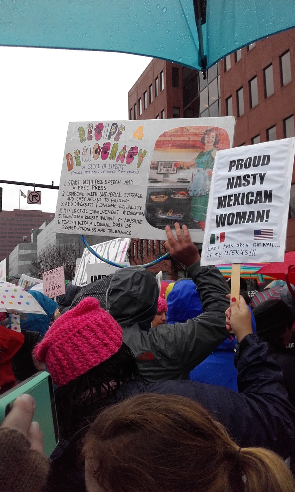
The Portland, OR protest also exceeded attendance expectations as marchers withstood hours of pouring rain. Holding the “sister” marches on the same day worldwide emphasized the magnitude and assists in building collective identity. Yet it also meant organizers in different locations faced vastly different challenges. Factors such as weather that might not have existed if organizers had been scheduling based solely on local norms and contexts.
Portland photo by Kelsy Kretschmer.Portland photo by Kelsy Kretschmer.
To help provide a preliminary sense of the motivations and continued engagement of marchers, we examined a sample of the ~40,000 tweets posted over two months. The analysis continues.
In the coming month, we are launching a separate survey to better understand a group social movement scholars are sometimes less inclined to study: people who do not participate in marches on January 21 (there are exceptions to this of course). As social movement scholars know, mobilization is actually a rare occurrence when we consider the range of grievances present in any society at any given moment. For a second phase of the project, we will conduct interviews with select survey participants.
Understanding the range of responses to grievances is critical as we move into this new era. If the first month of Trump’s presidency is any indication of the years to come, scholars and activists across the political spectrum will have many opportunities to engage these questions.
____________________
*The team Faculty collaborators are Zakiya Luna, PhD (Principal Investigator, California, DC, LA,PH and TX coordinator); Kristen Barber, PhD (St. Louis Lead); Selina Gallo-Cruz, PhD (Boston Lead); Kelsy Kretschmer, PhD (Portland Lead). The site leadership was provided by Anna Chatillon (Austin, TX); Fátima Suarez (Los Angeles, CA); Alex Kulick (Philadelphia, PA & social media); Chandra Russo, PhD (DC co-lead). We are also grateful to many volunteer research assistants.
Dr. Zakiya Luna is an Assistant Professor of Sociology at University of California, Santa Barbara. Her research focused on social movements, human rights and reproduction with an emphasis on the effects of intersecting inequalities within and across these sites. She has published multiple articles on activism, feminism and reproductive justice. For more information on her research and teaching, see http://www.zakiyaluna.com.
Alex Kulick, MA, is a doctoral student in sociology at the University of California, Santa Barbara and trainee in the National Science Foundation network science IGERT program. Their research investigates social processes of inequality and resistance with an emphasis on sexuality, gender, and race.
Anna Chatillon-Reed is a doctoral student in sociology at the University of California, Santa Barbara. She is currently completing her MA, which investigates the relationship between the Black Lives Matter movement and feminist organizations.
About Sociological Images
Sociological Images encourages people to exercise and develop their sociological imaginations with discussions of compelling visuals that span the breadth of sociological inquiry. Read more…