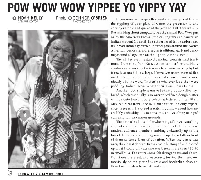
If you’re interested in cultural representations of Native Americans, I highly recommend the blog Native Appropriations. Recently Adrienne K. posted about an article in a student-government-funded newspaper at Cal State U.-Long Beach that stands out for its disrespectful, hostile tone. The article, titled “Pow Wow Wow Yippee Yo Yippy Yay,” was a “review” of the annual powwow sponsored by the American Indian Student Council. It had never occurred to me that you would review a cultural event as though it were just another form of entertainment, like a new movie, but that’s the least of the issues here. The full article, from the Union Weekly (via OC Weekly):

Some key excerpts:

…it really seemed like a large, Native American themed flea market. Some of the food vendors just seemed to unceremoniously add the word “Indian” to whatever food they were peddling. Indian tacos? What the fuck are Indian tacos?

…like a Mexican pizza from Taco Bell, but shittier. The only experience I have with fry bread is watching a show about how incredibly unhealthy it is to consume, and watching its rapid consumption on campus grounds.

The entire scene felt disingenuous and cheap. Donations are great, and necessary, tossing them unceremoniously on the ground is crass and borderline obscene. Even the homeless have hats and cups.

I flinched several times while reading the article. I grew up in Oklahoma surrounded by Native American cultures, both because I lived in an area where several tribes were very visible and because my mom is part Cherokee herself and several close relatives married people enrolled in other tribes. Even though I know that in most of the U.S. Native Americans are often culturally invisible and most people haven’t gone to tons of powwows or sat around watching the women in the family sewing ribbon shirts in the living room, I still sometimes forget that these things aren’t instantly recognizable and interesting to other people, or that they could see something that I was taught to be respectful and appreciative of and have such a different reaction.

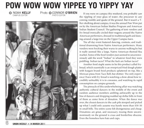
Of course, this article goes beyond being unfamiliar or uninterested. The author, the paper’s campus editor, clearly didn’t want to learn what was going on. I mean, even if you’ve never heard of one before in your life, just a minimal Google search will explain to you than an Indian taco is, more or less, a taco on fry bread (the Osage Nation even has an annual competition). An image of a dancer is used to highlight a mocking, mean-spirited “review,” as though the powwow’s only function was to entertain uneducated outsiders.

The Union Review and the author of the article issued the typical non-apology “apology” statements — we’re just here to let all sides of the debate have a voice! We’re sorry if anyone got themselves all offended, we really didn’t expect this reaction at all! — which is also available at the OC Weekly link above.

As Adrienne points out, though the “Asians in the library ” rant from a UCLA student got a huge amount of attention, there’s been much less about this. It highlights the point Tami made at What Tami Said: overtly disrespectful and/or racist behavior on campuses shouldn’t shock us, if we’re paying attention.

Cross-posted at Racialicious.

We owe many iconic images of American Indians to photographer Edward S. Curtis. Growing up in Wisconsin and Minnesota, Curtis began photographing Indians in 1895 and, in 1906, was offered $75,000 by JP Morgan to continue documenting their lives (wikipedia).  The 1,500 resulting photographs inevitably impacted the image of Indians in the American imagination.

Later it came to light that Curtis’ photographs weren’t exactly pure representations.  In some photographs, for example, he erased signs of modernity.   The first photograph below, the un-edited version, includes a clock between the two men, whereas the edited version does not.

Curtis also sometimes staged scenes and dressed paid participants in costumes, as in this photograph:

12

According to Wikipedia contributors:

In Curtis’ picture, Oglala War-Party, the image shows 10 Oglala men wearing feather headdresses, on horseback riding down hill. The photo caption reads, “a group of Sioux warriors as they appeared in the days of inter tribal warfare, carefully making their way down a hillside in the vicinity of the enemy’s camp.”  In truth headdresses would have only been worn during special occasions and, in some tribes, only by the chief of the tribe.  The photograph was taken in 1907 when natives had been relegated onto reservations and warring between tribes had ended. Curtis paid natives to pose as warriors at a time when they lived with little dignity, rights, and freedoms.

Curtis’ photographs, then, pushed his subjects back into a false past that non-Indian Americans would misrecognize as authentic for a hundred years.

The problem of misrepresentation of groups who have little power to control their own images is a widespread one.  Shelby Lee Adams’ work was mired in controversy, with critics suggesting that he contributed to the belief that Appalachians were backward, imbred, and unintelligent.   We might apply the same critical eye to representations of marginalized peoples today, like the representation of Arabs in video games and Italian-Americans on Jersey Shore and spin-offs.

Thanks to Dolores R. and Adrienne at Native Appropriations for the post idea.

Lisa Wade, PhD is an Associate Professor at Tulane University. She is the author of American Hookup, a book about college sexual culture; a textbook about gender; and a forthcoming introductory text: Terrible Magnificent Sociology. You can follow her on Twitter and Instagram.

I’m still totally geeking out about the Census Bureau starting to release data from the 2010 Census, so today you’re getting another post based on it. Kristina K. let us know that Salon has up maps of the 10 most racially-segregated metropolitan areas with populations of 500,000+, based on analyses from the University of Michigan’s Population Studies Center and available at CensusScope. Note that in the race categories, Hispanic is presented as a separate category; all other racial groups include only members of that race who said they were not of Hispanic origin. The Population Studies Center also has data available broken down by specific races and at the state level, though they don’t have maps for them, just the raw dissimilarity indices.

Here’s L.A., at #10:

Here, just for my friend Tony, is his hometown of Buffalo, NY, #6 on the list:

New York comes in second:

The most segregated 500,000+ metro area in the U.S.? Milwaukee:

Based on the dissimilarity index, over 81% of Milwaukee’s non-White population would have to relocate to be distributed similarly to Whites.

Interestingly, given assumptions many have about race relations in the U.S., the South doesn’t show up here. St. Louis is the most Southern city in the top 10, which is dominated by cities in the old industrial core of the North and upper Midwest/Great Lakes regions.

The U.S. Census Bureau has started releasing data from the 2010 Census. This map shows the change in the racial/ethnic minority (i.e., anything other than non-Hispanic White) population over the last decade:

Legend:

They released a report, An Overview: Race and Hispanic Origin in the 2010 Census (available here), which includes data on those who reported more than one race. Among those who reported more than one race, the vast majority listed two. Here are the most commonly reported combinations:

AIAN = American Indian/Alaska Native, NHPI = Native Hawaiian/Pacific Islander, and SOR = some other race.

Laura E. pointed out that New Geography posted some maps based on 2010 Census data. Here’s the Hispanic population as a percent of the total population, by county (notice that the legend need to be multiplied by 100 to get the percent):

The African American population (alone or in combination with another race, and again, multiply by 100):


The struggles in Madison have understandably focused attention on the wages and working conditions of public sector workers.  Thankfully, it appears that these struggles have helped to promote greater solidarity between public and private sector workers.  Now, we must build on this new solidarity to focus our collective energies on the bigger challenge: transforming a system that demands that workers (in both the public and private sector) accept ever worsening living and working conditions.

As many involved in the Wisconsin struggles have pointed out, there is plenty of wealth being produced—the problem is that those who are doing the producing are being increasingly denied access to it, both collectively and individually.  For example, as the Economic Policy Institute points out:

U.S. productivity grew by 62.5% from 1989 to 2010, far more than real hourly wages for both private-sector and state/local government workers, which grew 12% in the same period. Real hourly compensation grew a bit more (20.5% for state/local workers and 17.9% for private-sector workers) but still lagged far behind productivity growth.

The chart below highlights this development.  As one can see, the real issue isn’t whether public sector workers make more or less than private sector workers (and the chart covers compensation which includes pay and benefits).  Rather it is that workers together have been increasingly productive but receving an increasingly smaller share of the fruits of their labor.    Those who are well place to benefit, those at the very top of the income scale, have of course done quite well.  For example, the richest 1% received 56% of all the income growth between 1989 and 2007 (before the start of the recession).  By contrast the bottom 90% got only 16%.

If we want to change this we are going to have to build a powerful political movement, one that is prepared to take on the powerful interests that are determined to keep spending on the military; privatizing our educational, health, and retirement systems; promoting corporate mobility; weakening labor laws; and confusing us all about the causes of existing trends.


——————————

If you would like to write a post for Sociological Images, please see our Guidelines for Guest Bloggers.

Katrin sent us a link to a image at GOOD that illustrates the geopolitics of first-person shooter video games. The image was created by a group at Complex to illustrate the way that the changing actual political landscape can be seen in the nationality of villains in video games. Peter Rubin, of Complex, explains, “Gone are the days of all FPSes being either World War II or sci-fi; in the new milennium, developers are on the hunt for enemies that are speculative but still plausible.”

They looked at 20 FPS games from the past decade (unfortunately, they give no details about how those 20 games were chosen

The selected titles:

Return to Castle Wolfenstein (2001): Germany
Tom Clancy’s Ghost Recon: Desert Siege (2002): Ethiopia
Tom Clancy’s Ghost Recon: Island Thunder (2003): Cuba
Delta Force: Black Hawk Down (2003): Somalia
Tom Clancy’s Ghost Recon: Jungle Storm (2004): Colombia
Tom Clancy’s Ghost Recon 2 (2004): North Korea
Joint Operations: Typhoon Rising (2004): Indonesia
Tom Clancy’s Ghost Recon 2: Summit Strike (2005): Afghanistan
Delta Force Xtreme (2005): Chad
Tom Clancy’s Ghost Recon: Advanced Warfighter (2006): Mexico
Call of Duty 4: Modern Warfare (2007): Russia/Afghanistan
Army of Two (2008): Somalia/Afghanistan/China/Iraq
Frontlines: Fuel of War (2008): Russia/China
Call of Duty: Modern Warfare 2 (2009): Russia/Afghanistan/Brazil
Operation Flashpoint: Dragon Rising (2009): China/Russia
Singularity (2010): Russia
MAG (2010): Russia/China/India
Army of Two: The 40th Day (2010): China
Homefront (2011): Korea (They don’t specify if it’s North or South Korea)
Operation Flashpoint: Red River (2011): China

Anyway, it provides a nice little illustration of the way that global politics seeps into this element of pop culture, as well as a snapshot of nations currently perceived as rivals or even enemies of the U.S. — a mixture of old tensions (Russia, Germany), ongoing anxiety about China, and emerging focal points.

Lisa recently posted about Abercrombie Kids selling push-up bikini tops (though I just went to the website and they seem to have removed the “push-up” description). In another example of encouraging pre-teens to sexualize their bodies, Meghan L. sent in the clip “You’ve Got Snooki” from AOL Video in which Snooki, from Jersey Shore, does a makeover on an 11-year-old girl, since you’re “never too young to look bangin'” or to start thinking about how you look to boys:


In neither of the two videos below, collected by Nathan Palmer at Sociology Source, does Jon Stewart use the phrase “class war.” But when sociologists use this phrase, this is part of what we mean:

Lisa Wade, PhD is an Associate Professor at Tulane University. She is the author of American Hookup, a book about college sexual culture; a textbook about gender; and a forthcoming introductory text: Terrible Magnificent Sociology. You can follow her on Twitter and Instagram.