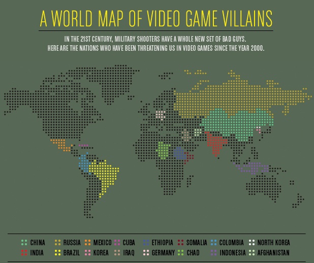
Katrin sent us a link to a image at GOOD that illustrates the geopolitics of first-person shooter video games. The image was created by a group at Complex to illustrate the way that the changing actual political landscape can be seen in the nationality of villains in video games. Peter Rubin, of Complex, explains, “Gone are the days of all FPSes being either World War II or sci-fi; in the new milennium, developers are on the hunt for enemies that are speculative but still plausible.”
They looked at 20 FPS games from the past decade (unfortunately, they give no details about how those 20 games were chosen
The selected titles:
Return to Castle Wolfenstein (2001): Germany Tom Clancy’s Ghost Recon: Desert Siege (2002): Ethiopia Tom Clancy’s Ghost Recon: Island Thunder (2003): Cuba Delta Force: Black Hawk Down (2003): Somalia Tom Clancy’s Ghost Recon: Jungle Storm (2004): Colombia Tom Clancy’s Ghost Recon 2 (2004): North Korea Joint Operations: Typhoon Rising (2004): Indonesia Tom Clancy’s Ghost Recon 2: Summit Strike (2005): Afghanistan Delta Force Xtreme (2005): Chad Tom Clancy’s Ghost Recon: Advanced Warfighter (2006): Mexico Call of Duty 4: Modern Warfare (2007): Russia/Afghanistan Army of Two (2008): Somalia/Afghanistan/China/Iraq Frontlines: Fuel of War (2008): Russia/China Call of Duty: Modern Warfare 2 (2009): Russia/Afghanistan/Brazil Operation Flashpoint: Dragon Rising (2009): China/Russia Singularity (2010): Russia MAG (2010): Russia/China/India Army of Two: The 40th Day (2010): China Homefront (2011): Korea (They don’t specify if it’s North or South Korea) Operation Flashpoint: Red River (2011): China
Anyway, it provides a nice little illustration of the way that global politics seeps into this element of pop culture, as well as a snapshot of nations currently perceived as rivals or even enemies of the U.S. — a mixture of old tensions (Russia, Germany), ongoing anxiety about China, and emerging focal points.
Lisa recently posted about Abercrombie Kids selling push-up bikini tops (though I just went to the website and they seem to have removed the “push-up” description). In another example of encouraging pre-teens to sexualize their bodies, Meghan L. sent in the clip “You’ve Got Snooki” from AOL Video in which Snooki, from Jersey Shore, does a makeover on an 11-year-old girl, since you’re “never too young to look bangin'” or to start thinking about how you look to boys:
In neither of the two videos below, collected by Nathan Palmer at Sociology Source, does Jon Stewart use the phrase “class war.” But when sociologists use this phrase, this is part of what we mean:
In a perfect example of the tendency to sexualize women but not men, MM sent in a screen capture of an image for the graphic t-shirts section of the Urban Outfitters website, in which the men are all fully clothed and the women…less so:
Students of mine who are unversed in race politics frequently use the phrase “colored people.” They hear me use the phrase “people of color” and assume that the phrases are equivalent. This is a truly reasonable assumption, even as people familiar with race-based struggle know for sure that “colored” is an offensive term and “people of color” is typically not considered so.
Occasionally a student asks me what the difference is and, to be frank, I’m not quite sure. I’ve simply absorbed the rules of talking-about-race and have a good idea of how to do so in ways that reflect grass roots language claims.
Accordingly, I was really excited to see a clip of famed activist Loretta Ross at Racialicious explaining the history of the phrase “women of color,” and later “people of color.” She explains that, while “colored people” was a phrase used to delegitimate black- and brown-skinned people, “people of color” was coined by activists hoping to bring all non-white people together into a coalition against racism.
(Thanks to decius for placing a transcript in the comments. I’ve pasted it in after the jump.)
Mindy Jovanovic sent in a vintage advertisement for “Stuffed Girl’s Heads”: fake heads meant to mimic the taxidermied trophies of hunted game oh-so-popular among some types. Mindy said, “Now I think I’ve seen it all.”
Well Mindy, I hate to disappoint you, but I think I have something even more offensive to show you: Jingle Jugs. At least the girls have heads in this “conquest,” Jingle Jugs are just fake dancing boobs mounted on a board (hard nipples included). And they’re not vintage. Oh no, they’re for breast cancer awareness.
When the earthquake and tsunami hit Japan, the twin disasters received a lot of media attention. However, it didn’t take long before concerns about the situation at the Fukushima Daiichi nuclear reactors became a major focal point of media coverage. I remember first hearing about the explosion that damaged the outer containment building at one of the reactors. Every few hours brought more news accounts that seemed to indicate impending disaster — possible radiation clouds set to arrive in Tokyo within hours, evacuations of employees from the reactors, more explosions, the possibility that a full core meltdown would occur. Officials in the U.S. expressed concern about the 20-kilometer (12 1/2-mile) evacuation zone established by the Japanese government and suggested Americans evacuate a larger area.
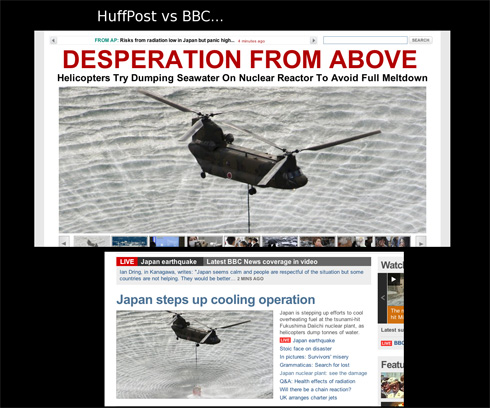
But criticisms have emerged of media — particularly much of the non-Japanese media — coverage of the problems at the nuclear reactor, suggesting the reporting was often inaccurate or that the severity of the situation and potential dangers were exaggerated, and as a result drew attention away from the destruction and suffering caused by the earthquake and tsunami. The blog Japan Probe posted screen captures illustrating the different tone of coverage of the attempt to dump water from military helicopters onto Reactor 3 as part of the efforts to keep the fuel rods cool. The first, from the Huffington Post, implies more of a sense of panic and looming disaster than does the title to a BBC article using the same photo:
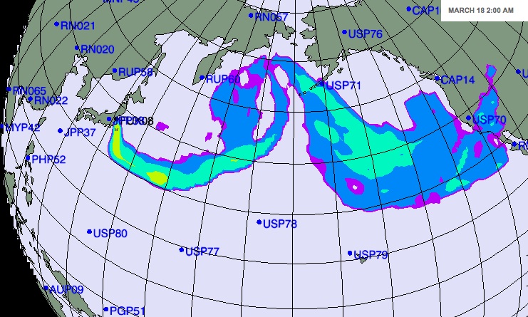
Japan Probe also links toa New York Times map, titled “Forecast for Plume’s Path Is a Function of Wind and Weather,” that shows when various detecting stations could potentially be able to pick up what the NYT takes pains to say would be “extremely low levels” of radiation that would have “extremely minor health consequences” (that last phrase bolded). Here’s the scenario that was forecast for March 18:
Scary, right? But then take a look at the color legend for the map:
The radiation levels indicated by different colors are reported in “arbitrary units.” So the different colors reflect differences in the potential level of radiation as it might hypothetically spread. But it’s based on a scale where the reader has no way to know whether the difference between purple, yellow, and red are actually meaningful and whether everything from 0.001 to 100 units, or a hundred billion gazillion units, all still count as “extremely low levels”of radiation, or if the red would indicate we’re all going to die.
I’m sure that the scientists who developed the model explained what the arbitrary unit was, but as provided in the NYT map, despite the text saying there is little to fear in terms of health, the map with the color coding seems likely to generate concern without providing much useful information.
UPDATE: Dmitriy T.M. just emailed me a link to a post about this topic at TechCrunch, which includes a clip from CNN in which Nancy Grace “schools” a meteorologist about how he’s totally wrong about radiation:
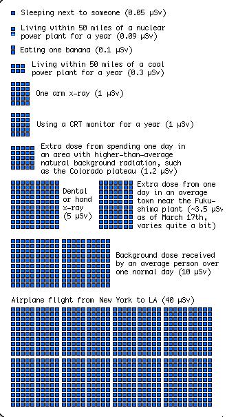
On the topic of concerns about radiation levels, my friend Kelly V. sent me a graphic put together by xkcd to put the level of radiation exposure from various sources into some context. The image is too large to fit in the space available here, but it’s worth clicking over to take a look. Here are two segments of it, but really, go look at the full image:
I’m certainly not in a position to adequately sort through the actual dangers posed by what’s going on at the Fukushima reactors, but it’s certainly worth questioning media coverage, especially insofar as that coverage drew attention away from the horrendous aftereffects of the earthquake and tsunami.
UPDATE: Reader Rei Tokyo, who lives in Tokyo, says the video has never been shown on local TV to their knowledge. I have a feeling this is more of an internet sensation outside Japan than within it.
About Sociological Images
Sociological Images encourages people to exercise and develop their sociological imaginations with discussions of compelling visuals that span the breadth of sociological inquiry. Read more…