According to an article at the Wall Street Journal,  the average income for the bottom 90% of families fell by over 10% from 2002 – 2012 while the average income for families in all the top income groups grew.  The top 0.01% of families actually saw their average yearly income grow from a bit over $12 million to over $21 million over the same period.  And that is adjusted for inflation and without including capital gains.

MI-BZ607_UNEQUA_G_20131110150005

What was most interesting about the article was its discussion of the dangers of this trend and the costs of reversing it.  In brief, the article noted that many financial analysts now worry that inequality has gotten big enough to threaten the future economic and political stability of the country.  At the same time, it also pointed out that doing anything about it will likely threaten profits.  As the article notes:

But if inequality has risen to a point in which investors need to be worried, any reversal might also hurt.

One reason U.S. corporate profit margins are at records is the share of revenue going to wages is so low. Another is companies are paying a smaller share of profits on taxes. An economy where income and wealth disparities are smaller might be healthier. It would also leave less money flowing to the bottom line, something that will grab fund managers’ attention.

Any bets how those in the financial community will evaluate future policy choices?

Martin Hart-Landsberg is a professor of economics at Lewis and Clark College. You can follow him at Reports from the Economic Front.

The current economic recovery officially began June 2009 and is one of the weakest in the post-World War II period.  This is true by almost every indicator, except growth in profits.

One reason it has offered working people so little is the contraction of government spending and employment.  This may sound strange given the steady drumbeat of articles and speeches demanding a further retrenchment of government involvement in the economy, but the fact is that this drumbeat is masking the reality of the situation.

The figure shows the growth in real spending by federal, state, and local governments in the years before and after recessions.  The black line shows the average change in public spending over the six business cycles between 1948 and 1980.  Each blue line shows government spending for a different recent business cycle and the red line does the same for our current cycle.  As you can see, this expansionary period stands out for having the slowest growth in public spending.  In fact, in contrast to other recovery periods, public spending is actually declining.

government spending

According to Josh Bivens:

…public spending following the Great Recession is the slowest on record, and as of the second quarter of 2013 stood roughly 15 percent below what it would have been had it simply matched historical averages… if public spending since 2009 had matched typical business cycles, this spending would be roughly $550 billion higher today, and more than 5 million additional people would have jobs (and most of these would be in the private sector).

The basic stagnation in government spending has actually translated into a significant contraction in public employment.  This figure highlights just how serious the trend is by comparing public sector job growth in the current recovery to the three prior recovery periods.

figure21

As Josh Bivens and Heidi Shierholz explain:

…the public sector has shed 737,000 jobs since June 2009. However, this raw job-loss figure radically understates the drag of public-sector employment relative to how this sector has normally performed during economic recoveries… [P]ublic-sector employment should naturally grow as the overall population grows. Between 1989 and 2007, for example, the ratio of public employment to overall population was remarkably stable at roughly 7.3 public sector workers for each 100 members of the population. Today’s ratio is 6.9, and if it stood at the historic average of 7.3 instead, we would have 1.3 million more public sector jobs today.

In short, the challenge we face is not deciding between alternative ways to further shrink the public sector but rather of designing and building support for well financed public programs to restructure our economy and generate living wage jobs.

Martin Hart-Landsberg is a professor of economics at Lewis and Clark College. You can follow him at Reports from the Economic Front.

The dominant firms in the U.S. and other major capitalist counties are happily making profits, but they aren’t interested in investing them in new plants and equipment that increase productivity and create jobs.  Rather they prefer to use their earnings to acquire other firms, reward their managers and shareholders, or increase their holdings of cash and other financial assets.

The chart below, taken from a Michael Burke post in the Irish Left Review, shows trends in both U.S profits and investment .

1

As you can see the increase in profits (in orange) has swamped the increase in investment (in blue) over the relevant time period; in fact, investment in current dollars has actually been falling.

Looking at the ratio between these two variables helps us see even more clearly the growth in firm reluctance to channel profits into investment.  The investment ratio (investment/profits) was 62% in 1971, peaked at 69% in 1979, fell to 61% in 2000 and 56% in 2008, and dropped to an even lower 46% in 2012.

According to Burke,  if U.S. firms were simply to invest at the level they did in 1979, not even the peak, the increase in investment in the American economy would exceed $1.5 trillion, close to 10% of GDP.

The same dynamic is observable in the other main capitalist economies:

In 1995 the investment ratio in the Euro Area was 51.7% and by 2008 it was 53.2%. It fell to 47.1% in 2012. In Britain the investment ratio peaked at 76% in 1975 but by 2008 had fallen to 53%. In 2012 it was just 42.9% (OECD data).

So what are firms doing with their money? As Burke explains:

The uninvested portion of firms’ surplus essentially has only two destinations, either as a return to the holders of capital (both bondholders and shareholders), or is hoarded in the form of financial assets. In the case of the U.S. and other leading capitalist economies both phenomena have been observed. The nominal returns to capital have risen (even while the investment ratio has fallen) and financial assets including cash balances have also risen.

So, with firms seeing no privately profitable outlet for their funds, despite great societal needs, their owners appear content to reward themselves and sock away the rest in the financial system.  In many ways this turns out to be a self-reinforcing dynamic.  No wonder things are so bad for so many.

Cross-posted at Reports from the Economic Front.

Martin Hart-Landsberg is a professor of economics at Lewis and Clark College. You can follow him at Reports from the Economic Front.

The Federal Reserve Bank has said it will maintain its stimulus policy as long as the economy remains weak. One of its key indicators for the strength of the economy is the unemployment rate, which has been steadily falling for several years, from 10% in October 2009 to 7.3% in August 2013.  However, this decline in the official unemployment rate gives a misleading picture of economic conditions, at least as far as the labor market is concerned.

The reason, as the Economy Policy Institute explains, is because of the large number of “missing workers.”  These missing workers are…

…potential workers who, because of weak job opportunities, are neither employed nor actively seeking a job. In other words, these are people who would be either working or looking for work if job opportunities were significantly stronger. Because jobless workers are only counted as unemployed if they are actively seeking work, these “missing workers” are not reflected in the unemployment rate.

We are seeing many more missing workers now than in recent history.  The chart below shows the Economic Policy Institute estimate for the number of missing workers.

missing workers_Page_1

 The next chart compares the estimated unemployment rate including missing workers (in orange) with the official unemployment rate (in blue).

unemployment rates_Page_1

As you can see, while the official unemployment rate continues to decline, the corrected unemployment rate remains stuck at a rate above 10%. In other words labor market conditions remain dismal. And here we are only talking about employment.  If we consider the quality of the jobs being created, things are even worse.

Martin Hart-Landsberg is a professor of economics at Lewis and Clark College. You can follow him at Reports from the Economic Front.

The great majority of Americans might find the post-recession expansion disappointing, but not the top earners.

The following table reveals that our economic system is operating much differently than in the recent past.  The rightmost column shows that the top 1% captured 68% of all the new income generated over the period 1993 to 2012, but a full 95% of all the real income growth during the 2009-2012 recovery from the Great Recession.  In contrast, the top 1% only captured 45% of the income growth during the Clinton expansion and 68% during the Bush expansion.

piketty_saez

Of that weren’t enough, the next chart offers another perspective on how well top income earners are doing. In the words of the New York Times article that included it:

…the top 10% of earners took more than half of the country’s total income in 2012, the highest level recorded since the government began collecting the relevant data a century ago… The top 1% took more than one-fifth of the income earned by Americans, one of the highest levels on record since 1913 when the government instituted an income tax.

We have a big economy.  Slow growth isn’t such a big deal if you are in the top 1% and 22.5% of the total national income is yours and you can capture 95% of any increase.  As for the rest of us…

One question rarely raised by those reporting on income trends: What policies are responsible for these trends?

Cross-posted at Reports from the Economic Front.

Martin Hart-Landsberg is a professor of economics at Lewis and Clark College. You can follow him at Reports from the Economic Front.

As the Wall Street Journal reports:

Four years into the economic recovery, U.S. workers’ pay still isn’t even keeping up with inflation. The average hourly pay for a nongovernment, non-supervisory worker, adjusted for price increases, declined to $8.77 last month from $8.85 at the end of the recession in June 2009, Labor Department data show.

In other words, as the chart below illustrates, the great majority of workers are experiencing real wage declines over this expansion”

image

Growth also remains sluggish, increasing “at a seasonally adjusted annual pace of less than 2% for three straight quarters — below the pre-recession average of 3.5%.”  But by intensifying the pace of work and reducing the pay of their employees, corporations have been able to boost their profits despite the slow growth.

The following chart from an Economic Policy Institute study shows the continuing and growing disconnect between productivity and private sector worker compensation (which includes wages and benefits) using two different measures of compensation.

epi trends

As the Economic Policy Institute study explains, “there has been no sustained growth in average compensation since 2004. The stagnation began even earlier, in 2003, when considering wages alone. Since 2003, wages as measured by both the ECI and the ECEC (not shown) have not grown at all — a lost decade for wages.”

The point then is that we need a real jobs program, one that is designed to create new meaningful jobs and boost the well-being of those employed.  Government efforts to sustain the existing expansion have certainly been responsive to corporate interests.  It should now be obvious that such efforts offer workers very little.

Martin Hart-Landsberg is a professor of economics at Lewis and Clark College. You can follow him at Reports from the Economic Front.

Any improvement in living and working conditions in the United States is going to require far more than tinkering at the margins.  The fact is that U.S. economic dynamics have undergone a major transformation.

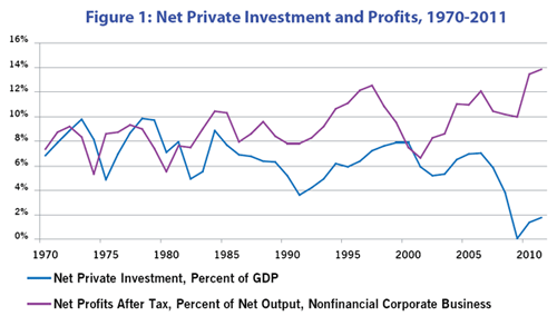
Figure 1, taken from an article by Gerald Friedman, shows that profits and investment are no longer positively related.  Since the early 2000s, profits have soared as a percent of GDP and net private investment has plummeted.  Even during the 1990s, when high-technology was celebrated as the engine of never-ending growth, net investment as a share of GDP remained below 1970s and 1980s highs.

Figure 1: Net Private Investment and Profits, 1970-2011

Our leading companies, the ones that shape government policy, are now able to make healthy profits without spending on plant and equipment much beyond replacement.  Their profits are now largely secured by globalizing manufacturing production, financialization, intensification of work, wage suppression, and government tax-breaks and subsidies.  Of course, that means that their quest for profits will continue to lead to policies likely to undermine progress in reversing negative trends in majority living and working conditions.

A case in point is their aggressive push, supported by the Obama administration, for new free trade agreements: the Trans-Pacific Partnership Free Trade Agreement and the Trans-Atlantic Free Trade Agreement. President Obama took the lead in securing passage of the Korea-U.S. Free Trade Agreement, arguing that it would improve our trade balance with Korea and by extension U.S. jobs.  Well, the returns are in, and in line with the record of past agreements, the outcome is the exact opposite.

The Eyes on Trade blog offers the following summary:

April [2013] was another record-breaking month for U.S. trade with Korea under the U.S.-Korea Free Trade Agreement (FTA).  The monthly U.S. trade deficit with Korea soared to its highest point in history, topping $2.5 billion for the month of April alone.

According to a ratio used by the Obama administration, the unprecedented deficit surge implies 13,500 U.S. jobs lost to trade with Korea in just thirty days.  April’s trade deficit with Korea was 30% higher than in April 2012 — the first full month of FTA implementation — and 90% higher than in April 2011, before the FTA took effect.

The deficit increase owes largely to a dramatic drop in U.S. exports to Korea since enactment of the FTA.  U.S. exports to Korea in April once again fell below the levels seen in any given month in the year before the FTA took effect.  The sorry track record defies the promise (FTA = more exports) that the Obama administration used to pass the FTA.  Undeterred by the facts, today the administration is using the same worn-out promise to sell the Trans-Pacific Partnership.

April 2013

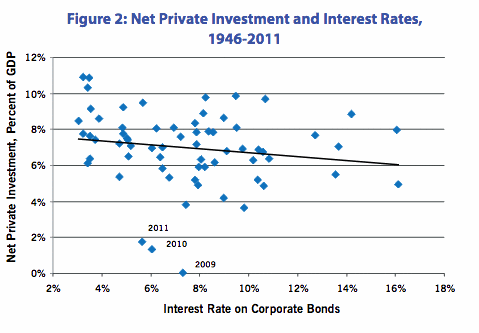
Unwilling to pursue policies that directly threaten corporate interests, the Obama administration has relied on monetary policy, or more specifically lower interest rates, to boost investment and employment.  As Figure 2 from Friedman’s article makes clear, while lower rates generally boost investment, data points for 2009, 2010, and 2011 strongly suggest that monetary policy has lost its effectiveness.

Figure 2: Net Private Investment and Interest Rates, 1946-2011

President Obama can talk all he wants about the need for more investment and better jobs, but unless he is pushed to pursue dramatically different policies, it is hard to see any real gains for working people over the next decades.

Martin Hart-Landsberg is a professor of economics at Lewis and Clark College. You can follow him at Reports from the Economic Front.

Paraphrasing Donald Rumsfeld, there are things we know and things we don’t know, and things we know we don’t know, and things we don’t know we don’t know.

One thing many working people in American don’t know that they don’t know is how poor our social benefits are compare with those enjoyed by workers in other countries.  No doubt one reason is the general media blackout about worker experiences in other countries.  A case in point: vacation benefits.

The Center for Economic and Policy Research recently completed a study of vacation benefits in advanced capitalist economies.  Here is what the authors found:

The United States is the only advanced economy in the world that does not guarantee its workers paid vacation. European countries establish legal rights to at least 20 days of paid vacation per year, with legal requirements of 25 and even 30 or more days in some countries. Australia and New Zealand both require employers to grant at least 20 vacation days per year; Canada and Japan mandate at least 10 paid days off. The gap between paid time off in the United States and the rest of the world is even larger if we include legally mandated paid holidays, where the United States offers none, but most of the rest of the world’s rich countries offer at least six paid holidays per year.

vacations

Even though paid vacations and holidays are not legally required in the United States, some employers do provide them to their workers. The table below shows the paid vacations and paid holidays offered in the U.S. private sector based on data from the 2012 National Compensation Survey.  The first two columns show the percentage of private sector workers that receive paid leave, vacation and holidays.  The next two columns show the average number of paid vacation and paid holidays provided to those employees that receive the relevant benefit.  The last two columns show the average number of paid vacation and paid holidays for all private sector workers, meaning those that receive and those that do not receive the relevant benefits.

US data

Thus, on average, private-sector workers in the United States receive ten days of paid vacation per year and six paid holidays.  This total still leaves U.S. workers last in the rankings even when compared with the legal minimums highlighted above.  And many employers in these other countries also offer more paid leave than legally required.

Moreover, several countries require additional paid leave for younger and older workers, additions that are also not included in the legal minimums highlighted above.  For example, “in Switzerland, workers under the age of 30 who do volunteer work with young people are entitled to an additional five days of annual leave. Norway offers an additional week of vacation to workers over the age of 60.”

And some countries provide additional leave for workers with difficult schedules.  For example, “Australia offers some shift workers an additional work week of leave. Austria offers workers with ‘heavy night work’ two to three extra days of leave, depending on how frequently they do this shift work, and an additional four days of leave after five years of shift work.”

Several countries offer additional paid leave for jury service, moving, getting married, or community or union work.  For example, “French law guarantees unpaid leave for community work, including nine work days for representing an association and six months for projects of ‘international solidarity’ abroad and leave with partial salary for ‘individual training’ that is less than one year. Sweden requires employers to provide paid leave for workers fulfilling union duties.”

Austria, Belgium, Denmark, Greece, and Sweden even require employers to pay workers at a premium rate while they are on vacation.

There is more to say, but the point should be clear.  Ignorance of experiences elsewhere has narrowed our own sense of possibilities.

Martin Hart-Landsberg is a professor of economics at Lewis and Clark College. You can follow him at Reports from the Economic Front.