Cross-posted at Reports from the Economic Front.

There are those that argue that lowering the top marginal tax rates on “ordinary” income (from wages or salary) and capital gains will stimulate economic growth.  Thomas L. Hungerford, in a Congressional Research Report, tests and rejects this claim.

He finds no statistical relationship between changes in either of these top tax rates and private savings, investment, productivity, or real per capita GDP growth.  However, he does find a strong statistical relationship between changes in these tax rates and income inequality.  More specifically, raising top tax rates can be expected to promote greater income equality without causing harm to the economy.

Tax Trends

There are two main tax concepts: the marginal tax rate, which is the tax paid on the last dollar of income received, and the average tax rate, which is the proportion of all income that is paid in taxes.  How much a person pays on the last dollar received depends on whether it is classified as ordinary income or capital gains.

Most importantly, as the chart below shows, the very top tax payers have enjoyed a steady decline in their average tax rate.

The next chart shows trends in top marginal tax rates on ordinary income and capital gains.  The top marginal tax rate on ordinary income has clearly been on the decline: from 91% in the 1950s, 70% in the 1960s and 1970s, to a low of 28% in 1986.  It now stands at 35%.  The top marginal capital gains tax rate has not changed as much.  It was 25% in the 1950s and 1960s, 35% in the 1970s, and is now 15%.

The Tests

Hungerford used econometric methods to test whether changes in top marginal tax rates affect private savings, investment, productivity, and/or per capita GDP growth.  Simply plotting the movement of top tax rates and each of these variables suggests that a decline in top tax rates is associated with a positive movement in each of these economic variables.

However, as Hungerford correctly states, correlation is not the same as causation.  Using regression analysis, he found that the relationships were only coincidental or spurious; there was no statistically significant connection between changes in the top tax rates and movements in any of the variables.

Hungerford also tested to see if changes in top marginal tax rates had any effect on the distribution of income.  The first chart below shows the scatter plot of top tax rates and the share of income going to the top 0.1% for the years 1945-2010.  The second shows the same with the top 0.01% of income earners.

As we can see the fitted lines suggest a very strong relationship between the variables.  As before, Hungerford used regression analysis to determine whether the relationships were statistically significant.  This time his answer was yes in both cases; changes in top marginal tax rates do affect income concentration.  In other words, lowering the top rates increases income inequality, raising them reduces it.

It is time for us to start agitating for raising the top tax rates.

Cross-posted at Reports from the Economic Front.

Politicians always seem to be talking about the middle class.  They need some new focus groups.  According to the Pew Research Center, over the past four years the percentage of adult Americans that say they are in the lower class has risen significantly, from a quarter to almost one-third (see chart below).

Pew also found that the demographic profile of the self-defined lower class has also changed.  Young people, according to Pew, “are disproportionately swelling the ranks of the self-defined lower classes.”   More specifically some 40% of those between 18 to 29 years of age now identify as being in the lower classs compared to only 25% in 2008.

Strikingly, the percentage of whites and blacks that see themselves in the lower class is now basically equal.  The percentage of whites who consider themselves in the lower class rose from less than a quarter in 2008 to 31% in 2012.  This brought them in line with blacks, whose percentage remained at a third.  The percentage of Latinos describing themselves as lower class rose to 40%, a ten percentage point increase from 2008.

And not surprisingly, as the chart below shows, many who self-identify as being in the lower class are experiencing great hardships.   In fact, 1 in 3 faced four or all five of the problems addressed in the survey.

In short, there is a lot of hurting in our economy.

Cross-posted at Reports from the Economic Front.

The media has focused on the lack of jobs as a major election issue.  But the concern needs to go beyond jobs to the quality of those jobs.

As a report by the National Employment Law Project makes clear, we are experiencing a low wage employment recovery.  This trend, the result of an ongoing restructuring of economic activity, has profound consequences for issues of poverty, inequality, and community stability.

The authors of the report examined 366 occupations and divided them into three equally sized groups by wage.  The lower-wage group included occupations which paid median hourly wages ranging from $7.69 to $13.83.  The mid-wage group range was from $13.84 to $21.13.   The higher-wage group range was from $21.14 to $54.55.

The figure below shows net employment changes in each of these groups during the recession period (2008Q1 to 2010Q1) and the current recovery (2010Q1 to 2012Q1).   Specifically:

  • Lower-wage occupations were 21 percent of recession losses, but 58 percent of recovery growth.
  • Mid-wage occupations were 60 percent of recession losses, but only 22 percent of recovery growth.
  • Higher-wage occupations were 19 percent of recession job losses, and 20 percent of recovery growth.

The next figure shows the lower-wage occupations with the fastest growth and their median hourly wages.  According to the report, three low-wage industries (food services, retail, and employment services) added 1.7 million jobs over the past two years, 43 percent of net employment growth.  According to Bureau of Labor Statistics projections these are precisely the occupations that can be expected to provide the greatest number of new jobs over the next 5-10 years.

 As the final figure shows, the decline in mid-wage occupations predates the recession.  Since the first quarter of 2001, employment has grown by 8.7 percent in lower-wage occupations and by 6.6 percent in higher-wage occupations.  By contrast, employment in mid-wage occupations has fallen by 7.3.


Significantly, as the report also notes, “the wages paid by these occupations has changed. Between the first quarters of 2001 and 2012, median real wages for lower-wage and mid-wage occupations declined (by 2.1 and 0.2 percent, respectively), but increased for higher-wage occupations (by 4.1 percent).”

A New York Times article commenting on this report included the following:

This “polarization” of skills and wages has been documented meticulously… A recent study found that this polarization accelerated in the last three recessions, particularly the last one, as financial pressures forced companies to reorganize more quickly.

“This is not just a nice, smooth process,” said Henry E. Siu, an economics professor at the University of British Columbia… “A lot of these jobs were suddenly wiped out during recession and are not coming back.”

Steady as she goes is just not going to do it and changes in taxes and spending programs, regardless of how significant, cannot compensate for the increasingly negative trends generated by private sector decisions about the organization and location of, as well as compensation for production.

Cross-posted at Reports from the Economic Front.

It’s election season and Republicans and Democrats are working hard to demonstrate that they support dramatically different policies for rejuvenating the economy.

While the Democratic Party’s call for more government spending makes far more sense than the Republican Party’s call for cuts in government spending (see below), the resulting back and forth hides the far more serious reality that our existing economic system no longer appears capable of supporting meaningful social progress for the great majority of Americans.

The chart below helps to highlight our economy’s worsening stagnation tendencies.  Each point shows the 10 year annual average rate of growth and the chart reveals a decade long growth trend that is moving sharply downward.

As David Leonhardt explains:

The economy’s recent struggles arguably began in late 2001, when a relatively mild recession ended and a new expansion began. The problem with this new recovery was that it wasn’t especially strong. From the fourth quarter of 2001 through the fourth quarter of 2007 (when the financial crisis began), the economy grew at an average annual rate of only 2.7 percent. By comparison, the average annual growth rate of both the 1990s and 1980s expansions exceeded 3.5 percent.

This mediocre expansion was followed by the severe recession and weak recovery brought on by the financial crisis. The combined result is that, in recent years, the economy has posted its slowest 10-year average growth rates since the Commerce Department began keeping statistics in 1947.

In fact, the economic growth figures for the period 1995 to 2007 were artificially propped up by a series of bubbles, first stock and then housing.  Once those bubbles popped, average growth rates began steadily falling.

The weakness (and unbalanced nature) of our current weak recovery is well captured in the following chart from Catherine Rampell, which compares the percent change in various indicators in the current recovery (which began in June 2009) with previous post-war recoveries.  The first point to stress is that the current recovery lags the average in all indicators but one: corporate profits.  The second is that government spending has actually been falling during the current recovery, no doubt one reason that the percent increase in so many indictors remains below the average in previous recoveries; the public sector is actually smaller today than it was three years ago.

The relative strength in the performance of corporate profits helps to explain why the two established political parties feel no real pressure to focus on our long term economic problems; corporations just don’t find the current situation problematic despite the economy’s weak overall economic performance.

Even more telling of the growing class divide is the explosion in income inequality over the last thirty years, which is illustrated in the following chart.

In other words, while corporations have succeeded in raising profits at the expense of wages, those in the top income brackets have been even more successful in raising their income at the expense of almost everyone else.  Notice, for example, that median household income in 2010 is roughly where it was in the late 1980s while the median income of the top households racked up impressive gains. Thus, the very wealthy have every reason to do what they are currently doing, which is using their wealth to ensure that candidates restrict their economic proposals to reforms that will do little to change the existing system.

The takeaway: without a mass movement demanding change, election debates are unlikely to seriously address our steady national economic decline.

Cross-posted at Reports from the Economic Front.

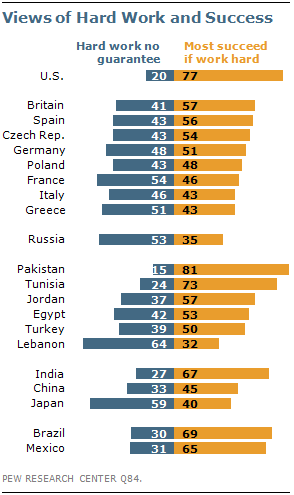
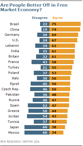
The Pew Research Center recently published a report titled “Pervasive Gloom About the World Economy.” The following two charts come from Chapter 4 which is called “The Causalities: Faith in Hard Work and Capitalism.”

The first suggests that the belief that hard work pays off remains strong in only a few countries: Pakistan (81%), the U.S. (77%), Tunisia (73%), Brazil (69%), India (67%) and Mexico (65%). The low scores in China, Germany, and Japan are worth noting. This is not to say that people everywhere are not working hard, just that many no longer believe there is a strong connection between their effort and outcome.

The second chart highlights the fact that growing numbers of people are losing faith in free market capitalism.  Despite mainstream claims that “there is no alternative,” a high percentage of people in many countries do not believe that the free market system makes people better off.

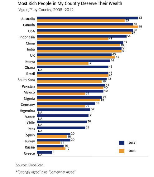
GlobeScan polled more than 12,000 adults across 23 countries about their attitudes towards economic inequality and, as the chart below reveals, the results were remarkably similar to those highlighted above.  In fact, as GlobeScan noted, “In 12 countries over 50% of people said they did not believe that the rich deserved their wealth.

It certainly seems that large numbers of people in many different countries are open to new ways of organizing economic activity.

Martin Hart-Landsberg is a professor of economics at Lewis and Clark College. You can follow him at Reports from the Economic Front.

Cross-posted at Reports from the Economic Front.

The Supreme Court has ruled favorably on the legality of the Affordable Care Act.  Actually, despite its name, the Act has more to do with extending and attempting to improve private health insurance coverage than it does with improving care or reducing its cost.

Unfortunately for us, the effort to improve our health care system has remained within bounds set by the needs of private health care providers and insurers.  As President Obama made clear from the start of his push for health care reform, there would be no consideration of a universal system.

Critics of such a universal system are always quick to argue that only market forces driven by the private pursuit of profit can ensure an efficient health care system.  Of course, in determining whether this is true, we need to recognize that efficiency is a complex term and that our health care system, like all systems, produces multiple outcomes.  The most obvious ones are private profit as well as the quality and cost of the relevant health care.

In terms of private profit there can be no doubt that our health care system functions well.  However, the story is quite different if we evaluate it in terms of quality and cost.  The fact that we continue to embrace a private health care system makes clear which measures of efficiency are considered most important and by whom.

The following map shows the countries, colored green, that have adopted a universal health care system.

mf-healthcaremap-p-thumb-615x314-91612.jpg

As Max Fisher explains:

What’s astonishing is how cleanly the green and grey separate the developed nations from the developing, almost categorically. Nearly the entire developed world is colored, from Europe to the Asian powerhouses to South America’s southern cone to the Anglophone states of Australia, New Zealand, and Canada. The only developed outliers are a few still-troubled Balkan states, the Soviet-style autocracy of Belarus, and the U.S. of A., the richest nation in the world.

The handful of developing countries that provide universal access to health care include oil-rich Saudi Arabia and Oman, Latin success story Costa Rica, Kyrgyzstan, and, famously, Cuba, among a few others. A number of countries have attempted universal health care but failed, such as South Africa, which maintains a notoriously inefficient and troubled public plan to complement the private plans popular among middle- and upper-class citizens…

That brings us to another way that America is a big outlier on health care. The grey countries on this map tend to spend significantly less per capita on health care than do the green countries — except for the U.S., where the government spends way more on health care per person than do most countries with free, universal health care. This is also true of health care costs as a share of national GDP — in other words, how much of a country’s money goes into health care.

The OECD just published a major study on the health care systems of its 34 member nations.  It found that:

 Health spending accounted for 17.6% of GDP in the United States in 2010, down slightly from 2009 (17.7%) and by far the highest share in the OECD, and a full eight percentage points higher than the OECD average of 9.5%. Following the United States were the Netherlands (at 12.0% of GDP), and France and Germany (both at 11.6% of GDP).

The United States spent 8,233 USD on health per capita in 2010, two-and-a-half times more than the OECD average of 3,268 USD (adjusted for purchasing power parity). Following the United States were Norway and Switzerland which spent over 5,250 USD per capita. Americans spent more than twice as much as relatively rich European countries such as France, Sweden and the United Kingdom.

combined1.jpg
What does all of this mean in terms of health outcomes?  According to the OECD report:

Most OECD countries have enjoyed large gains in life expectancy over the past decades. In the United States, life expectancy at birth increased by almost 9 years between 1960 and 2010, but this is less than the increase of over 15 years in Japan and over 11 years on average in OECD countries. As a result, while life expectancy in the United States used to be 1½ year above the OECD average in 1960, it is now, at 78.7 years in 2010, more than one year below the average of 79.8 years. Japan, Switzerland, Italy and Spain are the OECD countries with the highest life expectancy, exceeding 82 years.

One possible explanation for this lagging performance, highlighted in an earlier OECD report, is that the U.S. ranked 26th in terms of the number of practicing physicians relative to its population, 29th in terms of the number of doctor consultations per capita, 29th in terms of the number of hospital beds per capita, and 29th in terms of the average length of hospital stay.  At the same time, the “U.S. health system does do a lot of interventions… it has a lot of expensive diagnostic equipment, which it uses a lot. And it does a lot of elective surgery — the sort of activities where it is not always clear cut about whether a particular intervention is necessary or not.”

Private health care providers and insurers are clear about how they measure health care efficiency.  And as long as we rely on them to set the terms of the debate we will continue to suffer the consequences.

The conventional wisdom seems to be that our biggest economic challenge is runaway government spending. The reality is that government spending is contracting and pulling economic growth down with it.  And worse is yet to come.

Perhaps the best measure of active government intervention in the economy is something called “government consumption expenditure and gross investment.”  It includes total spending by all levels of government (federal, state, and local) on all activities except transfer payments (such as unemployment benefits, social security, and Medicare).  

The chart below shows the yearly percentage change in real government consumption expenditure and gross investment over the period 2000 to 2012 (first quarter).  As you can see, while the rate of growth in real spending began declining after the end of the recession, it took a nose dive beginning in 2011 and turned negative, which means that government spending (adjusted for inflation) is actually contracting.

fredgraph-percente-change-from-a-year-ago.png

The next chart, which shows the ratio of government consumption expenditure and gross investment to GDP, highlights the fact that government spending is also falling as a share of GDP.

dolan-relative-to-gdp.png

Adding transfer payments, which have indeed grown substantially because of the weak economy, does little to change the picture.  As the chart below shows, total government spending in current dollars, which means unadjusted for inflation, has stopped growing.  If we take inflation into account, there can be no doubt that total real government spending, including spending on transfer payments, is also contracting. 

current-total-expenditures.png

The same is true for the federal government, everyone’s favorite villain.  As the next chart shows, total federal spending, unadjusted for inflation, has also stopped growing.

federal-current.png

Not surprisingly, this decline in government spending is having an effect on GDP. Real GDP in the 4th Quarter of 2011 grew at an estimated 3 percent annual rate.  The advanced estimate for 1st Quarter 2012 GDP growth was 2.2 percent.  A just released second estimate for this same quarter revised that figure down to 1.9 percent.  In other words, our economy is rapidly slowing.

What caused the downward revision? 

The answer, says Ed Dolan, is the ever deepening contraction in government spending:  

What is driving the apparent slowdown? It would be comforting to be able to blame a faltering world economy and a strengthening dollar, but judging by the GDP numbers that does not seem to be the case. The following table (see below) shows the contributions of each sector to real GDP growth according to the advance and second estimates from the Bureau of Economic Analysis. Exports, which we would expect to show the effects of a slowing world economy, held up well in the first quarter. In fact, the second estimate showed them even stronger than did the advance estimate. The contribution of private investment also increased from the advance to the second estimate, although not by as much. Exports and investment, then, turn out to be the relatively good news, not the bad, in the latest GDP report.

Instead, the largest share of the decrease in estimated real GDP growth came from an accelerated shrinkage of the government sector. The negative .78 percentage point decrease of the government sector is the main indicator that we are already on the downward slope toward the fiscal cliff.

p120601-1a.png

If current trends aren’t bad enough, we are rapidly approaching, as Ed Dolan noted, the “fiscal cliff.” That is what I was referring to above when I said that worse is yet to come. As Bloomberg Businessweek explains 

Last summer, as part of its agreement to end the debt-ceiling debate (debacle?), Congress strapped a bomb to the economy and set the timer for January 2013. Into it they packed billions of dollars of mandatory discretionary spending cuts, timed to go off at exactly the same time a number of tax cuts [for example, the Bush tax cuts and the Obama payroll-tax holiday] were set to expire  

The congressional deficit supercommittee had a chance to disarm the bomb last fall, but of course it didn’t. And so the timer has kept ticking. The resulting double-whammy explosion of spending cuts and tax increases will likely send the economy careening off a $600 billion “fiscal cliff.”

The fiscal contraction will actually be even worse, since the extended unemployment benefits program is also scheduled to expire at the end of the year.  

So, what does all of this mean?  According to Bloomberg Businessweek:

If Congress does nothing, the U.S. will almost certainly go into recession early next year, as the combo of spending cuts and tax hikes will wipe out nearly 4 percentage points of economic growth in the first half of 2013, according to research by Goldman’s Alec Phillips, a political analyst and economist. Since most estimates project the economy will grow only about 3 percent next year, that puts the U.S. solidly in the red.

One can only wonder how it has come to pass that we think government spending is growing when it is not and that it is the cause of our problems when quite the opposite is true.  Painful lessons lie ahead — if only we are able to learn them.

Cross-posted at Reports from the Economic Front.

Economic recoveries often depend on the state of the housing market.  While an April increase in housing prices has led many analysts to talk of a housing recovery, U.S. home values still remain depressed.  According to a Zillow real estate research report, they are still some 25% below their 2007 peak.

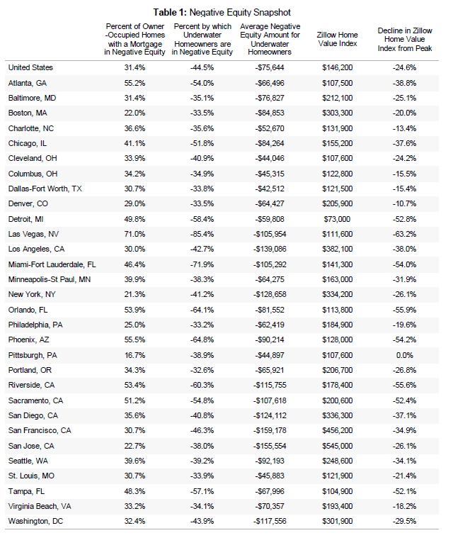
Perhaps the most telling indicator of the state of the housing market is that, as of the first quarter 2012, 31% of all owner-occupied homeowners with a mortgage were “underwater,” which means they had a mortgage greater than the market value of their home. As the table below shows, these homeowners owed, on average, $75,644 more than what their home was worth.

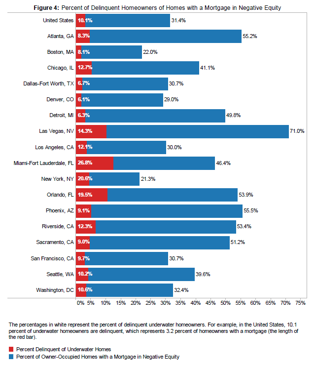
To this point, the high percentage of underwater homeowners represents, in the words of Zillow, only “a potential danger.”  That is because “the majority of underwater homeowners continue to make regular payments on their mortgage, with only 10% percent of the 31% nationwide being delinquent.”  The following figure highlights the percent of delinquent/underwater homeowners in the largest metropolitan areas.

At the same time, as Zillow notes:

With nearly a third of the nation’s mortgaged homeowners in negative equity and the average underwater homeowner having a home value that is 31 percent lower than their mortgage balance, negative equity will prove both to be difficult to fully eradicate near-term and to have pernicious effects longer term as some households continue to encounter short-term financial trouble even with a slowly improving broader economy. Should economic growth slow, more homeowners will not be able to make timely mortgage payments, thereby increasing delinquency rates and eventually foreclosures.

In other words, if the economy slows, or interest rates rise, two very likely possibilities, the housing market could deteriorate quickly, intensifying economic problems.  In short, we are a long way from recovery.