The OccupyWallStreet movement has succeed in forcing the media to acknowledge the extent and seriousness of income inequality.  In many ways wealth inequality is a bigger problem since it is wealth that largely underpins income and power differences.  According to an Economic Policy Institute posting,

the richest 5 percent of households obtained roughly 82 percent of all the nation’s gains in wealth between 1983 and 2009. The bottom 60 percent of households actually had less wealth in 2009 than in 1983, meaning they did not participate at all in the growth of wealth over this period.

It is worth dividing the top 5% into what has now become two familiar groups, the top 1% and the next 4%.  As the chart below shows, the top 1% of households captured 40% of all the growth in wealth over the period 1983 to 2009.  The next 4% gained 41.5%.

ob-pr379_wealth_g_20110916115942.jpg

Putting these trends into dollars, households in the top 1% gained an average of $4.5 million in wealth and households in the next 4% gained an average of $1.2 million over the period.  It is worth restating that those are just their gains. How does your existing wealth stack up against their gains?

OccupyWallStreet has given rise to Occupy actions all over the United States and other countries as well.   One of the many slogans of this growing grassroots movement is “We are the 99%.”  This is a powerful slogan—highlighting the ways in which our current system serves the interests of a very small number of people.  Case in point: the top 1% of income earners captured 65% of all the growth in income over the period 2002 to 2007. 

Before this movement, there was another movement of 99ers.  Those were the unemployed facing life without a job and without any unemployment benefits.  Their ranks are about to grow again.  According to the Wall Street Journal, some 2.2 million people currently receiving unemployment benefits will lose them by Feb. 11, 2012 if Congress doesn’t renew our expanded unemployment benefits programs before the end of the year.

 na-bn729_number_d_20111014160903.jpg

Here is some background on the two programs slated to end, the federal Emergency Unemployment Compensation (EUC) program and the federal-state Extended Benefits (EB) program. Workers in all states are typically eligible to receive up to 26 weeks of Unemployed Insurance (UI) benefits from the regular state-funded unemployment compensation program.  Workers in any state who exhausted their UI benefits became eligible for up to 34 additional weeks of benefits thanks to the EUC program. That number went up to 53 weeks in states that had especially high unemployment rates (see chart below). Workers who exhausted their UI and EUC benefits were eligible for a maximum 20 additional weeks of coverage through the EB program if their state’s unemployment insurance laws allowed it.

policybasics_ui_weeks_table1-rev8-30-10.jpg

So, depending on what state you live in and how bad the unemployment rate is, an unemployed person would receive the base 26 weeks, possibly an additional 53 weeks under the EUC program, and possibly a further 20 weeks under the EB program, for a maximum of 99 weeks. What is up for renewal now is not an extension of benefits beyond the 99 weeks, but continuation of the EUC and EB programs. 

If Congress lets those programs expire, people who would have received benefits beyond the 26 week limit will lose them once they run though the weeks corresponding to the program that now provides them benefits.  For example, workers receiving EUC benefits will not be eligible for EB benefits.  And workers receiving UI benefits will not be eligible for EUC benefits.  And of course all new unemployed will be limited to 26 weeks. 

The assumption seems to be that there are jobs out there for the taking.  In reality, people just cannot find work.  Here are two charts from the Federal Reserve Bank of St. Louis that illustrate just how bad the job market has been for American workers.  The first shows the percentage of unemployed who have been out of work for 27 weeks or more.  The second shows the median duration of unemployment.

picture1.jpg


picture2.jpg

Here is what the Wall Street Journal has to say about recent and projected unemployment trends:

The number of Americans out of work for more than six months rose by 208,000 to 6.2 million in September, the Labor Department said last week. Some 44.6% of all of those who are unemployed have been sidelined for at least six months. Most of those individuals — nearly 4.4 million — have been out of work for at least a year.

In past recessions, unemployment extensions continued until the unemployment rate dropped below 7.5%. That’s a long way from the 9.1% rate recorded for September. Indeed, economists in the latest Wall Street Journal forecasting survey see the rate still elevated at 8.2% in December 2013.

So, why is Congress reluctant to renew our extended unemployment benefits programs, a renewal which doesn’t even help those that have gone through their 99 weeks?  According to the Wall Street Journal:

The Congressional Budget Office estimates that it would cost around $44 billion to extend benefits through 2012. That makes it a tough sell in a Congress looking to trim deficits. 

That’s right–$44 billion is just too much money to spend in a budget that includes close to a trillion dollars to fund the Pentagon, fight wars in Afghanistan and Iraq, and maintain costly and intrusive domestic security programs.

What can we do?  The best response is to deepen our support for the Occupy America movement and force a change in priorities. 

312296_10150419637402518_638522517_10164775_1895526551_n.jpg


An April 2011 Gallup poll found that 29% of Americans thought that the U.S. economy was in a depression.  Another 26% thought it was only a recession.   This is scary since, according to the National Bureau of Economic Research, we have been in an economic expansion since June 2009.

Why would so many Americans feel this way you might ask.  Here is one reason.  According to recent Census Bureau data, during the recession, which lasted from December 2007 to June 2009, inflation-adjusted median household income fell by 3.2%.  Between June 2009 and June 2011, a period of economic expansion, inflation-adjusted median household income fell by 6.7%.   This decline is illustrated in the New York Times chart below.

1010-nat-incomeweb.jpg

I recently appeared on the Alliance for Democracy’s “Populist Dialogue” TV show to talk about our economic crisis and possible responses to it.  You can watch the show here or below.

Children are our most important resource.  Everyone says it, but we don’t really mean it.

Exhibit one: the percentage of children under the age of 18 that live in poverty. In 2007, at the peak of our previous economic expansion, the child poverty rate was 18%.  In 2009, it hit 20%.  The figure below provides a look at child poverty rates in each state.  New Hampshire had the lowest rate: 11%.  Mississippi the highest rate: 31%. According to a recently released Census Bureau study, the 2010 national child poverty rate was 22%.


poverty.jpg


How Do We Measure Poverty?

Children under the age of 18 are counted as poor if they live in families with income below U.S. poverty thresholds.  There are a range of poverty thresholds which are based on family size and number of children.  These poverty thresholds are far from generous.  The 2009 poverty threshold for a family of two adults and two children was$21,756.

Sadly our poverty rates understate the seriousness of our poverty problem, for children and adults.  The history of how we developed and calculate our official poverty thresholds provides perhaps the clearest proof of the inadequacy of current statistics.  First introduced in 1965, the thresholds were based on previous work by the Department of Agriculture (DOA).  The DOA created an “economy” food plan in the 1950s that was designed for “temporary or emergency use when funds are low.”  DOA surveys had also established that families of three or more persons spent approximately one-third of their after tax income on food.  Our initial thresholds were set by multiplying the cost of the economy food plan (adjusted for family size) by three.

From 1966 to 1969, these poverty thresholds were revised annually by the yearly change in the cost of the items contained in the economy food plan.  After 1969, and still today, the poverty thresholds were adjusted by the rise in the consumer price index.

Our poverty rates are calculated by comparing pre-tax family incomes to these thresholds.

Why the Poverty Threshold is Deficient

This methodology has produced a poverty standard and estimates of poverty that are deficient for several important reasons:

First, our knowledge of nutrition has significantly changed since the 1950s.

Second, families now spend approximately one-fifth of their after-tax income on food, not one-third.  That correction alone would mean that the food budget should be multiplied by 5 rather than 3, thereby producing higher thresholds and poverty rates.

Third, poverty is best thought of as a relative condition, which means that it should not be measured by comparing incomes to an unchanging standard based on the cost of a 1950’s economy food plan.

Fourth, poverty rates should be calculated using after-tax family income adjusted to include the value of government support programs like food stamps (which are also fluctuating and often cut in hard times), not unadjusted pre-tax family income.

A Better Measure

Researchers, drawing on the work of the National Academy of Sciences Panel on Poverty and Family Assistance Economists, have developed an alternative experimental approach to measuring poverty.  They start with a reference family, two adults and two children.  Then, using Consumer Expenditure Surveys, they calculate the dollar amount of spending on food, clothing, shelter, utilities and medical care by all reference families in a given year.

The poverty threshold for the reference family is set at the midpoint between the 30th and 35th percentile of the spending distribution for all families with two adults and two children.  Small multipliers are then used to add spending estimates for other needs, such as transportation and personal care, slightly raising the poverty threshold.   This threshold is adjusted for families of other compositions.

The chart below shows national poverty rates for the years 1996 to 2005.  We see that the rates produced by this experimental methodology are significantly higher than the official rates.

comparison.jpg

Strikingly, while the official poverty rate is lower in 2005 than in 1996, the 2005 experimental poverty rate is the highest in the period.  The difference is largely explained by the fact that the experimental measure incorporates changes in the availability of social programs and the relative importance of non-food goods and services in family spending.

Returning to the issue of child poverty, the table below highlights the difference between the two measures for specific demographic groups.  Notice that the child poverty rate calculated using the experimental measure is always higher than the official rate.  As previously stated, the official 2010 child poverty rate is 22 percent.  The experimental rate would no doubt be several percentage points higher, closing in on 25 percent.

poverty-table.jpg

What can one say about a situation where between one-fifth and one-fourth of all children in the United States live in poverty?  Language like “outrageous,” “unacceptable,” and “indicator of a flawed economic system” comes to mind.  What also comes to mind is the fact that these poverty statistics rarely get the attention they deserve, as does the question of why that is so.


The media likes to talk about markets as if they were just a force of nature.  In fact, markets and their outcomes are largely shaped by political power.  In a capitalist system like ours, that power is largely used to advance the interests of those who own and run our dominant corporations.

Thanks to Bloomberg News we have yet another example of this reality.  In brief, as a result of Congressional and media pressure the Federal Reserve was recently forced to reveal its lending activity for the period August 2007 through April 2010.   Bloomberg News examined these Federal Reserve records and found that the Fed secretly provided selected banks, brokerage houses, and even non-financial firms (such as General Electric and Ford) with at least $1.2 trillion in loans, often with minimal collateral required and at below market interest rates.

This money was given through more than a dozen lending programs.  Many firms tapped multiple programs through multiple subsidiaries. Bloomberg arrived at its total by focusing on the seven largest programs, which included the Fed’s discount window and six temporary lending facilities (the Asset-Backed Commercial Paper Money Market Mutual Fund Liquidity Facility; the Commercial Paper Funding Facility; the Primary Dealer Credit Facility; the Term Auction Facility; the Term Securities Lending Facility; and so-called single- tranche open market operations).

If you like visuals, here is a 5 minute video that provides a good summary of what Bloomberg gleaned from its examination.

UPDATE: Embedding was disabled, but you can watch it here.

Bloomberg also has an interactive site that allows you to chart who got what and over what period.

Some of the highlights are as follows:

The largest borrower, Morgan Stanley, got as much as $107.3 billion, while Citigroup took $99.5 billion and Bank of America $91.4 billion . . .

Almost half of the Fed’s top 30 borrowers, measured by peak balances, were European firms. They included Edinburgh-based Royal Bank of Scotland, which took $84.5 billion, the most of any non-U.S. lender, and Zurich-based UBS AG, which got $77.2 billion. . . .

The $1.2 trillion peak on Dec. 5, 2008 — the combined outstanding balance under the seven programs tallied by Bloomberg — was almost three times the size of the U.S. federal budget deficit that year and more than the total earnings of all federally insured banks in the U.S. for the decade through 2010, according to data compiled by Bloomberg.

The Federal Reserve fiercely resisted making its records public, arguing that doing so would stigmatize those institutions that received loans.  A group of the largest commercial banks actually petitioned the Supreme Court in an unsuccessful effort to keep the loan information secret.

Perhaps one reason that the Federal Reserve and the banks were reluctant to have these records made public is that they raise significant questions of conflict of interest.  According to a statement by Vermont Senator Bernie Sanders:

…the Fed provided conflict of interest waivers to employees and private contractors so they could keep investments in the same financial institutions and corporations that were given emergency loans.

For example, the CEO of JP Morgan Chase served on the New York Fed’s board of directors at the same time that his bank received more than $390 billion in financial assistance from the Fed.  Moreover, JP Morgan Chase served as one of the clearing banks for the Fed’s emergency lending programs.

In another disturbing finding, the GAO said that on Sept. 19, 2008, William Dudley, who is now the New York Fed president, was granted a waiver to let him keep investments in AIG and General Electric at the same time AIG and GE were given bailout funds.  One reason the Fed did not make Dudley sell his holdings, according to the audit, was that it might have created the appearance of a conflict of interest.

Another reason may be that the Federal Reserve didn’t want it known that it was deviating from its past practice of requiring borrowers to provide secure collateral, which was normally either Treasuries or corporate bonds with the highest credit rating, and never stocks.  For example:

Morgan Stanley borrowed $61.3 billion from one Fed program in September 2008, pledging a total of $66.5 billion of collateral, according to Fed documents. Securities pledged included $21.5 billion of stocks, $6.68 billion of bonds with a junk credit rating and $19.5 billion of assets with an “unknown rating,” according to the documents. About 25 percent of the collateral was foreign-denominated.

Moreover, as Bloomberg News also reported, many Fed loans were made at below market interest.

On Oct. 20, 2008, for example, the central bank agreed to make $113.3 billion of 28-day loans through its Term Auction Facility at a rate of 1.1 percent, according to a press release at the time.

The rate was less than a third of the 3.8 percent that banks were charging each other to make one-month loans on that day. Bank of America and Wachovia Corp. each got $15 billion of the 1.1 percent TAF loans, followed by Royal Bank of Scotland’s RBS Citizens NA unit with $10 billion, Fed data show.

These loans were absolutely critical to the survival of our leading companies.  A case in point:

Citigroup was in debt to the Fed on seven out of every 10 days from August 2007 through April 2010, the most frequent U.S. borrower among the 100 biggest publicly traded firms by pre- crisis market valuation. On average, the bank had a daily balance at the Fed of almost $20 billion.

These loans are also a key reason that our post-Great Recession economy remains largely unchanged in structure.  In other words, it was the exercise of political power, rather than so-called market dynamics or efficiencies, that explains the financial industry’s continuing profitability and economic dominance.

Now imagine if we had a state that engaged in transparent planning and was committed to using our significant public resources to reshape our economy in the public interest.  As we have seen, state planning and intervention in economic activity already goes on.  Unfortunately, it happens behind closed doors and for the benefit of a small minority. It doesn’t have to be that way.

Everyone says that they want an economic recovery.  So, why don’t we have one?  Most surveys of business people tell the same story: there is no recovery because business owners are unwilling to hire and they are unwilling to hire because people are not spending.

So, why aren’t people spending?  One reason is that many people are unemployed.  Another reason, one that business leaders doesn’t like to discuss, is that business has been boosting its profits by cutting worker pay.  And not just for the less educated who are said to be the unfortunate victims of technology and globalization.  Rather, as the chart below shows, for workers in almost all educational categories.

na-bn371_census_g_20110919135704.jpg

The average earnings of workers in almost all educational categories declined between 2000 and 2010.  Talk about a lost decade for working people!  Only those with an MD, JD, MBA or PhD enjoyed a real increase over the period, and those workers make up only 3% of the workforce.

The average earnings of college graduates, 19.5% of the workforce, declined (adjusted for inflation) by approximately 8%.  Interestingly, the average earnings of high school graduates, 30.7% of the workforce, actually suffered a smaller decline.

These numbers make clear that the solution to our economic problems is not more education.  Even those with Masters Degrees lost money on average.  Recovery will require real structural change in the way our economy operates.

In a previous post I discussed data showing the growing income inequality in the U.S.: the middle class is shrinking, the poor are getting poorer, and the rich are getting richer. It turns out that corporations understand what is happening and they are responding.  In brief, they are letting go of the middle class as a market and restructuring their offerings to appeal to the top and bottom of the income distribution.

Below the jump (warning, it automatically starts playing with sound) is an enlightening five minute discussion of this new business strategy on Daily Ticker video:

The Wall Street Journal, highlighting Procter & Gamble, also reports on this development:

For the first time in 38 years… the company launched a new dish soap in the U.S. at a bargain price.

P&G’s roll out of Gain dish soap says a lot about the health of the American middle class: The world’s largest maker of consumer products is now betting that the squeeze on middle America will be long lasting…

P&G isn’t the only company adjusting its business.  A wide swath of American companies is convinced that the consumer market is bifurcating into high and low ends and eroding in the middle.  They have begun to alter the way they research, develop and market their products…

To monitor the evolving American consumer market, P&G executives study the Gini index, a widely accepted measure of income inequality that ranges from zero, when everyone earns the same amount, to one, when all income goes to only one person. In 2009, the most recent calculation available, the Gini coefficient totaled 0.468, a 20% rise in income disparity over the past 40 years, according to the U.S. Census Bureau.

“We now have a Gini index similar to the Philippines and Mexico—you’d never have imagined that,” says Phyllis Jackson, P&G’s vice president of consumer market knowledge for North America. “I don’t think we’ve typically thought about America as a country with big income gaps to this extent.”

Such a response may well strengthen corporate bottom lines, at least for a while.  Unfortunately for the great majority of us, it may also reinforce existing downward trends in income.

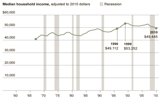
The Census Bureau just published new data revealing trends in living standards as of 2010.  The trends are troubling to say the least. Median household income (adjusted for inflation) fell to $49,445.  That means that the median household now earns less than it did a decade ago.  This marks the first decade since the Great Depression without an increase in real median income.

According to Lawrence Katz, a labor expert and Harvard economist:

This is truly a lost decade.  We think of America as a place where every generation is doing better, but we’re looking at a period when the median family is in worse shape than it was in the late 1990s.

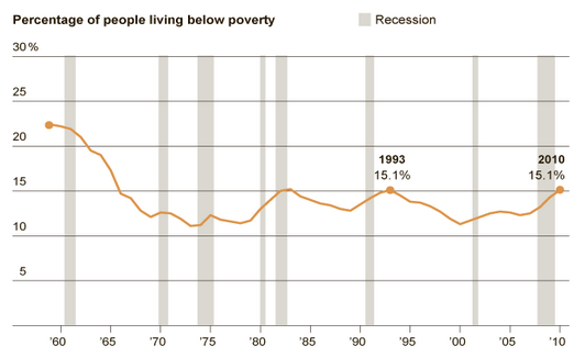
The percentage of Americans living in poverty hit 15.1 percent, the highest percentage since 1993.  There are now 46.2 million people living below the poverty line, the greatest number ever recorded by the Census Bureau. Child poverty stood at 22 percent.

Things are unlikely to get better this year.  State and local governments are slashing employment and programs and the federal government is now moving into cutting mode itself.

This depressing situation is not simply a recession phenomenon.  As the New York Times reports, the expansion period of 2001 to 2007 “was the first… on record where the level of poverty was deeper, and median income of working-age people was lower, at the end than at the beginning.”

Of course, while the great majority of people are struggling, a small minority have been doing very well.  One consequence, as the chart below highlights, is a strong growth in inequality (as measured by the Gini coefficient with higher numbers reflecting greater inequality).  As I noted in a previous post, over the years 2002 to 2007, the top 1% of households captured 58% of all the income generated.

inequality-2.jpg


In brief, there is a small minority that is doing very well and a great majority that is struggling, with a significant number in free fall.