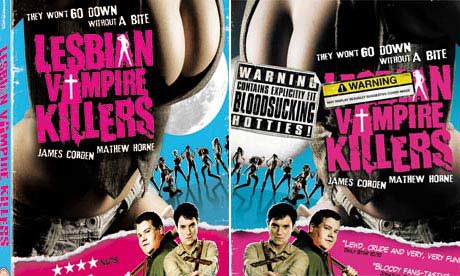
Giorgos S. sent us a link to a story in the Guardian about the cover of DVDs of the movie “Lesbian Vampire Killers.” Some stores are carrying censored versions. Giorgos says he’s seen the censored version at Borders stores in the U.K.:

Lesbian-Vampire-Killers-c-001

So apparently the phrase “they won’t go down without a bite” is fine, and major cleavage requires just a tad bit of coverage with a sticker that says “Warning: Contains explicitly fit bloodsucking hotties!” The sticker that nearly entirely obscures the word “lesbian” says, “Warning: may display sexually suggestive cover image.”

The distributors blame stores, saying a number of large retailers requested that they obscure particular parts of the cover. The stores say they didn’t request that the word “lesbian” be hidden. I suppose we’ll never know what happened there. It does crack me up that you’d be willing to sell a movie called “Lesbian Vampire Killers,” but then be worried about the cover.

The issue of censorship leaves aside, of course, the content of the film itself. This may surprise you, but it was apparently widely negatively reviewed. IMDb summarizes the plot thusly:

Their women having been enslaved by the local pack of lesbian vampires thanks to an ancient curse, the remaining menfolk of a rural town send two hapless young lads out onto the moors as a sacrifice.

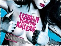
Here’s the original marketing poster:

200px-Lesbian_vampire_killers_film

I like how her nipples have been photoshopped out (unless lesbian vampires have nipples on the sides of their boobs).

If anyone’s seen it, I’d be interested to know if it portrays lesbians as ridiculously as I suspect it does.

See also: airbrushing out men’s nipples.

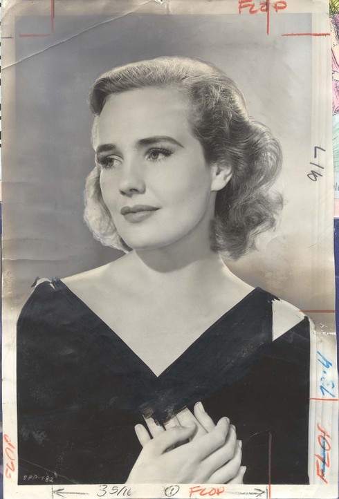
Larry Harnisch of the L.A. Times blog The Daily Mirror sent in some old images from the Times archives that show how photos of stars were touched up to show less skin. Here’s one of Frances Farmer (from Larry’s post about her):

frances_farmer_1940_0910_flowing_go

The image comes from the 1940 movie “Flowing Gold.” Apparently it was considered too revealing and the Times had someone draw in a dress above her wrap…with what appears to be a black magic marker.

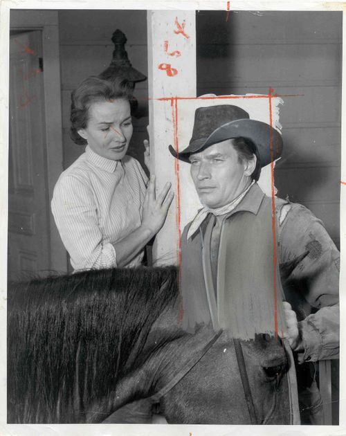
Charlton Heston was also retroactively covered up. Both of the following images come from The Daily Mirror. This is a still from a 1957 episode of “Shlitz Playhouse.” Someone very obviously, and badly, drew a shirt on him:

6a00d8341c630a53ef01156f112b81970c-500wi

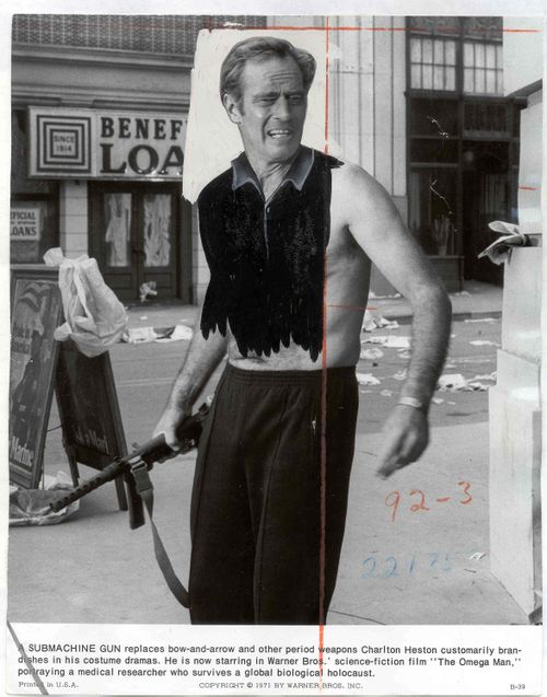
Though the photo was touched up by the L.A. Times staff, it’s not clear whether it actually appeared in the paper. This photo most definitely did, however; it accompanied a review of “The Omega Man” from August 27, 1971. They did an even better job with the shirt this time:

6a00d8341c630a53ef01157008260e970b-500wi

It provides some perspective on how ideas of how much uncovered skin is appropriate to run in a mainstream media outlet have changed over the years. It’s also interesting that both men’s and women’s chests were covered. But mostly they just crack me up. The last one is my favorite.

Also check out the post about Sacha Baron Cohen naked on the cover of GQ and spoofing magazine covers that have naked people on them.


This clip from The Daily Show nicely illustrates how ridiculous and utterly meaningless the statistics we encounter can be:

This probably goes without saying, but there are multiple problems here:

1. Viewers of these shows are a self-selected group who are quite likely watching because they agree with the hosts to some degree, so it wouldn’t be surprising they’d agree with the hosts’ views.

2. Viewers who care enough to text are an even more unusual group, likely to be those who feel most passionately about an issue.

3. Only those people watching the show and are able to text right then are able to vote.

4. The wording of the questions is clearly intended to lead to a particular answer, using leading phrases like “are you outraged,” which responsible social scientists would never use–any question that uses something along the lines of “don’t you agree” or “wouldn’t you say that” makes it more likely the respondents will, indeed, agree with the point.

5. The hosts actively cajole viewers to give a specific answer if they aren’t getting as many of that answer as they wanted.

Of course, the hosts aren’t trying to present factual, useful information and almost certainly know very well that they’re manipulating questions to get results that will appear to overwhelmingly support their position. But we’re inundated with “statistics” such as these every day that are completely meaningless, but many many people don’t know how to evaluate them. This little clip shows some of the things a person should look for as an indication that a number was created to support a particular viewpoint and should be viewed with extreme skepticism, if not dismissed altogether.

Gwen Sharp is an associate professor of sociology at Nevada State College. You can follow her on Twitter at @gwensharpnv.

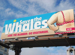
Often when we have an image related to PETA we add it to one of our existing posts, since they tend to be similar–mostly sexualizing women or showing them as bloody meat. But Jessica B. and Dmitriy T.M. told us about a PETA billboard that takes a different angle, and I thought it was worth its very own post:

s-SAVE-THE-WHALES-large

Found at The Huffington Post.

This is just…ugh. Erg. !!! ??? !!!

I’m sorry, but that’s the most coherent I can be about this. I’m sure our commenters will be able to make more useful points about it.

Well, ok, I have one more thought: the implication is that being a vegetarian will automatically make you lose weight. That’s just dumb, or more likely intentionally misleading.

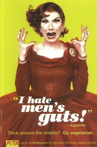
UPDATE: Anomie let me know that there’s at least one version about men (found here):

41963

Two more examples with men here.

Related posts: women in (fake) lettuce bikinis, Dutch animal rights ad shows stripper brutally murdered, not sexualizing older women, PETA ad banned from Superbowl, women as bloody packaged meat, Holocaust on Your Plate campaign, using domestic violence to oppose animal abuse, Christina Applegate naked, more naked celebrities, and leftist balkanization.

In my Intro to Soc course I assign K.R. Thompson’s article “Handling the Stigma of Handling the Dead: Morticians and Funeral Directors” (Deviant Behavior 1991, v. 12, p. 403-429). Thompson looked at how those involved in preparing the dead for burial and planning funerals try to manage the negative perceptions they suspect much of the public has of them. Language was a major way they tried to do this–redefining themselves as “funeral directors” rather than “morticians” or “undertakers,” referring to dead people as “the deceased” rather than “the body” or “the corpse,” “casket” rather than “coffin,” and so on. The point was to try to reduce the association with death–to never blatantly refer to death at all.

They also tried to avoid what they felt were stereotypes of funeral directors. Some mentioned trying not to wear black suits, and one man went so far as to keep hand warmers in his pockets so his hands would be warm when he shook family members’ hands–a reaction to what he said was a belief that funeral directors have cold, clammy hands. Others lived in a different town than where they worked and tried to keep their careers secret.

All of this was an attempt to avoid the stigma often placed on those who handle the dead (found in many cultures). We often suspect those who do so, thinking they must be creepy to be willing to do that kind of work. In addition, funeral directors are often depicted as unethical individuals who profit from a family’s pain and who can manipulate people while they are emotionally vulnerable.

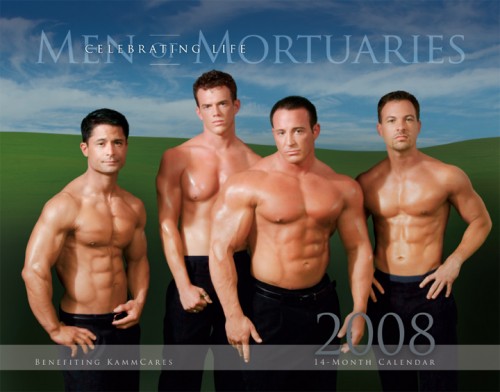
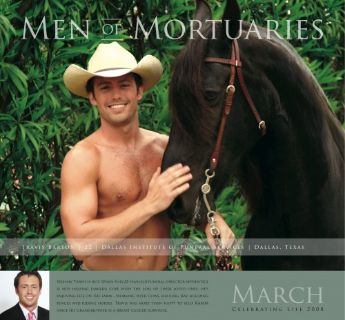
I thought of that article when Lisa sent me a link to an article in Obit Magazine about the 2008 Men of Mortuaries calendar, which raised money for a breast-cancer charity:

1256_men of mort cover

9239_March With Copy

The article directly discusses stereotypes:

Aren’t undertakers old, gray of complexion, gaunt and, well, creepy?

Four hundred morticians and funeral directors from across the country who defy that stereotype sent applications to Kenneth McKenzie’s funeral home in Long Beach, Ca., to vie for a month in the calendar…

Also:

McKenzie sees the calendars as a humorous way to dispel the notion that morticians “are gray-haired and hunchbacked with no personality.”

Interestingly, the article does use the word “mortician,” so apparently some in the industry are still comfortable with the term. But overall, I think the calendar and the quotes from the article demonstrate the effort to manage stigma quite well.

CLARIFICATION: In light of a previous post about a calendar featuring nudity, some commenters are conversing about whether this calendar is objectifying or humanizing. That is an interesting, appropriate question and certainly worth discussing. I wanted to clarify, though, that I wasn’t trying to answer that particular question in this post. I only meant to suggest that the calendar was an example of an attempt at humanizing funeral directors in order to manage perceived stigma, which isn’t the same as saying it’s a good or effective attempt (or a bad or ineffective one, for that matter).

Jen S. emailed us about the controversy surrounding casting for the movie version of Nickelodeon’s cartoon “Avatar: The Last Airbender.” Jen describes the cartoon:

[It’s] set in a fantasy Asian world that also incorporated the philosophies, cultures, martial arts, and writing of a pan-Asian world. Multiple groups were brought in like the Media Action Network for Asian Americans and a master of Chinese calligraphy to bring an authentic Asian feel to the world and this was the main thing that made the cartoon an award winner. It was non European based and wasn’t afraid to use characters of Asian and Inuit cultures as the lead characters.

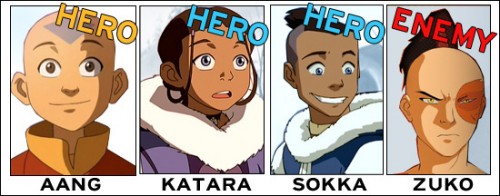
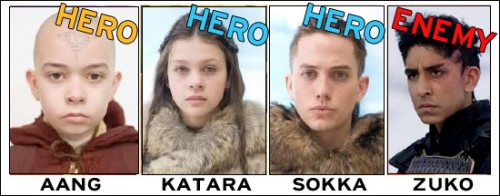
Fans of the series protested when it became clear that the cast for the movie was overwhelmingly Caucasian. The “bad” character, Zuko, was originally played by Jesse McCartney, a White actor/musician, but when he pulled out of the movie the role went to Dev Patel:
castingchars

castingactors

Jen says that in the cartoon, the “evil” characters were lighter-skinned than the heroes, but the casting has reversed that, and apparently several of the Asian-inspired elements from the cartoon have been removed for the movie because “they wanted to make the world ‘more diverse’ than the show and apparently that means an all white lead cast.”

Commenting in an article, Jackson Rathbone, the actor who plays Sokka, said,

I think it’s one of those things where I pull my hair up, shave the sides, and I definitely need a tan…

It’s unclear to me if he was saying he needs to do those things to look Asian enough to play the role, or was arguing that Sokka isn’t specifically Asian so Rathbone can play him, and either way it misses the point, but I suppose an actor isn’t likely to make an argument that someone else should have gotten their role instead of them.

The animatic editor of the cartoon series expressed disappointment that none of the main “good” protagonists will be played by Asian characters.

This reminded me of the debate about the Pixar movie “Up” that came out earlier this summer. One of the two main characters, and the only child, is Asian-American:
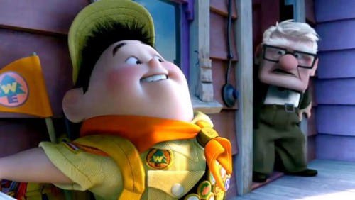
russell-pixar-550x311

The character was apparently partially based on Pixar animator Pete Sohn:
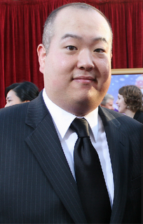
peter_sohn

Before the movie came out, I read an article in a magazine in which industry insiders expressed doubt about whether non-Asian kids would identify with an Asian-American character. The gist of the comments was that the movie might fail because kids might not like watching an Asian-American lead. Of course, the movie went on to gross over $287 million in the U.S. and $367 million worldwide by early August.

In another example, when faced with criticism of casting Whites as the main characters in “21,” a movie based on a book about actual Asian-American college students, the movie’s producer said,

Believe me, I would have loved to cast Asians in the lead roles, but the truth is, we didn’t have access to any bankable Asian American actors that we wanted…If I had known how upset the Asian American community would be about this, I would have picked a different story to film.

There were no bankable Asian American actors…that they “wanted.” None of the men on this page, for instance, are bankable. And the solution to concerns raised by Asian Americans about the lack of roles for Asian American actors isn’t to provide them more leads, or at least seriously engage in a discussion about the issue…it’s to pack up your toys and go film something else.

There are many other examples of movies in which characters that were Asian or Asian American in the source material (book, TV series, etc.) are played by Whites in the movie adaptation; the links above describe many of them. There still seems to be an assumption that male Asian American actors won’t appeal to a general audience, that they aren’t “bankable,” and that it’s therefore preferable to cast relatively unknown White actors over Asian American actors who may be more recognizable. It’ll be interesting to see if the Korean-American actor who plays one of the non-vampire characters in “Twilight” will now get as many opportunities as Jackson Rathbone, who also stars in the movie (but, from what I understand, actually has a less prominent role and smaller speaking part).

In a comment, reader Julian says,

And I have to wonder why no one has pointed out that in the original (animation), though all the characters are non-Caucasian, the only one with “slanted” or upturned eyes is the Bad Guy. Though lighter skinned, he looks like the one least likely to be able to “pass” as white to me. This strikes me as odd, and even weirder that no one has mentioned it, especially among all this talk of erasing/demonizing PoC.

Matt K. adds,

…I do recall that in anime, one shorthand for identifying good vs. evil characters is eyes. Good characters have huge eyes, round faces, and so forth. Evil characters have pointy chins and narrow eyes. Of course, of interest in a lot of anime is how so many of the characters look white…but that’s probably another story.

And Adam says,

I don’t think Up is a good counter-example given that it is narratively structured around colonialism in Latin America. I mean, was there even ONE single Latin American person in the film or even any refrence to the people who must have lived on the land they were tredding across and the sacred species whom they had been hunting/rescuing. No. Not to mention the dogs were racialized via popular physiognomy.

Also see our post on gender in Pixar films.
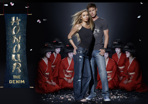
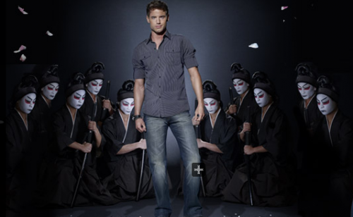
Tristian B. told us about Jeanswest Australia’s Authentic Japanese Vintage Denim ad campaign, which features images of White people surrounded by groups of kneeling Japanese men or women:

Picture 1

Picture 2

Oddly enough, Andrea J. recently sent us a link to the Palm Pre “Flow” ad, which has a White woman using the Palm Pre while a group of identically-dressed Asians, none shot in a way that presents them as individuals, dancing around her as she discusses how nice it is when everything rearranges itself to do just what you want:

NEW! (Oct. ’09) Macon D. found another example of the use of generic, undifferentiated Asians as props.  This time in a performance by Shakira:

[youtube]http://www.youtube.com/watch?v=6bZxN1Qq9K4[/youtube]

She gives the same performance on Saturday Night Live.

Gwen Stefani’s Harajuku Girls are another great example.

This reminds me a lot of some images from Britain’s Next Top Model that Lisa posted about last year, in which Africans were used as background props in a photo shoot with the contestants. The Asian individuals in these two ads are an undifferentiated mass, strikingly dressed and posed to show off the subjects of the ads–the White people who are foregrounded and depicted as specific, individual human beings rather than an interchangeable member of a group.

For other examples of non-Whites used as props, see our post about a fashion spread in Vogue Italia and this photo from NYLON magazine.

Gwen Sharp is an associate professor of sociology at Nevada State College. You can follow her on Twitter at @gwensharpnv.

Jay L. sent in this Brylcreem commercial from the 1950s, in which men are warned that if they don’t have well-styled, healthy hair, they won’t get the girl next door:

Notice the creepy cartoon characters at about 0:48. Jay says,

He is obviously turned on by the girl, so he elbows the tube, which ejaculates a white blob that falls onto his head. The girl returns to run her hands through it.

Here’s another commercial that tells men if they don’t use Brylcreem, they’ll actually disgust women and make them run away:

Also see this Just for Men commercial that tells men grey hair will hurt them on the dating scene, this one about career insecurity, and this one that equates grey hair with a loss of masculine virility.