Archive: Apr 2012

Last month the Centers for Disease Control (CDC) released a series of graphic anti-smoking ads intended to “raise awareness of the human suffering caused by smoking and to encourage smokers to quit.”   The campaign, titled “Tips From Former Smokers,” depicts individuals who have experienced some of the potential effects of tobacco use, including stomas, stroke, lung removal, heart attack, limb amputations, and asthma.  For example, this ad features several former smokers who offer “tips” on how to live with a throat stoma (hole), such as “Crouch, don’t bend over—you don’t want to lose the food in your stomach”:

This ad shows Terrie, a throat cancer survivor, completing the morning routine she performs in order to maintain her appearance after losing her hair and teeth and having a tracheotomy:

Finally, this ad depicts several people who suffered a vascular disease brought on by smoking who had to have limbs amputated:

In addition to the whether these ads will be effective in persuading smokers to quit, we might ask whether fear and stigma are appropriate health promotion strategies.  Is it possible or ethical to scare people into changing their behaviors?  What are the implications of using stigmatized people to serve as a warning label to others?

What’s most striking about these ads is how they use and portray the human body.  Medical sociologist Deborah Lupton suggests that health promotion campaigns such as this one do not simply depict bodies but also produce them; that is, the ways we talk about and create images of certain bodies says something about who or what that body is and what it does. She argues that when the body is seen as uncontrolled, say, with holes or missing limbs, then the self is understood as undisciplined.  For these former smokers, their undisciplined selves resulted in their uncontrolled bodies. Lupton suggests that by producing the body as a site of contamination or catastrophe the rest of us can be kept in line by fear.

In these ads, a group of disabled people and cancer survivors are used as a warning for current smokers to quit.  The ads invite us to feel disgust at their bodies and fear at what could happen to our own.  In particular, Terrie’s ad invokes gendered beauty norms and prompts viewers to imagine themselves without traditional markers of attractiveness such a full head of hair.

Paying attention to how health promotion images use the body is one way to think more critically about bodies, well-being, and how to effectively promote healthy behaviors.

 —————

Christie Barcelos is a doctoral candidate in Public Health/Community Health Education at the University of Massachusetts Amherst.

This 48-second ad is a fantastic example of framing, as well as a super-ridiculous blast-from-the-past.  Paid for by the movie theater industry, the ad attacks the idea of cable.  Cable, of course, was going to deliver more content to television sets and potentially compete for the business movie theaters enjoyed. So they frame cable as “pay tv” and counterpose it to “free tv.”  They don’t, you might notice, frame cable as “pay tv” and the movie theaters as “pay movies” because that comparison is not as useful for them.  Instead, without drawing attention to the fact that they charge for entertainment, they try to delegitimate the idea of paying for on-screen entertainment at home.

They also try to argue that cable tv will bring scary monsters into your living room.  So cute.  In an era where millions of instances of pornifed violence are just a click away, it is almost incomprehensible to imagine wanting to make sure that scary movies stayed at the theater.

Via BoingBoing.

Lisa Wade, PhD is an Associate Professor at Tulane University. She is the author of American Hookup, a book about college sexual culture; a textbook about gender; and a forthcoming introductory text: Terrible Magnificent Sociology. You can follow her on Twitter and Instagram.

In our post devoted to vintage douche ads, we present a number of examples of such ads that warn women that if they do not take steps to control their smelly, disturbing girly parts, they risk permanently alienating their male partners. Such ads encourage women to feel shame and anxiety about their bodies, which require constant vigilance or they become offensive to men.

Jeff S., Saed A., and Yvette send in a Indian commercial for Clean and Dry Intimate Wash that includes the same theme. The commercial starts out with a despondent-looking woman who cannot get her male companion’s attention. But a quick shower is just the trick; Clean and Dry apparently lightens as it deodorizes, with the word “fairness” appearing as the darkish smudge on the cartoon image magically disappears. According to the product description,

To be used while showering, its special pH-balanced formula cleans and protects the affected area, and even makes the skin fairer. Life for women will now be fresher, cleaner, fairer!

And presto! She’s confident, sassy, and suddenly has her boyfriend’s full attention; all is right with the world:

[youtube]https://www.youtube.com/watch?v=8phEyKrxBZM[/youtube]

Via Jezebel.

Gwen Sharp is an associate professor of sociology at Nevada State College. You can follow her on Twitter at @gwensharpnv.

Technically yesterday was tax day, but since it fell on a weekend and today is a holiday in Washington, D.C. (Emancipation Day), Americans actually got two extra days to file. Whether you’re already done or are wildly rushing to finish up, you might enjoy this short video by political economist Robert Reich, explaining how the concentration of wealth, and the ability of the very wealthy to redesign the tax code to their advantage have affected the overall economy:

Via The Sociology Cinema.

The Numbers

Types of Taxes as a Percent of GDP (1937-2014)
Historical Comparison of Top Tax Brackets (1945-2010)
Tax Receipt for 2009

The Winners and the Losers

Recent Trends in US Income Inequality and the Tax Rate (1990-2010) (pictured)
Social Class and the Tax Burden
Donation and Welfare States
Corporate Tricks of the Trade
Who Benefited from the Bush Tax Cuts

Tax Cultures

Collecting Taxes in Pakistan
Danish vs. American Attitudes Towards Taxes
TurboTax Maps Out a (Conventional) Future

Lisa Wade, PhD is an Associate Professor at Tulane University. She is the author of American Hookup, a book about college sexual culture; a textbook about gender; and a forthcoming introductory text: Terrible Magnificent Sociology. You can follow her on Twitter and Instagram.

Mother Jones magazine offers some comparisons. Highlights:

  • Its net sales is greater than the GDP of Norway.
  • Its entertainment sales is triple that of Hollywood.
  • It emits more CO2 than the 50 lowest-emitting countries together.
  • It employs a workforce the size of the population of the 50 smallest countries in the world.
  • Its square-footage exceeds that of the island of Manhattan.

The data:


Via SocProf.

Lisa Wade, PhD is an Associate Professor at Tulane University. She is the author of American Hookup, a book about college sexual culture; a textbook about gender; and a forthcoming introductory text: Terrible Magnificent Sociology. You can follow her on Twitter and Instagram.

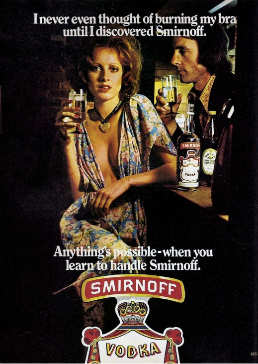
In a collection of alcohol ads from the 1960s and ’70s, Retronaut included an ad that is a nice example of how marketers sometimes co-opt social movements.  In this case, the co-optation works against the movement, sending the opposite message that it intended.

“I never even thought of burning my bra until I discovered Smirnoff,” says a woman with bedroom eyes.   The message, of course, is not that a woman who drinks the vodka will become politicized; instead, it is that Smirnoff will “loosen her up” and facilitate seduction.

We’ve posted other examples of this phenomenon, including a series of Playboy illustrations that co-opted the feminist movement (“Male supremacy is all right — but I favor a different position”) as well as the Civil Rights and Anti-War movements.  We’ve also collected instances of feminist rhetoric being used to market a wide range of products and, of course, there’s always the remarkable “torches of freedom” pro-smoking campaigns.

The bra-burning story, incidentally, is a myth.  In 1968 feminists protested outside of the Miss America pageant; they threw many items deemed oppressive into a trash can: bras, yes, as well as cosmetics, high heels, etc.  They didn’t light the trash can on fire.  The idea that they burned bras was added later, in an effort to link the Women’s Movement to the Anti-War Movement (remember that draftees were burning their draft cards).  The Anti-War Movement was, at the time, being taken more seriously, so the link was meant to give feminism more credibility.  Instead, the idea of feminists burning bras became a humorous cultural trope, hence the ad above.

Lisa Wade, PhD is an Associate Professor at Tulane University. She is the author of American Hookup, a book about college sexual culture; a textbook about gender; and a forthcoming introductory text: Terrible Magnificent Sociology. You can follow her on Twitter and Instagram.

For the past few years I’ve been following a wonderful little blog, Hanzi Smatter. The author invites people to submit images of tattoos written in (what they think is) Japanese or Chinese, to find out what they actually mean. As it turns out, tattoos often do not mean what their bearers think they mean. The results can be hilarious, like Thought to mean: Loyalty. Actual meaning: Noodles.

It is quite trendy in the U.S. to get a word that means something to you in English (“love,” “strength” etc.) tattooed in Japanese or Chinese characters. Visit any tattoo parlor or online tattoo image gallery and you’ll see many Chinese and Japanese character options. So why is this so popular? Some argue that the beauty and simplicity of the symbols make Asian characters desirable for tattoos: “But what, besides the beauty of the art, would make these tattoos so popular? The main reason is that Chinese symbolism can be used to express so much, while still remaining simple and clean.” But couldn’t any written language be considered beautiful (cursive English, for instance)? And isn’t any language capable of expressing a lot in just a few simple characters (words have multiple meanings even in English)?

I don’t think this is just about beauty and simplicity. Using Japanese or Chinese characters makes a tattoo more exotic than getting the same word tattooed in English. And there is an added element of mystery—having a tattoo that not everyone in an English-speaking country can read is cool (even if the person with the tattoo can’t read it, either).

Cultural appropriation describes the adoption of specific aspects of a culture that is not your own. A Kanji tattoo when the wearer is not Japanese and has no specific connection to Japanese culture is an example of cultural appropriation. While we could debate whether or not cultural appropriation is ever positive (e.g. the popularity of yoga, or the interest in Italian food and culture when HBO’s The Sopranos was running), there are negative consequences to cultural appropriation. When language and symbolism are taken out of their original context, the meaning is over simplified or completely lost. Tattoos that attempt to translate English into Japanese or Chinese characters are a perfect example of lost meaning:

Intended meaning: None. Characters chosen for their appeal. Actual meaning: “Buy/trade”, “road, path”, and “card” which is like a type of prepaid card that allows its owner to access public transportation.

Thought to mean: Warrior. Actual meaning: Waterfall or rapids.

 Many tattoos are victims of what Hanzi Smatter calls “gibberish font.” There is no correlation between English letters and Japanese or Chinese characters, but some tattoo shops use this gibberish font for tattoos—using the font to spell out words letter by letter, when Chinese and Japanese don’t work that way.

Thought to mean: Initials of loved ones. Actual meaning: Nothing

Thought to mean: Beautiful. Actual meaning: “Calamity, disaster, catastrophe.”

 Thought to mean: As long as I breathe, I hope. Actual meaning: The five characters mean “living”, “air”, & “love” separately, but just the characters together do not create the intended sentence.

 Thought to mean: Outlaw. Actual meaning: “[In] hiding” and “criminal”, or the equivalent of “snitch” or “rat”.

 Thought to mean: Live for today. Actual meaning: None.

Hanzi Smatter discusses that last one:

As is, this gibberish means nothing in Japanese or at least nothing like “live for today” and I don’t think it means anything in Chinese either. The only meaning I can guess is that if it were written 生きて現れる, this would mean “to show up alive” or “turn up alive” as if someone thought dead had appeared alive. Anyway, it sounds pretty spooky, like seeing a zombie!

I think the person who made this up just looked in a dictionary for the word for “to live” 生 and a word that means something like “now” 現and thought you could stick them together to make “live for today.”

The fact that these tattoos, and countless more like them, don’t mean what people think they mean, illustrates the consequences of fetishizing aspects of a culture. Symbols and language don’t translate easily from one culture to another. Adopting aspects of a culture that might seem “exotic” without understanding what they mean in their specific contexts ends up creating cultural gibberish; tattoos that make no sense to anyone at all.