Archive: Oct 2008

During WWII, many companies stopped producing the civilian goods that they were best known for. Instead, these companies contributed to the war effort by making products necessary for American soldiers. Scranton Craftspun Curtains, for example, switched from making lace curtains to camouflage covers, mosquito nets and parachutes. By touting their wartime conversions, companies kept their brands in the public’s mind, while achieving patriotic cachet.

Here’s a WWII-era ad for Scranton Craftspun Curtains. Click on the thumbnail to see it larger and read the narrative.

Scranton Craftspun curtains.
Scranton Craftspun curtains. Ad from Better Homes and Gardens, October, 1943.

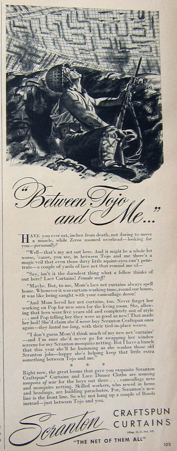
The copy is written from the point of view of a trench soldier somewhere in Japan:

“Have you ever sat, inches from death, not daring to move a muscle, while Zeros zoomed overhead — looking for you — personally?

“Well — that’s my act out here. And it might be a whole lot worse, ’cause, you see, in between Tojo and me there’s a magic veil that even those dirty little squint-eyes can’t penetrate — a couple of yards of lace net that remind me of —

“Say, isn’t it the darndest thing what a fellow thinks of out here? Lace Curtains! Female stuff!

“Maybe. But, to me, Mom’s lace net curtains always spell home. Whenever it was curtain-washing time, round our house, it was like being caught with your camouflage down!

“And Mom loved her net curtains, too. Never forget her working on Pop for new ones for the living room. She, allowing that hers were five years old and completely out of style … and Pop telling her they were as good as new! That made her boil! She’d claim she’d never buy Scranton Craftspun ones again — they lasted too long, with their tied-in-place weave.

“I don’t guess Mom’s think much of my new net ‘curtains’ — and I’m sure she’d never go for swapping her window screens for my Scranton mosquito netting. But I have a hunch that this year she’ll be humming as she washes those old Scranton jobs — happy she’s helping keep that little extra something between Tojo and me.”
* * *

Right now, the great looms that gave you exquisite Scranton Craftspun* Curtains and Lace Dinner Cloths are weaving weapons of war for the boys out there … camouflage nets and mosquito netting. Skilled workers, who sewed in hems and headings, are building parachutes. For, Scranton’s new line is the front line. So why not hang up a couple of Bonds instead — just between Tojo and you.

You could spend a few hours talking about all the subjects and rhetorical devices brought up by this ad. The phenomenon of advertising without a product to sell is interesting, but you could go beyond that. You could talk about the gendering of war vs. housework, the racist characterization of the Japanese, the appeals to patriotism, the construction of a personalized, in-your-face theater of battle where homefront=front line, etc.

Kirsten Dunst (found here):

Kirsten Dunst on the cover of Harper’s Bazaar (found here):

Observation made at Jezebel.

A couple of weeks ago I posted about American Indian sports mascots. An interesting comparison to spark discussion, and an example students often bring up, is the University of Notre Dame’s mascot. The name of the Notre Dame athletic teams is the Fighting Irish, and the official mascot is the leprechaun (image found at Wikipedia):

Each year a student is chosen to be the leprechaun. Here is an image (found here) of the Notre Dame leprechaun performing at a game:

According to the Notre Dame website, the leprechaun did not become the official mascot until 1965; before that, the university was represented by Irish terrier dogs.

You might compare this to the Chief Illini logo, as well as the University of Illinois student performing as Chief Illini, both in the original mascots post. It brings up some interesting issues for discussion. Is there any difference between the the Fighting Irish and the Fighting Illini (or the Fighting Sioux, the Redskins, etc.)? Does the existence of the Fighting Irish invalidate opposition to American Indian mascots? Opponents to Indian mascots often argue that they objectify American Indians in a way that would not be allowed if used against African Americans or Asians–that this modern form of blackface is acceptable only when used to mimic Native American groups or cultural traditions. Those who support American Indian mascots often use the Fighting Irish to try to invalidate that criticism–to argue that Whites are also used as mascots and don’t seem to mind (to my knowledge, there is no movement against the Notre Dame mascot based on the idea that it is offensive to the Irish), and thus that critics of American Indian mascots are over-sensitive whiners.

Opponents of American Indian mascots respond that, first, this is one example, compared to the many, many American Indian mascots found throughout the U.S., and second, whereas Americans of Irish descent face no systematic ethnicity-based discrimination in the U.S. today (and haven’t for several decades), Native Americans still do. In addition, they argue that many American Indian groups openly oppose Indian mascots, and that their voices deserve to be heard; presumably, if Irish-Americans began to protest the Fighting Irish mascot, the same logic would hold and, indeed, those opposing American Indian mascots would oppose the Fighting Irish as well.

This might be useful not just for a discussion of sports mascots, but more generally for a discussion of the idea of equivalency in discrimination. I see this a lot with students–if, for instance, we’re discussing sexual harassment and they can point to an example when a man was sexually harassed by a woman, then they argue that men are affected just like women, and thus it has nothing to do with gender inequality or power. I suspect those who bring up Notre Dame in an effort to invalidate arguments against Indian mascots are doing the same thing–if a White ethnic mascot exists, then charges that Indian mascots are racist can be dismissed. It’s a false form of equalizing because it ignores the lop-sidedness of the “equality” (the tiny number of non-Indian racialized mascots compared to the number of Indian ones) and the role of systemic inequality (that American Indians are underrepresented at colleges and universities and face racial discrimination in a way that Irish-Americans do not). And it also serves to discount opponents’ voices by saying that if any social group wouldn’t be opposed to a particular type of portrayal or treatment, then no one else has any right to be offended by it, either, regardless of their different histories, treatment, or social positions.

There is a lot going on here.  Comments after the image (found at MultiCultClassics):  

First, notice how this ad mobilizes a nostalgia for a simpler past (“We’re bakers”).  Goldfish crackers are likely baked not by bakers (how quaint), but in large automated factories.  Second, in line with this nostalgia, Pepperidge Farm, the company, is recast as a parents (“We’re bakers. But we’re parents, too”) instead of a corporation in a capitalistic society likely employing low-wage workers (who are not, by the way, busy caring about consumers kids).  Notice that, by re-casting the company as parents, they encourage you to think of the company’s motives not as profit, but nurturing.  Third, the Goldfish crackers themselves are anthropomorphized into a happy parent and child. Finally, happiness and family togetherness are commodified. Text:

That’s why we bake Goldfish crackers the way we do. Natural. With no artificual preservatives adn zero grams trans fat. Made with whole grains, real cheese, and plenty of smiles. For tips and tools to help keep your kids smiling, visit fishfulthinking.com. Because we believe kids should be happy and healthy.

I use TV dinners to show my students that nearly everything, even things they’d never expect, are awash in race, gender, and class meaning.

Hungry-Man is probably the most obviously meaning-laden of the TV dinners.  It is aimed directly at men, of course, with one and a half pounds of food, an excellent blue box, and a strong font in all capital letters.  But it also advertises a particularly working-class masculinity.  In these two boxes, notice the references to “backyard barbeque” and “sports” (XXL).  The food itself, barbeque chicken and pork, mashed potatoes, and beer battered chicken, reinforces this class message.  But this is also about race, as the working-class masculinity is implicitly white.

Stouffer’s, in contrast, is more moderate.  The font for the brand is cursive, for the meal in lower-case.  Without being over the top, it still passes as masculine.

Stouffer’s bistro, in contrast, is a feminine version.  References to a “bistro” makes you think of France (a notoriously feminized country) and the meal here is a “crustini” (something a “real” man would never eat).

Healthy Choice seems to go further towards neutralizing its brand.  The green color is neutral and using the term “healthy,” instead of “diet” or a similar word, keeps the brand from being too feminine.  Plus, there’s a running MAN in the logo.  Still, there’s a feminine feel to the food choices.  The first meal is “Roasted Chicken Marsala… in Wine Sauce with Penne Pasta [and] Green Bean and Red Pepper Medley.”  The second includes “Caramel Apple Crisp” and “Broccoli Florets.”  Descriptions of truly manly food would not include “wine,” “medley,” “crisp,” or “florets.”

The Cafe Steamers sub-brand further feminizes Healthy Choice.  Notice the cursive font and the double reference to “merlot.”

Lean Cuisine is the most feminized brand.  Between the turqoise and orange color scheme, the reference to slimness with the word “lean,” and the delicate all lower-case font on the boxes, the fact that the product is aimed at women is clear.  There is also a class message.  Who eats “Szechuan Style Stir Fry with Shrimp”?  Not the same guy that eats “Backyard Barbeque.”

In our comments on this post featuring a “Future Trophy Wife” and “Future M.I.L.F.” t-shirts for very young girls, Penny linked to some lefty stores that carry these leftist t-shirts for babies and kids (found here and here).

“Future Feminist”

“Homeland Security: Fighting Terrorism since 1492”

“Hate is not a family value”

There was interesting discussion in the comments as to whether having your child wear ANY idea that attributed characteristics to them was okay.  An anonymous commenter wrote:

As much as I would love to have a child wearing a “future feminist” or “future president” shirt, I think forcing any sort of rules on them as to what they should be is wrong. Sure, I’d love to have a son or daughter grow up to be a feminist, or even the president, but I would want them to know that I support them in whatever decisions they make for themselves.

To which Penny replied:

I’m not sure a t-shirt is “forcing any sort of rules” on a baby (who are notoriously oblivious to any kind of written propaganda). Honest, an 18-month-old will never feel bound to the politics of her t-shirt. She’ll mostly just feel bound to dribble strawberry stains into it, message or no message. Even if it’s 100% organic sweatshop-free cotton, the stains will soon detract from the message somewhat. All babies’ clothes reflect their parents’ ideas, whether subtly or blatantly. There’s no way around that–even letting them run naked is a statement, and one they may come to detest later, when they see the videos.

I thought this was an interesting discussion.  What’s your take?  If you are for the shirts above, must you also be for “God Hates Fags” t-shirts and their ilk?  Is it not okay to place any characteristics on your child?  If it’s not, do you also have to keep them out of pro-gay marriage and Fred Phelps rallies?

For another example of politicizing kids, see this post.

p.j. sent me two images that she received in an email forwarded to her. The subject line of the email was “Harley…Any questions?” and the text said,

Food for thought.  I’m telling you folks, this should be all you need to know to make the right choice.

Here is the first image, of Sarah Palin sitting on a Harley:

The second image showed Barack Obama on a bicycle:

The email also said,

Note:  Her Harley is made in the US and his bike is made in China…..

There are a couple of things going on here. Clearly we’re supposed to take from this that because Palin once sat on an American-made form of transportation and Obama once sat on a form of transportation made in China, that Obama is unAmerican and, thus, unworthy of the presidency. Because trying to use less imported oil and reduce pollution by riding a bike totally makes you unworthy of running the country.

But there’s also a clear gender message here. We are supposed to take from the first image that, because she leans on American-made tough motorcycles, Palin is tough and strong. On the other hand, the picture of Obama riding a bike (in a bike helmet, no less) is, I believe, meant to imply that he is a weak, effete city boy who wouldn’t know how to shoot a moose if the need arose. The effect is that Palin, a woman, is depicted as more masculine than Obama. It’s a good example of how masculinity and femininity are characteristics of not just people, but also things, and that both men and women can adopt symbols of masculinity and femininity. However, because masculinity is more valued in our culture, women usually benefit from associating themselves with aspects of masculinity, whereas men are usually ridiculed for appearing feminine in any way. In this case, Palin’s connection to the hyper-masculine Harley makes her seem, to those forwarding this email around, tough and cool. Obama, on the other hand, can’t benefit from appearing more feminine in the way that Palin can benefit from appearing more masculine, because being feminine is stigmatized.

Of course, you might also discuss how big motorized machines are associated with masculinity, while caring about the environment (including things such as riding a bike to work) is often associated with femininity.

Thanks, p.j.!

UPDATE: Lea R. made a good point in a comment:

I’m not entirely convinced that what’s going on here is the “masculinization” of Sarah Palin. The “Harley babe” is a pretty standard trope of advertising those bikes, particularly when it comes to staking the objects out as masculine in themselves. Palin isn’t riding the motorcycle, after all– she’s posing with it. Pretty women posing with motorcycles aren’t really being presented as “masculine;” they set off the implied masculinity of the motorcycle, and reinforce it as a heterosexual accessory.

I think that’s an excellent point, and well said. I do think the Harley pic plays into Palin’s image as a rough, outdoorsy type of woman who engages in other masculine activities, like hunting, which have been been used to make her seem cool, strong, and “authentic.” But at the same time, she reinforces her femininity with her clothes and make-up, so she’s not in danger of being too masculinized, to where she’s threatening or stereotyped as a lesbian.

JT, in another comment, pointed out:

It looks like Obama might have a child on a trailer bike behind him — see the front of the trailer?  Another piece of info that might contribute to the gender roles discussion.

Thanks for the excellent commentary!

UPDATE 2: In another comment, Will asked if the bike Obama was riding is actually manufactured in China, as the email claims. It is a Trek, a very popular brand. According to Wikipedia, there is some “high-end” domestic production and “assembly,” and “Trek also imports bicycles manufactured in Taiwan and mainland China.” I suspect this means that some of the expensive models are made in the U.S., and some cheaper models have the parts imported and put together here, but that most of the cheaper, regular-use bikes, like the one in the picture, are imported. I suppose the type of reader who would make a decision about voting based on these images would not care that Taiwan is not, in fact, China, and so if the bike was manufactured in Taiwan, the statement is technically incorrect.

Why are people of color included in advertising aimed at mostly white people?

1.   To associate the product with a racial stereotype.
2.  To give a product “color” or “flavor.”
3.  To invoke ideas of “hipness,” “modernity,” “progressive” politics and other related ideas.
4.  To trigger the idea of human variation itself.

And, 5., as these ads show, to make you think that the company cares about diversity and racial/ethnic equality (whether they do or not).

(found here)

Text: “All human beings are born free and equal in dignity and rights.”  (found here)

Next up:  How people of color are included, starting with “white-washing.”