nation: Argentina

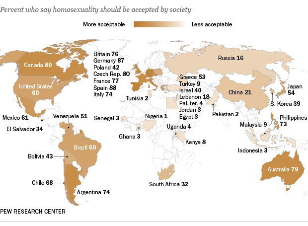
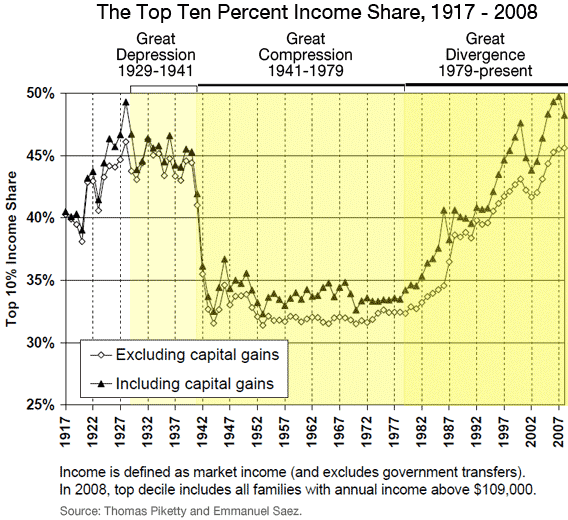
The Pew Research Global Attitudes Project recently released data on attitudes about homosexuality in 39 countries. Generally, those living in the Middle East and Africa were the least accepting, while those in the Americas, Europe, and parts of Asia (the Philippines, Australia, and to a lesser extent Japan) were most accepting:

PG_13.06.04_HomosexualityAccept_620

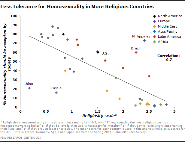
Generally, the more religious a country, the less accepting its citizens are of homosexuality:

2013-Homosexuality-03

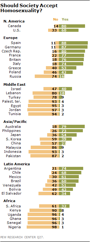
The proportion of people who support social acceptance of gays and lesbians ranged from a high of 88% in Spain to a low of 1% in Nigeria:

2013-Homosexuality-05

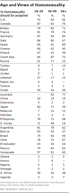
Attitudes about homosexuality vary widely by age. There is a pretty consistent global pattern of more positive attitudes among younger people, with a few exceptions:

2013-Homosexuality-01

Thus far, legalization of same-sex marriage has been largely confined to the Americas and Europe; New Zealand and South Africa are the two outliers:

FT_13.05.31_gayMarriageMap

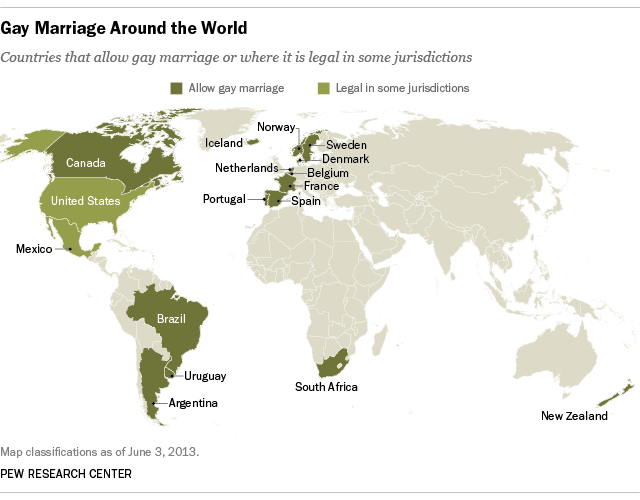
The Pew Center points out that of the 15 nations that have fully extended marriage rights to same-sex couples, 8 have done so just since 2010. In the U.S., we’re currently awaiting a Supreme Court’s decision, which should arrive shortly, to know if we’ll be joining the list sooner rather than later.

Thanks to Peter Nardi at Pitzer College for the link!

Gwen Sharp is an associate professor of sociology at Nevada State College. You can follow her on Twitter at @gwensharpnv.

Cross-posted at Montclair SocioBlog.

The Washington Post has provided some data on medical costs across a selection of countries (Argentina, Canada, Chile, and India in grey; France, Germany, Switzerland, and Spain in blue; and the U.S. in red). The data reveal that American health care is very expensive compared to other countries.

1

No wonder the US spends twice as much as France on health care.  In 2009, the U.S. average was $8000 per person; in France, $4000.  (Canada came in at $4800).  Why do we spend so much?  Ezra Klein quotes the title of a 2003 paper by four health-care economists:  “it’s the prices, stupid.”

And why are US prices higher?  Prices in the other OECD countries are lower partly because of what U.S. conservatives would call socialism – the active participation of the government.  In the U.K. and Canada, the government sets prices.  In other countries, the government uses its Wal-Mart-like power as a huge buyer to negotiate lower prices from providers.  (If it’s a good thing for Wal-Mart to bring lower prices for people who need to buy clothes, why is it a bad thing for the government to bring lower prices to people who need to buy, say, an appendectomy? I could never figure that out.)

There may also be cultural differences between the U.S. and other wealthy countries, differences about whether greed, for lack of a better word, is good.  How much greed is good, and in what realms is it good?  Klein quotes a man who served in the Thatcher government:

Health is a business in the United States in quite a different way than it is elsewhere.  It’s very much something people make money out of. There isn’t too much embarrassment about that compared to Europe and elsewhere.

So we Americans roll along, paying several times what others pay for medical procedures, doctor visits, and drugs.

Jay Livingston is the chair of the Sociology Department at Montclair State University. You can follow him at Montclair SocioBlog or on Twitter.

The  International Society of Aesthetic Plastic Surgeons has released new data on the incidence of invasive and non-invasive cosmetic procedures.  The U.S. leads in sheer numbers of procedures but, accounting for population, we fall into 4th place.  South Korea leads for the number of procedures per person, followed by Greece and Italy.

1

By far the most common kinds of surgical cosmetic procedures are lipoplasty and breast augmentation.  Along with fat, breasts seem to be a particular concern: breast lifts and breast reductions for both men and women are also in the top ten.  Abdominoplasty, nose jobs, eyelid surgeries, and facelifts are as well.

2

The incidence of these surgeries is strongly related to everything from the gender binary to global power dynamics.  In 2008 we reported that male breast reductions were the most common cosmetic surgery for 13-19 year olds (boys and girls combined). You would be shocked at what counts as excess breast tissue and how little the before and after photos look.  Boys and men getting breast reductions, alongside women getting augmentations, is obviously about our desire for men and women to be different, not naturally-occurring difference.  See The Story of My Man-Boobs for more.

Likewise, we’ve posted about surgeries that create an epithelial fold, a fold of skin in the eyelid more common in people with White than Asian ethnic backgrounds.  This surgery is a trend among Asians and Asian-Americans, as colonization has left us with an association between Whiteness, attractiveness, and power.

The Economist summarizes some other trends:

Breast augmentation, the second biggest surgical procedure, is most commonly performed in America and Brazil. Buttock implants are also a Brazilian specialty, as is vaginal rejuvenation. Asia is keen on nose jobs: China, Japan and South Korea are among the top five nations for rhinoplasty.

More on where and how many procedures are being performed, but nothing on why, at the ISAPS report.

Image at The Economist; via Global Sociology.

Lisa Wade, PhD is an Associate Professor at Tulane University. She is the author of American Hookup, a book about college sexual culture; a textbook about gender; and a forthcoming introductory text: Terrible Magnificent Sociology. You can follow her on Twitter and Instagram.

Cross-posted at Reports from the Economic Front.

The Pew Research Center recently published a report titled “Pervasive Gloom About the World Economy.” The following two charts come from Chapter 4 which is called “The Causalities: Faith in Hard Work and Capitalism.”

The first suggests that the belief that hard work pays off remains strong in only a few countries: Pakistan (81%), the U.S. (77%), Tunisia (73%), Brazil (69%), India (67%) and Mexico (65%). The low scores in China, Germany, and Japan are worth noting. This is not to say that people everywhere are not working hard, just that many no longer believe there is a strong connection between their effort and outcome.

The second chart highlights the fact that growing numbers of people are losing faith in free market capitalism.  Despite mainstream claims that “there is no alternative,” a high percentage of people in many countries do not believe that the free market system makes people better off.

GlobeScan polled more than 12,000 adults across 23 countries about their attitudes towards economic inequality and, as the chart below reveals, the results were remarkably similar to those highlighted above.  In fact, as GlobeScan noted, “In 12 countries over 50% of people said they did not believe that the rich deserved their wealth.

It certainly seems that large numbers of people in many different countries are open to new ways of organizing economic activity.

Martin Hart-Landsberg is a professor of economics at Lewis and Clark College. You can follow him at Reports from the Economic Front.

Cross-posted at Family Inequality.

I have criticized sloppy statistical work by some international feminist organizations, so I’m glad to have a chance to point out a useful new report and website.

The Progress of the World’s Women is from the United Nations Entity for Gender Equality and the Empowerment of Women. The full-blown site has an executive summary, a long report, and a statistics index page with a download of the complete spreadsheet. I selected a few of the interesting graphics.

Skewed sex ratios (which I’ve written about here and here) are in the news, with the publication of Unnatural Selection, by Mara Hvistendahl. The report shows some of the countries with the most skewed sex ratios, reflecting the practice of parents aborting female fetuses (Vietnam and Taiwan should  be in there, too). With the exception of Korea, they’ve all gotten more skewed since the 1990s, when ultrasounds became more widely available, allowing parents to find out the sex of the fetus early in the pregnancy.

The most egregious inequality between women of the world is probably in maternal mortality. This chart shows, for example, that the chance of a woman dying during pregnancy or birth is about 100- 39-times higher in Africa than Europe. The chart also shows how many of those deaths are from unsafe abortions.

Finally, I made this one myself, showing women as a percentage of parliament in most of the world’s rich countries (the spreadsheet has the whole list). The USA, with 90 women out of 535 members of Congress, comes in at 17%.

The report focuses on law and justice issues, including rape and violence against women, as well as reparations, property rights, and judicial reform. They boil down their conclusions to: “Ten proven approaches to make justice systems work for women“:

1. Support women’s legal organizations

2. Support one-stop shops and specialized services to reduce attrition in the justice chain [that refers to rape cases, for example, not making their way from charge to conviction -pnc]

3. Implement gender-sensitive law reform

4. Use quotas to boost the number of women legislators

5. Put women on the front line of law enforcement

6. Train judges and monitor decisions

7. Increase women’s access to courts and truth commissions in conflict and post-conflict contexts.

8. Implement gender-responsive reparations programmes

9. Invest in women’s access to justice

10. Put gender equality at the heart of the Millennium Development Goals

I’m back! I was in the middle of moving and just overwhelmed with everything. Anyway. Talking Points Memo posted a link to an article at Slate about income inequality in the U.S., and particularly the increasing proportion of total U.S. income earned by the very rich. Timothy Noah refers to the “great compression” as a time period when income concentration among top earners dropped significantly, and argues that in the past three decades we’ve seen a “great divergence,” with increasing income inequality hitting levels not seen since the Great Depression:

A slideshow accompanies the article, providing more info on the changes Noah discusses. A few examples (the slideshow provides the data source used to create each image):

Even among the very rich, we see increasing divergence, with the super-ultra rich, the top 0.1% of earners, now making 8% of all U.S. income:

A comparison to some other countries (I don’t know why these specific nations were chosen for the comparison):

Keep in mind, this data includes only income. Wealth — the worth of all assets, including retirement and savings accounts, stocks, homes, cars, and anything else of value — is much more unequally distributed.

Congress is about to be embroiled in a major debate about whether to extend the tax cuts on high incomes; as both sides weigh in, here’s some context to keep in mind:

The effective tax rate is what people actually pay, as opposed to what their tax rate theoretically is. While we’ve certainly seen a large drop since the late ’70s, Noah argues that, compared to other economic changes, the effective tax rate hasn’t affected the rise in income inequality much. It plays a role, yes, but changing the tax rate on the very rich doesn’t affect the overall distribution of income a huge amount, in part because the effective rate, what people end up actually paying, generally ends up being smaller than what they theoretically owe based on the stated tax rate, once you take into account deductions, write-offs, loopholes, and so on.

So…happy post-Labor Day!