bodies: re-touching

Leontine G. sent in this iconic image (found at Empire) of Spock and Captain Kirk from the original Star Trek series, next to the actors who play those characters in the new version (a movie by J.J. Abrams):

Leontine says, “I have a vague feeling that actors and musicians are getting smoother and more plasticky looking,” and this image shows some of that. The Spock and Captain Kirk on the right are supposed to be younger than the ones on the left (the movie is a prequel, more or less), but it’s not just that the actors are younger. There’s clearly also irbrushing and make-up used to erase any lines, blemishes or other “imperfections” on their faces (and either New Spock’s shirt fits perfectly, or they airbrushed out most of the wrinkles).

You might use this to talk about changing standards of beauty in the visual media. If the original Star Trek came out today, how much retouching would they do to the picture of Leonard Nimoy and William Shatner? Maybe the photo would still show them with as many wrinkles and facial lines as they have…but I’m doubtful.

For another example of how TV standards of changed (in this case, how much sexual activity is shown on teen-oriented shows),  see this post about the old and new versions of Beverly Hills, 90210.

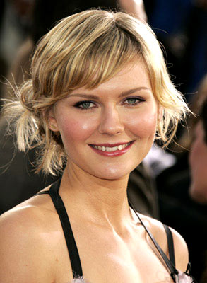
Kirsten Dunst (found here):

Kirsten Dunst on the cover of Harper’s Bazaar (found here):

Observation made at Jezebel.

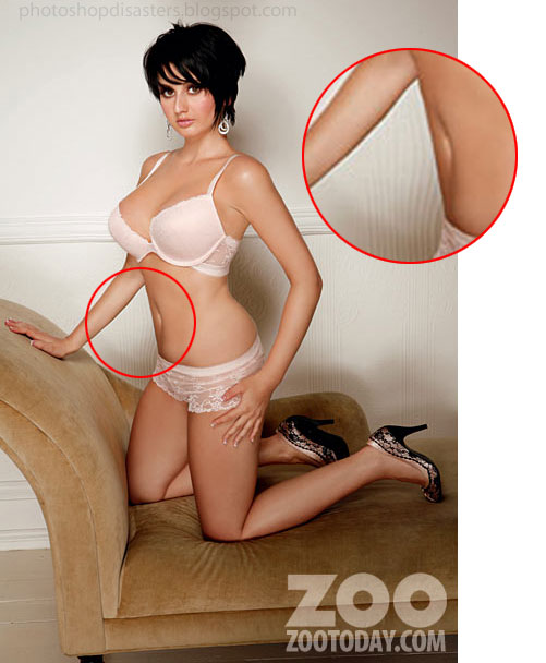
Look for how the striation on the wall bends in towards her belly where they thinned her midsection:

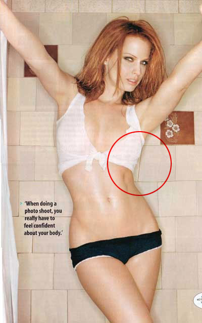
Like in the above photo, here the square tiles in the wall are warped, reflecting where they tapered her waist:

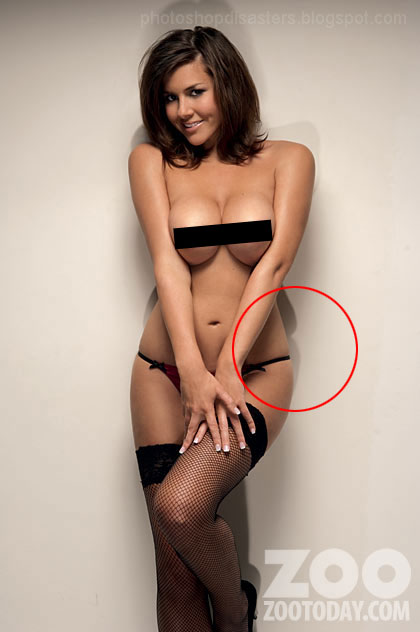
Check out the shadow to see her pre-photoshop profile:

These women are, of course, genuinely thin.  Much photoshopping isn’t about correcting “faults” (like a blemish), it’s about creating an unrealistic image.  These images remind me of Gwen’s post on the “fat” supermodel, Karolina Kurkova.  Kurkova is still incredibly thin!  The problem is that her body is betraying its humanness.  Like in the image above, where her body (god forbid) reacts to the string squeezing her midsection, Kurkova’s body reacts to the way she is moving it (with the squishing of her mid-back and buttocks).  There is no amount of thinness that will make you not human, but this is what we’re supposed to be aiming for.  And, if we get there, we’re not supposed to look skinny!  You might remember this photoshop example in which bones protruding from Cameron Diaz’s body are photoshopped out to make her thinness look more “healthy.”  So it’s not enough to rid yourself of the fat part of you, now they are ridding us of our very skeletons with photoshop. 

In Unbearable Weight, Susan Bordo argues that compulsory thinness for women isn’t just a standard of beauty, it’s literally about making women less.  How much of us do they want to get rid of?

All three found at Photoshop Disasters.

Click here (and then click portfolio) for before and after photos of lots of celebrities!

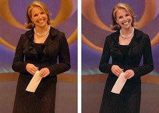
Some examples of image manipulation to add to a previous post.

This is from the material promoting Katie Couric’s now ended news anchor job:


Notice that Keira has larger breasts and a flatter stomach on the re-touched poster:

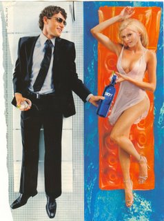
And here’s one that shows how they differently change men’s bodies (head shrunk, biceps enlarged):

This is what Roddick’s arms really look like (but you can google image him and find many many images in which he looks more like this than he does on the Men’s Health cover):

Also see this interactive website here.

NEW: Samantha J. sent in a link to Picture-Perfect, a gallery of images comparing real photos of celebrities such as Jennifer Hudson and Liv Tyler to Photoshopped images of them on magazine covers. Thanks, Samantha!

Take a careful look at these two images (you may need to download them to see it). The first is from Cosmo, the second from Maxim. There is one incredibly subtle and important difference: the latter shows a nipple and the former does not. I’ll let you guess which one is in Playboy. This is a great example of how carefully advertisers are planning their images according to their audiences.


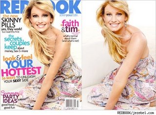
Faith Hill, after and before. There’s quite a lot going on if you look closely.

Click here to see an animated back and forth at Jezebel (thanks to Amy for the tip).
See also the Dove evolution video here.