politics

The federal minimum wage is $7.25 an hour.  Several states mandate a higher minimum wage; the state of Washington has the highest, at $9.19.

President Obama recently voiced his support for efforts to increase the minimum wage to $10.10.  The federal minimum wage was last raised in 2009 and certainly needs to be increased again.  The fact is that the federal minimum wage has not kept up with inflation.  As the New York Times graphic below shows, the current minimum wage is, when adjusted for inflation, 32% below what it was in 1968.  It is 8% below what it was in 2010.  In other words, those earning the minimum wage are suffering a real decline in income.

1

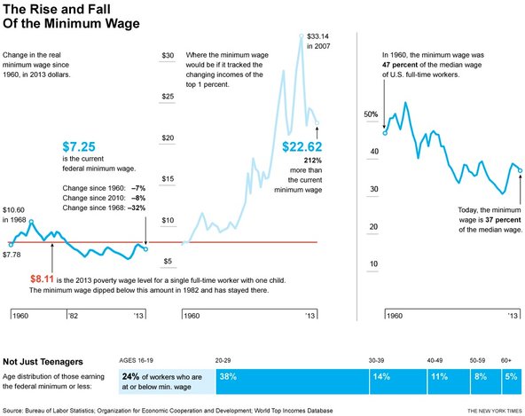
As for the appropriate value, why not $22.62?  That, as the graphic illustrates, is what the minimum wage would be if it grew at the same rate as the income of the top 1%. Alan Pyke explains:

[Such a large increase] may seem outlandish, but previous research indicates American workers have just about earned it. Worker productivity has more than doubled since 1968, and if the minimum wage had kept pace with productivity gains it would have been $21.72 last year. From 2000 to 2012 alone workers boosted their productivity by 25 percent yet saw their earnings fall rather than rise, leading some economists to label the early 21st century a lost decade for American workers.

Looked at from that perspective the current movement for a $15 hourly wage at fast food restaurants sounds reasonable.  

Martin Hart-Landsberg is a professor of economics at Lewis and Clark College. You can follow him at Reports from the Economic Front.

Thanks to Grace K. for sending in this provocative comic from Macleod Cartoons!

Lisa Wade, PhD is an Associate Professor at Tulane University. She is the author of American Hookup, a book about college sexual culture; a textbook about gender; and a forthcoming introductory text: Terrible Magnificent Sociology. You can follow her on Twitter and Instagram.

Cats and dogs are gendered in contemporary American culture, such that dogs are thought to be the proper pet for men and cats for women (especially lesbians).  This, it turns out, is an old stereotype.  In fact, cats were a common symbol in suffragette imagery.  Cats represented the domestic sphere, and anti-suffrage postcards often used them to reference female activists.  The intent was to portray suffragettes as silly, infantile, incompetent, and ill-suited to political engagement.

1

2

3

Cats were also used in anti-suffrage cartoons and postcards that featured the bumbling, emasculated father cruelly left behind to cover his wife’s shirked duties as she so ungracefully abandons the home for the political sphere.  Oftentimes, unhappy cats were portrayed in these scenes as symbols of a threatened traditional home in need of woman’s care and attention.

54

While opposition to the female vote was strong, public sentiment warmed to the suffragettes as police brutality began to push women into a more favorable, if victimized, light.

6

As suffragettes increasingly found themselves jailed, many resisted unfair or inhumane imprisonment with hunger strikes.  In response, jailers would often force-feed female prisoners with steel devices to pry open their mouths and long hoses inserted into their noses and down their throats.  This caused severe damage to the women’s faces, mouths, lungs, and stomachs, sometimes causing illness and death.

Not wanting to create a group of martyrs for the suffragist cause, the British government responded by enacting the Prisoner’s Act of 1913 which temporarily freed prisoners to recuperate (or die) at home and then rearrested them when they were well.  The intention was to free the government from responsibility of injury and death from force feeding prisoners.

This act became popularly known as the “Cat and Mouse Act,” as the government was seen as toying with their female prey as a cat would a mouse.  Suddenly, the cat takes on a decidedly more masculine, “tom cat” persona.  The cat now represented the violent realities of women’s struggle for political rights in the male public sphere.

7

The longevity of the stereotype of cats as feminine and domestic, along with the interesting way that the social constructions flipped, is a great example of how cultural associations are used to create meaning and facilitate or resist social change.

Cross-posted at Jezebel and Human-Animal Studies Images.

Ms. Wrenn is an instructor of Sociology with Colorado State University, where she is working on her PhD.  She is a council member of the American Sociological Association’s Animals & Society section and has published extensively on the non-human animal rights movement. 

Yesterday the Pew Research Center released data on the news coverage of Typhoon Haiyan — a disaster that has killed at least 4,000 people — and the bungled Obamacare website roll-out.  Comparing 20 hours of news coverage over four major U.S. channels, they found dramatic differences.  The data below shows the hours and minutes spent on each topic at each channel (red = Obamacare, yellow = the typhoon).

large-1

First, the two partisan channels (Fox News and MSNBC) gave more time to Obamacare than the typhoon.  On MSNBC, there was four times as much coverage of Obamacare.  On Fox, there as a stunning 80 times as much coverage.  Al Jazeera America and CNN spent significantly more time on the typhoon, likely reflecting their more global focus and less of an ideological mission.

The channels also differed in how much time they spent on facts/reporting versus opinion/commentary.  Check it out:

1

While most all of us sometimes lazily refer to “the media” as if it’s a homogeneous thing, it’s important to remember that our perceptions of reality are strongly shaped by which media we consume.

Lisa Wade, PhD is an Associate Professor at Tulane University. She is the author of American Hookup, a book about college sexual culture; a textbook about gender; and a forthcoming introductory text: Terrible Magnificent Sociology. You can follow her on Twitter and Instagram.

The current economic recovery officially began June 2009 and is one of the weakest in the post-World War II period.  This is true by almost every indicator, except growth in profits.

One reason it has offered working people so little is the contraction of government spending and employment.  This may sound strange given the steady drumbeat of articles and speeches demanding a further retrenchment of government involvement in the economy, but the fact is that this drumbeat is masking the reality of the situation.

The figure shows the growth in real spending by federal, state, and local governments in the years before and after recessions.  The black line shows the average change in public spending over the six business cycles between 1948 and 1980.  Each blue line shows government spending for a different recent business cycle and the red line does the same for our current cycle.  As you can see, this expansionary period stands out for having the slowest growth in public spending.  In fact, in contrast to other recovery periods, public spending is actually declining.

government spending

According to Josh Bivens:

…public spending following the Great Recession is the slowest on record, and as of the second quarter of 2013 stood roughly 15 percent below what it would have been had it simply matched historical averages… if public spending since 2009 had matched typical business cycles, this spending would be roughly $550 billion higher today, and more than 5 million additional people would have jobs (and most of these would be in the private sector).

The basic stagnation in government spending has actually translated into a significant contraction in public employment.  This figure highlights just how serious the trend is by comparing public sector job growth in the current recovery to the three prior recovery periods.

figure21

As Josh Bivens and Heidi Shierholz explain:

…the public sector has shed 737,000 jobs since June 2009. However, this raw job-loss figure radically understates the drag of public-sector employment relative to how this sector has normally performed during economic recoveries… [P]ublic-sector employment should naturally grow as the overall population grows. Between 1989 and 2007, for example, the ratio of public employment to overall population was remarkably stable at roughly 7.3 public sector workers for each 100 members of the population. Today’s ratio is 6.9, and if it stood at the historic average of 7.3 instead, we would have 1.3 million more public sector jobs today.

In short, the challenge we face is not deciding between alternative ways to further shrink the public sector but rather of designing and building support for well financed public programs to restructure our economy and generate living wage jobs.

Martin Hart-Landsberg is a professor of economics at Lewis and Clark College. You can follow him at Reports from the Economic Front.

I read an article today about whether visible, viable female candidates for elected office make adolescent girls more interested in politics.  They do.  But what made my jaw drop was the data on adolescents’ interest in politics overall.  It’s been falling for decades.

The graph below was included as part of the description of their data.  The measure of “political engagement” is a combination of responses to questions about whether they plan to participate in political activities when they get older, imagine they’ll ever write to a public official, think they’d like to work on a political campaign.   Remember, they’re just kids, so it’s all prospective.

They’ve been asking this question of about 2,500 kids since 1979.  In that year, adolescents scored about 0.75, with possible scores ranging from zero to three.  So, the average kid said yes to fewer than one of the questions.  The likelihood of adolescents saying yes to even one, however, has been dropping.  In 2001, the average score was closer to 0.5.  That’s equivalent to every other kid saying yes to just one of the questions.

Click to enlarge:

Screenshot_1

The drop isn’t as dramatic as it looks because the graph only goes from 0.4 to 0.9, while the scale is from zero to three.  The pattern of decreasing interest in politics, however, seems real.  I’m outside of my range of expertise here, otherwise I’d be able to offer some hypotheses for why.  But I’d love to hear your ideas and any guesses about what’s happened to adolescents’ interest in politics since 2001.

Lisa Wade, PhD is an Associate Professor at Tulane University. She is the author of American Hookup, a book about college sexual culture; a textbook about gender; and a forthcoming introductory text: Terrible Magnificent Sociology. You can follow her on Twitter and Instagram.

Republicans tend to be Second Amendment absolutists.  The NRA and their representatives in Congress haven’t yet weighed in on the specific issue of, say, banning assault rifles in LAX, but they just might argue that such a law would be an unconstitutional infringement of the right to bear arms.

The  First Amendment begins, “Congress shall make no law respecting an establishment of religion,” and when it comes to the Establishment Clause, Republican ideas become a bit more nuanced.  Here are the results of a recent YouGov survey.  The question was, “Would you favor or oppose establishing Christianity as the official state religion in your state?”

1

Democrats and Independents oppose the establishment of Christianity – “strongly oppose” is their modal response.  But a majority of Republicans favor making their state a Christian state, and of those, most (two-thirds) are in the “strongly favor” pew.

This is not to say that Republicans are unaware of the Establishment Clause.  “Based on what you know, would you think that states are permitted by the constitution to establish official state religions, or not?”

2

Republicans are slightly more likely than Democrats to say that the Constitution does not permit state religions.  They just think that on this one, the framers of the Constitution got it wrong.

Republicans are only a bit less enthusiastic about establishing Christianity as the official religion of the entire country.  “Would you favor or oppose a Constitutional amendment which would make Christianity the official religion of the United States?”

3

A plurality, 46% – almost a majority – want to correct the Framers’ careless omission by amending the Constitution.  We can’t know specifically what the people who favor this have in mind. Republicans themselves probably differ in their ideas. Maybe only symbolic gestures, like invoking Jesus’s blessing on public events. Maybe public indoctrination – requiring Christian prayer and Bible reading in the public schools. Or maybe more tangible forms of support – giving taxpayers’ money directly to Christian organizations for explicitly religious purposes.

In any case, this is an interesting piece of data to keep in mind for next time a representative of the political right argues that the Constitution is unamendable and inflexible.

Cross-posted at Montclair SocioBlog.

Jay Livingston is the chair of the Sociology Department at Montclair State University. You can follow him at Montclair SocioBlog or on Twitter.

The Federal Reserve Bank has said it will maintain its stimulus policy as long as the economy remains weak. One of its key indicators for the strength of the economy is the unemployment rate, which has been steadily falling for several years, from 10% in October 2009 to 7.3% in August 2013.  However, this decline in the official unemployment rate gives a misleading picture of economic conditions, at least as far as the labor market is concerned.

The reason, as the Economy Policy Institute explains, is because of the large number of “missing workers.”  These missing workers are…

…potential workers who, because of weak job opportunities, are neither employed nor actively seeking a job. In other words, these are people who would be either working or looking for work if job opportunities were significantly stronger. Because jobless workers are only counted as unemployed if they are actively seeking work, these “missing workers” are not reflected in the unemployment rate.

We are seeing many more missing workers now than in recent history.  The chart below shows the Economic Policy Institute estimate for the number of missing workers.

missing workers_Page_1

 The next chart compares the estimated unemployment rate including missing workers (in orange) with the official unemployment rate (in blue).

unemployment rates_Page_1

As you can see, while the official unemployment rate continues to decline, the corrected unemployment rate remains stuck at a rate above 10%. In other words labor market conditions remain dismal. And here we are only talking about employment.  If we consider the quality of the jobs being created, things are even worse.

Martin Hart-Landsberg is a professor of economics at Lewis and Clark College. You can follow him at Reports from the Economic Front.