nation: Luxembourg

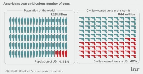
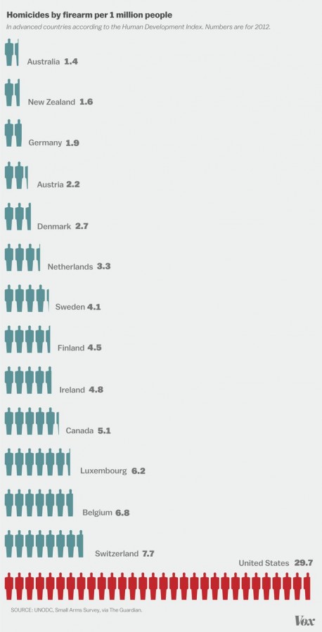
According to Vox, the U.S. has 4.43% of the world’s population and almost 42% of the world’s population of civilian-owned guns.

This is your image of the week:

2

It’s hard to say exactly, but there may be as many guns as there are people in the U.S., or even more guns than people. Since not everyone is a gun owner, that means that the typical gun owner owns more than one. In fact, they own, on average, 6.6 guns each. Two-thirds of the guns in the U.S. are in the hands of 20% of the population. Gun manufacturers know this and market accordingly.

Gun ownership is correlated with both gun homicide and suicide. Accordingly, we also have the highest rate of gun violence of any developed country. In 2013, there were 21,175 gun suicides and 11,208 gun homicides.

4

This data was collected by the UNODC and compiled by the Guardian.

Lisa Wade, PhD is an Associate Professor at Tulane University. She is the author of American Hookup, a book about college sexual culture; a textbook about gender; and a forthcoming introductory text: Terrible Magnificent Sociology. You can follow her on Twitter and Instagram.

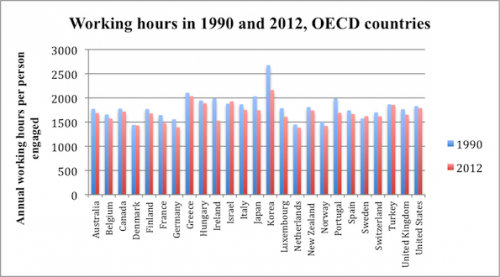
On average, U.S. workers with jobs put in more hours per year  than workers in most OECD countries. In 2012, only Greece, Hungary, Israel, Korea, and Turkey recorded a longer work year per employed person.

2

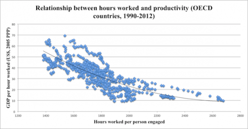
A long work year is nothing to celebrate. The following chart, from the same Economist article, shows there is a strong negative correlation between yearly hours worked and hourly productivity.

3.5

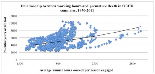
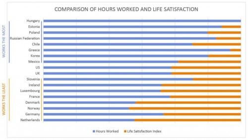
More importantly, the greater the number of hours worked per year, the greater the likelihood of premature death and poor quality of life.  This reality is highlighted in the following two charts taken from an article by Angus Chen titled “8 Charts to Show Your Boss to Prove That You Can Do More By Working Less.”

1 (2) - Copy

1 (2)

In sum, we need to pay far more attention to the organization and distribution of work, not to mention its remuneration and purpose, than we currently do.

Martin Hart-Landsberg is a professor of economics at Lewis and Clark College. You can follow him at Reports from the Economic Front.

Our favorite economist, Martin Hart-Landsberg, has written a detailed account of what is causing the rise of income inequality around the world.  Here I’d like to highlight just one of his really interesting observations.

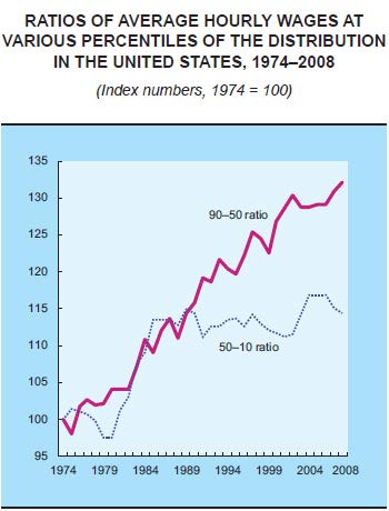
While we usually think that rising income inequality is caused by the rich getting richer and the poor getting poorer, a more complex picture is emerging.  The graph below plots the hourly wages of the 90th percentile (Americans who make more than 89% of the population) relative to the wages of the 50th percentile (the purple line) and the wages of the 50th compared to the 10th percentile (the dotted blue line).

In English: it asks how quickly the richest people (90th) are pulling away from the average person (50th) and how quickly the average person is pulling away from the poorest (10th).  The answer?  Income inequality has been increasing since the 70s but, since the late ’80s, rich people have continued pulling ahead of the average American, but the average American has not been gaining on the poor.

Wage-ratios

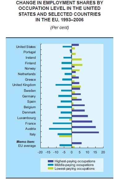
Another indicator that the middle class is shrinking is changes in the share of jobs that are low-, middle-, or high-paid.  The next graph shows that, across a wide range of countries, high- and low-paying jobs are on the rise, but middle-paying jobs are on the decline.  So, middle income jobs are disappearing, but there are more of both high- and low-income jobs.

Jobs (1)

Hart-Landsberg suggests that the reason for this shift in the economy involves the globalization of production.  For more, visit Reports from the Economic Front.

Lisa Wade, PhD is an Associate Professor at Tulane University. She is the author of American Hookup, a book about college sexual culture; a textbook about gender; and a forthcoming introductory text: Terrible Magnificent Sociology. You can follow her on Twitter and Instagram.
Cross-posted at Montclair SocioBlog.

According to an op-ed in the Times, America is the global leader in broadband, with high speeds and great service. And it’s all because the government restrained “onerous” regulation and let companies like Verizon do what they want and charge what they want.

It was written by the CEO of Verizon, Lowell McAdam.

I pay Mr. McAdam’s company about $115 each month for my land line, wi-fi, and cable (all FIOS).  Mr. McAdam compares the U.S. favorably with Europe, “where innovation and investment in advanced networks have stagnated under an onerous regulatory regime.”  I asked a friend who lives in Paris what he pays for his FIOS phone, wi-fi, and cable.  The monthly bill:  39.90€ ($52) or half of what I pay Verizon.  Maybe there’s an upside to stagnant and onerous.

There’s nothing wrong with getting what you can afford, and it occurred to me that U.S. broadband is the best because we can afford more.  Onerous regulations or no, most other countries are not as rich as the U.S.  What if you looked at broadband and per capita GDP?

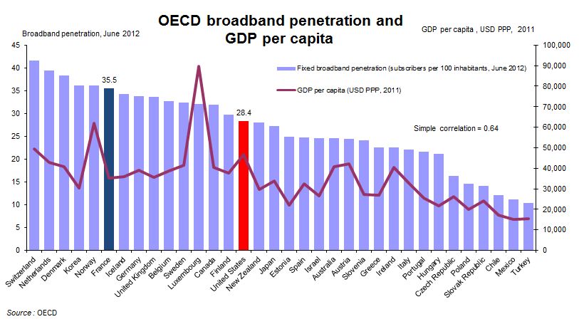
The OECD did just that with data from June 2012 (their several spreadsheets on this are here). The purple bars are broadband penetration and the bumpy red line is GDP per capita. Do you see a correlation?

1

Consider France: As of a year ago, the country had greater broadband penetration despite a lower per capita GDP than the U.S. ($35,133 vs. $46,588); that’s 25% more broadband on 33% less income and at half the cost to consumers.

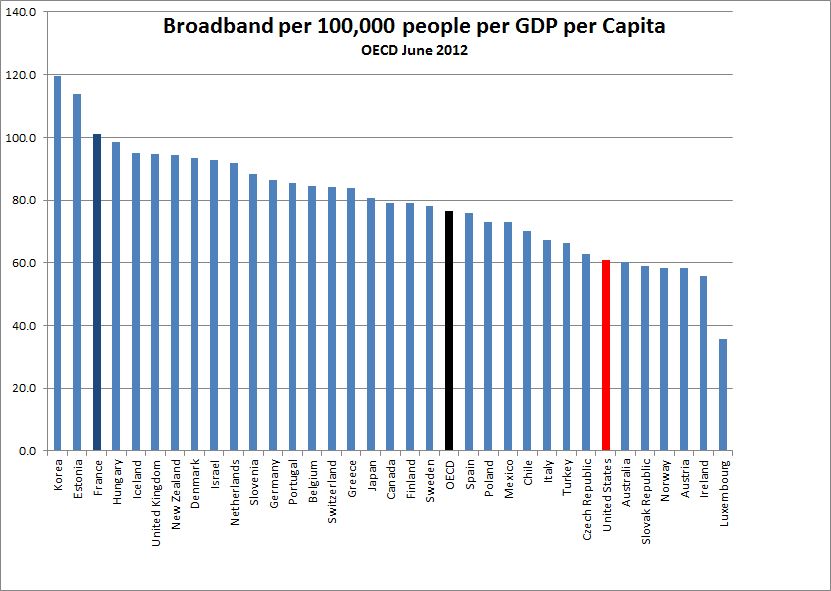
If you re-rank the OECD countries factoring in per capita GDP, the line-up changes.  Notably, the U.S. and Luxembourg drop well below the OECD average, despite being among the wealthiest countries.

2

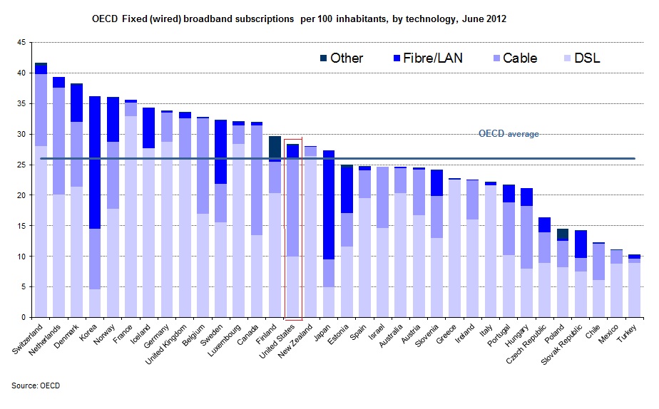
Of course, not all broadbands are equally broad.  Verizon sold me on fiber-optic with their assurance that it was dazzlingly faster than their DSL that I had been clunking along on. This graph breaks down broadband into its various incarnations.

3

The U.S. is slightly above average on all broadband, but when it comes to a high fibre diet, we are ahead of several other countries that have greater total penetration.  On the other hand, the Scandinavian countries are ahead of us, as are, impressively, the Asian countries.

This is not to deny U.S. advances.  TechCrunch summarizes more recent data from Akamai on these changes:

the U.S. is currently second in the price of broadband for entry-level users. The nation is also third in network-based competition, second in the fiber-optic installation rate, first in the adoption of next-generation LTE, ahead of Europe in broadband adoption, and doing quite well in Internet-based services.

Still, the U.S. lags behind other, less wealthy countries.  InnovationFiles, using Akamai data for different variables, has a less congratulatory view.

  • The U. S. has picked up one place in the “Average Peak Connection Speed” that’s the best measurement of network capacity, rising from 14th to 13th as the measured peak connection speed increased from 29.6 Mbps to 31.5 Mbps.
  • In terms of the “Average Connection Speed,” widely cited by analysts who don’t know what it means, the U. S. remains in 8th place world-wide. but we’re no longer tied for it as we were in the previous quarter; Sweden is right behind us on this one.
  • In terms of “High Speed Broadband Adoption”, the proportion of IP addresses with an Average Connection Speed greater than 10 Mbps, we remain in 7th place, but now we’re tied with  Sweden.

The title of CEO McAdam’s op-ed is “How the US Got Broadband Right.”  Given the content, I  guess “We’re Number 13!” wouldn’t have been appropriate.  Even “We’re Number Seven (Tied With Socialist Sweden)!” doesn’t quite have that affirmative zing.

Jay Livingston is the chair of the Sociology Department at Montclair State University. You can follow him at Montclair SocioBlog or on Twitter.

Cross-posted at Reports from the Economic Front.

The Supreme Court has ruled favorably on the legality of the Affordable Care Act.  Actually, despite its name, the Act has more to do with extending and attempting to improve private health insurance coverage than it does with improving care or reducing its cost.

Unfortunately for us, the effort to improve our health care system has remained within bounds set by the needs of private health care providers and insurers.  As President Obama made clear from the start of his push for health care reform, there would be no consideration of a universal system.

Critics of such a universal system are always quick to argue that only market forces driven by the private pursuit of profit can ensure an efficient health care system.  Of course, in determining whether this is true, we need to recognize that efficiency is a complex term and that our health care system, like all systems, produces multiple outcomes.  The most obvious ones are private profit as well as the quality and cost of the relevant health care.

In terms of private profit there can be no doubt that our health care system functions well.  However, the story is quite different if we evaluate it in terms of quality and cost.  The fact that we continue to embrace a private health care system makes clear which measures of efficiency are considered most important and by whom.

The following map shows the countries, colored green, that have adopted a universal health care system.

mf-healthcaremap-p-thumb-615x314-91612.jpg

As Max Fisher explains:

What’s astonishing is how cleanly the green and grey separate the developed nations from the developing, almost categorically. Nearly the entire developed world is colored, from Europe to the Asian powerhouses to South America’s southern cone to the Anglophone states of Australia, New Zealand, and Canada. The only developed outliers are a few still-troubled Balkan states, the Soviet-style autocracy of Belarus, and the U.S. of A., the richest nation in the world.

The handful of developing countries that provide universal access to health care include oil-rich Saudi Arabia and Oman, Latin success story Costa Rica, Kyrgyzstan, and, famously, Cuba, among a few others. A number of countries have attempted universal health care but failed, such as South Africa, which maintains a notoriously inefficient and troubled public plan to complement the private plans popular among middle- and upper-class citizens…

That brings us to another way that America is a big outlier on health care. The grey countries on this map tend to spend significantly less per capita on health care than do the green countries — except for the U.S., where the government spends way more on health care per person than do most countries with free, universal health care. This is also true of health care costs as a share of national GDP — in other words, how much of a country’s money goes into health care.

The OECD just published a major study on the health care systems of its 34 member nations.  It found that:

 Health spending accounted for 17.6% of GDP in the United States in 2010, down slightly from 2009 (17.7%) and by far the highest share in the OECD, and a full eight percentage points higher than the OECD average of 9.5%. Following the United States were the Netherlands (at 12.0% of GDP), and France and Germany (both at 11.6% of GDP).

The United States spent 8,233 USD on health per capita in 2010, two-and-a-half times more than the OECD average of 3,268 USD (adjusted for purchasing power parity). Following the United States were Norway and Switzerland which spent over 5,250 USD per capita. Americans spent more than twice as much as relatively rich European countries such as France, Sweden and the United Kingdom.

combined1.jpg
What does all of this mean in terms of health outcomes?  According to the OECD report:

Most OECD countries have enjoyed large gains in life expectancy over the past decades. In the United States, life expectancy at birth increased by almost 9 years between 1960 and 2010, but this is less than the increase of over 15 years in Japan and over 11 years on average in OECD countries. As a result, while life expectancy in the United States used to be 1½ year above the OECD average in 1960, it is now, at 78.7 years in 2010, more than one year below the average of 79.8 years. Japan, Switzerland, Italy and Spain are the OECD countries with the highest life expectancy, exceeding 82 years.

One possible explanation for this lagging performance, highlighted in an earlier OECD report, is that the U.S. ranked 26th in terms of the number of practicing physicians relative to its population, 29th in terms of the number of doctor consultations per capita, 29th in terms of the number of hospital beds per capita, and 29th in terms of the average length of hospital stay.  At the same time, the “U.S. health system does do a lot of interventions… it has a lot of expensive diagnostic equipment, which it uses a lot. And it does a lot of elective surgery — the sort of activities where it is not always clear cut about whether a particular intervention is necessary or not.”

Private health care providers and insurers are clear about how they measure health care efficiency.  And as long as we rely on them to set the terms of the debate we will continue to suffer the consequences.

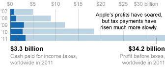
Apple’s profits more than quintupled in the last five years, but their tax burden has risen much more slowly.  Last year, just 9.8% of their profits went to taxes.   “By comparison,” writes economist Marty Hart-Landsberg, “Wal-Mart was downright patriotic — paying a tax rate of 24 percent.”

How does the company do it?  Hart-Landsberg summarizes the New York Times: “The answer is tax loopholes and a number of subsidiaries in low tax places like Ireland, the Netherlands, Luxembourg and the British Virgin Islands. ”  More details at Reports from the Economic Front.

Lisa Wade, PhD is an Associate Professor at Tulane University. She is the author of American Hookup, a book about college sexual culture; a textbook about gender; and a forthcoming introductory text: Terrible Magnificent Sociology. You can follow her on Twitter and Instagram.
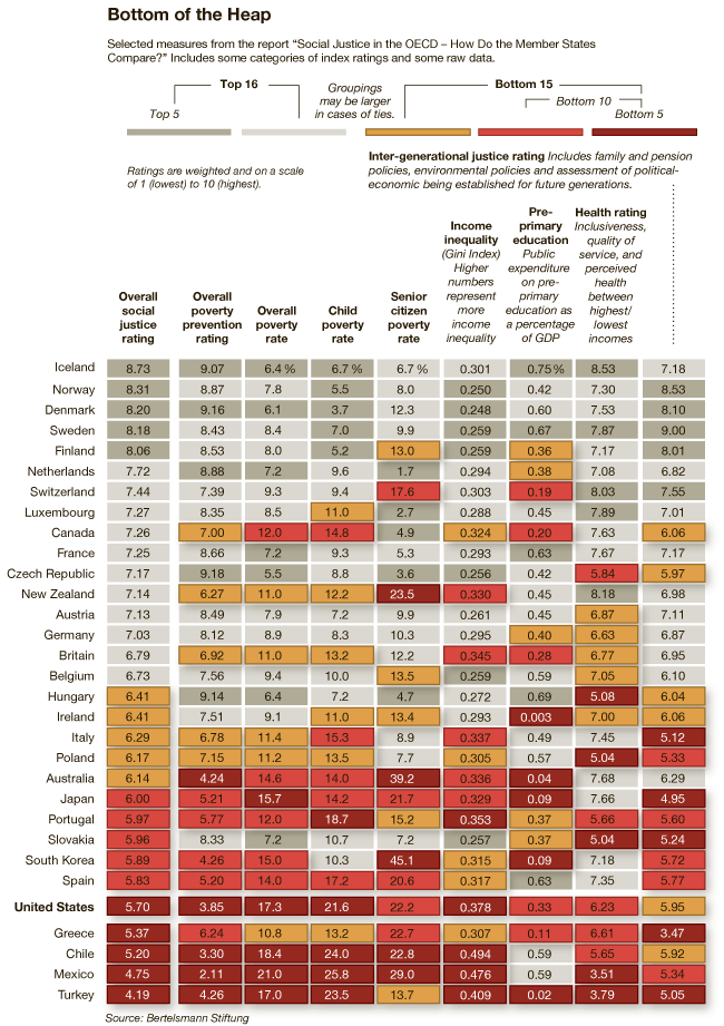
How does the U.S. compare to other developed countries on measures of social justice? According to the New York Times, not very well.  The visual below compares countries’ poverty rates, poverty prevention measures, income inequality, spending on pre-primary education, and citizen health.  The “overall” rating is on the far left and the U.S. ranks 27th out of 31.


Via Feministing.  See also how the U.S. ranks on measures of equality and prosperity(33 out of 33, for what it’s worth). Thanks to Dolores R. for the link!

Lisa Wade, PhD is an Associate Professor at Tulane University. She is the author of American Hookup, a book about college sexual culture; a textbook about gender; and a forthcoming introductory text: Terrible Magnificent Sociology. You can follow her on Twitter and Instagram.
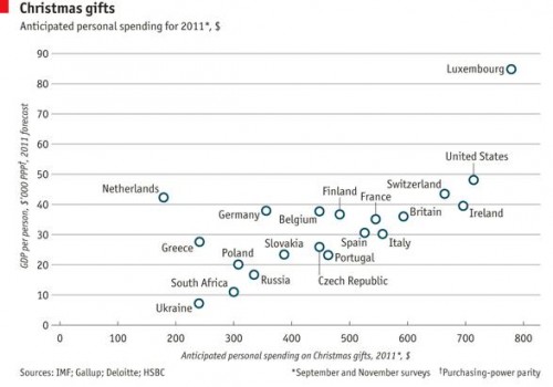
As we enter the last frenzied days of Christmas shopping, Dmitriy T.M. thought it was worth looking at international comparisons in spending on the holiday. The Economist posted a graph based on Gallup polls and other data sources about how much individuals in various countries in Europe, plus the U.S. and South Africa, plan to spend on Christmas shopping this year, plotted against national GDP. Overall, Christmas spending correlates with national wealth, with the Netherlands being a noticeable outlier (spending less than we’d expect) and Luxembourg in a spending league of its own: