nation: Finland

Cross-posted at Montclair SocioBlog.

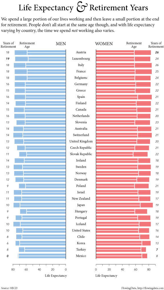
As I speculated years ago (here and here), it may be hard for Americans to imagine a world where the law guarantees them at least 20 paid vacation days per year.  But such a world exists.  It’s called Europe.*

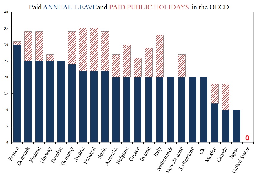
Americans are the lucky ones.  As Mitt Romney has warned us “European-style benefits” would   “poison the very spirit of America.”  Niall Ferguson, who weighs in frequently on history and economics, contrasts America’s “Protestant work ethic” with what you find in Europe – an “atheist sloth ethic.”

The graph is a bit misleading. It shows only what the law requires of employers.  Americans do get vacations.  But here in America, how much vacation you get, or whether you get any at all, and whether it’s paid – that all depends on what you can negotiate with your employer.

Since American vacations depend on what the boss will grant, some people get more paid vacation, some get less, and some get none.  So it might be useful to ask which sectors of our economy are beehives of the work ethic and which are sloughs of sloth.  (Ferguson’s employer, for example, Harvard University, probably gives him three months off in the summer, plus a week or two or more in the winter between semesters, plus spring break, and maybe a few other days.  I wonder how he would react if Harvard did away with these sloth-inducing policies.)

The Wall Street Journal recently (here) published a graph of BLS data on access to paid vacations; they break it up by industry near the bottom.

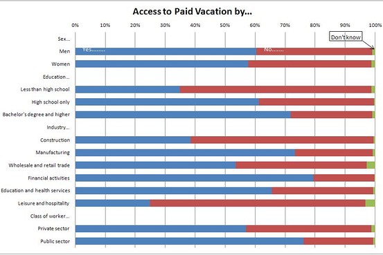
Those people who are cleaning your hotel room and serving your meals while you’re on vacation — only about one in four can get any paid vacation days.  And at the other end, which economic sector is most indulgent of sloth among its workforce?  Wall Street.  Four out of five there get paid vacation.

How much paid vacation do we get?  That depends on sector, but it also depends on length of service.  As the Journal says,

Europeans also get more time off: usually a bare minimum of four weeks off a year. Most Americans have to stay in a job for 20 years to get that much, according to BLS data.

—————————

* The graph is from five years ago, but I doubt things have changed much. The US still has no federal or state laws requiring any paid vacation days.

Cross-posted at Reports from the Economic Front.

The Supreme Court has ruled favorably on the legality of the Affordable Care Act.  Actually, despite its name, the Act has more to do with extending and attempting to improve private health insurance coverage than it does with improving care or reducing its cost.

Unfortunately for us, the effort to improve our health care system has remained within bounds set by the needs of private health care providers and insurers.  As President Obama made clear from the start of his push for health care reform, there would be no consideration of a universal system.

Critics of such a universal system are always quick to argue that only market forces driven by the private pursuit of profit can ensure an efficient health care system.  Of course, in determining whether this is true, we need to recognize that efficiency is a complex term and that our health care system, like all systems, produces multiple outcomes.  The most obvious ones are private profit as well as the quality and cost of the relevant health care.

In terms of private profit there can be no doubt that our health care system functions well.  However, the story is quite different if we evaluate it in terms of quality and cost.  The fact that we continue to embrace a private health care system makes clear which measures of efficiency are considered most important and by whom.

The following map shows the countries, colored green, that have adopted a universal health care system.

mf-healthcaremap-p-thumb-615x314-91612.jpg

As Max Fisher explains:

What’s astonishing is how cleanly the green and grey separate the developed nations from the developing, almost categorically. Nearly the entire developed world is colored, from Europe to the Asian powerhouses to South America’s southern cone to the Anglophone states of Australia, New Zealand, and Canada. The only developed outliers are a few still-troubled Balkan states, the Soviet-style autocracy of Belarus, and the U.S. of A., the richest nation in the world.

The handful of developing countries that provide universal access to health care include oil-rich Saudi Arabia and Oman, Latin success story Costa Rica, Kyrgyzstan, and, famously, Cuba, among a few others. A number of countries have attempted universal health care but failed, such as South Africa, which maintains a notoriously inefficient and troubled public plan to complement the private plans popular among middle- and upper-class citizens…

That brings us to another way that America is a big outlier on health care. The grey countries on this map tend to spend significantly less per capita on health care than do the green countries — except for the U.S., where the government spends way more on health care per person than do most countries with free, universal health care. This is also true of health care costs as a share of national GDP — in other words, how much of a country’s money goes into health care.

The OECD just published a major study on the health care systems of its 34 member nations.  It found that:

 Health spending accounted for 17.6% of GDP in the United States in 2010, down slightly from 2009 (17.7%) and by far the highest share in the OECD, and a full eight percentage points higher than the OECD average of 9.5%. Following the United States were the Netherlands (at 12.0% of GDP), and France and Germany (both at 11.6% of GDP).

The United States spent 8,233 USD on health per capita in 2010, two-and-a-half times more than the OECD average of 3,268 USD (adjusted for purchasing power parity). Following the United States were Norway and Switzerland which spent over 5,250 USD per capita. Americans spent more than twice as much as relatively rich European countries such as France, Sweden and the United Kingdom.

combined1.jpg
What does all of this mean in terms of health outcomes?  According to the OECD report:

Most OECD countries have enjoyed large gains in life expectancy over the past decades. In the United States, life expectancy at birth increased by almost 9 years between 1960 and 2010, but this is less than the increase of over 15 years in Japan and over 11 years on average in OECD countries. As a result, while life expectancy in the United States used to be 1½ year above the OECD average in 1960, it is now, at 78.7 years in 2010, more than one year below the average of 79.8 years. Japan, Switzerland, Italy and Spain are the OECD countries with the highest life expectancy, exceeding 82 years.

One possible explanation for this lagging performance, highlighted in an earlier OECD report, is that the U.S. ranked 26th in terms of the number of practicing physicians relative to its population, 29th in terms of the number of doctor consultations per capita, 29th in terms of the number of hospital beds per capita, and 29th in terms of the average length of hospital stay.  At the same time, the “U.S. health system does do a lot of interventions… it has a lot of expensive diagnostic equipment, which it uses a lot. And it does a lot of elective surgery — the sort of activities where it is not always clear cut about whether a particular intervention is necessary or not.”

Private health care providers and insurers are clear about how they measure health care efficiency.  And as long as we rely on them to set the terms of the debate we will continue to suffer the consequences.

Cross-posted at Family Inequality.

In 1994, Sara McLanahan and Gary Sandefur published, Growing Up With A Single Parent: What Hurts, What Helps. The growth of children living with only their mothers was — then as now — a matter of concern not only for children’s well-being, but for intergenerational mobility. One of their empirical conclusions was this:

For children living with a single parent and no stepparent, income is the single most important factor in accounting for their lower well-being as compared with children living with both parents. It accounts for as much as half of their disadvantage. Low parental involvement, supervision, and aspirations and greater residential mobility account for the rest.

The biggest problem, in other words, is economic. The other factors —  involvement, supervision, aspirations, mobility — are related to social class and the time poverty that economically-poor parents experience.

Examples

Here are some bivariate illustrations — that is, head-to-head comparisons of the difference between children of poor and non-poor versus single and married parents.

These are the “skill group” rankings by teachers of children by socioeconomic status (or SES, a composite of parents’ education, occupational prestige and income) versus race/ethnicity, gender and family structure. SES shows the widest spread in reading teachers’ group placement of first graders.

Source: Condron (2007)

Similarly, the poor/nonpoor difference is greater than the two-parent/single-parent difference in kindergarten entry scores:

Source: Early Childhood Longitudinal Study (2009)

Those are just two examples from early-childhood assessments. More importantly, here is the breakdown seen in a longitudinal study of children growing up. When women grow up to be mothers, their poverty level in childhood is more important than their family structure for predicting whether they will be in poverty themselves. The poverty difference is large, the family structure difference is not:

Source: Musik & Mare (2006)

This study included a more sophisticated set of multivariate analyses than this simple graph, but the author’s conclusion fits it:

Net of the correlation between poverty and family structure within a generation, the intergenerational transmission of poverty is significantly stronger than the intergenerational transmission of family structure, and neither childhood poverty nor family structure affects the other in adulthood.

That is, childhood poverty matters more.

Fewer single parents, or less poverty?

But if single parenthood and poverty are so closely related, some people say, we should spend hundreds of millions of dollars promoting marriage to help children avoid poverty (and other problems). That’s what the government has done, with money from the welfare budget. Even if it worked, which it apparently doesn’t, it’s only one approach. What about reducing poverty? And, more specifically, reducing the relative likelihood of poverty in single-parent families versus those with married parents. That is, address the poverty gap between the two groups, rather than the size of the two groups. This has the added advantage of not singling out one group — single mothers — for social stigmatization (of the kind I mentioned here). And, because it defines the problem as economic rather than moral, may make it easier to build public support for helping the poor.

Consider a recent paper by David Brady and Rebekah Burroway, which will be published in Demography. They analyzed the relative poverty of single mothers versus the total population — that is, what percentage had incomes below half the median (per person, after accounting for taxes and government transfers). Such a relative poverty measure is really a measure of inequality, but specifically inequality at the low end. (Regardless of how rich the rich are, it’s theoretically possible to have no one below half the median income). Here is my graph showing that result, with only the countries that have reliable sample sizes in the survey:

The Nordic countries have the lowest overall poverty rates. But in absolute terms their advantage is much bigger for single mothers. (The red line shows equal poverty rates for single mothers and the total population.) The US and UK have the largest difference in poverty rates between single mothers and overall poverty. That is, we have the largest poverty penalty for single motherhood. If the relative poverty rates for single mothers were lower in the US, we might spend more time and money addressing poverty and less trying to change family structures.

How does the U.S. compare to other developed countries on measures of social justice? According to the New York Times, not very well.  The visual below compares countries’ poverty rates, poverty prevention measures, income inequality, spending on pre-primary education, and citizen health.  The “overall” rating is on the far left and the U.S. ranks 27th out of 31.


Via Feministing.  See also how the U.S. ranks on measures of equality and prosperity(33 out of 33, for what it’s worth). Thanks to Dolores R. for the link!

Lisa Wade, PhD is an Associate Professor at Tulane University. She is the author of American Hookup, a book about college sexual culture; a textbook about gender; and a forthcoming introductory text: Terrible Magnificent Sociology. You can follow her on Twitter and Instagram.

As we enter the last frenzied days of Christmas shopping, Dmitriy T.M. thought it was worth looking at international comparisons in spending on the holiday. The Economist posted a graph based on Gallup polls and other data sources about how much individuals in various countries in Europe, plus the U.S. and South Africa, plan to spend on Christmas shopping this year, plotted against national GDP. Overall, Christmas spending correlates with national wealth, with the Netherlands being a noticeable outlier (spending less than we’d expect) and Luxembourg in a spending league of its own:


With all the emphasis on Halloween, you may or may not have heard that this year, October 31st was noteworthy for another reason: according to the United Nations, that’s the day the global population hit 7 billion. The UN has set up a website to provide information about population trends and estimates for the future. Here’s the current world population, by region:

The map is interactive, so you can click on a region to find out its population, as well as its percentage of the total world population.

You can also estimate the population through 2100 based on various fertility scenarios. In the default medium scenario, fertility is expected to follow past trends, leveling out at a little over 10 billion by 2100:

On the other hand, if we saw no further reductions in global fertility, the 2100 population would be over 26.8 billion:

There’s an enormous amount of data available at the site. For instance, if you select the Births tab, you can click on either a region or a specific country and find out what percent of births are to women in different age groups. Here’s the % of all births to women aged 15-19, by country:

And the chart showing the total age breakdown for Finland (at the site you can hover over the graph to get the actual %):

A chart of deaths by age and sex, illustrating the continued high mortality in infancy and early childhood:

There’s also a section of the site where you can enter information about your own date and place of birth and then get a snapshot of what the global population was when you were born. Since I entered the world:

Overall, it’s a pretty great resource, and another one of those websites that can easily eat up a significant amount of your time without you realizing it.

Cross-posted at Family Inequality.

I have criticized sloppy statistical work by some international feminist organizations, so I’m glad to have a chance to point out a useful new report and website.

The Progress of the World’s Women is from the United Nations Entity for Gender Equality and the Empowerment of Women. The full-blown site has an executive summary, a long report, and a statistics index page with a download of the complete spreadsheet. I selected a few of the interesting graphics.

Skewed sex ratios (which I’ve written about here and here) are in the news, with the publication of Unnatural Selection, by Mara Hvistendahl. The report shows some of the countries with the most skewed sex ratios, reflecting the practice of parents aborting female fetuses (Vietnam and Taiwan should  be in there, too). With the exception of Korea, they’ve all gotten more skewed since the 1990s, when ultrasounds became more widely available, allowing parents to find out the sex of the fetus early in the pregnancy.

The most egregious inequality between women of the world is probably in maternal mortality. This chart shows, for example, that the chance of a woman dying during pregnancy or birth is about 100- 39-times higher in Africa than Europe. The chart also shows how many of those deaths are from unsafe abortions.

Finally, I made this one myself, showing women as a percentage of parliament in most of the world’s rich countries (the spreadsheet has the whole list). The USA, with 90 women out of 535 members of Congress, comes in at 17%.

The report focuses on law and justice issues, including rape and violence against women, as well as reparations, property rights, and judicial reform. They boil down their conclusions to: “Ten proven approaches to make justice systems work for women“:

1. Support women’s legal organizations

2. Support one-stop shops and specialized services to reduce attrition in the justice chain [that refers to rape cases, for example, not making their way from charge to conviction -pnc]

3. Implement gender-sensitive law reform

4. Use quotas to boost the number of women legislators

5. Put women on the front line of law enforcement

6. Train judges and monitor decisions

7. Increase women’s access to courts and truth commissions in conflict and post-conflict contexts.

8. Implement gender-responsive reparations programmes

9. Invest in women’s access to justice

10. Put gender equality at the heart of the Millennium Development Goals

Does American prosperity translate into long retirements?  Not compared to other developed countries in the world.  Flowing Data borrowed OECD numbers on life expectancy and age of retirement to calculate the average number of years in retirement for men and women across many different countries.  The portion of each bar with the line is the average number of years working, while the non-lined portion represents years in retirement.

Largely because of life expectancy, women enjoy more years than men in all states except Turkey, but the number of years varies quite tremendously, from an average of zero years for men in Mexico, to an average of 26 years for women in Austria and Italy.  The United States is way down on this list, not doing so well relatively after all.

Lisa Wade, PhD is an Associate Professor at Tulane University. She is the author of American Hookup, a book about college sexual culture; a textbook about gender; and a forthcoming introductory text: Terrible Magnificent Sociology. You can follow her on Twitter and Instagram.