nation: Canada

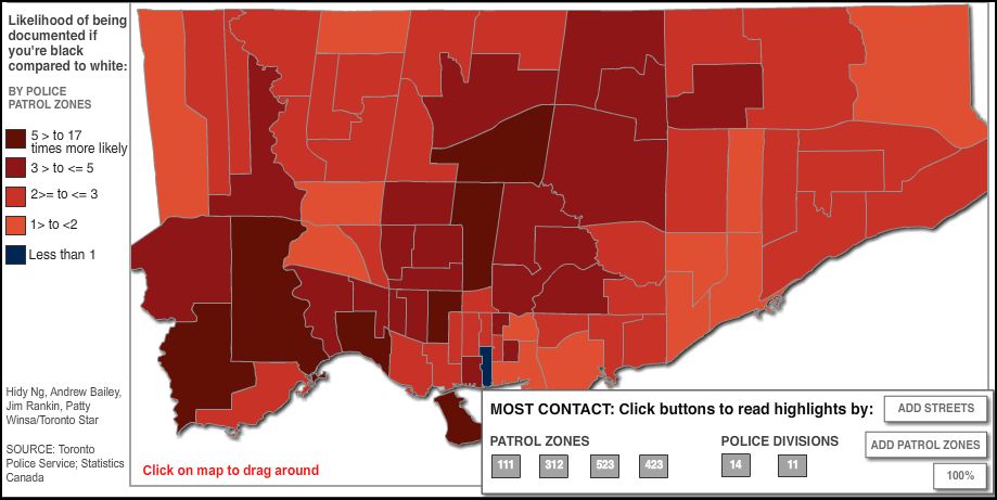
Michelle DuB. sent in some data from the Toronto Star, showing that blacks are more likely than whites to be stopped by police in every single patrol zone except for one.  The disproportion was even high in mostly white areas; they were stopped up to 17 times as often (darker red is most disproportion):

Click here for a video showing what some citizens and a bunch of Toronto police have to say.

See also our posts showing how the stopping of people on the street usually results in… nothing (other than people feeling harassed) and how racial profiling turns out to be ineffective anyway.

Lisa Wade, PhD is an Associate Professor at Tulane University. She is the author of American Hookup, a book about college sexual culture; a textbook about gender; and a forthcoming introductory text: Terrible Magnificent Sociology. You can follow her on Twitter and Instagram.

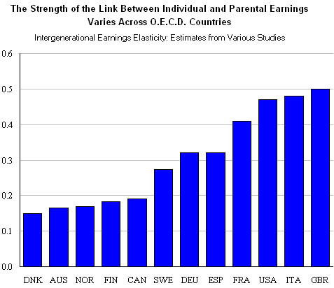
Katrin sent us a great figure comparing the rate of socioeconomic mobility across several OECD nations.  Using educational attainment and income as measures, the value (between zero and one) indicates how strongly parental socioeconomic status predicts a child’s socioeconomic status (a 1 is a perfect correlation and a zero would be no correlation).

The figure shows that Great Britain, the U.S., and Italy have a near 50% correlation rate.  So, in these countries, parents status predicts about 50% of the variance in children’s outcomes.  In contrast, Denmark, Australia, Norway, Finland, and Canada have much lower correlations.  People born in the countries on the left of this distribution, then, have higher socioeconomic mobility than people born in the countries on the right.  Merit, presumably, plays a greater role in your educational and class attainment in these cases.

Source:  The New York Times.

Lisa Wade, PhD is an Associate Professor at Tulane University. She is the author of American Hookup, a book about college sexual culture; a textbook about gender; and a forthcoming introductory text: Terrible Magnificent Sociology. You can follow her on Twitter and Instagram.
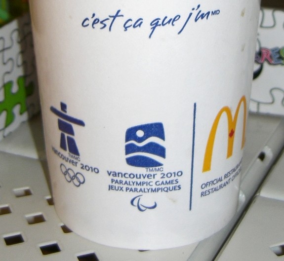
The 2010 Olympics logo is an altered version of traditional Arctic Inuit sculptures. This quasi-indigenous logo has been displayed in a barrage of Olympics branding. You can see two examples of this marketing in photos — from the summer of 2009 – shown below.

With this Olympics logo, and other Olympics promotional messages, marketers have been portraying the 2010 Games as ‘indigenous’ Olympics. Indigenous references are foregrounded in mass produced Olympics marketing.  The online Olympics store even sells “Authentic Aboriginal Products” (such as t-shirts and silk ties).

Some people who encounter this Olympics branding are bound to come away with the impression that natives (that is, individuals with a significant enough amount of native ancestry or culture) are respected, empowered, and well-integrated here in Canada. In other words, some viewers will view this marketing as a sign of harmonious bonds between natives and mainstream Canadian society.

Chief Stewart Phillip, the president of Union of B.C. Indian Chiefs, conveyed a much different view of Olympics marketing when he asserted that,

We’re deeply concerned about the concerted and aggressive marketing campaign advanced by Vanoc [the 2010 Olympics organization committee] which suggests the indigenous people of [British Columbia] and Canada enjoy a very comfortable and high standard of living. The Disneyesque promotional materials suggests a cosy relationship between aboriginal people of the province with all levels of government and it completely ignores the horrific levels of poverty our people endure on a daily basis.


Arctic indigenous branding on a McDonald’s cup in a
Wal-Mart store, in a city in Ontario, Canada

In British Columbia, and elsewhere in present-day Canada, natives have communicated conflicting views about how the 2010 Olympics relate to their lives, lands, and traditions. Indigenous Environmental Network campaigners have been among the more vocal critics who have opposed the 2010 Games.

Some have found the cartoonish Olympic marketing imagery to be a mockery of native traditions.  For example, critics have argued that the 2010 Olympics committee has edited and re-packaged native culture — which also has been ripped out of its traditional contexts. The Committee is highlighting Arctic indigenous imagery — yet Vancouver, the centre of the Games, is a temperate city.  Arctic indigenous peoples did not live there — or on the nearby Whistler and Cypress mountains, where some Olympic events will be held. Other indigenous populations who did live in that area of British Columbia also are not represented in the marketing iconography.

The Olympics branding denies noteworthy differences among native groups spread across these areas. Passing theatrical gestures to native peoples during the open ceremonies could be considered to be more respectful, but Olympics marketers otherwise have been mixing up North American native traditions into a soup-like caricature. Natives have been consistently oppressed, but the various peoples who are considered to be native (in some way, or to some degree) certainly are not ‘all the same.’ Tacking Arctic imagery on to Vancouver-area Games implies that there is only one native essence (in North America, if not beyond this continent).

What else is going on here? What does this superficially ‘indigenous’ rhetoric and imagery have to do with the rest of the 2010 Olympics? In other words, are indigenous populations benefiting from the 2010 Olympics in a way that might explain or justify the appropriation of Arctic imagery?

I pose these questions:

– What proportion of the profits from Olympics sales and tourism will natives groups receive?

– To what extent have native groups actively participated in Olympics organizing?

– How many of the athletes representing Canada at the Games have strong ties to native traditions and ancestors?

– Aside from the branding rhetoric and imagery discussed here, how much indigenous culture will be included in Olympic sports events and Olympics broadcasting?

– And how should we interpret the use of traditional imagery for product marketing purposes? What is the relationship between native peoples and chewing gum wrappers, sugary soda pop drink bottles, and other products which display Olympics brand logos?  Are indigenous peoples profitting from these product sales?  Are natives involved in the boardrooms of the corporations behind these sales?  And are there any other noteworthy connections between these products and any natives in present-day Canada?

Answers to those preceding questions are tied to the conditions that native peoples live under in present-day Canada. As I will explain, there are deep problems with the ‘indigenous’ Olympics rhetoric and imagery, which is very much at odds with Canadian realities.


Arctic advertising
‘Indigenous’ marketing in a major commercial square in
Toronto, Ontario, Canada


Native issues can be complex — and yet brutally straightforward, at the same time. Here are some figures that convey the highly disproportionate impoverishment, vulnerabilities, marginalization, and disempowerment of natives in present-day Canada. (Here are additional child poverty statistics.) The worst racism in Canada is reserved for indigenous peoples who are trapped between assimilation and ghettoization. Native groups ultimately are disappearing — in a nation that was established on native lands.

No marketing imagery ever could erase these ongoing legacies of a history of colonial genocide in Canada (and elsewhere).

Frankly, the ‘indigenous’ Olympics rhetoric and imagery strikes me as yet another form of liberal tokenism, given how fundamental problems are glossed over with paltry gestures (rather than a more radical redistribution of resources — or other constructive societal change).

In fact, while the Olympics imagery implies some sort of harmony between natives and non-natives in Canada, there actually are various ongoing native land claim conflicts in this country. In Ontario, indigenous activists helped to wage a defensive campaign which was a relatively high-profile land claim conflict here in Ontario, during the summer of 2009.

Native land claims are at the forefront of the issues raised by anti-Olympic protestors in Canada (who occasionally have supported tactics that I do not agree with). The phrase “No Olympics on Stolen Land” has been a common protest slogan, and indigenous imagery has been foregrounded in messages from no2010 campaigners, and other anti-Olympic activists. Although these opponents of the Olympics have not carefully distinguished between imagery from different indigenous cultures, their campaign messages surely could not be considered a tokenist form of whitewashing or conservatism — since these anti-Olympic activists have been siding with native land claims.

Protesters also have been raising concerns about how the Olympics are tied to indigenous land conflicts around the tar sands in Alberta. A recent day of action call-out from the Indigenous Environmental Network is the best example of connections drawn between the tar sands and the 2010 Games. As in some other activist campaign messages, this day of action announcement highlights financial and energy-system ties between the Olympics and tar sands pollution in Alberta — beside native lands. These tar sands operations also are the world’s worst climate threat; and the Arctic indigenous peoples alluded to in Olympics marketing actually are on the front lines of global warming impacts, which are aggravated by Olympic environmental devastation (including deforestation, which releases carbon into the world-wide atmosphere). As in other areas of the world, the most disempowered and resource-poor Canadians tend to be much more vulnerable to climate impacts.

Given all of the aforementioned gaps between pro-indigenous rhetoric and actual indigenous realities, why have so many people tolerated the native branding around the 2010 Games? After all, the Olympic brand logo was selected in 2005, and the Olympics marketing blitz was well-underway by the summer of 2009, in Canada.

Aside from the sheer monetary force behind the Olympics, there also are important cultural factors at work here. The harmonious vision conveyed through ‘indigenous’ packaging around the Olympics is an extension of mainstream Canadian visions of an outright “multicultural” “mosaic” in this country — where some claim that there is a complete lack of systemic racism, as well as equally proportioned room for all ethnic groups. In spite of arguments and evidence from critics (including scholars who are affiliated with John Porter’s The Vertical Mosaic), rhetoric about ethnic equality in Canada persists in marketing, in policy documents, and in other mainstream rhetoric. ‘Native’ Olympics marketing celebrates the Canadian status quo, in the same way.

At the same time, the ‘indigenous’ Olympics imagery provides some ethnic spice to the 2010 Games — as well as associated merchandising, and mass media spectacle. In Canada, remnants of native cultures likewise are re-packaged as decorations and tourist industry products. In much the same way, Olympics marketers have sought to increase profits with shreds of de-contextualized indigenous culture which they have appropriated.

But how are indigenous traditions linked to capitalist consumption, mass advertising, mainstream media systems, or tourism? These systems are entrenched on former native lands, but are there any other noteworthy connections between native traditions and such mainstream systems?

(I don’t mean to imply that people with native ancestors will be or should be forever trapped in a receding past. Vibrant, living traditions are flexible. Yet, I do not see how native heritage could be considered to be largely optional in any conception of indigenous-ness.)

Outside of Canada, it probably is not so apparent that the disputes over the Olympics have been national-scale tensions. Anti-Olympic protests (hyper-marginalized though they may be) actually have been organized in various other areas of Canada — well beyond British Columbia. (Here is one example of anti-Olympic campaigning in a city in Ontario.) I also find it telling that, in the face of an anti-Olympic protest in the city that I live in here in southern Ontario, some people conveyed their support for the Olympics by chanting “Canada… Canada… Canada.”

In sum, mainstream Canada claims and re-packages imagery from natives to sell a vision of a present-day Canada that is a tolerant country, with a rich and interesting history; such visions have been produced for the 2010 Games – as well as other tourism and merchandising, and wider nationalism. Then, ironically, when pro-indigenous groups challenge the use of this appropriated iconography to represent ‘Canada,’ majority groups dismiss their protests by claiming a more authentic Canadian-ness. Of course, the refusal to take indigenous protests seriously is just another manifestation of disinterest in the welfare of living indigenous peoples. Even as gestures are made toward native culture, actual natives generally are ignored.

——————————–

Toban Black is a Sociology PhD student specializing in environmental sociology, theory, inequality, and media.  He is also an activist, a blogger, and an amateur photographer.  He considers this guest post to be a blend of each of those four forms of communication.  Black is a frequent contributor to Sociological Images and the many posts inspired by his material can be viewed here.

If you would like to write a post for Sociological Images, please see our Guidelines for Guest Bloggers.

I’ve got a special treat for you today: an interview with artist Nathan Meltz about his pieces on industrial food production. Nathan has shown his art in group shows around the country.  He received a Master’s degree in Art from the University of Wisconsin-Madison and is currently a graduate student at SUNY-Albany, where he will be graduating this spring with his MFA.  He lives in upstate New York with his wife, Abby Kinchy, and their infant son Aldo. His artistic and musical exploits can be followed at The House of Tomorrow.

I went to grad school with Abby, so that’s how I knew about Nathan’s work. As a sociologist who specialized in food issues and rural communities, I immediately loved these pieces and thought many of our readers would too, so I convinced Nathan to let me post an interview and some of my favorites. (And be forgiving of my amateurish interview questions. I am not a Creative Type, and my general reaction to art I like is “You made a pretty!”)

—————————-

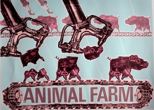
Animal Farm
ANIMALFARMBLUE

What drew you to the issue of food?

I have to give a lot of credit to Abby, who is a sociologist at the Rensselaer Polytechnic Institute, and has done a lot of research on controversies surrounding genetically-modified corn and canola. [She’s currently working on a book about conflicts over genetically modified crops in Canada and Mexico.–Gwen].  A lot of the themes in my art developed from kitchen-table discussions we had while in grad school in Madison.  What was technology doing to agriculture? And then, from my end, what would it look like?

How did you come up with the idea of representing food products as machines?

I wanted a visual metaphor that would reveal tech taking over plants and animals.  Unfortunately, our most current tech can be hard to visualize.  A series of ones and zeros?  Some sort of digital technology?  I decided to combine elements of Dada collage with early modernist German machine aesthetic [Oh, yes, the early modernist German machine aesthetic! Of course!–Gwen]  to create my own visual vocabulary. One that, while not exactly 21st century, would act as a symbol of science and technology for the viewer/audience.

What does your Animal Farm series convey about our modern food system?

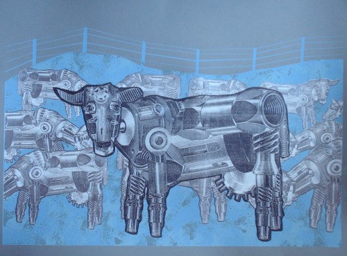
Waiting for My Mechanical BullCOWs

Enviropig
enviropig_paper

In my machine world, animals are put on assembly lines, cramped together in feed lots, and, in the case of the chickens in The Chicken Coup animation, reside in an agricultural system designed by sadists.  They all look the same because there is no diversity on the factory farm.

    The Chicken Coup, pt. 1

    The Chicken Coup, pt. 2

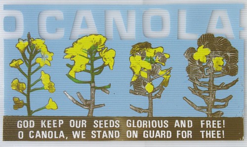
Many people have at least some knowledge of slaughterhouses and the treatment of animals, so the Animal Farm series is probably fairly accessible. But O Canola! is, I think, more complex and harder to understand if you’ve never thought much about bioengineering before, or why the song “O Canada” would be particularly meaningful in the context of discussing canola and bioengineering.

O Canola!
Ocanola

O Canola! was a project long in the making, very much piggybacking on the research Abby was doing at the time. I try to tell the story of Canada’s GMO [genetically modified organism] canola contamination* in a visual form. The clever riffing on the Canadian National Anthem (which Abby thought of) is meant to reflect the nationalist tensions inherent in the controversy, where a hybrid plant created by the Canadian government during WWII to produce a mechanical lubricant at the local level would years later be threatened by GMOs produced by agribusiness.

What about Food for Fuel?

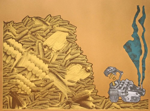
Food for Fuel
3

Food for Fuel came after news reports kept coming in about food shortages around the world, particularly in Mexico, because so much edible food was being turned into fuel for vehicles.  The message on this one is pretty straightforward.

Food for Fuel, along with Animal Farm, definitely reflects my interest in Agitprop.  At the time I made these, I was sharing a studio with printmaker/activist Josh MacPhee, a member of the Just Seeds print collective, which promotes socially activist printmaking.  A lot of the work he was doing really influenced me, and I think these two prints reflect my desire to have a clear social message.

How have people reacted to the series? Do you get a sense that people react more forcefully, or emotionally, to the ones about animals than the ones about crops?

Reaction has been positive, or at least the reaction I hear about.  A lot of the prints have traveled around in various shows.  I think the animation The Chicken Coup has maybe received a little more attention than the prints among the art audience.  Static prints on paper have a hard time competing with moving images with sound, music, etc.  And I don’t think people care any less about the crop-based works than the animal ones.  I find people who are really into food/agriculture issues care just as forcefully about what is happening to corn as they do cows.

—————————–

* GMO contamination occurs when genetically modified seeds migrate to fields that were not intentionally planted with them, an increasingly common occurrence. Aside from the problems this can cause farmers who want to sell their products as specifically not GMO, and concerns about the ecological effects that could occur if modified genes spread into other varieties (or even related wild species), it also puts farmers at legal risk. GMO crops such as marketed under the Roundup Ready label and engineered to be immune to the effects of Monsanto’s weedkiller Roundup, are patented. Farmers are not allowed to plant them without buying a license (including saving seeds from their own crop to plant the following year, a traditional practice of many farmers to eliminate the cost of buying seeds each year; so-called “terminator” varieties are even engineered to produce only sterile seeds, thus ensuring farmers must buy fertile seeds from the manufacturer annually). Monsanto has sued farmers for patent infringement in cases where a field was contaminated with Monsanto’s GMO seeds when they blew in from a neighboring field. Conversely, a group of Canadian organic farmers sued Monsanto on the grounds that genetic contamination had made it impossible for them to sell their products as organic.

If you’re interested in the topic, you might try to get a copy of Abby’s new article, “Anti-Genetic Engineering Activism and Scientized Politics in the Case of ‘Contaminated’ Mexican Maize,” Agriculture and Human Values.

Kathleen K. was recently looking at the Credit Education Week Canada website, where they have a number of quizzes for couples to take. At the end of each quiz there is a picture of a couple along with your results. She was pleasantly surprised that this image accompanied the results of one quiz:

-1

It’s a rare example of the normalization of gay/lesbian couples in media not specifically targeted at the GLBT community. The couple is presented as a legitimate image of love for both straight and gay couples, and there is no ambiguity about whether or not they’re a couple. Given the general invisibility of gay and lesbian couples in media outlets, and the use of only heterosexual couples as “neutral,” unmarked examples, it’s quite striking to see this.

Also see our post on a commercial by an Argentinian bank that depicted transgendered individuals positively.

In 2000, at the University of Wisconsin – Madison (UW), Diallo Shabazz was my student.  He was a senior.  At the very beginning of his Frosh year, someone snapped this picture:

Picture5

From that point forward, Diallo was featured in UW promotional materials again and again.  He became accustomed to seeing that smile everywhere.  Because diversity has become such a popular, even trendy thing for a college to have, many students of color find themselves used as representatives of their colleges disproportionately.

But Shabazz’s story takes a fascinating turn.  At the end of his senior year he paged through the next year’s application and didn’t see himself.  Hmmm.  Then, someone asked if he saw himself on the cover.  And he looked and didn’t see it and then he did.  Do you?

Capture1

That’s Diallo behind the excited girl on the left.  Except Diallo had never been to a UW football game.  You might recognize his face, transposed, from the original picture.  Indeed, someone at UW had photoshopped Diallo into the image below in order to give the impression that attendance at the game was more diverse than it was.  No Diallo:

Capture2

In that year 100,000 admission booklets went out with his face.  More insidiously, 100,000 admission booklets went out using his face to give the illusion of diversity at the University of Wisconsin – Madison.

Diallo sued.  He didn’t ask for a settlement.  He said that he wanted a “budgetary apology.”  He asked that, in compensation, the University put aside money for actual recruitment of minority students.  He won.  Ten million dollars was earmarked for diversity initiatives across the UW system.  The irony in the whole thing is that UW requested photos of Shabazz shaking administrators’ hands in reconciliation (i.e., photographic proof that everything was just fine).  Oh, and also, the Governor vetoed part of the earmark and many initiatives wore off with turnover.

What does this teach us?

First, notice that we have a commodification of diversity.  It is considered useful for selling an institution.

Second, if real diversity isn’t possible, cosmetic diversity will do.

Third, Shabazz himself was dismissed even as his image was used over and over.  Not only did they own the rights to his image and include him in many materials without the requirement that they ask or inform him, they literally took his image, cut it up, and used it to create a false picture.  When Shabazz complained, they first tried to blow him off.  So he wasn’t important to them, even as what he represented clearly was.

This suggests, fourth, that there was a real lack of a substantive dialog about and investment in race and diversity on the campus.  Talk: difficult.  Recruitment of minorities to a mostly white campus: tricky.  Addressing the systematic educational underinvestment in minorities prior to arriving at UW: expensive.  Retaining minorities in that environment: challenging.  Photoshop: easy.

Macon D., at Stuff White People Do, featured a similar situation in which Toronto’s Fun Guide (badly) photoshopped a black man onto their cover because their “goal was to depict the diversity of Toronto and its residents” (story here) (images also sent in by fds and Michael G.):

FUNphotoshop2

Original photo:

FUNphotoshop1

All of this puts into some perspective the recent Microsoft scandal that Jon S. and Dmitriy T. M. asked us to blog about.  If you were in the U.S. you would see the first image on the Microsoft webpage (with, as far as we know, real minorities) and, if you were in Poland, you would have seen the second image (with the black man replaced by a white man):

msft_sux_engadget

NEW! (Nov ’09):

Arturo Garcia pointed out that U.S. advertising for Couples Retreat included a black couple, but the advertising in the U.K. did not.

U.S. poster:

4113140933_210b27e6b6

U.K. poster:

4113141007_5a64763a21

The willingness to play with the presence of minorities–both by photoshopping them in and out–suggests that companies are making strategic, not ethical, decisions about what kind of public face (forgive the pun) to put on.  All of this avoids any real engagement with diversity itself.  This is probably largely because diversity is a minefield.  It’s incredibly difficult to even figure out how to define it, let alone how to build it, or how to manage it once you have it (something that my current institution struggles with).  And yet, these are the things that we must do.  Otherwise all of these strategic moves, both towards and away from minorities, are suspect.

NEW! In our comments, Jackie and Jasmine drew our attention to another example.  This is from the University of Texas, Arlington:

utarlington

See also our series on how people of color are included in advertising aimed primarily at white people, starting here.

If you’re really interested in these ideas, you might want to read MultiCultClassics, a blog specializing in how companies try to recruit minorities and present themselves as diverse institutions.

—————————

Lisa Wade is a professor of sociology at Occidental College. You can follow her on Twitter and Facebook.

Lisa Wade, PhD is an Associate Professor at Tulane University. She is the author of American Hookup, a book about college sexual culture; a textbook about gender; and a forthcoming introductory text: Terrible Magnificent Sociology. You can follow her on Twitter and Instagram.
Laura W. sent us a link to a review of sex education in the U.K. that featured a three minute video. The video is a clip from a 1917 film, called “Whatsoever a Man Soweth,” encouraging Canadian soldiers to refrain from having sex with prostitutes. It was important for states to keep their soldiers from hiring prostitutes because soldiers filled up the sick bay with sexually transmitted infections that, during World War I, were not easily cured with antibiotics. Watch it here.

Also in soldiers and STIs: “Bad” women as disease vectors.

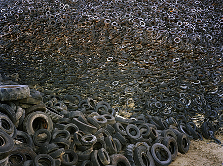
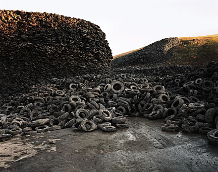
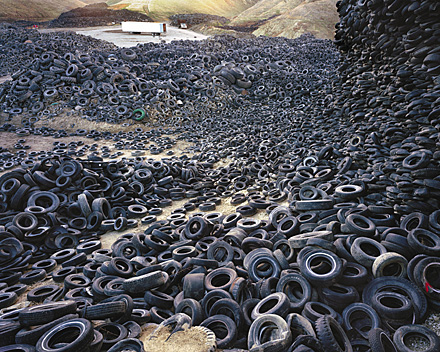
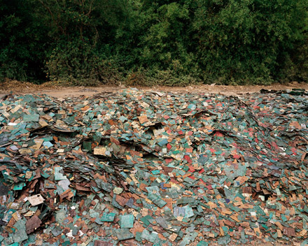
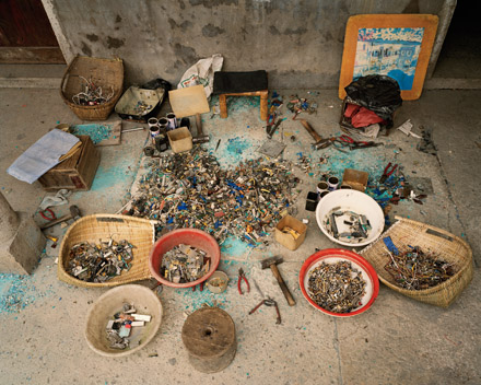
In a previous post, I shared some photographs by Edward Burtynsky of oil fields and mines.  Burtynsky takes pictures with an eye towards the modern global economy. This set documents massive piles of waste sorted for recycling:

Three pictures of the Oxford tire pile in Westley, California (1999):

Densified Oil Drums in Hamilton, Ontario (1997):

Metal for recycling in Hamilton, Ontario (1997):

Metal for recycling in Hamilton, Ontario (1997):

Plastic toy parts in Guiyu, Guangdong Province (2004):

Circuit boards in Guiyu, Guangdong Province (2004):

Recycling work station (I believe the worker is taking apart computers) in Zenguo, Zhejiang Province (2004):