media: marketing

Oliver Noble edited a fun look at the history of product placement in American film, featured at Political Remix Video.   Among other tidbits, in this 6-and-a-half minute video, he reveals that:

  • the first known product placement was in 1919;
  • Hershey’s paid a million dollars to make Reeses Pieces a plot point in E.T. (image source);
  • movies sometimes switch up the product placed for different audiences;
  • and the record for the most product placements in a single film goes to Michael Bay’s Transformers with 47.

Fun stuff:

Lisa Wade, PhD is an Associate Professor at Tulane University. She is the author of American Hookup, a book about college sexual culture; a textbook about gender; and a forthcoming introductory text: Terrible Magnificent Sociology. You can follow her on Twitter and Instagram.

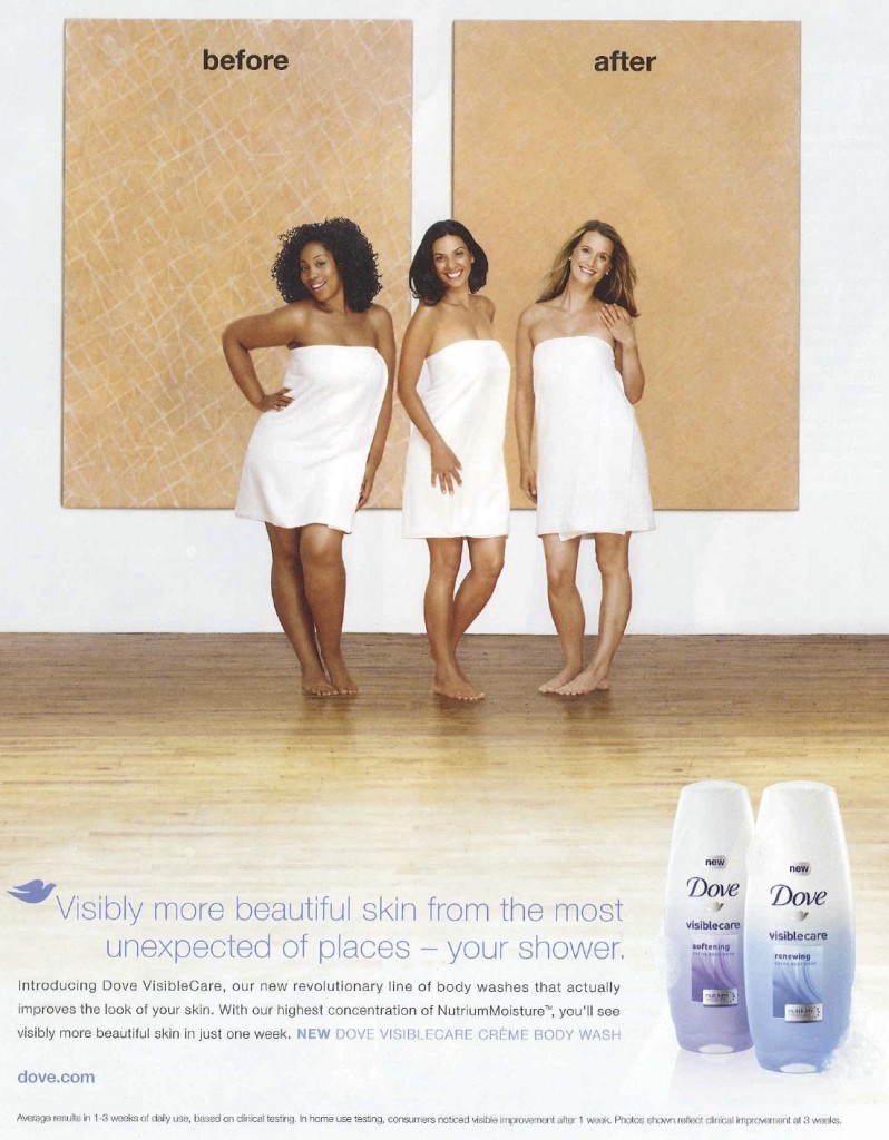
Amy H. sent in a Dove ad from O magazine. The ad clearly means to say that women get “visibly more beautiful skin” because their body wash moisturizes dry skin. However, the placement of the women in front of the “before” and “after” text may unfortunately, based on a quick glance, inadvertently convey a different message:

I continue to be puzzled that multinational corporations with resources for large-scale marketing campaigns so often stumble in awkward ways when trying to include a range of racial/ethnic groups in their materials. This seems to occur by not sufficiently taking into account existing or historical cultural representations that may provide a background for the interpretation of images or phrases in the advertising. In this case, the arrangement of the models combined with the text above and below them unfortunately intersects with a cultural history in which White skin was seen as inherently “more beautiful” than non-White skin (not to mention thinner bodies as more beautiful than larger ones).

It would be possible to make this same ad, using these same models and basic idea, in a way that avoided any potential misinterpretation — all it would take, I think, would be to take the before-and-after pics and make them small off-set images on the side, so “before” and “after” couldn’t be read as referring to the women’s bodies. Given that advertising materials are often highly scrutinized, Photoshopped, market tested, and focus grouped, I can’t quite figure out how potentially problematic racial/ethnic connotations aren’t caught before such ads are released.

UPDATE: In my analysis, I gave Dove the benefit of the doubt in assuming this was a non-intentional aspect of the ad, largely because even in the “best case scenario” where this is entirely unintended, it is problematic. However, several readers suggest that we shouldn’t too quickly assume that instances such as these are accidental.

Gwen Sharp is an associate professor of sociology at Nevada State College. You can follow her on Twitter at @gwensharpnv.

Cross-posted at Jezebel.

There was a time when the idea of sticking needles into one’s face was something that was to be avoided at all costs.  Then there was botox.  And it didn’t take long before certain segments of society were flocking to the needlers, begging to be stuck.  Face needling has become so commonplace — so desirable, even — that non-needly products have been disguising themselves as needles, so as to attract consumer dollars.

Of what am I speaking?  A product sent in by Ella Dilkes-Frayne.  Ella saw posters in a mall in Melbourne, Australia for non-injectable beauty products sold in containers that mimicked syringes.   The product, hoping to capitalize on the new acceptance of and desire for botox, is a great example of how socially and personally acceptable bodily intervention is always changing.

Lisa Wade, PhD is an Associate Professor at Tulane University. She is the author of American Hookup, a book about college sexual culture; a textbook about gender; and a forthcoming introductory text: Terrible Magnificent Sociology. You can follow her on Twitter and Instagram.

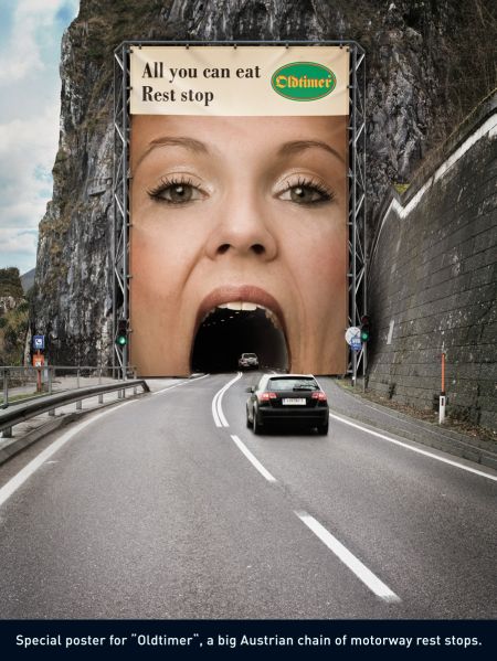
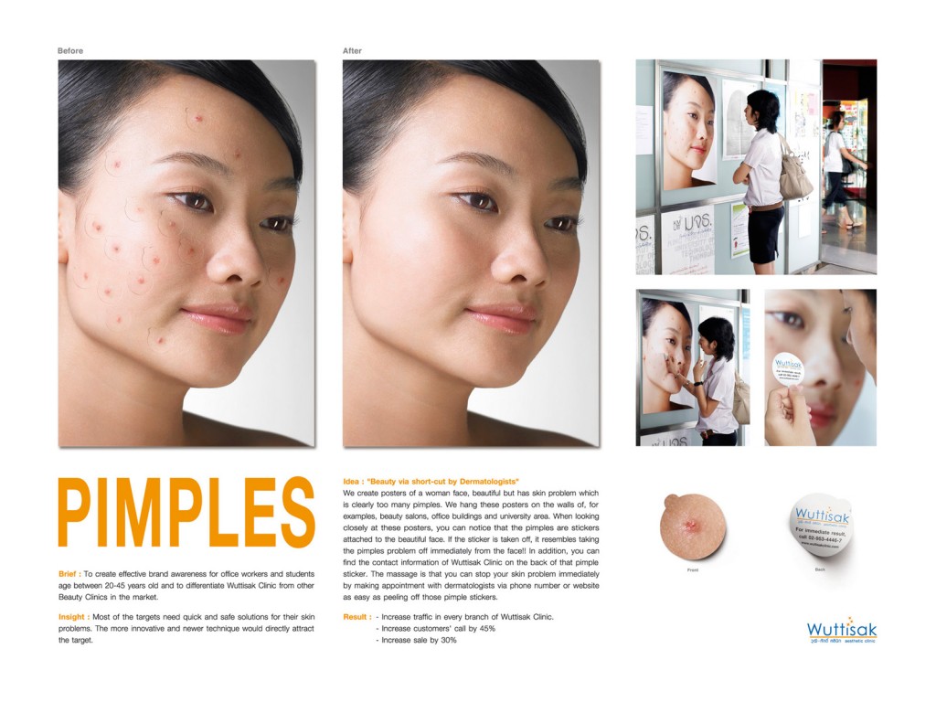
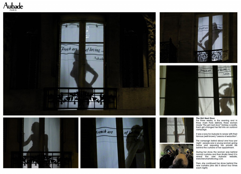
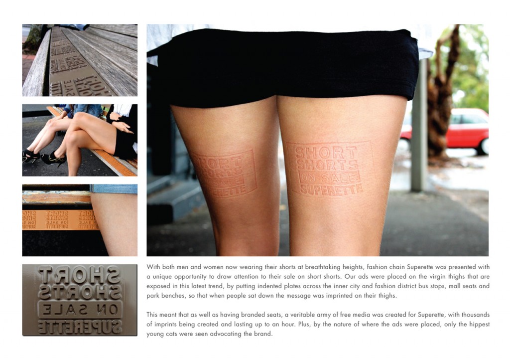
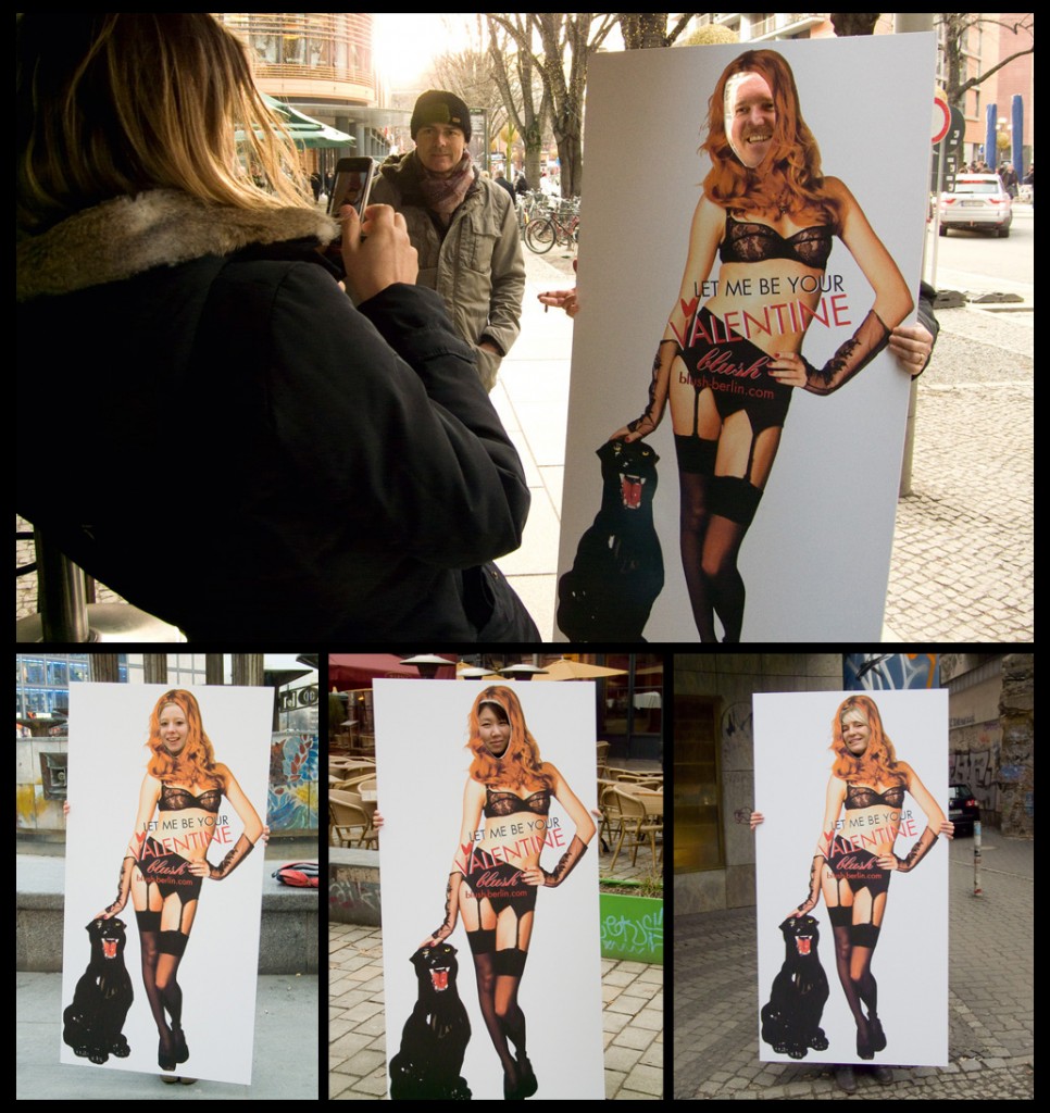
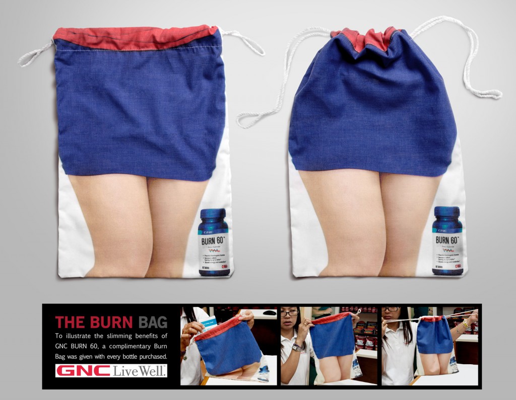
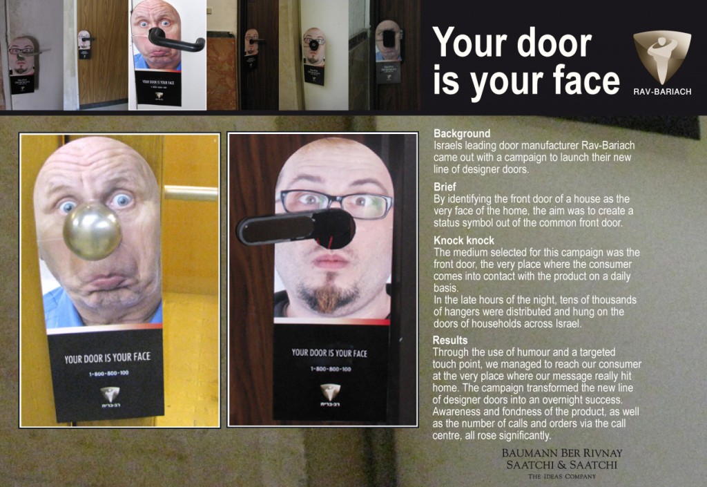
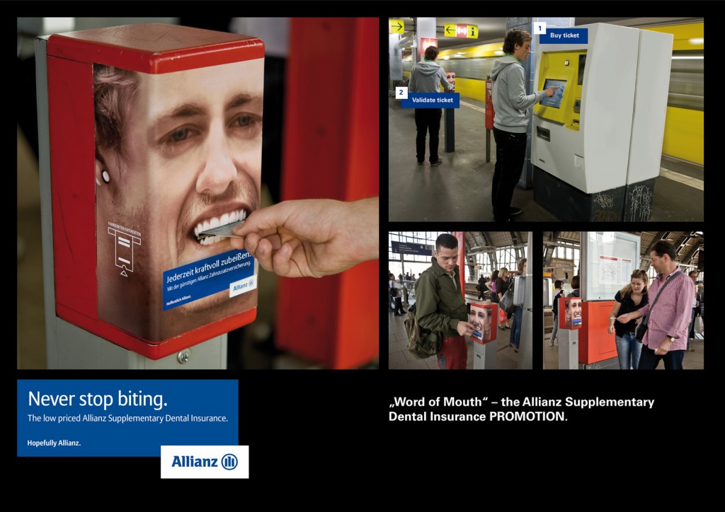
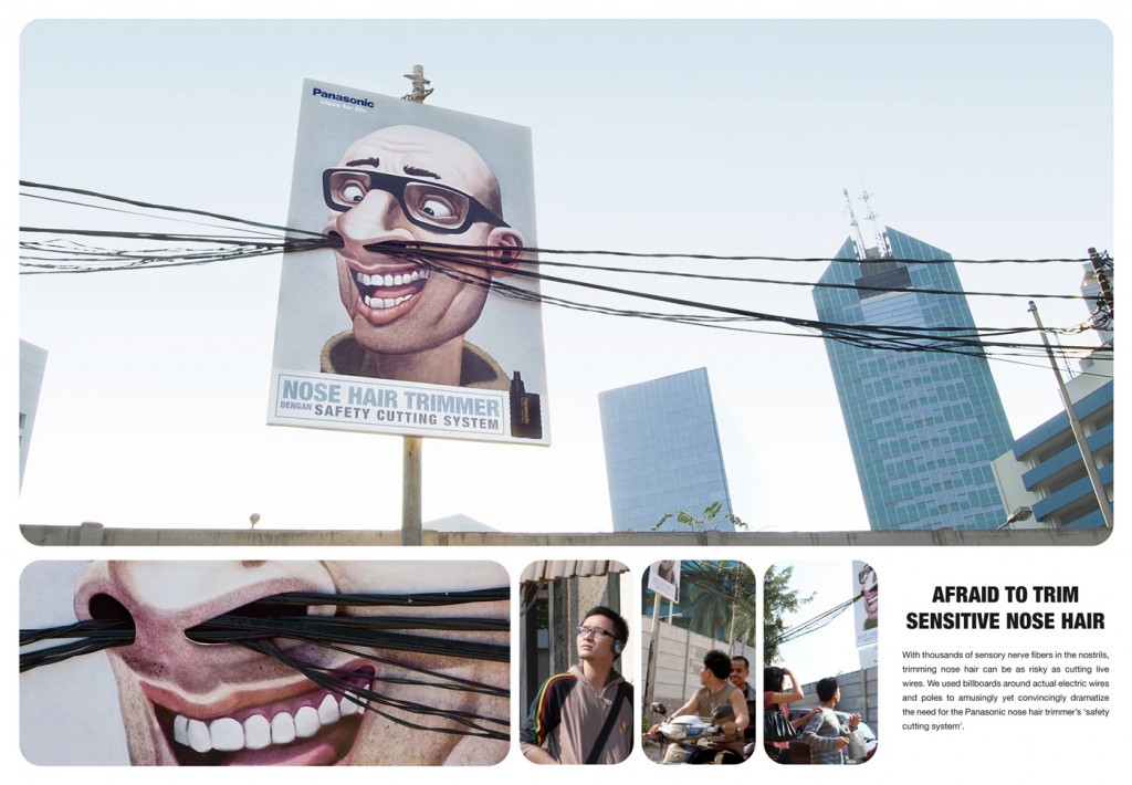
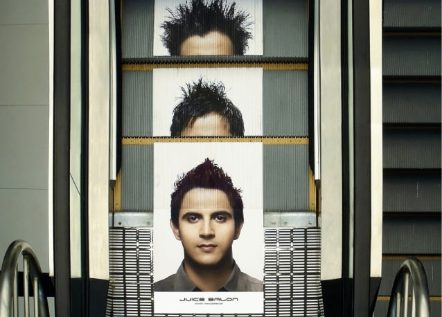
One form of advertising I am excited and interested in “reading” is the emerging practice of ambient advertising.  Where traditional outdoor advertising may be placed on a billboard with a particular message and/or images, ambient advertising may have that same message and/or images but it seeks to have interaction with its environment or given location.

Given ambient advertising’s special characteristics, it provides a great opportunity to “read” what is said on those advertisements culturally when the male and female body is the focal point of the ad.  Consistent with non-ambient advertising, we tend to see representations that ‘naturally’ give the male body strength and power and one which gives the female body as much strength and power as only in relation to how much the male body allows.

When looking at this dynamic realized in ambient advertising we see the female body as one that is to be gazed upon and scrutinized. Furthermore, the female body is not only just scrutinized and gazed upon in these advertisements but also provides its spectators (male or female) authority over that female body; that authority is usually sexually charged. The following are some examples:

This is not to say that the male body is also not put on display in ambient advertisements. However, those bodies are generally treated with sexual ambiguity and where they are displayed sexually the themes are generally different than where they are when a female body is displayed. The following are some examples:

Understanding that advertising, as an institution, has a function of reflecting our societal norms and considering the body as cultural text (a la Susan Bordo) what we can then “read” in ambient advertising is that culturally the male body has a certain power that the female body does not. This then materializes into a reality where the female body is seen as compliant which continues to enforce an environment where a woman’s body is not hers.

—————————–-

Steve Grimes has his Master of Arts degree in sociology from St. John’s University in New York, is currently seeking a Master of Science degree in media studies from CUNY Brooklyn College, and plans to be enrolled in a Ph.D. program within the next two years.  He is, at the moment, engrossed in all things cultural studies and his blog, TimelyDonut, is an avenue to express that.

If you would like to write a post for Sociological Images, please see our Guidelines for Guest Bloggers.

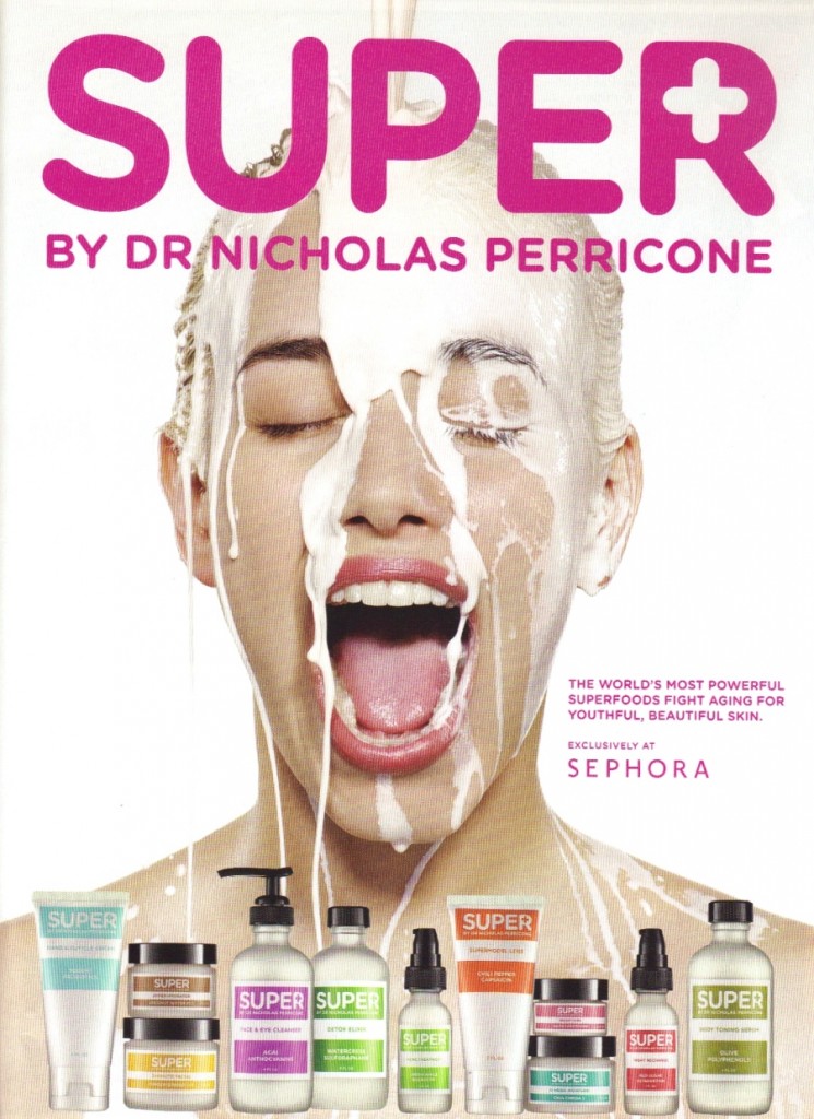
Authors are increasingly arguing that mainstream culture has been “pornified” (see, for example, the books Pornified and The Porning of America).  In other words, what used to be considered pornographic is now disseminated widely as simply advertising or entertainment and both verbal and visual references to pornography in popular culture are increasingly common.   In this vein, we have a collection of posts featuring ejaculation imagery (visual references to the “cum shot”), and I thought an ad recently submitted by one of my students, Breiana Caldwell, as well as readers Scatx and Xander, was a good opportunity to remind readers of this pervasive trope:

(source)

Lisa Wade, PhD is an Associate Professor at Tulane University. She is the author of American Hookup, a book about college sexual culture; a textbook about gender; and a forthcoming introductory text: Terrible Magnificent Sociology. You can follow her on Twitter and Instagram.
Lindsey V., who recently sent in the excellent film clip in which “scientists” “tested” gendered battle gear, also sent us a link to images showing that the breast size of two video game characters — “Ivy” from “Soul Caliber” and, to a lesser extent, Lara Croft from “Tomb Raider” — have increased over time (source).

Ivy:

Lara Croft:

What might drive their ever-inflating breasts?

Speaking in terms of advertising, Sut Jhally wrote that advertisers must:

…now worry about clutter and noise. That is, how do you make your ads stand out from the [5,000] commercial impressions that people are exposed to [every day].  So if you’re Pepsi, you’re not just competing with Coke anymore. You’re competing with every other advertiser who wants our attention. As advertising takes over more and more space in the culture, the job of the individual advertiser gets harder and harder.

Martin Barron and Michael Kimmel make a similar argument about the rise of “extreme” and violent sexual acts in pornography.  The increase in the sheer amount of porn that emerged with the Internet has created a competitive market in which “sexual victimization of women is a currency” (p. 350).  You have to get noticed somehow.

So, insofar as this boob inflation is a trend, we may be able to explain it, at least in part, with the greater number of cultural products.  Proliferation creates conditions in which each one has to up the ante to “stand out” against the “clutter and noise.”

Sources:

  • Barron, M., & Kimmel, M.S. (2010).  Sexual violence in three pornographic media. Journal of Sex Research, 37, 161-169.
  • Jhally, S. (2000). Advertising at the edge of the apocalypse. In Anderson, R., & Strate, L., Eds. Critical studies in media commercialism. New York: Oxford University Press, 27-39.

Thanks also to Caroline Heldman; I borrowed some of the text in this post from a forthcoming co-authored essay.

Lisa Wade, PhD is an Associate Professor at Tulane University. She is the author of American Hookup, a book about college sexual culture; a textbook about gender; and a forthcoming introductory text: Terrible Magnificent Sociology. You can follow her on Twitter and Instagram.

Disneyland markets itself as “The Happiest Place on Earth” and goes to great pains to create a visual experience that defies our everyday realities, but these photos by Arin Fishkin, of bored kids waiting in line, contrasts starkly with Disney’s claims.   I’ve always thought it was really interesting how companies that sell “fun” (theme parks, obviously, but also places like casinos and dance clubs) do so by downright insisting “this is what fun looks like!”   “There are flashing lights! Fun! There are bright colors! Fun! There is happy music! Fun! This is what fun looks like and you are having it!!!”  Anyway, just because Disneyland says it’s fun, doesn’t mean it is.

Via BoingBoing.

Lisa Wade, PhD is an Associate Professor at Tulane University. She is the author of American Hookup, a book about college sexual culture; a textbook about gender; and a forthcoming introductory text: Terrible Magnificent Sociology. You can follow her on Twitter and Instagram.
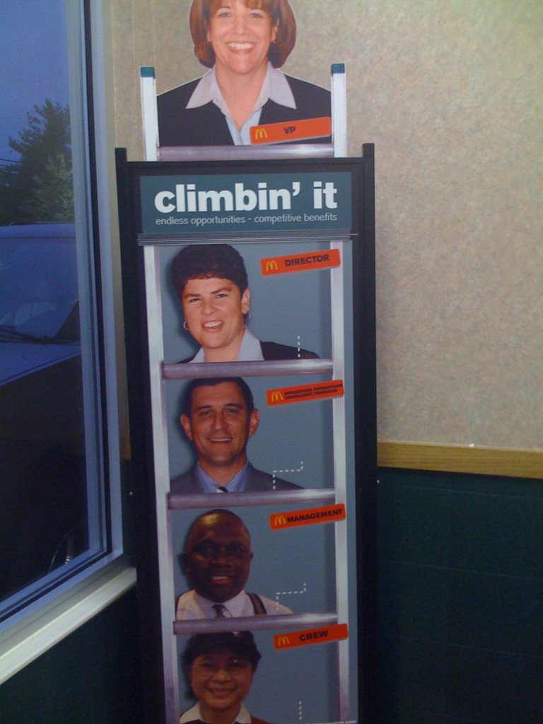
You know how sometimes you see something and you just cringe and wonder how, how, something made it into the public sphere? Paul Fidalgo, of Near Earth Object, took a photo of this display illustrating the career ladder at McDonald’s. The display provides a rather unintended commentary on race and corporate hierarchies in general:

I suppose I should be happy, as the sky appears to be the limit for White women like me on the Ladder of Whiteness.

I was doing some googling, looking for data on the racial diversity of McDonald’s employees, since the company has touted itself as a leader in providing career opportunities to women and underrepresented minorities. I’m always surprised how corporations that carefully guard their brand in other ways, and talk about diversity issues, often seem to drop the ball when it comes to thinking about the cultural politics of representations of race and ethnicity in their materials.

[UPDATE: A number of commenters argue that McDonald’s has a better record on promoting women and minorities than most corporations. I’m not trying to argue there that they don’t — I was trying to find some data on their employees because I’ve also heard they stand out, as far as corporate America goes. That’s why I found the display surprising, as opposed to perhaps predictable.]

So anyway, my online search led me to 365Black, the website McDonald’s set up to appeal to African Americans:

Ok…uh, sure. Just exactly like the baobab tree.

I’d seen 365Black before — readers have sent it in, and we just couldn’t think of much to say so we’ve never posted about it. But then my googling took me to MeEncanta, the McDonald’s page for the Latino community. They offer this sticker (i.e., instruct you to download the image and print it on sticky-backed paper) to show off your Latin pride:

Alrighty…

And finally I arrived at Myinspirasian, which targets Asian Americans. On the page about Asian Pacific American Heritage Month they include information about contributions by Asian Pacific Americans, such as this:

Multimedia creations inspired by Asian Pacific Americans are the latest rage among kids, teens and young adults of all ages. The multimedia creations offer a variety of the trendiest ways to receive news, information, entertainment and services using the worldwide web.

No specifics are given, so you’ll have to figure out what these mysterious “multimedia creations” are. Also, “they have become household names in a host of sporting activities,” though apparently not the type of household names where McDonald’s could actually name one. The entire section is similarly vapid, completely lacking in anything other than non-specific statements that Asian Pacific Americans have, like, done stuff, and things. It reminded me of some of the very superficial celebrations of Black History Month we’ve seen.

But if you want, you can take the Asian Phrases Challenge, where you can hear various phrases spoken in either Mandarin or Cantonese, Filipino/Taglish, Indian/Hinglish, or Korean:

I’m not sure what the “challenge” aspect is, since it doesn’t do anything but play the phrases.

I just…I don’t know. You decide to make webpages entirely devoted to a particular demographic and this is the best you can do? And do these types of marketing projects actually work?

———————–

For more, see our previous post showing how people of color are subordinated visually in advertising materials.