LeBron James got his turn as King Kong on a magazine cover. Now (an illustration of) David Stern, Commissioner of the NBA, strikes the pose on Sports Northwest Magazine.
gender: masculinity
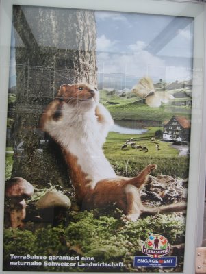
Andrea G. in Switzerland snapped these pictures of an ad campaign for TerraSuisse natural agriculture. Their tagline translates as “TerraSuisse guarantees natural Swiss agriculture.” They might be useful for a discussion of doing gender (West and colleagues) or gender as performativity (Butler). As Andrea S. noted, it’s obvious instantly that the bird is supposed to be female and the chipmunk male by their pose alone.
Posed like a chick:
Posed like a dude:
They might, also, be a nice contrast to this one for which a gender is not immediately apparent (to me…but who knows in Switzerland):

Thanks Andrea!
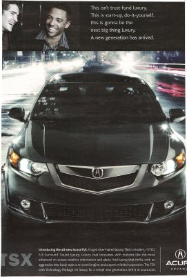
I found this ad in Rolling Stone and thought it was an interesting take on class. The text at the top says:
This isn’t trust-fund luxury. This is start-up, do-it-yourself, this is gonna be the next big thing luxury. A new generation has arrived.
At the bottom it says:
Introducing the all-new Acura TSX. Forget silver-haired luxury. This is modern, i-VTEC, ELS Surround Sound luxury. Luxury that innovates, with features like the most advanced on-screen weather information and alerts. And luxury that thrills, with an aggressive new body style, a re-tuned engine, and a sport-minded suspension. The TSX with Technology Package. It’s luxury for a whole new generation. See it at acura.com.
So they’re playing on the idea of the self-made man–he creates the “next big thing,” he “innovates.” And he’s young and “modern.” And “aggressive.” All in contrast to those who inherit wealth, who are “silver-haired” and, presumably, not aggressive or brave enough for this car. This could be useful for a discussion of social class, in particular the old-money/new-money divide, as well as different ideas of masculinity.
.
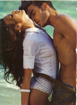
Here’s an Axe ad, sent in by Krystal-Lynn M., the idea being that if you use Axe, women will perform oral sex on you in the bathtub:
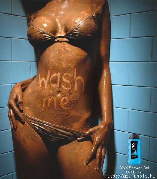
NEW: p.j. sent us this ad for Lynx, another name that Axe is marketed under in some countries:
NEW! (Mar. ’10): Katrin sent in this video about the LynxJet marketing campaign, which plays on the idea of the sexy airline stewardess who is sexually available and eager to please her male partner:
[youtube]https://www.youtube.com/watch?v=8QjcUf5pG3k[/youtube]
Gwen Sharp is an associate professor of sociology at Nevada State College. You can follow her on Twitter at @gwensharpnv.
This ad for Star Wars on Spike TV suggests that Darth Vader turned evil because he was called a girl’s name as a kid. After all, what could be more insulting than that? (His name, before he was Darth Vader, was Anakin Skywalker.)
Thanks Craig S.! Craig saw the ad in the New York City subway.
Also in men must avoid femininity at all costs: eat like a man, I have to act so masculine, denigration with feminity, and my wife makes more money (the shame).
.
Miguel in Barcelona sent us this government-sponsored poster aimed at promoting egalitarian relationships. He translates the text as:
The love has to be free
Free of machismo
Free of fights
Free of jealousy

This image, as a representation of idealized egalitarian love, is a nice contrast to the representations of love common in the U.S. (and in Spain?) that make power asymmetry sexy, desirable, and constitutive of love. Consider the love affair between this apple and pear and these two images (which look more like the fruit than Miguel’s image above):
Thanks to Miguel for sending us our first image from Spain!>
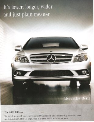
The last line says, “Then we engineered in a mean streak a mile wide.” Can you imagine such a marketing campaign for a Honda Civic or a VW Passat? This is a man’s car–it takes up more space, and it’s mean–characteristics we allow (some) men, but not women, to have.
Note: I like the commenters’ points that this intersects with class more (as well?)–see the comments. They did a better job with the analysis on this one than me.
NEW:
This ad (found here) plays up the fact that some cars are designed to look “mean,” so the Jaguar is actually afraid of the BMW:
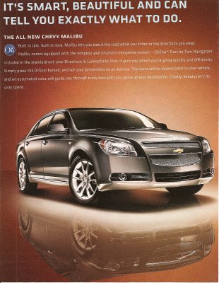
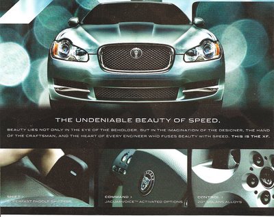
Compare the ads above to these two that link a car and beauty. The first one seems to be portraying the car as a beautiful but bossy woman (“…can tell you exactly what to do”):
It’s an interesting contrast–these three cars all look very similar, and yet one is mean/masculine and the other two are beautiful/feminine. I like to show comparisons like these in class to make it clear to students that advertisers have many different motifs and meanings to draw from when creating marketing strategies, and that the ones they pick are just that–CHOICES among many, many different ways you could advertise a product, none of which are necessarily more “obvious” or “natural” than others.
Here is an image for the website from Just for Men’s Touch of Gray line:

This product covers most, but not all, of a man’s gray hair. From the website:
Why use Touch of Gray? A little gray to show your experience, but not so much
that it hides your vitality.
There are a range of shades available and you can control how much gray is hidden.
The website has a total of four images of men with women. As Vanessa V., who sent this one in, pointed out, none of the women have a “touch of gray.” Nor could she imagine a product like this marketed to women.
Here is another example of an ad that gives men permission to age in a way women never are.
Other men’s hair dye posts: here, here, and here.
Thanks, Vanessa!
NEW: Corey O. found a Just for Men commercial that references Woodstock (sadly, I can’t find a video of it). Corey says,
It has everything you could want in an advertisement: classic rock soundtrack, co-opted counterculture, mixed messages about aging, demonstrations of male virility, minorities on the margins, gender disparity, and attempts to sell a “natural” look. The total package. What really got to me, though, was the gender aspect. Can you imagine a line of hair dye marketed toward women which is meant to leave some grey intact? I don’t think that Just for Men can either — in contrast to the silver-streaked men, none of the women in the ad are sporting a natural look and some look like they’ve had rather recent visits from the botox fairy. This ad is a nice way of illustrating the double-standard that women face in regards to aging: while men can benefit from grey hair as an illustration of their maturity without sacrificing their virility, women must always strive to look as young as possible. Because this is an ad for men’s hair dye, however, it also illustrates that while men may benefit from less scrutiny of their appearance than women, their appearance is also satisfactory only with the use of beauty aids.
I also like the appropriation of Woodstock and the counter-culture movement of the ’60s.
Thanks, Corey!
Gwen Sharp is an associate professor of sociology at Nevada State College. You can follow her on Twitter at @gwensharpnv.
Andrea G. in Switzerland snapped these pictures of an ad campaign for TerraSuisse natural agriculture. Their tagline translates as “TerraSuisse guarantees natural Swiss agriculture.” They might be useful for a discussion of doing gender (West and colleagues) or gender as performativity (Butler). As Andrea S. noted, it’s obvious instantly that the bird is supposed to be female and the chipmunk male by their pose alone.
Posed like a chick:
Posed like a dude:
They might, also, be a nice contrast to this one for which a gender is not immediately apparent (to me…but who knows in Switzerland):

Thanks Andrea!
I found this ad in Rolling Stone and thought it was an interesting take on class. The text at the top says:
This isn’t trust-fund luxury. This is start-up, do-it-yourself, this is gonna be the next big thing luxury. A new generation has arrived.
At the bottom it says:
Introducing the all-new Acura TSX. Forget silver-haired luxury. This is modern, i-VTEC, ELS Surround Sound luxury. Luxury that innovates, with features like the most advanced on-screen weather information and alerts. And luxury that thrills, with an aggressive new body style, a re-tuned engine, and a sport-minded suspension. The TSX with Technology Package. It’s luxury for a whole new generation. See it at acura.com.
So they’re playing on the idea of the self-made man–he creates the “next big thing,” he “innovates.” And he’s young and “modern.” And “aggressive.” All in contrast to those who inherit wealth, who are “silver-haired” and, presumably, not aggressive or brave enough for this car. This could be useful for a discussion of social class, in particular the old-money/new-money divide, as well as different ideas of masculinity.
.
Here’s an Axe ad, sent in by Krystal-Lynn M., the idea being that if you use Axe, women will perform oral sex on you in the bathtub:
NEW: p.j. sent us this ad for Lynx, another name that Axe is marketed under in some countries:
NEW! (Mar. ’10): Katrin sent in this video about the LynxJet marketing campaign, which plays on the idea of the sexy airline stewardess who is sexually available and eager to please her male partner:
[youtube]https://www.youtube.com/watch?v=8QjcUf5pG3k[/youtube]
Gwen Sharp is an associate professor of sociology at Nevada State College. You can follow her on Twitter at @gwensharpnv.
This ad for Star Wars on Spike TV suggests that Darth Vader turned evil because he was called a girl’s name as a kid. After all, what could be more insulting than that? (His name, before he was Darth Vader, was Anakin Skywalker.)
Thanks Craig S.! Craig saw the ad in the New York City subway.
Also in men must avoid femininity at all costs: eat like a man, I have to act so masculine, denigration with feminity, and my wife makes more money (the shame).
.
Miguel in Barcelona sent us this government-sponsored poster aimed at promoting egalitarian relationships. He translates the text as:
The love has to be free
Free of machismo
Free of fights
Free of jealousy

This image, as a representation of idealized egalitarian love, is a nice contrast to the representations of love common in the U.S. (and in Spain?) that make power asymmetry sexy, desirable, and constitutive of love. Consider the love affair between this apple and pear and these two images (which look more like the fruit than Miguel’s image above):
Thanks to Miguel for sending us our first image from Spain!>

The last line says, “Then we engineered in a mean streak a mile wide.” Can you imagine such a marketing campaign for a Honda Civic or a VW Passat? This is a man’s car–it takes up more space, and it’s mean–characteristics we allow (some) men, but not women, to have.
Note: I like the commenters’ points that this intersects with class more (as well?)–see the comments. They did a better job with the analysis on this one than me.
NEW:
This ad (found here) plays up the fact that some cars are designed to look “mean,” so the Jaguar is actually afraid of the BMW:
Compare the ads above to these two that link a car and beauty. The first one seems to be portraying the car as a beautiful but bossy woman (“…can tell you exactly what to do”):
It’s an interesting contrast–these three cars all look very similar, and yet one is mean/masculine and the other two are beautiful/feminine. I like to show comparisons like these in class to make it clear to students that advertisers have many different motifs and meanings to draw from when creating marketing strategies, and that the ones they pick are just that–CHOICES among many, many different ways you could advertise a product, none of which are necessarily more “obvious” or “natural” than others.
Here is an image for the website from Just for Men’s Touch of Gray line:

This product covers most, but not all, of a man’s gray hair. From the website:
Why use Touch of Gray? A little gray to show your experience, but not so much
that it hides your vitality.
There are a range of shades available and you can control how much gray is hidden.
The website has a total of four images of men with women. As Vanessa V., who sent this one in, pointed out, none of the women have a “touch of gray.” Nor could she imagine a product like this marketed to women.
Here is another example of an ad that gives men permission to age in a way women never are.
Other men’s hair dye posts: here, here, and here.
Thanks, Vanessa!
NEW: Corey O. found a Just for Men commercial that references Woodstock (sadly, I can’t find a video of it). Corey says,
It has everything you could want in an advertisement: classic rock soundtrack, co-opted counterculture, mixed messages about aging, demonstrations of male virility, minorities on the margins, gender disparity, and attempts to sell a “natural” look. The total package. What really got to me, though, was the gender aspect. Can you imagine a line of hair dye marketed toward women which is meant to leave some grey intact? I don’t think that Just for Men can either — in contrast to the silver-streaked men, none of the women in the ad are sporting a natural look and some look like they’ve had rather recent visits from the botox fairy. This ad is a nice way of illustrating the double-standard that women face in regards to aging: while men can benefit from grey hair as an illustration of their maturity without sacrificing their virility, women must always strive to look as young as possible. Because this is an ad for men’s hair dye, however, it also illustrates that while men may benefit from less scrutiny of their appearance than women, their appearance is also satisfactory only with the use of beauty aids.
I also like the appropriation of Woodstock and the counter-culture movement of the ’60s.
Thanks, Corey!
Gwen Sharp is an associate professor of sociology at Nevada State College. You can follow her on Twitter at @gwensharpnv.


