gender: bodies

One criticism of my post on gender dimorphism in Disney movies was that good animation inevitably exaggerates sex differences. There are a lot of these comments here on SocImages and at Slate. Here’s one example:

Cartoons aren’t meant to accurately portray people, EVER. They are meant to exaggerate features, so that they are more prominent and eye catching. So feminine features are made more feminine, and masculine features are made more masculine. … The less realistic the proportions, the more endearing and charming we find the character. The closer to realistic they are, the creepier/blander they can become.

Flipping through IMDB’s list of the top 500 animated movies reveals that Disney is certainly not alone in emphasizing the larger size of males. But there are a few successful counterexamples as well.

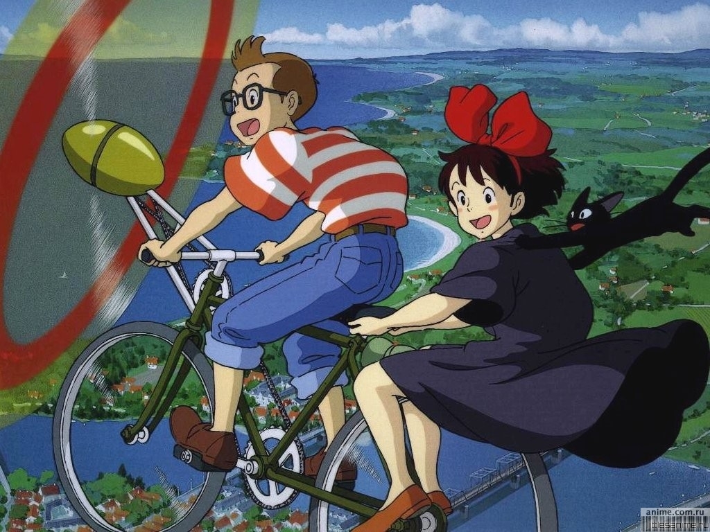
Here are some good ones where the male and female characters are similarly proportioned. Note these are not just random male and female characters but couples (more or less).

From Kiki’s Delivery Service by Hayao Miyazaki:

1

From Dreams of Jinsha:

2

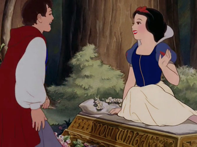
Even some old Disney movies have romantic moments between physically-similar males and females. The original Snow White (from the 1937 movie) was paired with a Prince Charming whose wrists were barely bigger than hers:

3

Disney non-human animal pairs were sometimes quite physically matched. Consider Bambi and Faline (Bambi, 1942):

4

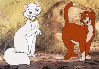
Or Dutchess and O’Malley from Aristocats (1970) in which their exaggerated femininity and masculinity are not conveyed through extreme body-size difference:

5

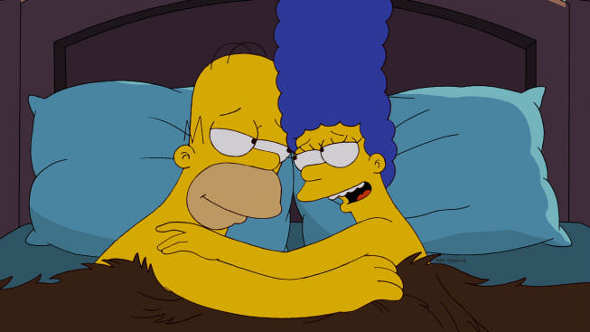
In other realms of animation, Marge and Homer Simpson, the most durable couple in animation history, have very similar features: heads, eyes, noses, ears. His arms are fatter and neither of them really have wrists, but I’d put this in the category of normal sex difference:

6

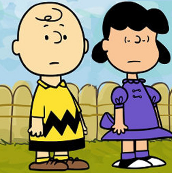
Of course, Lucy and Charlie Brown were virtually identical if you think about it:

7

I’m open to other suggestions.

Cross-posted at Family Inequality and Pacific Standard.

Philip N. Cohen is a professor of sociology at the University of Maryland, College Park, and writes the blog Family Inequality. You can follow him on Twitter or Facebook.

We’re celebrating the end of the year with our most popular posts from 2013, plus a few of our favorites tossed in.  Enjoy!

Last year Lynne Grumet set the internet a-flutter when she appeared on the cover of TIME magazine breastfeeding her toddler. Reactions were largely negative, often reflecting unease at the open display of a sexualized body part being used to feed a child older than the age we generally find acceptable. Others objected to what they saw as the sensationalism of the photo. Grumet later posed on the cover of another magazine in a pose that focused on bonding and intimacy, commonly cited as benefits by breastfeeding advocates. The entire episode tapped into larger cultural anxieties about appropriate mothering.

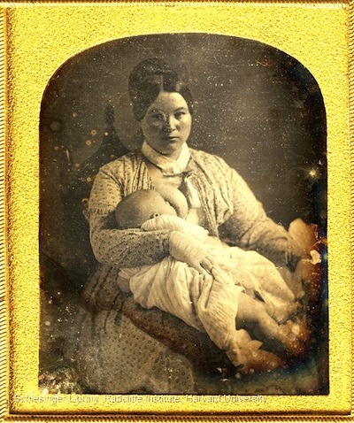
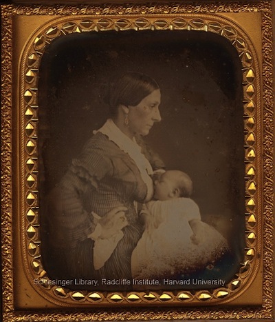
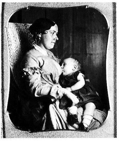
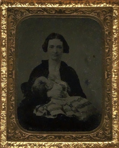
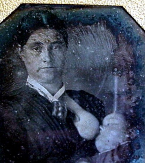
And as Jill Lepore explains in The Mansion of Happiness, it’s just the latest round in the changing discourse about breastfeeding; in the mid-1800s, images of breastfeeding mothers became a fad in the U.S. The use of wet nurses had never been as common in the U.S. as in Europe, and it became even less popular by the early 1800s; breastfeeding your own child became a central measure of your worth as a mother.  Cultural constructions of femininity became highly centered on motherhood and the special bond between a mother and her children in the Victorian era.

As daguerreotypes became available, women began to pose breastfeeding their infants, capturing them in this most essential of maternal roles:

daguerreotype5

daguerreotype6

daguerreotype2

M24278-1 001

2051237_1_l

Cosetra has created a Pinterest board of vintage photos and paintings of breastfeeding that has more examples.

Within decades, American women suddenly seemed to lose the ability to adequately feed their babies, just as infant formula hit the market. Doctors continued to push breastfeeding, but cultural perceptions changed, and with them the social construction of femininity. Rather than being a symbol of maternalism, breastfeeding seemed incompatible with femininity — or, specifically, with white upper-class femininity. Breastfeeding didn’t mesh well with ideas of delicate, refined white women; it was too animal-like, too uncivilized. As Lepore relates, by the early 1900s, a study in Boston found that 9 out of 10 poor mothers breastfed, but only 17% of wealthy mothers did.

By the 1950s, only 20% of mothers nursed their children. Then, ideas about motherhood changed once again; suddenly comparatively privileged, white women were drawn to movements that advocated breastfeeding. Formula came under increased scrutiny. And so continued the ongoing cultural debate over breastfeeding, motherhood, and proper femininity.

Cross-posted at The Huffington Post.  Sources: Schlesinger Library, Radcliffe Institute, Harvard University (direct link to daguerreotypes here); Marvelous Kiddoliveauctioneers.

Gwen Sharp is an associate professor of sociology at Nevada State College. You can follow her on Twitter at @gwensharpnv.

We’re celebrating the end of the year with our most popular posts from 2013, plus a few of our favorites tossed in.  Enjoy!

The philosopher Susan Sontag has written achingly about the way in which men are allowed to age and women are not.

The great advantage men have is that our culture allows two standards of male beauty: the boy and the man. The beauty of a boy resembles the beauty of a girl. In both sexes it is a fragile kind of beauty and flourishes naturally only in the early part of the life-cycle. Happily, men are able to accept themselves under another standard of good looks — heavier, rougher, more thickly built…

There is no equivalent of this second standard for women. The single standard of beauty for women dictates that they must go on having clear skin. Every wrinkle, every line, every gray hair, is a defeat.

Perhaps nowhere is this more plain than in the movies, where men’s love interests stay the same age as they get older, and @sphericalfruit sent in a fantastic example.  The four posters below are part of a new marketing plan for the forthcoming movie, The Counselor.

Notice anything?

Screenshot_1 Screenshot_2

What a stunning example of Sontag’s observation.  The men are not considered unattractive by virtue of the fact that you can tell they have skin.  The women, in contrast, have faces that are so smooth that they look inhuman; their images are halfway between photograph and cartoon.  Amazingly, this treatment of images of men and women is so ubiquitous that it now looks more or less normal to us.

Cross-posted at Business Insider and VitaminW.

Lisa Wade, PhD is an Associate Professor at Tulane University. She is the author of American Hookup, a book about college sexual culture; a textbook about gender; and a forthcoming introductory text: Terrible Magnificent Sociology. You can follow her on Twitter and Instagram.

We’re celebrating the end of the year with our most popular posts from 2013, plus a few of our favorites tossed in.  Enjoy!

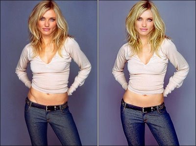
A former editor at Cosmopolitan, Leah Hardy, recently wrote an exposé about the practice of photoshopping models to hide the health and aesthetic costs of extreme thinness. Below is an example featuring Cameron Diaz:


The story about Diaz, in The Telegraph, includes the following description of the image’s manipulation:

  • Face: Cheeks appear filled out
  • Bust: Levelled
  • Thighs: Wider in the picture on the right
  • Hip: The bony definition has been smoothed away
  • Stomach: A fuller, more natural look
  • Arms: A bit more bulk in the arms and shoulders

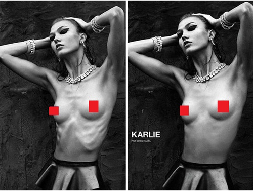
Another example was posted at The Daily What. Notice that her prominent ribcage has been photoshopped out of the photograph on the right, which ran in the October 2012 issue of  Numéro.

Hardy, the editor at Cosmo, explains that she frequently re-touched models who were “frighteningly thin.”  Others have reported similar practices:

Jane Druker, the editor of Healthy magazine — which is sold in health food stores — admitted retouching a cover girl who pitched up at a shoot looking “really thin and unwell”…

The editor of the top-selling health and fitness magazine in the U.S., Self, has admitted: “We retouch to make the models look bigger and healthier”…

And the editor of British Vogue, Alexandra Shulman, has quietly confessed to being appalled by some of the models on shoots for her own magazine, saying: “I have found myself saying to the photographers, ‘Can you not make them look too thin?'”

Robin Derrick, creative director of Vogue, has admitted: “I spent the first ten years of my career making girls look thinner — and the last ten making them look larger.”

Hardy described her position as a “dilemma” between offering healthy images and reproducing the mythology that extreme thinness is healthy:

At the time, when we pored over the raw images, creating the appearance of smooth flesh over protruding ribs, softening the look of collarbones that stuck out like coat hangers, adding curves to flat bottoms and cleavage to pigeon chests, we felt we were doing the right thing… We knew our readers would be repelled by these grotesquely skinny women, and we also felt they were bad role models and it would be irresponsible to show them as they really were.

But now, I wonder. Because for all our retouching, it was still clear to the reader that these women were very, very thin. But, hey, they still looked great!

They had 22-inch waists (those were never made bigger), but they also had breasts and great skin. They had teeny tiny ankles and thin thighs, but they still had luscious hair and full cheeks.

Thanks to retouching, our readers… never saw the horrible, hungry downside of skinny. That these underweight girls didn’t look glamorous in the flesh. Their skeletal bodies, dull, thinning hair, spots and dark circles under their eyes were magicked away by technology, leaving only the allure of coltish limbs and Bambi eyes.

Insightfully, Hardy describes this as a “vision of perfection that simply didn’t exist” and concludes, “[n]o wonder women yearn to be super-thin when they never see how ugly [super-]thin can be.”

UPDATE:  A comment has brought up the point that it’s bad to police people’s bodies, no matter whether they’re thin or fat.  And this is an important point (made well here) and, while I agree that some of the language is harsh, that’s not what’s going on here.  The vast majority of the models who need reverse photoshopping aren’t women who just happen to have that body type.  They are part of an social institution that demands extreme thinness and they’re working hard on their bodies to be able to deliver it.  This isn’t, then, about shaming naturally thin women, it’s about (1) calling out an industry that requires women to be unhealthy and then hides the harmful consequences and (2) acknowledging that even people who are a part of that industry don’t necessarily have the power to change it.

Cross-posted at Business Insider and The Huffington Post in Spanish, French, and German.

Lisa Wade, PhD is an Associate Professor at Tulane University. She is the author of American Hookup, a book about college sexual culture; a textbook about gender; and a forthcoming introductory text: Terrible Magnificent Sociology. You can follow her on Twitter and Instagram.

We’re celebrating the end of the year with our most popular posts from 2013, plus a few of our favorites tossed in.  Enjoy!

Over at his blog, The Ethical Adman, Tom Megginson asks us to consider the “power symbolism of fellatio.”  His post was prompted by this sign for an Android store (next door to an Apple store) in China:

Get it? Apple is fellating Android, so Apple is inferior. <sarcasm> Obvious right? </sarcasm>

The variations on the insult “you suck” — “suck it,” “suck my balls,” “suck my dick,” “cocksucker,” and Tom’s colorful addition, “this sucks donkey balls!” — are so commonplace that it’s easy to forget where it comes from.  Like the sign implies, and the more elaborate insults make clear, “you suck” works as an insult by positioning the male or female receiver in a position in which they are sexually servicing a man.

This cultural association of power and sex is pervasive throughout our insult vocabulary.  “Fuck you” is an excellent example, as is “fuck off,” “motherfucker,” and “go fuck yourself.”  Sexualized body parts used as insults are part of this too: “cunt,” “pussy,” “dick,” and “prick.”  “Scumbag” is a word that originally meant condom and suggests that sperm is somehow contaminating; sexual partners who receive or are covered with sperm can be seen as exposed to a disgusting or filthy substance.  Even “douchbag” may fall into this category (think about it).

People get pretty creative (or not) with this stuff.  Here’s one of my very favorite pieces of hate mail (in response to this post):

Just a tipoff, to let you filthy feminazi CUNTS know that we are exposing you, you fucking pieces of shit… see [name and organization redacted], a leading men’s rights magazine site, and boy does it expose you and your fucking feminazi cunt blog for what you are…. nothing but awful screaming feminazi harpy cunts who need to suck a dick and calm down… you evil twats…

Aside from this tipoff, all I will say to such feminazi CUNTS like you is, suck my fucking dick you awful feminazi cunts. FUCK I HATE YOU, AND EVERYTHING YOU STAND FOR!!!!! DOWN WITH FEMINAZI COCKSUCKING CUNTS WHO I HOPE GET BREAST CANCER.

So it’s interesting, right, to notice how often attempts to hurt other people come in the language of sexuality.  This reveals why sex can be scary, especially for women who are so often positioned as the one who “gets fucked.”  And this, of course, is what rape is all-too-often about.  It’s also part of how we demean and marginalize gay and bisexual men.  In the language of sex/power, they’ve voluntarily made themselves into lesser human beings, making homophobes feel justified in denigrating or assaulting them.

For my part, I try to avoid all of this language and I encourage you to do so too.

Lisa Wade, PhD is an Associate Professor at Tulane University. She is the author of American Hookup, a book about college sexual culture; a textbook about gender; and a forthcoming introductory text: Terrible Magnificent Sociology. You can follow her on Twitter and Instagram.

We’re celebrating the end of the year with our most popular posts from 2013, plus a few of our favorites tossed in.  Enjoy!

Philosopher Sandra Lee Bartky once observed that being feminine often means using one’s body to portray powerlessness.  Consider: A feminine person keeps her body small and contained; she makes sure that it doesn’t take up to much space or impose itself.  She walks and sits in tightly packaged ways.  She doesn’t cover the breadth of the sidewalk or expand herself beyond the chair she occupies. This comic from Chaos Life illustrates the point well..

Likewise, burping and farting, raising one’s voice in an argument, and even laughing loudly are considered distinctly unfeminine.  A feminine person doesn’t use her body to forcefully interact with the world, she lets others do for her when possible.  “Massiveness, power, or abundance in a woman’s body is met with distaste,” Bartky wrote.

Stunningly, when you think about it, these features of feminine body comportment are, in fact, not uniquely feminine, but associated with deference more generally.  Bartky again:

In groups of men, those with higher status typically assume looser and more relaxed postures; the boss lounges comfortably behind the desk while the applicant sits tense and rigid on the edge of his seat.  Higher-status individuals may touch their subordinates more than they themselves get touched; they initiate more eye contact and are smiled at by their inferiors more than they are observed to smile in return.  What is announced in the comportment of superiors is confidence and ease…

Acting feminine, then, overlaps with performances of submissiveness.  Both men and women use their bodies in more feminine ways when their interacting with a superior, whether it be their boss, their commander, a police officer, or their professor.

New evidence suggests that this is not pure theory.  Psychologist Andy Yap and his colleagues tested whether “expansive body postures” like the ones associated with masculinity increase people’s sense of powerfulness and entitlement.  They did.  In laboratory experiments, people who were prompted to take up more space were more likely to steal, cheat, and violate traffic laws in a simulation.  A sense of powerfulness, reported by the subjects, mediated the effect (a robust finding that others have documented as well).

In a real world test of the theory, they found that large automobiles with greater internal space were more likely than small ones to be illegally parked in New York City.

Research, then, has shown that expansive body postures that take up room instill a psychological sense of power and entitlement.  The fact that this behavior is gendered may go some way towards explaining the persistence of gender inequality and, more pointedly, some men’s belief that they have earned their unearned privileges.

Cross-posted at Jezebel and Pacific Standard.

Lisa Wade, PhD is an Associate Professor at Tulane University. She is the author of American Hookup, a book about college sexual culture; a textbook about gender; and a forthcoming introductory text: Terrible Magnificent Sociology. You can follow her on Twitter and Instagram.

I can’t offer much in the crowded field of Disney gender criticism. But I do want to update my running series on the company’s animated gender dimorphism. The latest installment is Frozen.

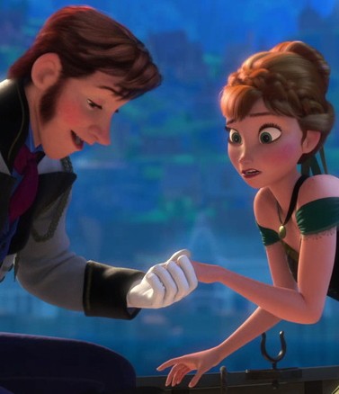
Just when I was wondering what the body dimensions of the supposedly-human characters were, the script conveniently supplied the dimorphism money-shot: hand-in-hand romantic leads, with perfect composition for both eye-size and hand-size comparisons:

1

With the gloves you can’t compare the hands exactly, but you get the idea. And the eyes? Yes, her eyeball actually has a wider diameter than her wrist:

2

Giant eyes and tiny hands symbolize femininity in Disneyland.

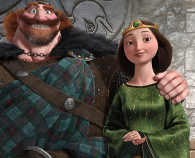
While I’m at at, I may as well include Brave in the series. Unless I have repressed it, there is no romance story for the female lead in that movie, but there are some nice comparison shots of her parents:

3Go ahead, give me some explanation about the different gene pools of the rival clans from which Merida’s parents came.

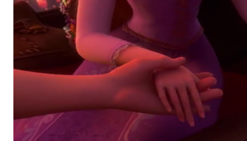
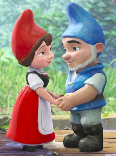
Since I first complained about this regarding Tangled, I have updated the story to include Gnomeo and Juliet. You can check those posts for more links to research (and see also this essay on human versus animal dimorphism by Lisa Wade). To just refresh the image file, though, here are the key images. From Tangled:

3.5

From Gnomeo:

4

At this point I think the evidence suggests that Disney favors compositions in which women’s hands are tiny compared to men’s, especially when they are in romantic relationships.

REAL WRIST-SIZE ADDENDUM

How do real men’s and women’s wrist sizes differ? I looked at 7 studies on topics ranging from carpal tunnel syndrome to judo mastery, and found a range of averages for women of 15.4 cm to 16.3 cm, and for men of 17.5 to 18.1 cm (in both cases the judo team had the thickest wrists).

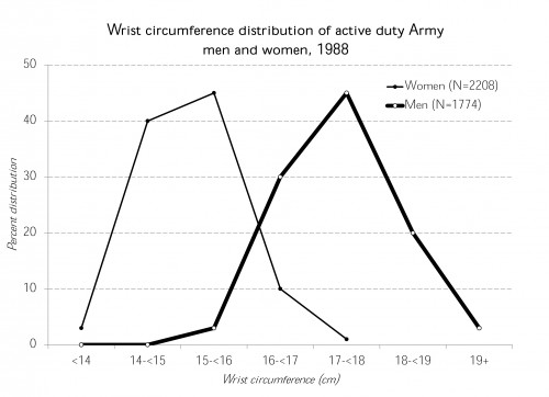
‘Then I found this awesome anthropometric survey of U.S. Army personnel from 1988. In that sample (almost 4,000, chosen to match the age, gender, and race/ethnic composition of the Army), the averages were 15.1 for women and 17.4 for men. Based on the detailed percentiles listed, I made this chart of the distributions:

5

The average difference between men’s and women’s wrists in this Army sample is 2.3 cm, or a ratio of 1.15-to-1. However, if you took the smallest-wristed woman (12.9 cm) and the largest-wristed man (20.4), you could get a difference of 7.5 cm, or a ratio of 1.6-to-1. Without being able to hack into the Disney animation servers with a tape measure I can’t compare them directly, but from the pictures it looks like these couples have differences greater than the most extreme differences found in the U.S. Army.

Cross-posted at Family Inequality and the Huffington Post.

Philip N. Cohen is a professor of sociology at the University of Maryland, College Park, and writes the blog Family Inequality. You can follow him on Twitter or Facebook.

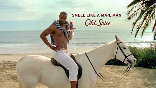
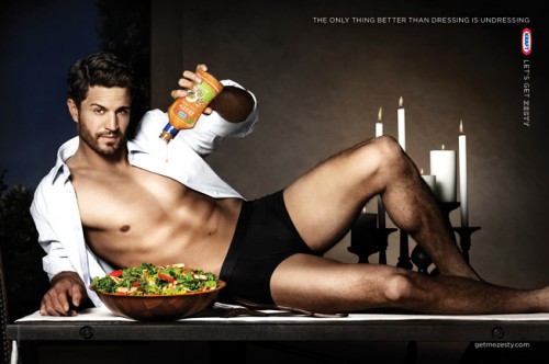
Recently David Gianatasio at AdWeek wrote an analysis of the sudden rise in the sexual objectification of men in advertising.  It seems to have been spurred by the wild popularity of the Old Spice character introduced in 2010, The Man Your Man Could Smell Like.  Gianatasio calls it “hunkvertising.”  Indeed, rippling abdominal muscles suddenly seem to be everywhere.

53Screenshot_3

Gianatasio interviewed me for the piece and I had two thoughts.  First, because the ads are so tongue-in-cheek, they didn’t seem to be acknowledging and validating women’s sexual desire, so much as mocking it.  “It’s funny to us to think of women being lustful,” I told Gianatasio, “because we don’t really take women’s sexuality very seriously.”  In this way, the joke affirms the gender order because the humor depends on us knowing that we don’t really objectify men this way and we don’t really believe that women are the way we imagine men to be.

Second, objectifying men alongside women certainly isn’t progress.  There’s the old critique that, if it is equality, it’s not the kind we want.  But, more importantly, the forces behind this so-called equality have nothing to do with justice.  Gianatasio generously gave me the last word:

I wouldn’t call it equality — I’d call it marketing, and maybe capitalism. Market forces under capitalism exploit whatever fertile ground is available. Justice and sexual equality aren’t driving increasing rates of male objectification — money is.

Lisa Wade, PhD is an Associate Professor at Tulane University. She is the author of American Hookup, a book about college sexual culture; a textbook about gender; and a forthcoming introductory text: Terrible Magnificent Sociology. You can follow her on Twitter and Instagram.