gender: beauty


This “Onslaught” ad by Dove has garnered a lot of attention and positive press:

The idea, of course, is that we need to protect our daughters from the images that may harm their self-esteem or make them uncomfortable about their bodies. A great message, no doubt.

However, corporate activism usually has limits and contradictions (as do most things in life, really). Miguel sent us this ad spoof that points out that many of the images the Dove ad says we should be protecting our daughters from are actually used in Axe ads–and Axe is owned by Unilever, the same company that owns Dove.

So Unilever manages to target both markets–those who respond to sexualized images and those who find them harmful–through different brands. This is a common tactic–because large multinational companies own so many different brands, they can market to many different groups of consumers; when we reject one product because of its production process or advertising and buy another instead, there’s a very good chance we’re buying from the same corporate entity, just a different brand name.

As one blogger nicely put it:

It’s a parent’s responsibility to make sure the damaging messages they themselves produce don’t reach your kids.

That is, Dove is telling parents to protect their kids, as if Dove CARES, but Dove’s parent company is producing those very same messages. (It’s kind of like a single corporation owning a beer company and running Alcoholics Anonymous. How very convenient for both.)

A commenter pointed out that Greenpeace made an ad based on Dove’s “Onslaught” commercial that brings up the effects of palm oil production in the destruction of forests in Indonesia:

Thanks, Dangger!

NEW: There is a terrific post at Moment of Choice about one woman’s experience auditioning for a Dove Real Woman commercial. From the post:

Under the guise of looking for women who felt truly comfortable in their own skin, no matter what they looked like, they asked us to bare all or most of it, to prove just how comfortable we really were…A young peppy assistant demonstrated how they wanted us to shake our hands in the air like we just didn’t care and do a full 360 for the camera and male judging panel.

It’s a fascinating inside look at a process most of us never take part in, and reinforces the fact that corporate activism often covers an awful lot of business-as-usual behind the scenes.


A student pointed me to bharatmatrimony.com, a matchmaking website targeting the general Indian sub-continent:

You can choose to search a variety of more specific groups (Hindi, Punjabi, Tamil, etc.). Among other search criteria, you can specify caste and sub-caste.

I did a quick search (I put in “any” for caste) and found that the profiles are publicly available (presumably you only have to pay if you actually want to contact them), and include such information as complexion (one profile said “wheatish”), blood type (??), eating habits (vegetarian or not), horoscope and whether or not the person requires a good horoscope match, the person’s caste and sub-caste, annual income, and their preferences in a partner (they can state a caste and first-language preference but not a complexion preference, from what I can tell).

The website might be useful for any number of discussions–about technology and the increasing global reach of the internet, of modern methods of dating, about what type of information we might think is important at first glance about a person (although in the U.S. I bet many people would say asking about someone’s complexion is inappropriate or racist, I presume we have things on our dating sites that would seem rude in India; also, I’d argue American users of dating website don’t openly ask about complexion but can get that information from photos and so may be judging potential partners on it anyway). This could also bring up an interesting discussion of language–I suspect many students would be horrified at the idea of a “matchmaker,” which implies arranged marriages to some degree, but a “dating service” seems different (even though eharmony and other sites call potential partners “matches”).

The same student also uncovered these anti-dowry posters:

They can be found here. I have tried to find a website for The Sisterhood Collective or the ad agency that supposedly made these posters but have not be able to, so I do not have definitive proof they are real (I have no reason to say they aren’t, only that I’m usually cautious of things that supposedly were displayed in other countries that seem a little too funny/horrific to be true, so I always try to do a little digging if I can. Snopes.com didn’t have anything on it.

One thing that I thought was interesting about the anti-dowry posters was that when I first saw them, the language (“you fucking prick”) made me assume they were directed at men, although when I looked at them again I realized there was no reason they couldn’t be directed at women. If they were meant to target a male audience, it could lead to an interesting discussion of the implication that only men are engaged in patriarchal oppression, ignoring the role that older women (particularly potential mothers-in-law) play in reinforcing dowry and the devaluation of women.

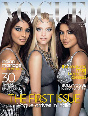
Finally, here’s the cover (found here) of the very first issue of Vogue India, from October, 2007:

Here we see that the image of beauty provided by the magazine to the millions of women in India includes a narrow set of features: light skin, straight hair, stereotypically “European” facial features–and, of course, very, very thin bodies. Compare to this Indian ad for skin-lightening cream for a discussion of standards of beauty and how a generalized “White” ideal of beauty has been increasingly globalized.

Thanks, Kellie G.!

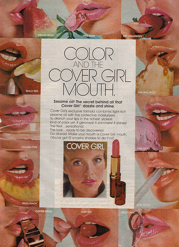
This old CoverGirl lipstick ad, found here, illustrates the infantilization of women we often see in ads-women (provocatively) licking ice cream cones, eating fruit, and so on. Thanks to Krystal-lynn M. for sending it in!

These Kenzie ads (available at the University of Michigan’s Sexual Assault Prevention and Awareness Center’s website) also have women in childlike poses, with their mary-jane shoes and ruffled socks. Thanks for sending them in, Laura L.!

These images illustrate two common trends in advertising: on the one hand, women are portrayed as little girls, as coyly innocent, as lacking in power and maturing. On the other hand, child-likeness is sexy, and girls are portrayed as Lolitas whose innocence is questionable.

NEW (Mar. ’10)! Jeff H. sent along this photo from a GQ spread in which Reille Hunter is posed with Kermit the Frog, Barney the Dinosaur, and Dora the Explorer:

These Slim Fast ads (found here) target soon-to-be-brides:

2.jpeg

sf.jpeg

cake_topper_ad.jpg

Thanks to Laura L. for sending these in!

Here at Sociological Images, we’re interested in how our standards of beauty are based on a European (that is, light-skinned and straight-haired) ideal. See here and here for examples. A reader pointed out that Syesha Mercado, a contestant on American Idol, has been progressively de-ethnicized.

Here is a photo of Syesha from early in the competition:

syesh.jpeg

Here is a photo of her from this week (end of April):


Am I the only one who thinks she looked prettier before?

top11syesha.jpg

However, the stylists have thus far let the white kid keep his dreads:

jason_c.jpg

Thanks for pointing this out, pj!

Here’s an Axe ad, sent in by Krystal-Lynn M., the idea being that if you use Axe, women will perform oral sex on you in the bathtub:

12.jpeg

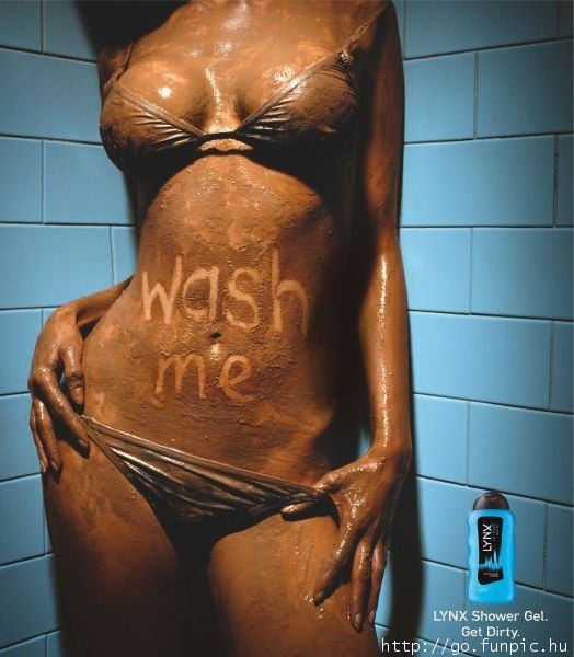
NEW: p.j. sent us this ad for Lynx, another name that Axe is marketed under in some countries:

NEW! (Mar. ’10): Katrin sent in this video about the LynxJet marketing campaign, which plays on the idea of the sexy airline stewardess who is sexually available and eager to please her male partner:

[youtube]https://www.youtube.com/watch?v=8QjcUf5pG3k[/youtube]

Gwen Sharp is an associate professor of sociology at Nevada State College. You can follow her on Twitter at @gwensharpnv.

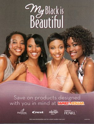
Toothpaste and tampons designed with your skin color “in mind.” MultiCult Classics says:

OK, Pantene offers products designed with Black women in mind. But Crest, Always and Tampax?

Also, apparently the black that is beautiful is light-skinned, with supposedly “European” facial features. See also: black models that don’t look black.

UPDATE: In the comments, Brian asked what I mean by “reification.” Thanks for the question, Brian! I mean “treating an abstraction as if it were real.” And, yep, race isn’t real. See racial categories as a historical artifact and check out this great website by the American Anthropological Association.

As I re-read… the contradiction between the two last paragraphs (black models that look white and there’s no such thing as black and white) is awesomely reflective of the reality of its race and its simultaneous non-reality!

.

This ad reminds women that they need to get their bodies ready before Rehab–and no, not that kind of rehab; it’s a big party being put on here in Vegas. Without new boobs, you simply won’t be “ready”–i.e., attractive enough–for this event. This could be useful as a really extreme case of ads that try to make people feel inadequate and provide a solution in the form of a product or service.

And as far as I can tell, what you’re supposed to be “ready” for is to be sexually available–she’s pulling her bikini bottom down and has a seductive look on her face.

Also, notice the doctor is having a “buy one, get the second 1/2 off” special if you bring in a friend. So women should encourage each other to feel uncomfortable about their bodies.

From Las Vegas Weekly.