I found this Rolex ad in Metropolitan Home magazine. Pair with this ad series that plays on the idea of “generations” of class. Or this ad for Patek Philippe ads, also using the generations theme. Then compare to this Acura ad that ridicules “trust-fund,” old-money types. It could also lead to an interesting discussion about the ways in which we use the word “class” both as an economic group and as a personal characteristic (i.e., “She has class”) and the way “classiness” is here turned into something you can buy for yourself.
commodification
Here is an image for the website from Just for Men’s Touch of Gray line:

This product covers most, but not all, of a man’s gray hair. From the website:
Why use Touch of Gray? A little gray to show your experience, but not so much
that it hides your vitality.
There are a range of shades available and you can control how much gray is hidden.
The website has a total of four images of men with women. As Vanessa V., who sent this one in, pointed out, none of the women have a “touch of gray.” Nor could she imagine a product like this marketed to women.
Here is another example of an ad that gives men permission to age in a way women never are.
Other men’s hair dye posts: here, here, and here.
Thanks, Vanessa!
NEW: Corey O. found a Just for Men commercial that references Woodstock (sadly, I can’t find a video of it). Corey says,
It has everything you could want in an advertisement: classic rock soundtrack, co-opted counterculture, mixed messages about aging, demonstrations of male virility, minorities on the margins, gender disparity, and attempts to sell a “natural” look. The total package. What really got to me, though, was the gender aspect. Can you imagine a line of hair dye marketed toward women which is meant to leave some grey intact? I don’t think that Just for Men can either — in contrast to the silver-streaked men, none of the women in the ad are sporting a natural look and some look like they’ve had rather recent visits from the botox fairy. This ad is a nice way of illustrating the double-standard that women face in regards to aging: while men can benefit from grey hair as an illustration of their maturity without sacrificing their virility, women must always strive to look as young as possible. Because this is an ad for men’s hair dye, however, it also illustrates that while men may benefit from less scrutiny of their appearance than women, their appearance is also satisfactory only with the use of beauty aids.
I also like the appropriation of Woodstock and the counter-culture movement of the ’60s.
Thanks, Corey!
Gwen Sharp is an associate professor of sociology at Nevada State College. You can follow her on Twitter at @gwensharpnv.
Due to the consolidation of food distributors, when we think we’re making socially and environmentally responsible food choices, we are often just still just lining the pockets of the big 30. See chart below, click to enlarge:
Found at lawgeek.

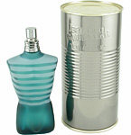

The first two are from the Gaultier Classique line. The third image is called Le Male. The final image is Fleur Du Male. You can see other examples of the women’s line here.
Thanks, Melissa C.!
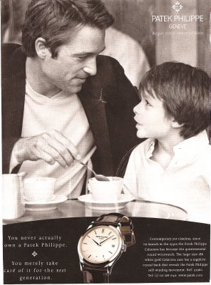
This is an ad I found in The New Yorker for Patek Philippe watches. The text in the lower-left corner says “You never actually own a Patrick Philippe. You merely take care of it for the next generation.” So by buying an expensive, new watch, you’re creating a “tradition.” I’m going to use this in the future when I talk about inventing traditions.
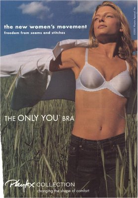
“The new women’s movement. Freedom from seams and stitches.”
This is another ad Lisa sent me years ago. I use it when discussing the de-politicization of social issues, and the commodification of freedom–it’s just something you buy. I also use this one from Lisa:
The Jeep Liberty–notice on the right it says “Glass Ceiling” and has an arrow pointing down below; so structural inequality at work is trivialized, and again, “liberty” is something we can purchase.
These ads go nicely along with the old Virginia Slims campaign, these other “liberated women” themed ads Lisa posted previously, and the “right hand ring” ad I posted.
Gwen Sharp is an associate professor of sociology at Nevada State College. You can follow her on Twitter at @gwensharpnv.
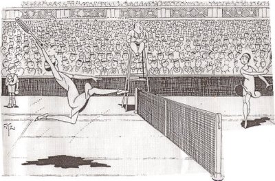
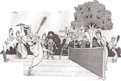
These two images were used in a 1927 ad for Wimbledon. Lisa actually sent them to me a couple of years ago but has never posted them, so I’m doing it. The point of showing the two images next to each other was to stress how liberated women were by 1927–they aren’t wearing stuffy old dresses to play tennis, and men aren’t shocked by the sight of a leg.
I use these, along with some of the “You’ve Come a Long Way, Baby” Virginia Slims ads, to show how “women’s liberation” is used by advertisers to sell products, as well as to imply that “now” (whenever “now” is) is always better than “then” (some indeterminate point in the past) and that the struggle for equality and freedom is over.
Here is an image for the website from Just for Men’s Touch of Gray line:

This product covers most, but not all, of a man’s gray hair. From the website:
Why use Touch of Gray? A little gray to show your experience, but not so much
that it hides your vitality.
There are a range of shades available and you can control how much gray is hidden.
The website has a total of four images of men with women. As Vanessa V., who sent this one in, pointed out, none of the women have a “touch of gray.” Nor could she imagine a product like this marketed to women.
Here is another example of an ad that gives men permission to age in a way women never are.
Other men’s hair dye posts: here, here, and here.
Thanks, Vanessa!
NEW: Corey O. found a Just for Men commercial that references Woodstock (sadly, I can’t find a video of it). Corey says,
It has everything you could want in an advertisement: classic rock soundtrack, co-opted counterculture, mixed messages about aging, demonstrations of male virility, minorities on the margins, gender disparity, and attempts to sell a “natural” look. The total package. What really got to me, though, was the gender aspect. Can you imagine a line of hair dye marketed toward women which is meant to leave some grey intact? I don’t think that Just for Men can either — in contrast to the silver-streaked men, none of the women in the ad are sporting a natural look and some look like they’ve had rather recent visits from the botox fairy. This ad is a nice way of illustrating the double-standard that women face in regards to aging: while men can benefit from grey hair as an illustration of their maturity without sacrificing their virility, women must always strive to look as young as possible. Because this is an ad for men’s hair dye, however, it also illustrates that while men may benefit from less scrutiny of their appearance than women, their appearance is also satisfactory only with the use of beauty aids.
I also like the appropriation of Woodstock and the counter-culture movement of the ’60s.
Thanks, Corey!
Gwen Sharp is an associate professor of sociology at Nevada State College. You can follow her on Twitter at @gwensharpnv.
Due to the consolidation of food distributors, when we think we’re making socially and environmentally responsible food choices, we are often just still just lining the pockets of the big 30. See chart below, click to enlarge:
Found at lawgeek.


The first two are from the Gaultier Classique line. The third image is called Le Male. The final image is Fleur Du Male. You can see other examples of the women’s line here.
This is an ad I found in The New Yorker for Patek Philippe watches. The text in the lower-left corner says “You never actually own a Patrick Philippe. You merely take care of it for the next generation.” So by buying an expensive, new watch, you’re creating a “tradition.” I’m going to use this in the future when I talk about inventing traditions.

“The new women’s movement. Freedom from seams and stitches.”
This is another ad Lisa sent me years ago. I use it when discussing the de-politicization of social issues, and the commodification of freedom–it’s just something you buy. I also use this one from Lisa:
The Jeep Liberty–notice on the right it says “Glass Ceiling” and has an arrow pointing down below; so structural inequality at work is trivialized, and again, “liberty” is something we can purchase.
These ads go nicely along with the old Virginia Slims campaign, these other “liberated women” themed ads Lisa posted previously, and the “right hand ring” ad I posted.
Gwen Sharp is an associate professor of sociology at Nevada State College. You can follow her on Twitter at @gwensharpnv.

These two images were used in a 1927 ad for Wimbledon. Lisa actually sent them to me a couple of years ago but has never posted them, so I’m doing it. The point of showing the two images next to each other was to stress how liberated women were by 1927–they aren’t wearing stuffy old dresses to play tennis, and men aren’t shocked by the sight of a leg.
I use these, along with some of the “You’ve Come a Long Way, Baby” Virginia Slims ads, to show how “women’s liberation” is used by advertisers to sell products, as well as to imply that “now” (whenever “now” is) is always better than “then” (some indeterminate point in the past) and that the struggle for equality and freedom is over.


