bodies

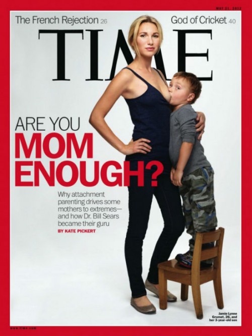
Just before Mother’s Day, TIME grabbed America’s attention with a cover image accompanying the headline “Are You Mom Enough?”  Its photo featured 26-year-old Jamie Lynne Grumet nursing her 3-year-old son.*  The image electrified the blogosphere. With 24 hours there were over 18,000 comments on one site alone.  LA Weekly called her a MILF and reported that internet traffic flooding her website caused it to crash.

Within no time, spoofs of the cover appeared.  Tiger Mom made a reappearance.  “Are You Phone Enough?” plays on the idea of attachment, but between user and electronic device.  One site offered “magazine makeovers” and generated a “make your own TIME magazine cover” template.

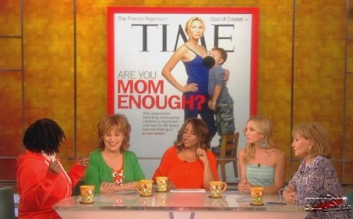
The responses, though, were mostly negative.  In a TODAY.com poll about the image, more than 131,000 people weighed in; 73% saying they would have preferred not to see the image.  Saturday Night Live wasted no time in skewering both mother and child. Purportedly, some newsstands covered up the image and when it appeared on some news shows, Grumet’s breast was blurred.

For those for whom the image was offensive, Grumet’s physical attractiveness and her exposed body conflate feeding with sexiness, hence constructing the image of her suckling son with creepy or incestuous undertones — exactly the kind of one-note misconstrual of the breast (for sexual appeal rather than nutrition) that breastfeeding advocates revile.  Objections to the image included revulsion that a child — clearly still not a baby — would be connected to his mother’s body this intimately, alongside a fair share who claimed he would surely later be scarred — if not by the experience of cognitively remembering breastfeeding, then by this image circulating through his future school yards.  One commentator claimed deep concern that Grumet’s son may “never be better-known for anything than for being a breastfeeding 3-year-old on the cover of a national magazine,” and that the image was one of “psychological abuse,” as well as “an act of media violence against a child” perpetuated by manipulative journalists.

Breastfeeding advocates (so-called “lactivists”) seemed torn. On the one hand, the image drew attention to their cause: the benefits of long-term breastfeeding, including both nutritional benefits and mother/child bonding.  On the other hand, it was clear this was being done for shock value and exploitative purposes.  Grumet’s hand-on-hip, defiant stance and her son’s stepladder perch hardly convey the sense of intimacy that breastfeeding can offer.  Most agreed that TIME‘s choice of a 26-year old, blonde, white woman who looks like a model was a deliberate move meant to provoke.  In a “Behind the Cover” online sidebar photographer Martin Schoeller admits that he posed Grumet and her child upright in order to “underline that this was an uncommon situation” (i.e., to be provocative). The story accompanying the article doesn’t mention Grumet at all; instead, it profiles 72-year-old Dr. William Sears, the “father” of the attachment parenting movement.  All this exacerbated the sense that the sensationalistic pose of Grumet’s lithe body and her son’s latch was generated just to move copies of the magazine.

By capitalizing on shock value and American squeamishness about breastfeeding, there is no doubt the image will continue to generate reaction for a while longer.  And it likely sold magazines.  It inspired a few “print is not dead” articles, with one writer calling the cover “a shocking stroke of genius” that serves as a testament that a powerful image can still generate buzz and boost magazine sales.

Unfortunately the image may ultimately harm the cause it represents.  The relationship between media and activists is a fraught one.  Activists need media attention, but far too often media attention can warp and undermine activist projects.  It remains to be seen whether the cover will be a net good or bad for lactivists.

*A few people wondered about why TIME didn’t feature Grumet’s older, adopted child, who she also breastfeeds. One guess is that bold as the cover image is, even TIME‘s editors were afraid to take on the implications of a white woman nursing a black child. 

————————

Elline Lipkin, PhD, is a Research Scholar with UCLA’s Center for the Study of Women.  She is the author of Girls’ Studies and The Errant Thread, recipient of the Kore Press First Book Award for Poetry.  She lives in Los Angeles and has written for the Ms. magazine blog, Salon.com and Girl w/Pen, as well as other contemporary publications.  She tweets at @girlsstudies.

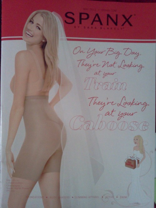
Melissa Fletcher Pirkey, a grad student at Notre Dame, sent in an image she saw in a catalog for Spanx, a company that sells shapewear. This page from the catalog reminds women that our bodies are always on display and subject to scrutiny, requiring the help of a range of garments to help us keep them under control lest we fail inspection:

d

Hennessy Youngman kicks around the question, should art be beautiful?

If you liked, more from Youngman:

Lisa Wade, PhD is an Associate Professor at Tulane University. She is the author of American Hookup, a book about college sexual culture; a textbook about gender; and a forthcoming introductory text: Terrible Magnificent Sociology. You can follow her on Twitter and Instagram.

This four-minute video reports research showing that, even if we’re not aware of it, most of us have unconscious biases against short men.  (It’s also a great description of Implicit Association Tests.)

[youtube]https://www.youtube.com/watch?v=SRlWvzUznlw[/youtube]

You, too, can take any multitude of implicit association tests.  Simply go to Harvard’s Project Implicit.

Borrowed from The Social Complex, a heightism blog. See also guest posts from The Social Complex introducing the concept of heightism as a gendered prejudice and discussing heightism (and other icky stuff) at Hooters.

Lisa Wade, PhD is an Associate Professor at Tulane University. She is the author of American Hookup, a book about college sexual culture; a textbook about gender; and a forthcoming introductory text: Terrible Magnificent Sociology. You can follow her on Twitter and Instagram.

April 15th was World Art Day.  A museum in Stockholm, the Moderna Museet, celebrated with what appears to be a chocolate and red velvet cake in the likeness of a caricature of member of a generic African tribe.  The cake was designed by an artist, Makode Aj Linde, who wanted to draw attention to the practice of female genital cutting, which occurs in parts of Africa (and elsewhere).  Accordingly, the cake was in the shape of a woman’s shoulders, breasts, belly, and genitals; it was covered in black fondant.  The head was the artist himself, painted black with cartoon-ish eyes and mouth reminiscent of American minstrelsy. Neck coils tied it all together.

The Swedish minister of culture, Adelsohn Liljeroth, was asked to cut the cake.  Playing along with the “art,” she began at the clitoris.  After slicing herself a piece, she fed it to the artist (it’s unclear if that was planned or improvised).  Each reveler carved out more and more of the genitals, revealing brown and then red cake inside.  With each cut, the artist let out a yell and cried.  People attending the exhibit reportedly gawked and generally went along having a good time.

Kitimbwa Sabuni, a spokesperson for the National Afro-Swedish Association, called the cake a “racist caricature of a black woman” and criticized the event, writing:

The “participation [of the minister of culture], as she laughs, drinks, and eats cake, merely adds to the insult against people who suffer from racist taunts and against women affected by circumcision.”

The minister shrugged rhetorically, saying  “Art needs to be provocative.”  On his Facebook page, the artist was nonchalant, writing about the above photo: “This is After getting my vagaga mutilated by the minister of culture…”

I will go on the record saying that this is obviously racist, trivializes genital cutting, is wildly insensitive to women who have experienced cutting, and fails to accord any respect to members of communities that practice genital cutting.  It’s a shameful mockery.

————————

UPDATE: It occurred to me that it’s possible that the artist intended to trap a mostly white audience into participating in this obviously racist game, all with the intention of revealing that they would.  Sort of like Spike Lee’s Bamboozled, where the fictional African American tv writer, asked by his White boss to write something “Black,” wrote the most racist thing he could think of… only to discover that audiences loved it.  So perhaps the artist meant to provoke the same sort of horror that Bamboozled provokes in its real audience.  And that is provocative indeed.  But I’m guessing that this message will be lost on the vast majority of people at the same time it provides a satisfying opportunity to object to something obviously racist (as I did); meanwhile, more subtle discrimination and institutionalized racism remains un-examined.

————————

One of my main areas of serious academic research involves trying to understand how Westerners think about female genital cutting, and what motivates them to understand it in the way they do.  I must say, though, that I am at a loss to explain this.  My research on American perceptions of the practice (not Swedish, notably) suggests that we take the practice extremely seriously, framing it as (one of) the worst human rights abuses imaginable.  From this perspective, this approach to raising awareness — from the party-atmosphere symbolized by the cake to the almost comical and obviously fake protestations from the artist/actor — takes the issue far too frivolously for comfort.

Caricaturing Africans, however, and seeing them as lesser humans is also part of what drives American condemnation of genital cutting.  U.S. discourses often frame Africans as either ignorant or cruel.  We routinely dehumanize both women and men in these discourses.  They are seen more as objects of intervention than human beings.  Accordingly, it doesn’t surprise me too much that the (mostly White, Swedish) people viewing the performance felt enough distance from the practice of genital cutting to enjoy their cake.  Nor does it surprise me to hear at least some of them dismiss the concerns of the spokesperson for the National Afro-Swedish Association.

The video, in all its glory:

Thanks to Sharla F., Samira A., and an anonymous reader for sending in the tip to this story!

Lisa Wade, PhD is an Associate Professor at Tulane University. She is the author of American Hookup, a book about college sexual culture; a textbook about gender; and a forthcoming introductory text: Terrible Magnificent Sociology. You can follow her on Twitter and Instagram.

Last month the Centers for Disease Control (CDC) released a series of graphic anti-smoking ads intended to “raise awareness of the human suffering caused by smoking and to encourage smokers to quit.”   The campaign, titled “Tips From Former Smokers,” depicts individuals who have experienced some of the potential effects of tobacco use, including stomas, stroke, lung removal, heart attack, limb amputations, and asthma.  For example, this ad features several former smokers who offer “tips” on how to live with a throat stoma (hole), such as “Crouch, don’t bend over—you don’t want to lose the food in your stomach”:

This ad shows Terrie, a throat cancer survivor, completing the morning routine she performs in order to maintain her appearance after losing her hair and teeth and having a tracheotomy:

Finally, this ad depicts several people who suffered a vascular disease brought on by smoking who had to have limbs amputated:

In addition to the whether these ads will be effective in persuading smokers to quit, we might ask whether fear and stigma are appropriate health promotion strategies.  Is it possible or ethical to scare people into changing their behaviors?  What are the implications of using stigmatized people to serve as a warning label to others?

What’s most striking about these ads is how they use and portray the human body.  Medical sociologist Deborah Lupton suggests that health promotion campaigns such as this one do not simply depict bodies but also produce them; that is, the ways we talk about and create images of certain bodies says something about who or what that body is and what it does. She argues that when the body is seen as uncontrolled, say, with holes or missing limbs, then the self is understood as undisciplined.  For these former smokers, their undisciplined selves resulted in their uncontrolled bodies. Lupton suggests that by producing the body as a site of contamination or catastrophe the rest of us can be kept in line by fear.

In these ads, a group of disabled people and cancer survivors are used as a warning for current smokers to quit.  The ads invite us to feel disgust at their bodies and fear at what could happen to our own.  In particular, Terrie’s ad invokes gendered beauty norms and prompts viewers to imagine themselves without traditional markers of attractiveness such a full head of hair.

Paying attention to how health promotion images use the body is one way to think more critically about bodies, well-being, and how to effectively promote healthy behaviors.

 —————

Christie Barcelos is a doctoral candidate in Public Health/Community Health Education at the University of Massachusetts Amherst.

In 2010 we wrote about how gender ideology inflects even the most “objective” of spheres.  In this case, we featured four examples of anatomical illustration, portrayals of human beings used to educate viewers about biology.  In each case, while the man faced forward with his weight evenly distributed on his two feet, the woman placed her hand on her hip, cocked a knee, or even turned slightly sideways.  In other words, he was posed in a masculine way and she in a feminine way.

When we see this kind of gendered posing in drawings that are ostensibly neutral, we are being told that our particular historically- and culturally-contingent version of masculinity and femininity is natural.

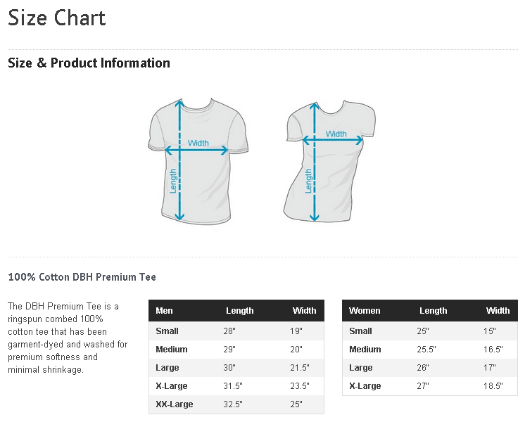
In this vein, Courtney S. sent in a Design by Hümans Size Chart.  The chart is supposed to help buyers decide what size to purchase, but the accompanying images do more than just illustrate how measurements are made; by torquing the female torso, they send a message about gender too:

Lisa Wade, PhD is an Associate Professor at Tulane University. She is the author of American Hookup, a book about college sexual culture; a textbook about gender; and a forthcoming introductory text: Terrible Magnificent Sociology. You can follow her on Twitter and Instagram.

Flickr Creative Commons, Lau

Stephanie Medley-Rath sent in a new example of urinals shaped like women’s mouths (source).

Liz B. sent in a slide show of “innovative” urinals that included this example.

Urinals at the Rosenmeer restaurant in Moenchengladbach, Germany, are shaped like women’s bodies (source).

Others are shaped like nuns urinals (more nun or maybe the Virgin Mary urinals here).


Emma B. sent in this image of sinks:

fail-owned-sink-design-fail

Gwen Sharp is an associate professor of sociology at Nevada State College. You can follow her on Twitter at @gwensharpnv.