age/aging

In her August 13 column in the Washington Times Communities section, Rebekah Kuschmider declares proudly, “So here’s the thing: I am not embarrassed about my stretch marks.” It’s a great message. Women should love their aging skin and reject the impossible Photoshop beauty standards that make us hate ourselves. Kuschmider describers herself as, not a Barbie Doll, but a “Velveteen Rabbit, so worn and loved that I’ve become real.”

Two curious images, however, accompany this story about a (presumably) wealthy white woman’s stretch marks. The two women pictured with Kuschmider’s column are actually a Thai woman from a village near Burma and an Indian laborer from the city of Diu (according to the Flickr pages from which the photos were captured). The old Thai woman’s face is a shrunken apple;  tattoos cover the younger Indian woman’s neck, and the whites of her eyes are yellowed from exposure to the sun. Both women are beautiful.

But why don’t we see, not to get too invasive here, the stretch marks of which Ms. Kuschmider is justifiably proud? Why do we instead see haunting portraits that seem to come straight off the pages of National Geographic? The underlying message from whoever chose these photos (the author? an online editor?) is that wrinkles look exotic on poor women whom privileged Americans love to gawk at. We don’t expect them to be attractive by our standards – they’re so lovely in their way, so tragic. But wealthier white women?

Maybe the conservative readership of the Washington Times doesn’t want to see white women looking old or wrinkled, no matter what Rebekah Kuschmider claims about aging.  Is that kind of woman is too dignified to be seen looking so “unattractive”? Is aging easier to accept when it’s exotified and Othered — as if it can’t (and shouldn’t) happen to those of us who are more privileged?
Kushlani de Soyza is a reporter and producer for APA Compass, an Asian-Pacific-American public affairs radio program on Portland’s KBOO-FM. She teaches Women’s Studies at Clark College in Vancouver, WA, and English/Journalism at Oregon State University.

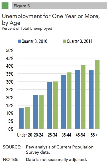
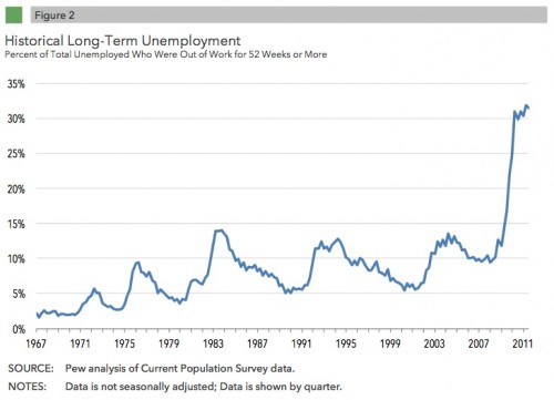
The Pew Charitable Trusts just released an update on the effects of long-term unemployment. One aspect of this economic crisis that sets it apart from others over the past several decades is how long unemployment is lasting. At this point, about a third of the unemployed have been out of a job for a full year or more:

Though the likelihood of being unemployed went down with age, among those who have lost their jobs, long periods of unemployment are more common among older than younger workers:

Read the full mini-report here. Via Talking Points Memo.

Also check out Lisa’s post on the long-term consequences of unemployment.

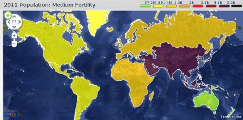
With all the emphasis on Halloween, you may or may not have heard that this year, October 31st was noteworthy for another reason: according to the United Nations, that’s the day the global population hit 7 billion. The UN has set up a website to provide information about population trends and estimates for the future. Here’s the current world population, by region:

The map is interactive, so you can click on a region to find out its population, as well as its percentage of the total world population.

You can also estimate the population through 2100 based on various fertility scenarios. In the default medium scenario, fertility is expected to follow past trends, leveling out at a little over 10 billion by 2100:

On the other hand, if we saw no further reductions in global fertility, the 2100 population would be over 26.8 billion:

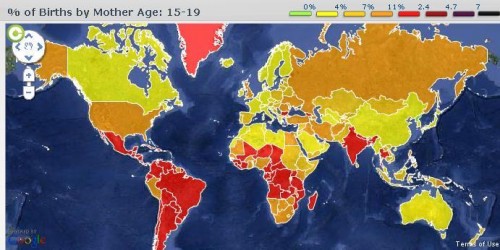
There’s an enormous amount of data available at the site. For instance, if you select the Births tab, you can click on either a region or a specific country and find out what percent of births are to women in different age groups. Here’s the % of all births to women aged 15-19, by country:

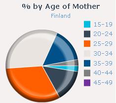
And the chart showing the total age breakdown for Finland (at the site you can hover over the graph to get the actual %):

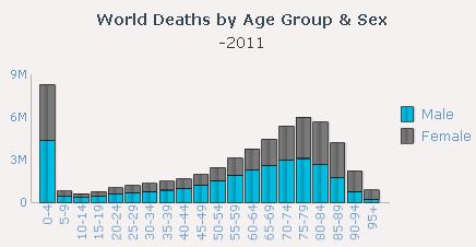
A chart of deaths by age and sex, illustrating the continued high mortality in infancy and early childhood:

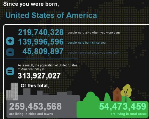
There’s also a section of the site where you can enter information about your own date and place of birth and then get a snapshot of what the global population was when you were born. Since I entered the world:

Overall, it’s a pretty great resource, and another one of those websites that can easily eat up a significant amount of your time without you realizing it.


A post for Love Your Body Day.

Krista, Debbie, and Diego sent in the following commercial for FreeScore. It nicely illustrates our bias against men who don’t live up to idealized standards of masculinity.  That is, men who are short, bald, and soft.

Like a bad credit score, men who aren’t young and handsome are a total drag. Klutzy, a potential serial killer, afraid to stand up for himself… his pain is our last laugh.  Disgusting.

Lisa Wade, PhD is an Associate Professor at Tulane University. She is the author of American Hookup, a book about college sexual culture; a textbook about gender; and a forthcoming introductory text: Terrible Magnificent Sociology. You can follow her on Twitter and Instagram.

The Demographics

During disasters, poor people, people of color, and the elderly die in disproportionate numbers (source), and Katrina was no exception. Many decisions were made in the days leading up to and shortly after Katrina that amplified loss of life for these groups. New Orleans is both a poor (23% poverty rate pre-Katrina – twice the national average) and segregated city, and these factors led to loss of life. First, an effective evacuation plan was not in place that accounted for the 112,000 poor, mostly black New Orleanians without cars. Additionally, the timing of the storm at the end of the month meant that those receiving public assistance were unusually cash-strapped. To make matters worse for poor people with children, school had just started so expenses for the month were higher than usual.

The immobile poor were disproportionately left behind and lost their lives. A comprehensive study of evacuees to Houston (who had stayed behind during the storm) found that 22% were physically unable to evacuate, 14% were physically disabled, 23% stayed in New Orleans to care for a physically disabled person, and 25% were suffering from a chronic disease (source). Also,

• 55% did not have a car or a way to evacuate
• 68% had neither money in the bank nor a useable credit card
• 57% had total household incomes of less than $20,000 in the prior year
• 76% had children under 18 with them in the shelter
• 77% had a high school education or less
• 93% were black
• 67% were employed full or part-time before the hurricane

Age was also a factor in fatalities. Nearly 40% of those who died in Katrina were elderly, and many more elderly individuals died from the stress of evacuation and home loss.

Government Response

Mayor Nagin received nearly $20 million to establish a workable evacuation plan in plenty of time for Katrina, but it’s questionable whether it was ever developed, and it was never disseminated. Two months before Katrina, Nagin spent money to produce and distribute DVDs in poorer neighborhoods to inform residents that they would be on their own if a storm hit because the city could not afford to evacuate them.  In the days before the storm, Nagin sent empty Amtrak trains out of the city, failed to mobilized available school and other buses, and waited an entire day to call for a mandatory evacuation so he could determine whether the City would face lawsuits from local businesses (source). All of these decisions were deadly.

The federal response was no better. The city was quiet after the storm whipped through late Sunday night/early Monday morning when President Bush announced that New Orleans had “dodged a bullet.” Within hours, three major levees breaches and over fifty minor breaches flooded the city. Despite Governor Blanco’s request for federal assistance on Saturday (two days before the storm made landfall) and concern from local media on Sunday (one day before the storm) that the levees wouldn’t hold, they breached on Monday morning with only two Federal Emergency Management Agency (FEMA) workers on the ground (see the timeline). It would take two days for 1,000 additional officials to arrive.

Once on the ground, FEMA slowed the evacuation with unworkable paperwork and certification requirements. Marc Cresswell, a medic from a private ambulance company, reported that “At one point I had 10 helicopters on the ground waiting to go, but FEMA kept stonewalling us with paperwork. Meanwhile, every 30 or 40 minutes someone was dying.” FEMA was also criticized for turning away personnel, vehicles, medical equipment, food and other supplies, and diesel fuel.

The 30,000 people who evacuated to the Superdome (per Nagin’s instructions) were stranded for a week. Those who evacuated to the Superdome experienced deplorable conditions – unbearable heat, darkness, the stench of sewage, and a lack of food and water. They were not allowed to leave, and, according to several evacuees I interviewed in Texas shortly after the storm, this led one man to take his life by jumping from a balcony. This death was one of only six deaths at the Superdome: one person overdosed and four others died of natural causes. Another 20,000 people gathered at the Convention Center for assistance, an evacuation site the federal government was unaware of until three days after the storm.

President Bush was otherwise occupied during this time. The day Katrina hit, he traveled to Arizona and California to promote his prescription drug plan, had birthday cake with John McCain, and attended a Padres game.

Panicked at the slow federal response, Governor Blanco sent an urgent request: “Mr. President, we need your help. We need everything you’ve got.” The president retired to bed that night without responding to Blanco. The next day, he sang songs with country singer Mark Willis and returned to Texas for the final night of his vacation. The President was so oblivious to the suffering in New Orleans that his staff made a video of news coverage four days after the storm to sensitize him. And, in response, President Bush’s team assembled a carefully crafted PR plan to blame local officials seven days into the ordeal while thousands of people were still stranded. Later that same day, President Bush made the infamous statement, “Brownie, you’re doing a heckuva job.”

Cross-posted at Caroline Heldman’s blog.

Cross-posted at Montclair SocioBlog.

I am a Londoner. A proud East Londoner, hailing from the working class. And this past week has been one of the most difficult I’ve encountered since I moved to the US nearly ten years ago.  This weekend my hometown was attacked by rioters, just minutes away from my family’s homes and businesses, my high school and a million childhood and teenage memories.  I don’t think I can do justice describing the feeling of watching this unfold from so far away.  Needless to say, I wouldn’t wish the experience on anyone.  Thankfully, it would appear that most of the violence has subsided. In its place: a myriad of social commentaries on why this happened.  Not only from journalists, but from the everyman benefitting from the very same social media that helped rioters coordinate.  Indeed, many sociologists have aired their ideas on Facebook, blogs and even op-eds.

But perhaps in our rush to explain and apportion blame perhaps we all missed asking some important questions.  Why did we assume that the rioters are poor?  How do we really know the class background of the rioters?  Why did the media depict the rioters as underprivileged? And why did we accept this depiction unquestioningly?

The sociologist in me fantasizes of a post-riot 10 question survey to be distributed to all rioters immediately after completion of law breaking activities with questions including: what is your average household income, what is your and your parent’s highest level of education, what is your occupation, on a scale of one to ten just how angry with the government are you at this moment, ten being really jolly pissed off?


Short of such a research tool, how did we come up with generalizations of a group of people we really know little about, except for the fact that they all rioted?

As someone who has lived in both nations, I feel class is certainly a nuanced thing in Britain, much more so than in the US. But even with the subtleties of the British system you cannot simply see class.  And for the most part, all the information we initially had about rioters is what we saw on TV and in still photographs.

We just cannot tell.  If you thought you could tell, you’d be guessing, and you’d be basing your decision on ideas you have about the poor.  Some might point to history; past rioters have tended to be from the working classes. But this only offers us the ability to make a prediction. But, most commentaries did not acknowledge that they were predicting who was involved.  Some might argue that those wearing hoodies are poor, as the wearing of hoodies has become synonymous in the British press with certain low-income groups.  But people of all class groups own hoodies.  We also cannot surmise simply from a picture that the rioters were from the area they attacked and attempt to extrapolate social class from that location.  Indeed, early police reports indicate that in some cases there was organized travelling to targeted areas and in my home borough of Waltham Forest, initial records show that more than half of those arrested did not live there.  So how do we ascertain the social class of the rioters?  Their behavior?

Did we see violence, looting and vandalism and assume that this could only be the work of poor people, and passively accepted the media’s categorization of the perpetrators as such?  Or are we so blinded by our ideological beliefs, romanticizing the riots to be exactly what Marx warned us of that we bought this generalization? Or do we want so desperately to blame governmental cuts against the poor that we ignore the lack of solid evidence as to who these rioters really are?  Or did we simply map on our understanding of other riots, and assume that all rioters are the same?  I don’t have the answer to these questions, but think it is worth considering why we made the assumptions we did about the rioters when we had little to no data.

As I write this, on Friday 12th August, long after many of the commentaries have been published and opinions have been shared, news outlets are beginning to report the demographic information of the rioters who have appeared in court. (Go here and click on “Get the data”; sorry for the broken link earlier!)

Among those rioters who fit the stereotype  — alienated, poor youth — are those who do not fit this type at all. They have already been the subject of several headlines: teachers, an Olympic ambassador, a graphic designer, college graduates and a “millionaire’s daughter.”  The very fact that these “unusual suspects” have been singled out by the press demonstrates the power of this prejudice; we are shocked when it isn’t poor people rioting.  But why? Is it because deep down we believe that the poor are capable of violence, but the rich aren’t? Or is it because this riot is more complex than simply the rage of downtrodden people?

At this point, we are far from really knowing the class backgrounds of the rioters, especially since many people have not, and probably will not, be caught for their actions. We are still without reliable data to draw conclusions, just as we were earlier in the week when so many of us rushed to attribute this rioting to disenfranchised youth. I am not arguing that class won’t be an important factor in our understandings of these riots, and it may well be that these riots were mostly poor people. But my point is we cannot say with certainty at this moment in time that this is the case. And as an East End girl, I ask: what does it say about us, especially sociologists, that we were so willing to believe this about the poor without any solid data?

UPDATE: Kat provided a link to some data that wasn’t available when the post was being written. The Guardian mapped the home addresses of those arrested in the riots; the results indicate that they appear to have been disproportionately, though not solely, from areas that are poor — and getting poorer. Of those arrested, for instance, 41% came from the top 10% of areas when ranked by levels of deprivation.

Faye Allard is an Assistant Professor of Sociology at Montclair State University.  When not busy winning teaching awards, she is working on a book about the African American gender gap in high school educational achievement, called “Mind the Gap.”

Cross-posted at Reports from the Economic Front.

Social Security is in Danger

The recently approved deficit reduction plan includes the establishment of a Congressional super committee that is supposed to propose ways to achieve $1.2-1.5 trillion in deficit reduction over the next ten years. Everything is on the table, including Social Security. It must complete its work by November 23, 2011.

While the committee could decide to spare Social Security, the odds are great that its final proposal will include significant benefit cuts. Most Republicans have long sought to dismantle the program and President Obama is willing to accept a reduction in Social Security benefits for the sake of deficit reduction.  Standard and Poor’s downgrade of the federal government’s credit rating only adds to the pressure.  The rating agency explained its decision as follows:

We lowered our long-term rating on the U.S. because we believe that the prolonged controversy over raising the statutory debt ceiling and the related fiscal policy debate indicate that further near-term progress containing the growth in public spending, especially on entitlements, or on reaching an agreement on raising revenues is less likely than we previously assumed and will remain a contentious and fitful process.

Why Social Security is Important

There has been little media discussion of the importance of Social Security to those over 65.  According to the Economic Policy Institute:

The average annual Social Security retirement benefit in 2009 was $13,406.40, slightly above the $10,289 federal poverty line for individuals age 65 and older, but less than the minimum wage. While modest in size, Social Security benefits comprise a substantial share of household income for most elderly recipients.

The chart below shows that the poorest 40% of households with a head 65 years or older rely on social security for more than 80% of their income. Even the middle 20% depend on social security for more than 60% of their income. In sum, cutting social security benefits will hit hard at the great majority of seniors.

ss.jpg
How the Change Will Undermine Benefits

If the super committee does decide to go after social security, it will likely do so by proposing that social security benefits be adjusted using a new measure of inflation. Right now benefits are adjusted using the CPI-W, which measures the change in prices of goods and services commonly consumed by urban wage earners and clerical workers. The new measure is called the Chained Consumer Price Index for all Urban Consumers.

This all sounds very technical, but the basic idea is simple. The CPI-W measures the increase in the cost of a relatively fixed bundle of goods and services. The Chained Consumer Price Index assumes that consumers continually adjust their purchases, giving up those goods and services that are expensive in favor of cheaper substitutes. The chained index would produce a lower rate of inflation because the goods and services whose prices are rising the fastest would be dropped from the index or given lower weight. The result would be a smaller annual cost of living adjustment for those receiving Social Security, thereby cutting Social Security outlays.

Those who support using a chained index argue that it is a more accurate measure of inflation than the CPI-W. In reality, it just masks the fact that people are unable to buy the goods and services they once enjoyed. If we are really concerned about accuracy, we could use the CPI-E, which measures the change in prices of those goods and services commonly consumed by seniors. The CPI-E has risen much faster than the CPI-W, demonstrating that current cost of living adjustments are actually too low, not too high.

The following chart should leave no doubt as to what is at stake in this “technical” adjustment.  A medium earner retiring this year at age 65 would receive $15,132.  The retiree’s real (inflation adjusted) earnings would remain constant over time assuming that Social Security benefits were adjusted using the existing CPI-W.  If benefits were adjusted using the proposed Chained CPI, the retiree’s real earnings would steadily decline, falling to $13,740 at age 95.  By comparison, benefits would grow to $16,131 if the CPI-E were used.
social-security-graph.jpg
Why Social Security is the Wrong Target

Social Security shouldn’t be on the cutting board at all.   It is a self-financing system, one with a large surplus.  Some analysts say that the system will not have sufficient funds to meet its obligations by 2037.  In fact, this claim is based on very extreme and unlikely assumptions about future economic activity.  But, even if we accept these assumptions, we can easily escape the predicted crisis by applying the Social Security tax to labor income above $106,800.  Currently, earnings above that amount are exempt from the tax.  Removing the tax ceiling would ensure the solvency of Social Security through the next 75 years.

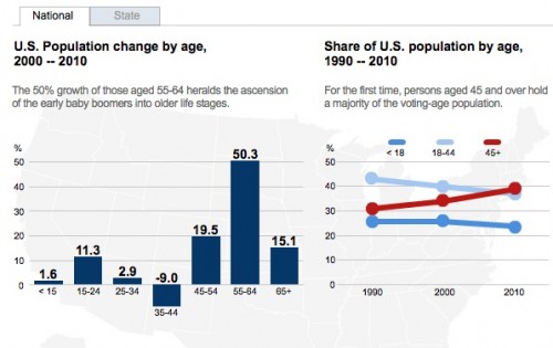
Dmitriy T.M. sent us a link to some images at the Brookings Institution, based on analysis by William Frey, illustrating the very uneven changes in average of of the population by state in the U.S. Overall, the U.S. population is aging, with rapid growth in the population over age 55 and individuals over age 45 surpassing those aged 18-44, according to the 2010 Census:

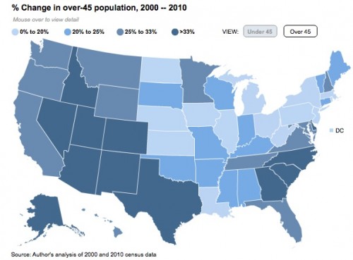
But this varies by region of the country. Here’s a map showing growth in the +45 population, illustrating the rapid growth in the Southwest and much of the South:

Nevada had the single highest growth in the 45+ population, with this group increasing by 50% between 2000 and 2010. West Virginia growth comes in last among this group (excluding Washington, D.C.), increasing by 15%. Of course, growth doesn’t tell you anything about the underlying numbers.

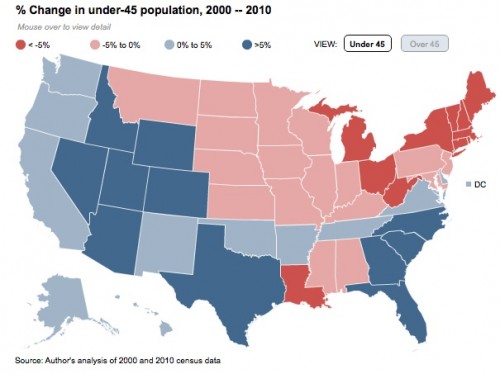
Many of the same states that had rapid growth in the 45+ population also saw significant gains in the under-45 range. But unlike with the 45+ population, where every state’s population was stable or growing, a significant number of states actually experienced a loss of the under-45 group:

Again, Nevada’s #1, with 28% growth. Michigan, on the other hand, had an 11% loss.

These patterns have significant implications for individual states — everything from estimating how many elementary schools they’ll need to build in the future, to how many health care workers they’ll need to educate or attract, to a state’s or region’s ability to attract different types of employers, and so on. And states will be grappling with these issues under very different circumstances. It’s one thing to, for instance, address the potential health-care needs of the elderly in a state where every age group is increasing; it’s another if your working-age population is fleeing.

Brookings has a much more detailed interactive map that includes information on aging; you can look at the dependency ratio (population under 18 or over 65 per person of working age) and look at age changes by major metro areas in addition to states.