
Photographs have played a major role in framing the environmental movement, and groups have used images to draw public attention and concern to specific issues. A famous example is the “Earthrise” image taken in 1968 from Apollo 8, the first time an image of this sort was taken by an actual person, rather than a satellite. The seeming fragility of the planet, clearly shown as an interconnected and isolated entity, has been largely credited with increasing concerns about and awareness of environmental issues:
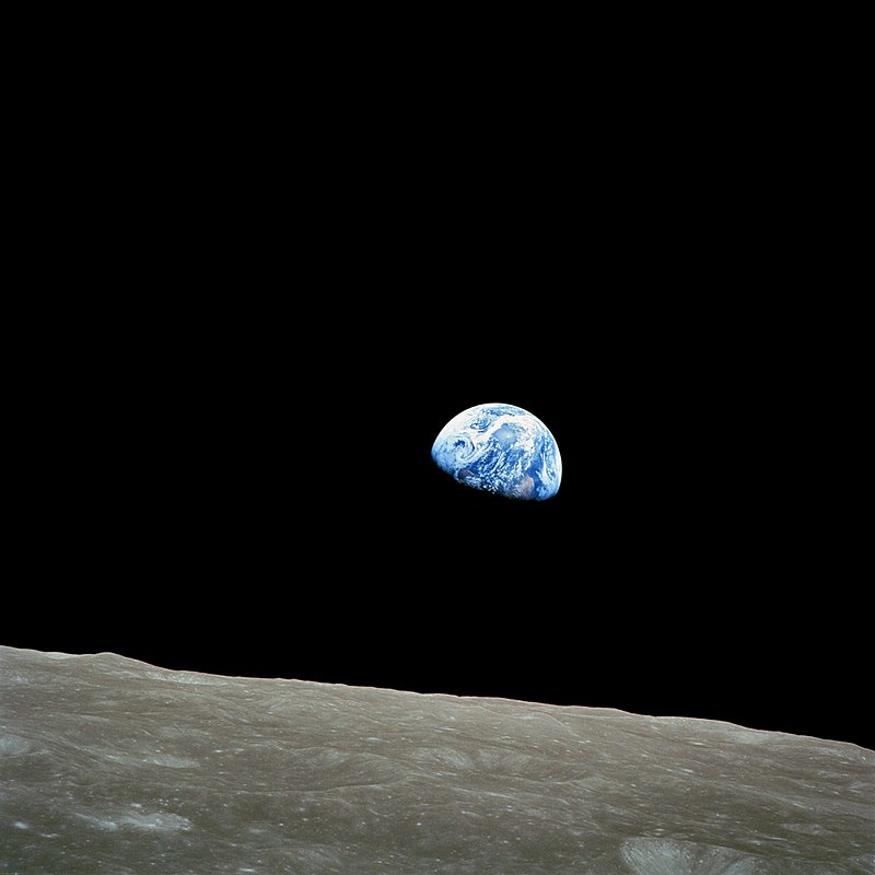
Life magazine included it in a list of “100 photographs that changed the world.”

On June 22, 1969, the Cuyahoga River in Ohio caught on fire. News spread, and the story — the shock many Americans experienced when they heard that rivers were catching on fire — increased concerns about water pollution, eventually leading to the 1972 Clean Water Act. Dramatic photos of the Cuyahoga burning appeared.

There was one small detail with the images that often went unnoticed: as far as anyone can tell, no one took any photos of the river burning in 1969. If you look online now, you’ll find lots of images from a fire in 1952, but none from 1969. At the time, rivers catching on fire in the former industrial centers around the Great Lakes weren’t really shocking; it happened pretty frequently and had been for decades. The 1969 fire was, if anything, unexceptional. It only lasted half an hour and didn’t do much damage.

Of course, context and timing are everything. The story about the 1969 fire emerged at a time when concerns about environmental pollution and safety were increasing, so an event that might have been completely ignored outside the local area, as they had been in the past, instead became a flashpoint in the environmental movement, and images of rivers on fire now seem shocking to us. I think most Americans would see a river catching on fire as inherently problematic, an automatic sign of a major environmental problem, rather than an unavoidable and unremarkable outcome of economic progress.

Given the force of images in these instances (and others), I can’t help but wonder what the effects will be of photos of the current oil spill in the Gulf of Mexico, particularly as it approaches the coasts. Dmitriy T.M. sent in a set of images. The oil spill, and the images we’ll continue to get of it, come soon after President Obama announced his support for offshore drilling in a number of areas, including the Atlantic coast and the Gulf of Mexico. The plan, already controversial, is likely to meet even more resistance now, particularly from residents in communities that are not dependent on oil drilling for their livelihoods and fear the effects of an oil spill. Public concern is likely to increase even further when the oil hits coastal areas and we begin to see images of oil-covered wildlife, beaches, and so on, much as we did after the Exxon Valdez spill.

These images are already striking, but the power of an image is highly connected to the social/historical context in which is arises (much as photos of rivers on fire didn’t cause a huge national stir until they became emblematic of the need for environmental regulations). I can’t help but think that the last photo I posted above will have more resonance than it might have otherwise because of the way it will intersect with memories of Hurricane Katrina bearing down on New Orleans — I suspect that a story that would be attention-getting regardless will be even more so now that it will connect to ideas of New Orleans as a beleaguered city, endangered by a string of natural and human-caused disasters.

——————————-

See also our post on how photographs of the fetus changed how we think about pregnancy and abortion and, for an interesting controversy regarding photography, see our post on Shelby Lee Adam’s images of Appalacians.

Gwen Sharp is an associate professor of sociology at Nevada State College. You can follow her on Twitter at @gwensharpnv.
Cross-posted at Ms. magazine.

Full-time women workers earn 80.2% of what full-time men workers earn.  One of the primary reasons that women earn less is job segregation by sex.  Jobs themselves are gendered, such that women have a tendency to enter feminized occupations and men have a tendency to enter masculinized occupations.  How severe is job segregation by sex?  A new report by the Institute for Women’s Policy Research, newly updated for 2009, reports that about four in ten women and men work in jobs that are 75% female and male respectively.

Overall, masculinized occupations pay more.  (This is a different kind of sexism, a sexism against feminine-coded things instead of against women, but sexism nonetheless… for example.)  Job segregation, then, contributes to the pay gap between men and women.

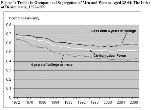
The figure below shows how this has changed over time.  The y axis is an “Index of Dissimilarity.”  Basically, a score of one indicates complete segregation and a score of zero means that the job is 50/50 male and female.

The white line, labeled “civilian labor force” shows that, overall, sex segregation has been going down over time.  It also shows, however, that most of the decrease occurred in the ’70s and ’80s.  It has changed little since then.

The lines above and below the white line show that sex segregation correlates with education level.  People who have at least a bachelors degree are in less sex segregated jobs, while people who did not attend or finish college tend to be in more segregated jobs.  This means that, insofar as sex segregation at work contributes to a wage gap, it is more extreme for working class people than for others.

Via Family Inequality.

Lisa Wade, PhD is an Associate Professor at Tulane University. She is the author of American Hookup, a book about college sexual culture; a textbook about gender; and a forthcoming introductory text: Terrible Magnificent Sociology. You can follow her on Twitter and Instagram.

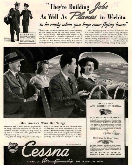
Peggy R. sent in this great vintage ad for Cessna private planes.  Placed in 1941, it suggests that all families should have private planes after the war:

I spoke with my friend and Cessna expert, Stephen Wilson.  He explained that the G.I. Bill, which reimbursed veterans for educational expenses, applied to flying lessons.  Veterans, then, could be reimbursed for learning to fly and Cessna was trying to encourage all veterans and their families to take to the skies.

Lisa Wade, PhD is an Associate Professor at Tulane University. She is the author of American Hookup, a book about college sexual culture; a textbook about gender; and a forthcoming introductory text: Terrible Magnificent Sociology. You can follow her on Twitter and Instagram.

NEWS:

Lisa was quoted in an Associated Press article that, much to her chagrin, rather uncritically celebrated the recent rash of untouched photos released by celebrities.  You can read it here and compare it to her unfiltered thoughts about it at her own post.

We added a new example of an assignment drawing on Sociological Images that instructors can use.  This one asks students to think critically about the whole project and is, thus, very interesting.  See #7 of our Sample Assignments.

This is your monthly reminder!  You can follow us on Twitter or friend us on Facebook where we update with a featured post every day.  We are, by the way, having lots of fun watching reactions to our posts on Facebook.  Thanks to all of you who have friended us and contribute to the conversations and the “like”!

NEWLY ENRICHED POSTS (Look for what’s NEW! Apr. ’10):

Neat, Cute, Ew, and Cool

In a comments thread a Reader, ckilgore, linked to her grandma’s cabinet fridge from the ’50s.  We added it, along with another example of an ad, to our vintage ad for the same.

We added a picture of pair-bonded female albatrosses to our (adorable) post on gay animals.

Tom M. sent in a billboard for Penthouse features a very suggestive… eye.  We added it to our post featuring ads with not-at-all-subtle visual sexual innuendo (NSFW).

I added an image of the Korean peninsula at night, linked in a comments thread by Brendon, to our post comparing the a map of the lights of the world at night and population density.

Race-Related Updates

We added a representation of “users” from WordPress that represented people as coming in different skin colors to our post featuring default avatars.

Jessica S. and Lucia M.M. sent in links to companies selling pretend teepees.  We added it to our post on American Indian-themed toys for kids.

Skada sent in another example in which white people are just people but black people are b-l-a-c-k, this time on Netflix.

Gender-Related Updates

We added lollipops, identical deodorants, and disposable cameras to our post on pointlessly gendered products.  We also added a new “girl talk” version of Jenga to our post on gendered versions of classic board games.  The first two were found by Sunlight Snow and the latter by Kathe H.

We also added a “drama queen” sign for girls to our post on babies’ and kids’ items that reinforce the “girls as spoiled divas” stereotype.  Thanks to Coley for sending it in!

Alex N. sent in a Fruit Loops commercial that genders doctors and nurses (in the direction that you would expect) and we added it to a post on that topic.

We updated our post on scrapbooking sticker sets of words about boys and girls with wall decals for boys and girls. In case you didn’t know, boys like hip-hop derived terms, while girls like any and all abbreviations.

Lizz Q. sent us another example of an anatomical illustration that featured a man facing straight forward and a woman posing rather sexily.  We added it to our burgeoning collection.

We added another great example of hygiene products being marketed to men by arguing that it enhances, instead of detracts from, their manliness.  In this one, sent in by Lucia M.-M., truly manly body wash is contrasted with sissy manly body wash.

Sofia R. sent us another example of Twix commercials that depict men as immature idiots.

We added a third example of shirts being sold in “unisex” and “women’s,” sent in by Mindy J.

Dmitriy T.M., Beth W., Abby D., and Jillian Y. sent in links to a video game called RapeLay.  We added it to a previous post on rape-themed video games (TRIGGER WARNING).

Lisa Wade, PhD is an Associate Professor at Tulane University. She is the author of American Hookup, a book about college sexual culture; a textbook about gender; and a forthcoming introductory text: Terrible Magnificent Sociology. You can follow her on Twitter and Instagram.


How have adults and young people weathered the worldwide economic downturn? This two-minute 12-second video shows that young people have been harder hit by joblessness in almost all OECD countries:

From the OECD Factblog.

Lisa Wade, PhD is an Associate Professor at Tulane University. She is the author of American Hookup, a book about college sexual culture; a textbook about gender; and a forthcoming introductory text: Terrible Magnificent Sociology. You can follow her on Twitter and Instagram.

Asa D. sent in an animated 1958 Disney segment titled “Magic Highway USA.” The cartoon extols the virtues of the highway system of the future (the interstate highway system was authorized by President Eisenhower in 1956). Apparently it is farther into the future than 2010, as my windshield does not have a radar, and road construction around here doesn’t seem to be instantaneous:

The segment of course illustrates gender expectations of the time — dad goes off to work while mom and the kid(s) go shopping. But as Asa points out, this example of the “techno-utopianism” of the post-World War II era, with faith that modern technologies will lead to a happy future that increasingly frees us from unpleasant work, boredom, wasted time, and so on, is truly fascinating.

Providing a nice contrast to that earlier vision, Dmitriy T.M. let us know about the stop-motion short video Metropolis by Rob Carter. The entire video, which is 9 1/2 minutes long, gives an abridged history of Charlotte, North Carolina.

Here are the last 3 minutes (you can see the entire video here). In this segment, we see the unfolding of a large highway system and urban construction/destruction/reconstruction. At about a minute in, “the video continues the city development into an imagined hubristic future, of more and more skyscrapers and sports arenas and into a bleak environmental future” (quote found here):

Metropolis by Rob Carter – Last 3 minutes from Rob Carter on Vimeo.

NEW! (May ’10): Kris H. sent in another example of envisioning the future. The Futurama, an exhibit at the 1939 World’s Fair, promised a future in which interstate highways will allow people to bypass slums, relieving us of the work of fixing them (found at Neatorama):

Jose Marichal, who blogs at Thick Culture, forwarded us this compilation of Bob Barker’s infantilizing and harassing behavior on The Price is Right during the 1970s.  It’s pretty stunning:

I’d like to say that men don’t call women “girls” these days… but I’m watching Jaime Oliver’s Food Revolution.

Source: FourFour via The Daily Dish.  More examples of calling women girls, both vintage and contemporary.

Lisa Wade, PhD is an Associate Professor at Tulane University. She is the author of American Hookup, a book about college sexual culture; a textbook about gender; and a forthcoming introductory text: Terrible Magnificent Sociology. You can follow her on Twitter and Instagram.

PART ONE:

Drinking lowers your GPA. So do smoking, spending time on the computer, and probably other forms of moral dissolution. That’s the conclusion of a survey of 10,000 students in Minnesota.

Inside Higher Ed reported it, as did the Minnesota press with titles like “Bad Habits = Bad Grades.” Chris Uggen reprints graphs of some of the “more dramatic results” (that’s the report’s phrase, not Chris’s). Here’s a graph of the effects of the demon rum.

Pretty impressive . . . if you don’t look too closely. But note: the range of the y-axis is from 3.0 to 3.5.

I’ve blogged before about “gee whiz” graphs , and I guess I’ll keep doing so as long as people keep using them. Here are the same numbers, but the graph below scales them on the traditional GPA scale of 0 to 4.0.

The difference is real – the teetotalers have a B+ average, heaviest drinkers a B. But is it dramatic?

I also would like finer distinctions in the independent variable, but maybe that’s because my glass of wine with dinner each night, six or seven a week, puts me in the top category with the big boozers. I suspect that the big differences are not between the one-drink-a-day students and the teetotalers but between the really heavy drinkers – the ones who have six drinks or more in a sitting, not in a week– and everyone else.

—————————-

PART TWO:

Some time ago, the comments on a post here brought up the topic of the “gee whiz graph.” Recently, thanks to a lead from Andrew Gelman, I’ve found another good example in a recent paper.

The authors, Leif Nelson and Joseph Simmons, have been looking at the influence of initials. Their ideas seem silly at first glance (batters whose names begin with K are more likely to strike out), like those other name studies that claim people named Dennis are more likely to become dentists while those named Lawrence or Laura are more likely to become lawyers

But Nelson and Simmons have the data. Here’s their graph showing that students whose last names begin with C and D get lower grades than do students whose names begin with A and B.

The graph shows an impressive difference, certainly one that warrants Nelson and Simmon’s explanation:

Despite the pervasive desire to achieve high grades, students with the initial C or D, presumably because of a fondness for these letters, were slightly less successful at achieving their conscious academic goals than were students with other initials.

Notice that “slightly.” To find out how slight, you have to take a second look at the numbers on the axis of that gee-whiz graph. The Nelson-Simmons paper doesn’t give the actual means, but from the graph it looks as though he A students’ mean is not quite 3.37. The D students average between 3.34 and 3.35, closer to the latter. But even if the means were, respectively, 3.37 and 3.34, that’s a difference of a whopping 0.03 GPA points.

When you put the numbers on a GPA axis that goes from 0 to 4.0, the differences look like this.

According to Nelson and Simmons, the AB / CD difference was significant (F = 4.55, p < .001). But as I remind students, in the language of statistics, a significant difference is not the same as a meaningful difference.
