One example of the pervasive sexualization of beer is the ubiquitous personification of “blond” ales as blond women.  Tom Megginson at Change Marketing made this observation and collected a number of examples of this particular example of the gendering and sexualizing of food:

See more at Megginson’s post.  See also our other posts on gender and beer here, here, and here.

—————————

Lisa Wade is a professor of sociology at Occidental College. You can follow her on Twitter and Facebook.

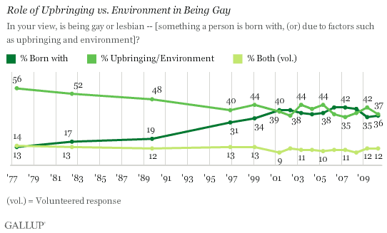
A blog post at Gallup, sent along by Michael Kimmel, discussed nearly 25 years of US opinion on the cause of homosexuality.  The data shows a slow decline in the percent of people who think that people are “made” gay or lesbian by their upbringing or environment (the nurture argument) and a slow rise in the number of people who think they are “made” gay or lesbian by biology (the nature argument).  The two meet in the late 1990s and, throughout the 2000s, they’ve been more-or-less neck-and-neck.

I welcome speculation as to why the trend didn’t continue such that nature ended up beating nurture good by 2010.  I can’t think offhand of a reason why.

—————————

Lisa Wade is a professor of sociology at Occidental College. You can follow her on Twitter and Facebook.

Tom Megginson blogged about a billboard advertising Gaylea spreadable butter that made fun of brutality… affixed to the back of a women’s shelter in Ottawa:

See also our post featuring dueling advertising and public service announcements.

—————————

Lisa Wade is a professor of sociology at Occidental College. You can follow her on Twitter and Facebook.

In this video they posted at Feministing, Chloe and Samhita discuss Sex and the City 2. Enjoy!

Nathan Yau, at Flowing Data, calls BP out on a piece of data representation trickery.  In a video on the BP website explaining the progress they were making cleaning up the oil, Kent Wells offered the following graph:

The bars represent oil collected over time.  But, as Yau points out, the data offered by Wells is cumulative.  It’s not the case that each consecutive day (May 16 to May 23) they are collecting more oil.  Instead, each collective day they have collected more oil overall.  If they keep collecting oil, we should expect nothing less.

Instead of showing the data cumulatively, they could have presented how much oil they collected each individual day.  But the data, in that case, doesn’t look as good.  Yau put this together:

This graph suggests that BP’s collection of oil is diminishing and makes viewers want to know why.  The graph they offered, however, hides their decreasing efficacy.

—————————

Lisa Wade is a professor of sociology at Occidental College. You can follow her on Twitter and Facebook.

There are masculine and feminine versions of standing, ones that many adults reproduce rather consistently, and boys and girls must learn which stances are which.  To illustrate this, Miriam H. sent us a photograph of a package of Tinkerbell figurines and a screen shot of a web page selling fairy costumes.  These images — two among many possible examples — nicely show how girls are taught, from a very young age, how to stand.

See also a related post: Male Models Display Clothes; Female Model Display Themselves.

—————————

Lisa Wade is a professor of sociology at Occidental College. You can follow her on Twitter and Facebook.

Lisa Wade, PhD is an Associate Professor at Tulane University. She is the author of American Hookup, a book about college sexual culture; a textbook about gender; and a forthcoming introductory text: Terrible Magnificent Sociology. You can follow her on Twitter and Instagram.

Keeping a trend in perspective.

The sociologist down the hall pointed out that yesterday’s chart gave the impression of a whopping increase in TANF (Temporary Assistance to Needy Families) support for poor families. But I have been complaining since December 2008 that the welfare system is not responding adequately to the recession’s effects on poor single mothers and their children. I wrote then:

We now appear headed back toward a national increase in TANF cases. But the restrictive rules on work requirements and time limits are keeping many families that need assistance out of the program…. If the government can extend unemployment benefits during the crisis, why not impose a moratorium on booting people from TANF?

So it does seem contradictory that I would post a chart yesterday showing a huge increase in TANF family recipients, and continue the same complaint. So let me put it in better perspective. It’s a good lesson for me on the principles of graphing data, which I have made a point of picking on others for.

Height and width

There were two problems with yesterday’s chart. First, the vertical scale only ran from 1.6 million to 1.9 million families. Second, the horizontal scale only ran for 26 months. I’ll correct each aspect in turn to show their effects. Here’s yesterday’s chart:

It sure looks like a dramatic turnaround. And any turnaround is a big deal. I wrote last year:

What should be striking in this is that the rolls are increasing even as the punitive program rules continue to pull aid from families according to the draconian term limits dreamed up by Gingrich, ratified by Clinton and endorsed by Obama — 2 years continuous, 5 years lifetime in the program. The current stimulus package includes more money for TANF, to help cover an expected growth in families applying — but no rule change to permit families to keep their support in the absence of available jobs.

But, run the vertical axis down to zero, and the same trend is not so dramatic:

Now the big bounce since July 2008 is put in perspective. We’ve seen a 16% increase since that bottom point, but the response seems much more modest in light of the size and impact of the Great Recession we’ve come to know.

In fact, though, the longer-term view underscores how paltry that response has really been. Back the chart up to 1996, and you can see how small the increase has been compared with the pre-draconian reform period:

All three images are correct, but their emphasis is different. To me, the important take-home message from this trend is, “That’s it? The greatest economic recession since the Great Depression, and our welfare response was that measly uptick? Our system really is a shambles.”

One important issue remains, however, and that is some measure of the need for welfare. So consider the number of single-parent families below the poverty line, compared with the number of families receiving TANF (formerly AFDC):

Now the story is much more clear.

After welfare reform in 1996, the number of families receiving welfare was cut by half in just a few years. At the same time, however, the number in poverty dropped. Since then, as the number in poverty has increased, the number on welfare has not. The two trends appeared to be uncoupled through most of the 2000s. In the last year we’ve seen the first increase in TANF numbers since 1996, but nowhere near enough to meet the increase in poor single-parent families.*

It is still the case that, although the stimulus bill allocated more money to TANF, the punitive rules and term limits have not been changed. So the system does not address longer-term poverty — something we should expect to see much more of in the next few years.

*We don’t have the official 2009 poverty rates yet, since they are compiled from a survey done in March 2010, to be released this fall.

Philip Cohen, PhD, is a professor of sociology at the University of North Carolina at Chapel Hill, where he teaches classes in demography, social stratification, and the family.  You can visit him at his blog, Family Inequality, and see his previous posts on SocImages here, here, and here.

Lisa Wade, PhD is an Associate Professor at Tulane University. She is the author of American Hookup, a book about college sexual culture; a textbook about gender; and a forthcoming introductory text: Terrible Magnificent Sociology. You can follow her on Twitter and Instagram.

The new Pew Research Center report on the changing demographics of American motherhood (discovered thanks to a tip by Michael Kimmel) reveals some pretty dramatic changes in the ideal family size between 1990 and 2008.  In the late 1960s and early ’70s, two suddenly overtook three and four or more and it’s never looked back:

Here are today’s preferences (notice how few people want to remain childless or only have one child):

I’d love to hear ideas as to why this change happened at that moment in history.  Is it possible that the introduction of the contraceptive pill, which was the most effective method of contraception that had ever been available to women (I think that’s true), made smaller families an option and that people became interested in limiting family size once they knew that could actually do it?

Interestingly, people still overwhelmingly say that they want children because they bring “joy.”  But apparently two bundles of joy are enough!

UPDATE! A number of commenters have pointed out that both I and the authors of the study are conflating people’s opinions about ideal family size and the number of children they personally want to have (see the second figure especially).  I think they’re right that asking the question “What is the ideal family size?” will not necessarily get the same response as “How many children do you want to have?”   A very nice methodological point.

For more on this data, see our posts on age and racetrends in American motherhood.

—————————

Lisa Wade is a professor of sociology at Occidental College. You can follow her on Twitter and Facebook.